
There is a lot to cover on Wednesdays. We should know, as collectively, we read an insane amount of comics. Even with a large review staff, it’s hard to get to everything. With that in mind, we’re back with Wrapping Wednesday, where we look at some of the books we missed in what was another great week of comics.
Let’s get this party started.

Amazing World of Gumball 2016 Grab Bag Special #1
Written and Illustrated by Terry Blas, Kate Sherron, Ann Szabla, Kate Farina
Reviewed by Liam Budd
Kaboom! have been doing some real amazing work with their Cartoon Network properties over the past year, somebody over there has done a fantastic job in finding quirky and talented comic book creators to handle these books. Titles, like “Amazing World of Gumball”, have been given the space and investment to become just as creative and expansive as their tv counterparts. Nowhere is this more evident than when they release a compilation of stories, as is the case here. The “Grab Bag Special” is made up of four short tales, all written and drawn by a different storyteller. And to make up for the high price, between each story is a stupidly fun collection of “ads” feature all the characters left out of the four tales.
The stories themselves completely distinct from one another, as every element from the show is given its own spotlight. We see Gumball and Darwin at school in ‘Lunch Trade’ by Terry Blas, a bonkers adventure featuring the Watterson clan in a wrestling tournament in ‘Crayon Wax On, Crayon Wax Off’ by Kate Sherron and then ‘The Treasure Room’ by Kate Farina, which is a brilliantly told tale where we see the two bro’s play a videogame together. Even though each story is from a different mind, everything you expect to see from a Gumball story is here, but just with the right level of individual personality. However, I would say the third story, ‘The Shack’ by Ann Szabla, is probably the least memorable, a perfectly fine tale, but it lacks any the smart creativity of the other three.
My favourite has to be Kate Sherron’s story. It is mostly down to her art style that makes it feel to me the most original. All the other stories are drawn to look like they have come straight off the show, which is not a bad thing, but Sherron has a style all to herself. It has this beautiful graphic illustrated look to it, like a graffiti artist who works in ice cream. Characters are drawn so oddly, you’ve never seen Darwin look so much like an actual fish, yet it works completely. The whole design is slick and dreamy while also being just downright funny.
Final Verdict: 7.5 – A fun, eclectic mix of stories featuring the Amazing World of Gumball. A total must for fans, I fear the high price may be too much for the casual reader.

DC Comics Bombshells Annual #1
Written by Marguerite Bennett
Illustrated by Elsa Charretier
Reviewed by Alice W. Castle
With each passing week, I’m genuinely more and more surprised that DC allows “Bombshells” to still be exist. It is literally a series of comics that eliminates the majority of DC’s male characters, promotes solely its female characters in new and interesting ways by virtue of the 40s pin-up aesthetic and is a story built on the power of female friendship and love. It is amazing. I feel like it’s a comic that DC doesn’t know exists and with each week we’re living on borrowed time until it is taken from us. Boy, writing about comics full time has pretty much killed all optimism I used to have.
This annual for “Bombshells”, written by Marguerite Bennett and illustrated by Elsa Charretier, works as a fantastic entry point for the series by reinterpreting a number of recently popular DC stories into the “Bombshells” universe. Focusing on the origin story of Batgirl, Bennett and Charrtier use Francine Charlie (who you might remember from Fletcher, Stewart and Tarr’s run on “Batgirl” as Frankie Charlie) to explore a wild new take on Batgirl: she is literally a vampire. I don’t want to just spoil the entire annual here, but, like, guys… Batgirl is a vampire.
Continued belowThe annual as a whole is entertaining because Bennett and Charretier use that subversion to make the story more of an action-oriented monster movie style story. Charretier’s artwork mixed with Hi-Fi’s colours pull the impressive task of nailing the 40s pin-up look with Batgirl’s origin, showing an impressive montage sequence and dogfight action scene, as well as the eerie, pulpy aesthetic of the latter half of the book. It’s a major shift in tone and one that the artwork handles incredibly well with Charretier’s clean lines being emphasised by the colour palette that switches from bright blues, purples and golds to blacks, greens and oranges.
The only downside to this annual, in my eyes, is that the story is very obvious in how things are going to play out. As soon as you find out the location of where Batgirl has been, you can pretty much guess the ending. What that doesn’t take away from, though, is the stellar storytelling from Marguerite Bennett, Elsa Charretier and Hi-Fi that makes this annual a fun, pulpy adventure.
Final Verdict: 7.2 – Sit this one in front of someone you know who read the pre-‘Rebirth’ “Batgirl” run and introduce them to an amazing new world of comics.

Future Quest #4
Written by Jeff Parker
Illustrated by Evan “Doc” Shaner, Jeff Parker, and Ron Randall
Reviewed by Brian Salvatore
Reviewing “Future Quest” is a weird proposition; there’s a ton of really promising stuff here. The art – mainly by Evan Shaner, but with assists from Jeff Parker and Ron Randall – shines page after page, representing a great synthesis of classic designs, fun action, and brilliantly rendered action sequences. So many panels and pages just sing in this issue. Visually, there may not be a finer book this month.
But when trying to read the issue, there are a few challenges that make the book less than fun.
A big part of that is that Parker writes these characters as if everyone reading the book knows these characters. I’m not saying that we don’t know who they are – many comics fans know who Space Ghost or Birdman is, but mostly, they know those characters from Adult Swim, or from general pop culture knowledge. On one hand, I applaud Parker for diving right in, and letting fans be smarter than so many publishers presume. This is not an origin story, and I can dig that.
But that said, this issue in particular reads really confusingly. There’s a point, mid-story, where Parker takes over the art, and it looks, if you ignore any credits, like the story continues. But there is a new title for this part of the story (“The Structure of Fear”), and with so many characters floating around, it is hard to keep track of exactly who is who. This isn’t helped by the fact that the third issue was all origin, and didn’t pick up the overall plot from the first two issues at all.
Look, I want to love this book. I really do. But until the story can read in a way that is more inviting to a casual, or even ignorant, fan, it will never transcend its time period and nostalgic nods of approval.
Final Verdict: 4.9 – I hate grading this book that low.
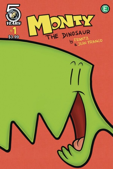
Monty the Dinosaur #1
Written by Bob & Sophie Frantz
Illustrated by Jean Franco
Reviewed by Matthew Garcia
Full of bright colors and geometric designs, “Monty the Dinosaur” #1 is the perfect kind of kids’ comic. It’s filled with lessons about friendship and responsibility (such as calling ahead to warn someone you’re going to bring a guest to a party) and features some genuinely charming humor. I wouldn’t think it’d be surprising to see it turned into one of those early Saturday morning educational cartoons. The Frantzes and Franco are well aware of their audience and every choice in the book seems designed to keep them engaged.
“Monty the Dinosaur” #1 is comprised of a few short adventures. In the first, Monty desperately wants friends, so he infiltrates the playground incognito. Except he’s a dinosaur. In another, he finds himself as the plus one to a birthday party for an underprepared girl. This leads to one of my favorite moments, where the underprepared birthday girl is explaining her cupcake predicament while her other guests slowly try to sneak up behind her. The situations and setups are simple enough that kids will easily be able to identify with them.
Continued belowWhile we can appreciate Franco’s lively and shapely designs, they seem in place so kids can easily draw them. The layouts are simple and easy to access. The book, as a whole, is targeted toward, and mostly for, kids. “Monty the Dinosaur” #1 has a strong heart and charming personality, but don’t go into it expecting it to be more than it wants. And it’s not like Monty’s Barney or anything.
Final Verdict: 7.5 – Cute artwork and charming situations; kids will probably love this.
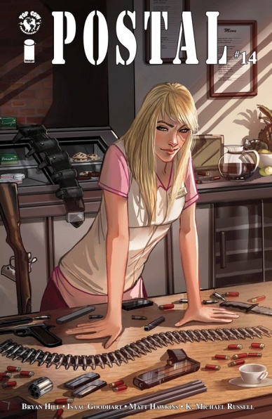
Postal #14
Written by Bryan Hill
Illustrated by Isaac Goodheart and K. Michael Russell
Reviewed by Jess Camacho
Like a great TV drama, “Postal” just keeps on giving. “Postal” #14 continues to build to what feels like a major turning point for the series. The white supremacist group is bearing down on Eden while Laura tries to rally her own tight knit group of allies to figure out how to deal with them along with the ongoing issues inside the town. Hill’s dialogue is so tight with lots of insight into character’s motives without ever feeling overbearing. This issue doesn’t include a lot of big events but it does move every part and it builds tension, which is something that “Postal” does extremely well and is a big part of why I keep coming back every issue.
Since he started working on the series, artist Isaac Goodheart has really grown as an artist. In “Postal” #14, Goodheart begins to really play with lots of different angles and shifting focal points. He’ll fill panels with multiple characters but has started to toy with who he wants our attention on. It’s a big improvement from earlier issues and makes me really excited to see where he’ll go from here. As usual, his characters do have a lot of varying degrees of expression, which for an issue like this, that’s full of tense, dialogue heavy moments, this is important. Russell’s colors also continue to hold this beautiful mood that makes “Postal” feel like a prestige drama.
Final Verdict: 7.9 – An uneventful but still very important piece of the “Postal” puzzle

X-Files Origins #1
Written by Jody Houser & Matthew Dow Smith
Illustrated by Chris Fenoglio & Corin Howell
Review by Ken Godberson III
Okay, some truth before I begin: I’ve never been the hugest fan of X-Files. I liked it well enough, I know the characters and every now and again I’ll pop an episode up on Netflix, but I always find it to be the prototype supernatural/sci-fi procedural that would inspire shows I’d end up liking more like Fringe. That being said, Houser, Smith, Fengolio and Howell do a pretty decent job of creating an duo of all-ages story featuring Mulder and Scully during childhood while still tying into what will make them who they are in the future.
The first half of this oversized issue is Mulder’s story with Houser scripting and Fenoglio on art. It’s been nearly a year since the abduction of Mulder’s little sister that would paint who he is and Houser does a good job of having that event haunt the entire issue, from the quiet scenes of Fox and his parents. That said, it does remind us that he’s still a kid, so when two summer friends invite him to go looking for U.F.O.’s, it’s tinged with both E.T-esque wonder and the foreboding, considering his future. This is helped along by Chris Fengolio’s really fine cartoonwork. It’s very reminiscent of The Iron Giant in its character designs and also tries to go for a similar tone.
Scully’s story (with Smith scripting and Howell & colorist Monica Kubina) in comparison is a bit more grounded, which is more fitting for a character like Dana. It centers around Dana’s loneliness about moving to a new Naval base as well as dealing with the murder of her Sunday School teacher. It’s the beginning of a story about processing and while Mulder’s story had that too, here it’s way more prevalent, we the reader being more inside Dana’s head. Howell and Kubina’s artwork forgoes childhood wonder a bit as well, being reminiscent of pre-reboot Archie but in a much more sketchy way. It sells the underlying somberness to the story without making it a complete drag.
Final Verdict: 7.0- A pretty good start to a more light-hearted mini-series.


