
There is a lot to cover on Wednesdays. We should know, as collectively, we read an insane amount of comics. Even with a large review staff, it’s hard to get to everything. With that in mind, we’re back with Wrapping Wednesday, where we look at some of the books we missed in what was another great week of comics.
Let’s get this party started.
Avatar: The Last Airbender – Smoke and Shadow Part One
Written by Gene Luen Yang
Illustrated by Gurihiru
Reviewed by Matthew Garcia
Though it didn’t start off that way, the Dark Horse “Avatar: The Last Airbender” comics, have become the bridge connecting the Aang Gang with the Korra Crew. Now starting its fourth original graphic novel series, Gene Luen Yang and artist team Gurihuru, have been working to show us how Republic City came about, and continue to show that even if they might have beaten former Fire Lord Ozai, there’s still a lot of trouble brewing in their new world.
After finding Zuko’s mother, helping Toph reconnect with her family, and stopping a handful of bad dudes who’re using the shift in the balance of power to their own monetary advantage, Fire Lord Zuko returns back to the Fire Nation. But all is not right. There’s a secret sect of Ozai devotees not happy with how Fire Lord Zuko is trying to bring the four parts of the world together, and they are finally ready to make their move to unseat him.
Avatar: The Last Airbender dealt with more moralistic themes, family elements, and ideas of inclusion than Korra, which explored ideas of power, evolution, and balance; Yang has found a way to juggle the two of them in these books, mostly through themes of perspective. Like with the previous series, the Aang Gang isn’t just given a bad guy who’s jacking up a bunch of people’s junk, but are dealt antagonists who question them about progress, about dealing with people who not not necessarily be wrong but are approaching their actions in the wrong way. And while there’s a lot of head wrangling about how to deal with these topics, the book never gets boring, thanks to Gurihuru’s expressive and dynamic art.
This is the first part of the next wave of the series, and even with a climatic battle, Yang and Gurihuru throw out more mysteries and questions than anything. It’s great to see these characters again, and this team has so well captured this world that all their voices immediately come back. Sokka, especially. Sokka’s so great. This team knows exactly what they’re doing with this series, and I think they’ve earned fan trust. Expect more revelations in later two volumes.
If I have a major problem with this book, it actually extends to the whole series altogether. This is a 70 page story and it goes for $10.99. Yes, it’s a licensed title from a pre-existing series and in full color, but these books read fast and that price seems more than a little steep. Especially for kids, Not only that, but Dark Horse only collects these series in these admittedly beautiful library-sized hardcover special editions that run for $40. I just wish they had a normal sized collection at normal trade price for these, which would help make these consistently fantastic stories even more accessible.
Final Verdict: 8.8 – the Aang Gang is always welcome to hang around.
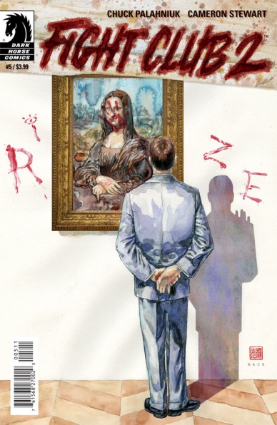
Fight Club 2 #5
Written by Chuck Palahniuk
Art by Cameron Stewart
Reviewed by Stephenson Ardern-Sodje
The cross medium sequel to the anti-corporate classic hits the half-way point of its projected run. Things are getting increasingly warped, and Sebastian still seems powerless against the forces of Tyler. But, as Marla and her progeria-inflicted new friend forge in-rounds into warzones across the world to investigate Tyler’s hand in destabilising nations, Sebastian gleans a rare clue that might just lead him to the whereabouts of his son, and the means to take his life back into his own hands.
It was obvious from the first issue that Palahniuk’s narrative wasn’t going to be easy to follow. With each subsequent release, Palahniuk has peeled another layer to reveal more of Tyler’s multi-layered plan. Arson, bribery, ‘Human Sacrifices’ who have given up there lives to become cogs in the capitalist machine and gain skills useful for Project Chaos, and now theft and damage of classical art and scuplture. The pendulum swing of Tyler and Sebastian that has formed the main focus of the conflict for this series is still as dizzying as ever, and it’s a credit to Palahniuk’s pitch perfect ambiguity that, even as he examines new levels of Tyler’s depravity and vanity, we can’t help but be drawn in by him.
Continued belowStewart has been killing it on this book since the first page, and this issue is no different. His art is crisp, clean, and unflinching, and the detailed nature of his pages – with asides and insert panels that force you to consider key sections of Palahniuk’s rhetoric – drags the reader into a position of complicit voyeurism. These glimpses are sometimes funny, sometimes thought-provoking, and sometimes just plain uncomfortable, as with a brilliantly decompressed moment in this issue that bombards the reader with almost a full page of charging, pendulous Gynomastia (or ‘Bitch Tits’, for all you laymen out there).
Palahniuk and Stewart have clearly got a sprawling and savage story plotted out but, while all the scathing counter-culture hallmarks of the first book/film are still present and up to date (including a nod to the fact that Project Chaos may have a hand in funding ISIS) it’s the human element that keeps this book centred and keeps us caring while bombs are going off and priceless pieces of art are being defiled by arterial ammunition. Half way through and with very little fully defined yet, it’s a safe bet to assume it’s going to get far more bizarre before we get any real answers about what it is Tyler is truly plotting. However, the confidence this creative team instils is enough to guarantee I’ll be back to see where it goes in the second half.
Final Verdict: 7.6 Palahniuk proves that you don’t have to choose between style and substance in this grimace inducing love letter to anarchy.
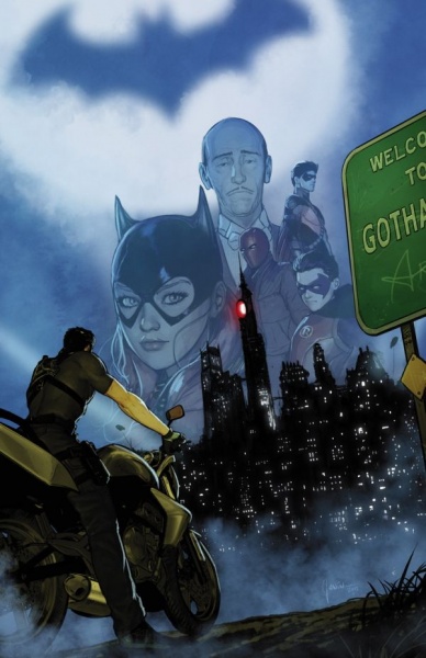
Gotham by Midnight #9
Written by Ray Fawkes
Illustrated by Juan Ferreyra
Reviewed by Brian Salvatore
If this book were somehow being published in the early 1990s, instead of 2015, “Gotham by Midnight” would have received a 50-60 issue run, and would be that little horror book that stuck around, telling interesting stories from the dark side of the DCU. Well, sadly, we’re not in the 90s anymore, and this book is kicking the bucket come December. That’s really a shame, as the book has been a really unique addition to DC’s stable of books, and has given the company an opportunity to do something really smart – find a Batman book for every genre of comic fan.
This issue is when the current arc comes to a head, and we have an appearance of the Spectre that feels quite different from how the character has been portrayed in the past – even in this title. That is an intentional change, as Fawkes is clearly playing with our preconceived notions of who/what the Spectre is, to tell this story. I’ve seen some longtime fans miffed at the changes that Fawkes has made to the Spectre’s mythos, but it is way too early to get the pitchforks out – for all we know, the mythos hasn’t changed at all, and there is another explanation for his proclamation at the end of the issue (which I won’t spoil here).
Ferreyra’s art continues to be the selling point here – with Bill Sienkiewicz’s covers not hurting matters either – and Ferreyra is really doing a wonderful job giving this book a vibe all its own, and not necessarily trying to ape what Ben Templesmith brought to the book initially. Ferreyra’s line is much cleaner than Templesmith’s, but he hasn’t lost any of the kinetic energy that Templesmith brought to the first arc. Because he is drawing, inking, and coloring the book himself, Ferreyra’s aesthetic has become an integral part of the book, allowing he and Fawkes to tell a story that is both about the Midnight Shift and about why the Midnight Shift is probably a bad idea – and they do so in a way that feels absolutely true to their own personal aesthetics. I’m sure that DC editorial has involvement with the book that borders on over-involvement (if the rumors are to be believed), but you can’t see it on the page at all.
Final Verdict: 8.0 – A solid book that will be sorely missed come January.
Grayson #12
Written by Tim Seeley & Tom King
Continued below
Illustrated by Mikel Janin
Review by Ken Godberson III
This issue left me very conflicted because, while I positively love the intent behind it, this issue made me realize just how cynical the New 52 has made me.
Let’s get the obvious out of the way: Mikel Janin and colorist Jeromy Cox are absolute dynamite as usual. Their ability to convey motion is unparalleled at DC right now and Janin’s layouts for the various flashbacks this issue has are so well crafted and detailed. Plus, Janin has to draw the designs of a variety of other artists such as Greg Capullo, Patrick Gleason, Cameron Stewart into his work and manages to make them his own while retaining the original looks.
So, what was it that made me so cynical about this issue? Well, this issue is finally Dick returning to Gotham and revealing to the rest of the Bat family and, at least to me, with the exception of his heartwarming reunion with Damian, these all felt very hollow. And the thing about it is, I cannot put the full blame on writers Seeley and King on this one. They are trying to make the best with what they have, utilizing word bubbles of key dialogue from the long history of Batman and Robin and choice images created by Janin and Cox from that history. You know, that history that is in a Schrodinger’s Box.
It’s the same problem as the event that caused this book to be created, Dick’s unmasking in “Forever Evil”. If that had happened before September 2011 it would have been huge because Dick had connections to nearly every superhero team out there, from the Justice League to the Outsiders. In fact, he was more the heart of the DC superhero community than Superman. Post-Flashpoint, it felt so much less because all those connections had been severed and DC was so spineless to commit one way or another.
The reunions here that suffer the most are the ones with Jason and Tim, or should I say, “the one reunion”. Yeah, Jason and Tim’s reunion are crammed together while Bruce, Barbara and Damian get single ones. Again, can only put partial blame to the writers because Jason and Tim were the ones in the Family most maligned by the reboot between the crunching of continuity with the six year timeline (another New 52 idea that really needs to get in the sea) and what seems like a tug-of-war control of them between the Bat Editorial office and other offices that, frankly speaking, are not as good with these characters. Plus, having their reunions with Dick crammed together really comes off as invalidating their individual relationships with the eldest Robin and leads more credence to the asinine idea that the Robins are interchangeable.
And it makes it more disparaging because this is what I wanted! I wanted to see Bat Family reunion at long last. And to see some characters get good reunions while others get shifted to seemingly “not as important” is depressing.
Not wanting to end this on a negative, I will applaud Seeley and King’s callback to their fantastic “Future’s End” tie-in issue with the Cluemaster’s Code to tie-in with the overall spy work that has been aces throughout the book.
Final Verdict: 6.0- The ideas and intent behind this issue are great and heartwarming, but it’s hampered by the editorial whims of the overall reboot of continuity.
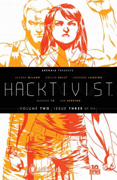
Hacktivist Vol. 2 #3
Written by Jackson Lanzing and Collin Kelly
Illustrated by Marcus To
Reviewed by Jess Camacho
The second miniseries of “Hacktivist” with this issue hits the halfway point and it unfortunately is not really turning into a story with the same weighty importance as the first miniseries. The focus of this volume has been cyberterrorism and hacking being used the wrong way but as far as this issue goes, it continues to focus a little too much on Nate and Ed. It sounds like a weird thing to say but what was great about the first volume of “Hacktivist” was how it felt connected to world events. There’s a lot here that’s not completely connecting to the world around us in a specific sense like the last issue did. What’s also not working is black and white view on the new hackers. There isn’t really an attempt at making the hackers feel like anything new and with the subject matter here there’s a lot of space to present an important and nuanced story.
Continued belowTo’s art is still very good but some of the women’s faces are looking a little too similar. The panel layouts work for the at times overwordiness of the script and the backgrounds create a very specific sense of place. The contrasts between Ed and Nate are very good but Ian Herring is really stealing the show as far as the art goes. His colors are all over the place in a very good way. He creates a very distinct tone for every single setting and there’s this excellent blaring alarm effect when cyber attacks happen that really get you invested in the action.
Final Verdict: 6.0 – I keep expecting more, but I don’t know if “Hacktivist Volume 2” is going to truly deliver in the long run.
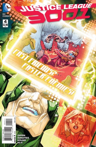
Justice League 3001 #4
Written by Keith Giffen & J.M. Demotes
Illustrated by Scott Kolins
Reviewed by James Johnston
I’m not sure why, but “Justice League 3001” is hitting this weird guilty pleasure spot of “not actually a good comic” and “still weirdly appealing.” I think that has to do with how every single character is treated like garbage. I’ve talked about this before, where that first issue of “3001” was all about how everyone wanted to nail Guy Gardner now that he transformed into a woman. And in this issue, that trend of violently weird characterization continues with Wonder Woman going out to get blackout drunk while The Flash (actually some scientist infused with the original’s powers) went on an ice planet, met Mirror Master, and then went home. It’s super weird, and feels like it should be reminiscent of other titles like “Superior Foes of Spider-Man” that had characters who went a little crazy but were still endearing.
Part of that might have to do with the artwork being super 90’s. Scott Kolins tackles this issue in place of Howard Porter, but his style is still reminiscent of Porter’s. It’s a lot of busy action, explosions, and characters that don’t feel genuine. “Justice League 3001” could honestly be a kind of funny character-based story, but the artwork doesn’t reflect the connection necessary to make those types of heroes feel human. It’s all a lot of manic faces and designs that should probably have had a couple more minutes of consideration.
On one hand, I really do want “Justice League 3001” to succeed as a weirdly ironic piece surrounding utter douchenozzles taking up the mantles of ancient heroes without knowing what made them work in the first place. That seems like a more viable story than whatever plot is going on with Lois Lane. To be fair, I haven’t read “Justice League 3000” so I don’t really know what’s going on, but one character named Ariel is just possessed by Lois Lane’s ghost who wants to kill everyone now. I don’t know why. Whenever anyone talks to her she has a a page-long monologue about how she’s really Lois and she’s the greatest villain the world will ever know. You know what? I don’t want an explanation. I want them to just continue and never address that plot point in any significant way.
Final Verdict: 5.6 – “Justice League 3001” feels weird and not in a constructive way. It has the potential to be good, but not in any way the creators initially intended.
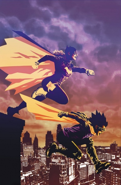
We Are Robin #4
Written by Lee Bermejo
Illustrated by James Harvey
Reviewed by Keith Dooley
After last issue’s tragedy, “We Are Robin” #4 focuses on one of the five remaining Robins. Writer Lee Bermejo and artist James Harvey create a character who acts and looks like a teenager. We empathize with her and understand the intense feelings she goes through, even though she just happens to be a teen hero who gains a coveted interaction with Batgirl. Lee Bermejo has written four fun, heartfelt issues that are expertly bringing to life a part of Gotham City and its fledgling teenage super-denizens in a bold yet natural way. This issue is the best one so far.
The reason for this issue’s particularly high quality is artist James Harvey. This is his first work for DC Comics and hopefully this issue gains him new admirers of his gorgeous art. In a style that is entirely his own (with a hint of Paul Pope during certain scenes), Harvey is a perfect fit for a book that focuses on youth. There are creative panels galore and every scene is infused with the imagination and wonder that any young person would experience in city where caped heroes and heroines fly through the night. The pages are never cluttered but are instead packed with such fun stuff as nods to Batman’s depiction from different media.
Continued belowHarvey is also credited as supplying the inks and colors (with assistance from inker Diana Egea and colorist Alex Jaffe) and brings a vibrancy to the brilliant colors that matches the art. The heavy use of certain hues of orange, red, and yellow in particular add to the pop art style that Harvey brings to the issue. The shading and shapes that permeate the book give it a hazy quality that imbues the art with dreamlike quality. Despite dealing with serious subject matter, the art compels us to see this world as one that belongs to children who still retain an innocence.
Final Verdict: 9.5 – Every aspect of “We Are Robin” #4, from the story to the art and Jared K. Fletcher’s letters, is done with such beauty and care. The result is one of the best issues of the month and the year. James Harvey is a man who deserves superstar status.
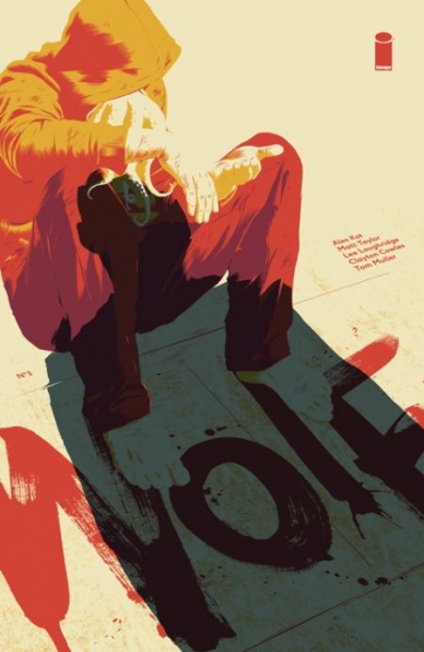
Wolf #3
Written by Ales Kot
Illustrated by Matt Taylor
Reviewed by Alice W. Castle
The thing about supernatural noir is that you’re combining equal parts horror and detective story. What Ales Kot and Matt Taylor have done with “Wolf” is that they’ve taken the framework of a complex, everyone-playing-each-other noir story and overlaid it with the characters and symbolism of a horror story. Like how Rian Johnson’s Brick took the narrative framework of a noir detective story, but overlaid it with the setting of a high school. The effect this achieves is that “Wolf” feels both familiar and strangely unique at the same time. The dense narrative that has been presented so far, with every character having a hidden agenda that is only just hinted at, feels like a classic detective story (Kot even has a character name-drop Raymond Chandler), but then the characters talk about ghosts and vampires and hell and you realise that it’s maybe not quite as classic as it seems.
It’s really all tied together by how compellingly Kot writes the characters and the world created by Matt Taylor’s art. Matt Taylor is able to capture that Los Angeles feeling of something dark and terrible lurking just underneath the surface. From grand manor houses in the hills to shitty downtown apartments, the locations feel real, but there’s something just off about them from the lighting and the shadows that perfectly captures the marriage of realistic noir and supernatural in the series. In just three issues, Kot and Taylor have captivated with “Wolf” and how it manages to blend two genres that feel all too familiar and do something entirely new with them.
Final Verdict: 8.2 – I cannot wait to see how far down the rabbit hole Kot and Taylor take this series.


