There is a lot to cover on Wednesdays. We should know, as collectively, we read an insane amount of comics. Even with a large review staff, it’s hard to get to everything. With that in mind, we’re back with Wrapping Wednesday, where we look at some of the books we missed in what was another great week of comics.
Let’s get this party started.

The Backstagers #2
Written by James Tynion IV
Illustrated by Rian Sygh and Walter Baiamonte
Reviewed by Jess Camacho
Jory has officially joined the backstage crew but he still has a lot of questions about what is down there in those tunnels. Thankfully, he has Hunter to show him around. As their bond deepens the more lost they get in the tunnels, more secrets are revealed about the backstage are. “The Backstagers” #2, like the first issue, is incredibly fun and charming. The building of the relationship between Hunter and Jory is adorable and the way this is juxtaposed against the weird stuff happening in the tunnels feels really right. Like some of the other all ages books that BOOM! is putting out, “The Backstagers” could have easily been a big animated series. It carries narrative weight but it also takes time to have fun and be something for a young person to really engage with on all levels.
Sygh’s art is art with true vision. “The Backstagers” #2 has a great look without ever feeling familiar. Sygh gives each of his characters a really distinct look and (more importantly) different body types. The characters are really expressive but the magic is really in the action that happens in the tunnels. Sygh really plays with lots of different genres in a short amount of space. There’s magical elements, sci fi elements and even a touch of horror. It gives the tunnels a lot of depth without taking away from the actual character driven narrative. Baiamonte’s colors have kind of flown under the radar with all the hype the book has received and it’s a shame. His work is gorgeous and doesn’t really settle for something easy. Like Sygh, he plays with lots of different genres to create something a bit more complex but with a very distinct style.
Final Verdict: 8.5 – “The Backstagers” is a winner and could easily be the next big thing for BOOM!

“Batman Beyond: Rebirth” #1
Written by Dan Jurgens
Illustrated by Ryan Sook
Reviewed by Stephenson Ardern-Sodje
Neo-Gotham gets a facelift in the wake of Rebirth, but while the buildings might change, villains definitely stay the same.
Terry McGinnis is a fan favourite for the cowl in a post-Bruce world, so it’s no surprise to see him headlining a title post-Rebirth. Jurgens has aged Terry up slightly during his pre-Rebirth run, and his version of the neo-Bat is a lot more jaded, a lot more closely aligned to the Bruce Wayne of old than he is with his wisecracking televisual variant. Back after a stint of assumed death at the hands of the Spellbinder, Terry’s back on the scene chasing up a lead on the Jokerz clan’s attempts to overtake the lower echelons of neo-Gotham real estate. Intermingled with yet another retread of Terry’s origin story, Jurgens re-establishes the relationships between Terry, Commissioner Barbara Gordon, and social worker Dana Tan, amongst other characters. In terms of narrative, there’s nothing much here that we haven’t seen before, but Jurgen’s take on Terry’s internal narrative is a great balance between a Robin’s sincerity and a Batman’s detectively detachment.
Sook’s handover of art duties is equally as strong, with a sleek, heavy-lined style that fits well with the neo-gothic aesthetic of the cityscape. His Terry is so slick he almost seems oiled, and stylised in a way that brings to mind the work of J.H. Williams on the New 52’s ‘Batwoman’. Heavy use of hypersaturated colours and a forceful flow of letters that threaten to bounce off the page at times round out this issue visually, setting up a neon-soaked nightmare of neo-Gotham that really feels like it’s got a life beyond the Gotham of old.
Continued belowLike I said before, this issue definitely doesn’t do too much out of the ordinary as far as set-up is concerned. There are some goons, Terry gets the scent of something bigger, and the stakes are set with regards to secondary players. What makes this issue stand out is a final page revelation that threatens to upset the balance of neo-Gotham for good. Jurgens’s choice is a bold one, but its presented well and offers up a villain whose connection to the Bat is almost as old as Bruce’s first cape. It’s this decision that will make or break this series, but resurrecting one of Bruce’s oldest foes for a different version of Batman is still a decision that leaves me uncertain about the future of this book.
Final Verdict: – 6.6. A by-the-numbers start with a bold final flourish, Jurgens and Sook set themselves up with a tall tale to tell.

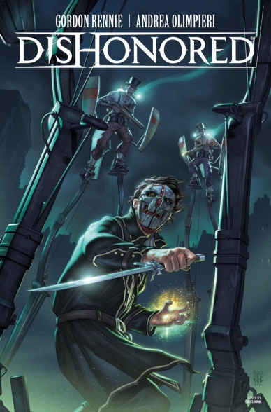
Dishonored #3
Written by Gordon Rennie
Illustrated by Andrea Olimpieri
Review by Ken Godberson III
With issue #3 of 4, the “Wyrmwood Deceit” continues to be one of the better tie-in comics I’ve seen. In this issue, the narrative is split between Corvo Attano, injured from his fight in the previous issue and rescued by Milo, a young boy who may be his nephew, and Martha Cottings, officer of the City Watch. This issue sees their paths beginning to cement together and allows for a bit of a slowdown. We see how Martha’s mind works, able to display some nice cunning to get a slip on her opponents, but we also see how different she is from Corvo, a bit more good hearted and even a slightly bit more optimistic. Corvo’s story is a bit quieter, more character focused, although I do feel like it was a bit over-expository at times. It does end with quite the gut punch, considering the implications of the reveal and how it ties in with the upcoming Dishonored 2.
That being said, the art feels like it’s beginning to slip. This style has an intentional roughness to it and for the most part it continues to paint the dreariness of Dunwall. It also uses page transitions really well. One such example being the final panel being the injured Corvo putting his mask back on, his face looking at the reader, only for the next page to be a City Watchman screaming in pain as he’s on fire (illuminated hauntingly by colorist Marcelo Maiolo). However, there are some aspects that don’t feel as sharp. Some faces and body movements that don’t look as they should be. Finally, while the games and this comic have good character designs, when you have multiple gang members together, it’s hard to determine the important ones from the mook, even with dialogue.
This may have been the weakest issue of the series, but it is still pretty good. It does make a good case for a Dishonored ongoing. Fifteen years between games, there is a lot you could do to build this world and these characters.
Final Verdict: 7.0- While the art is seeing some rickets in it, the narrative is still providing some interesting characters with loads of potential.

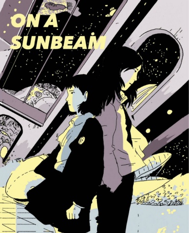
On a Sunbeam #1
Written and Illustrated by Tillie Walden
Reviewed by Matthew Garcia
Tillie Walden has produced a slew of comics. They’re deeply emotional, sometimes funny, sometimes thrilling, and sometimes heartbreaking. But they’re always unique, confident, and beautiful to look at. “On a Sunbeam” #1 is her latest, a longer project which just launched. Not only does it seem to balance all these elements Walden’s so great at, it also benefits immensely from a little more breathing room.
The story follows this girl named Mia, who has recently joined up with this space crew. They go around, tearing down old buildings. Walden gets a lot of mileage out of being the new person introduced to a tightly knit community. Through a series of flashbacks, we learn that Mia was in this intense school once upon a time (maybe a cadet academy? the school had some strict regulations involving assembly, dress, and light’s out, so…). She encounters this other girl in the principal’s office, who upends Mia’s whole life.
Continued belowThe images are often breathtaking. In a lot of science fiction comics, we often see space presented as something dangerous and impending, like the woods in old fairy tales. Walden takes a more romantic approach, where space is dreaming, something to escape toward. There’s not less danger, but now there’s opportunity. Much of this works because she paces the story so well, using the unlimited canvas space to build us to some great, emotional images. Walden’s artwork favors thin lines and minimal colors. She doesn’t often go for close-ups, preferring instead to keep the characters within their environment. Even when she only hints with a few lines at the environment, we get a sense of its presence and reality.
“On a Sunbeam” #1 kicks off an intriguing and deeply felt first comic. In the notes, Tillie Walden asks people to be patient with her as this is her first long-form comic or something, but her skills are on full display over here. It’s such assured storytelling you wish there was more of it already.
Final Verdict: 9.0 – Walden really outdoes herself.

Scooby Doo Team Up #18
Written by Sholly Fisch
Illustrated by Dario Brizuela
Reviewed by Brian Salvatore
I don’t want to read “Scooby Doo Team Up” every day; but when I get a hankering for this type of goofiness, nothing comes close to satisfying the way that this book does. It has a hefty dose of Silver and Bronze Age wackiness, along with some absolutely solid comedy (a feline villain named Psiamese? Brilliant), and it retains the tone and feeling of a Scooby Doo cartoon. This is the perfect comic for me to read to my daughter, because she can laugh at the cat and dog jokes, and I can relish in the JSA homage.
But I would be lying if I didn’t say that G’nort got me in the door. As a Green Lantern fan of a certain age, if G’nort is there, so am I. It is a character that absolutely shouldn’t work, and rarely does, but here, he fits in brilliantly. Sholly Fisch is one of DC’s least utilized weapons, which is a shame, as he nails all the characterizations here, and imbues usually silent characters like Krypto and Ace with big personalities that match their masters – Krypto is an honorary member of a group of dog superheroes, and Ace essentially rolls his eyes at the idea. Fisch has this superhero thing on point, and DC needs to turn one of their big properties over to him.
Dario Brizuela also does a great job of retaining the classic Hanna-Barbera look, and folding DC heroes into that without making either look out of place. They are perfectly complementary to one another, and bring to mind all the wonderful Superfriends episodes I grew up watching.
This is pure nostalgia for me, and I’m fine admitting that – but there is a really solid comic underneath it that is worth checking out whether you are an old man or not.
Final Verdict: 8.2 – A fun romp through space with the best pets in comics.


