
There is a lot to cover on Wednesdays. We should know, as collectively, we read an insane amount of comics. Even with a large review staff, it’s hard to get to everything. With that in mind, we’re back with Wrapping Wednesday, where we look at some of the books we missed in what was another great week of comics.
Let’s get this party started.

“Glitterbomb” #1
Written by Jim Zub
Illustrated by Djibril Morrisette-Phan
Reviewed by Stephenson Ardern-Sodje
‘Fame-hungry’ gets a whole new meaning in Jim Zub’s tale of the terrifying consequences of searching out stardom.
On the surface of things, “Glitterbomb’ has everything I look for in a comic. From the playful, but subtly scary title through to the menacing metaphorical premise, it’s designed – like many of the exports from the city that plays host to our protagonist – to hook you in from the get-go. But while the high-concept ‘desperate middle-aged actress finds unlikely help from demonic sources’ feels fool-proof, Zub’s script doesn’t quite carry enough newness or nuance to elevate it from the reams of ‘Hollywood is the real monster’ stories that come out every year. This first issue follows our protagonist Farrah as she tries and fails to pick up a role amongst a bevy of younger contemporaries. Frustrated, she drives off, only to find herself drawn to something dark and mysterious, that imbues her with a strange, volatile source of power. On her journey we meet an aspiring young actress – as naive and peppy as Farrah is weathered and cynical – and a cigar-chomping agent who’s all about ‘big-time, aspirational shit’.
The set-up and the initial twist play out competently enough, and Zub is clearly able to pace a first issue with all the skill of a guy who’s been in the industry for a while, but there’s something almost ironically soulless about his characterisation in this book that would feel purposeful if it was a little more pointed. As it is, I just found myself feeling like I was reading a story I’d heard/seen a fair few times before.
Morrisette’s art is strong, especially considering this is his first major release. There’s a visceral, grounded edge to both the violent and more subtle panels that feels like he’s really peeled the sheen off of Hollywood and exposed its seedy underbelly. His narrative style is slow and steady, with a big emphasis on decompression, stretching out key moments to really luxuriate in awkwardness, frustration, and other impressively rendered emotions. However, I do feel that his character design still leaves a little to be desired. Given that the crux of this book is that Farrah is supposed to be getting too visually old to play a sexy leading lady, there is little that distinguishes her facially or physically from the rest of her apparently younger contemporaries, a fact which makes one specific interaction between her and a mean budding starlet rather confusing, even as the girl calls Farrah ‘fucking ancient’.
This is definitely a slow-burning story, and if you enjoy mysterious body-horror it might be one that builds for you. I’m definitely going to give it another couple of issues before I put it down, but the blend of Zub’s not-quite-polished script and Morrisette’s solid but not outstanding art mean that it probably shouldn’t race to the top of your pull list unless the concept really grabs you and refuses to let go.
Final Verdict: – 5.9. A less than stellar start for this ageing starlet, but there’s potential behind the premise that may still pan out as the story progresses.

The Great Divide #1
Written by Ben Fisher
Illustrated by Adam Markiewicz
Reviewed by Liam Budd
I’m afraid there isn’t much that “The Great Divide” has to offer in terms of something new, brought to us by Dynamite, this is just your bog standard, post apocalyptic tale of a lone figure trying to survive. Though this time round, the end of the world comes in the form of a deadly plague that causes anybody you touch to die. The uninspiring premise is slightly elevated through the strange side effect that after human contact, not only does one person die, but their mind/soul/essence lives on within the survivor. It’s a shame that this isn’t explored further as it was the only element that managed to grab my attention..
Continued belowI constantly shifted in thinking the premise was actually intriguing or in fact really convoluted. By the end of the issue I was left with the opinion that it is just a reaching attempt to tell a story told so many times before, but in a flimsy new way. Unfortunately, the rest of the issue does not make up for the bad premise. The characters and the plot are in themselves far too cliched. From the handsome, wisecracking male protagonist to the surly and tough female side character, who has no real personality or purpose to mention, I can’t help but feel “The Great Divide” is just a poor man’s version of the peerless “Y: The Last Man”. There is even a subplot about sex albeit lacking any of the same nuance. Ultimately, writer Ben Fisher fails to do anything remotely fascinating a genre that has already been beaten to death.
As for the art, Adam Markiewicz is a capable artist, but just so far as he’s consistent and everything looks like it should. However, similar to the story, Markiewicz’s post apocalyptic America is bafflingly generic. He has seemingly worked through a tick list of end of the world cliches while failing to add absolutely no finer details or personality. His characters do show adequate emotion and his action is fairly fluid, but in the end the total sum adds up to not a whole lot.
Final Verdict: 3.0 – Dull and uninspiring, “The Great Divide” sits between itself and the reader.

Kim & Kim #2
Written by Magdalene Visaggio
Illustrated by Eva Cabrera and Claudia Aguirre
Reviewed by Jess Camacho
“Kim & Kim” has been talked about so much in the last few weeks and with good reason. The first issue was a joyous intergalatic romp and the second issue just takes things even further. In “Kim & Kim” #2, we get to know more about Kim D.’s past with necromancy and through some hilarious shenanigans, get closer to Lady Babylon. One of the things that stands out the most about “Kim & Kim” #2 is how the narration from Kim D. reads. A lot of comics have turned to this technique but they can become burdensome to the action happening. Visaggio’s dialogue and narration writing is crisp, paced well and most importantly, hilarious. Visaggio is having fun and it shows as there are genuine laughs throughout the issue. “Kim & Kim” #2 also opens up this world and cast of characters a little bit more but it doesn’t do too much. This is a planned miniseries (hopefully more) so I like that there’s a lot more for us to want but this is still a very cohesive and tight story.
Like Visaggio, the art team of Cabrera and Aguirre are superstars in the making. Cabrera has a style all of her own that is unlike anything else in comics right now. Her work is stylized but really fashionable. The designs of all her characters makes me believe this series takes place in outer space thanks to the lack of uniformity of looks. There’s a punk influence but her work goes into the world of couture. The reactions are big, the action is bigger and even though it’s decidely mature readers, there’s a youthful exuberance about the visuals. Aguirre’s colors prove that last point even further by being the definition of fun. Her work is so layered and so crisp. These two are working in perfect tandem with each other and I can’t get enough.
Final Verdict: 8.5 – “Kim & Kim” continues to be one of the very best and most kick ass comic books going.
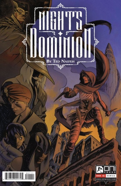
Night’s Dominion #1
Written and Illustrated by Ted Naifeh
Reviewed by Matthew Garcia
At least one half of his latest series, “Night’s Dominion” bears the exciting and interesting storytelling we expect from Ted Naifeh. The other half is tedious, outdated, and almost amateurish superhero knockoff. With this book, Naifeh tries to break away from the wonder-filled fantasies of “Courtney Crumrin” and “Princess Ugg” for something darker and more intense. The results are overall disappointing.
Continued belowEverything starts off well enough. A group of criminals meet at an inn in the mysterious city of Umber to discuss a mysterious new job. The meeting ends when they have to escape from a bunch of other fantasy gangsters and an eventual barroom brawl. Naifeh introduces an engaging bit of characters, complete with set personalities and voices and presence in their universe. It’s the kind of admirable characterization we see from someone who’s been doing this for a long time. The sets are also wonderfully realized and the colors perfectly moody and atmospheric: the world feels whole and bigger than we’re seeing.
But then Batman shows up and we realize our main hero is essentially Catwoman and the book falls off the rails. It abruptly turns into one of those ’90s-’00s Image books where characters are thinly disguised versions of corporately-owned superhero properties. The moment Naifeh has the big reveal, where Batman or whoever-the-fuck-he-actually-is lands in front of Catwoman or whoever-the-fuck-she-actually-is, all the life is sucked out of the material.
It also doesn’t help that, despite the great backgrounds and colors (oddly not completed by Naifeh’s usual colorist, Warren Wucinich, at least according to the title page credits), the art seems rushed and rough. The expressions seem like primary sketches and the eye lines consistently slips up. The characters have unique designs, sure, and it’s easy to tell them apart, but they don’t feel as fleshed out or situated.
If Naifeh had committed to the heist story instead of the random superhero story, this may have been another triumph in his bibliography. Instead, “Night’s Dominion” #1 reads like a lazy, unimaginative knockoff. For all his precision in setting up these characters and how they interact with this new world, it’s disheartening that he would fall back on something so lazy.
Final Verdict: 5.5 – I expected more out of Ted Naifeh.

Nightwing #4
Written by Tim Seeley
Illustrated by Javier Fernandez
Reviewed by Brian Salvatore
As Dick Grayson goes, so goes the DC Universe. In the times when Dick is thriving and put in the spotlight, the overall tone of the DCU, to me, is improved. Right now, we are getting peak Dick – he’s motivated, he has an interesting and expanding supporting cast, and his book is among the best of ‘Rebirth’ thus far. When “Grayson” launched, it began to bring a missing tone back into the DCU, and “Nightwing” has continued that tone and amped it up some.
This issue, we see a few different sides of Raptor, and we get to understand his character slightly better. He’s still mysterious, but Dick susses out a shared history they have: they are both from a circus background. There is a wonderfully mysterious reveal at the end of the issue that I’m not going to spoil, but it appears that Raptor and Dick have far more history than originally anticipated.
Javier Fernandez has been an absolute revelation on the book, doing all the little things perfectly, and setting up some pretty great looking action sequences. Fernandez is the perfect fit for this book, as his fighting scenes are intense but incredibly fluid, allowing Dick’s acrobatics background really shine. He also draws a great longing Dick, a little bit sad of what he’s been forced to do, from lying to Babs on down.
The issue’s finale, with Dick, Bruce, and Damian discussing his mission was one of the finest Bat-family moments of the year, and sets up the trio’s dynamic going forward. This is one of the best books of ‘Rebirth,’ which comes as no surprise.
Final Verdict: 8.5 – More fun than a trip to the circus.

A Year of Marvels: September Infinite Comic #1
Written by Nilah Magruder
Illustrated by Siya Oum
Reviewed by Robbie Pleasant
There’s nothing like a crossover between unexpected allies to make for an amusing “Year of Marvels” issue, and this one chooses two well-matched companions: Rocket Raccoon, the short-fused weapons expert of the Guardians of the Galaxy and… Tippy-Toe, Squirrel-Girl’s companion and loyal squirrel. What possible threat could bring these two unlikely of heroes together? Let’s go with animated trees on the rampage, that’ll work.
Continued belowIs this a goofy setup? Oh absolutely, but let’s be real, we’re talking about a genetically-modified space raccoon teaming up with an average squirrel (who happens to be sidekick to the Marvel universe’s least-beatable superhero), there’s no possible way to play this straight, so the comic makes it work. There’s a few good running gags, and just enough in the way of high stakes to make things interesting, while letting both characters shine. It’s a comic that shows that even a squirrel can be a hero if she puts her heart into it.
Teaming up with a heavily-armed raccoon (who happens to be fresh off a trip to an arms convention, a little gag the comic sets up nicely) certainly helps with that, though. But it would be a crying shame to forget Tippy-Toe’s magical transformation sequence, complete with Sailor Moon-style sparkles and a declaration of “In the name of Central Park… you’re going down!”
As this is an Infinite Comic, it’s set up in a unique style optimized for web viewing. Each panel leads into the next, often with overlapping images or transitions using the same panel placement to show a change in action. It works very well, giving certain scenes an almost animated feel to them. Siya Oum’s art style serves the characters well, with a very bright and slightly cartoonish design, which matches the tone while adding to the animated, quick pacing of the Infinite Comic. (And compliments must be given again for Tippy-Toe’s transformation sequence, which perfectly utilizes thin panels slashing across the screen for the setup, then uses the Infinite Comic style to show Tippy-Toe glowing and her equipment appearing as she readies for battle.)
Final Verdict: 6.5 – Not to be taken seriously, but still good fun. It’s cute and entertaining, featuring some of Marvel’s best and bushiest, and makes good use of the digital formatting. And sometimes that’s all you really need a comic to be.


