
There’s a lot to cover on Wednesdays. We should know, as collectively, we read an insane amount of comics. Even with a large review staff, it’s hard to get to everything. With that in mind, we’re back with Wrapping Wednesday, where we look at some of the books we missed in what was another great week of comics.
Let’s get this party started.

Written by Brian Schirmer
Illustrated by Claudia Balboni
Colored by Marissa Louise
Lettered by David Bowman
Reviewed by Niklynn Dunn
Compared to issue one, “Fairlady” #2 is a more complete, cohesive story. The writer Brian Schirmer also does a better job mixing P.I. genre tropes within a fantasy world. A missing person case, potentially because of a dragon attack? That’s an awesome set-up.
The story isn’t bogged down by over-explanation of the world around Jenner Faulds. In “Fairlady” #2, Faulds is simply shown just doing her investigation in what just so happens to be a fantastical world. And the fantasy elements enhance the story by making the common P.I. tropes presented feel unique, unlike issue one. In issue one, the fantasy elements got in the way of the plot and undermined the feeling that this comic series is a mashup of genres.
When there is world-building in “Fairlady” #2, the art is at the forefront. An example of this is page one when we’re shown an epic dragon and two other fire-breathing beasts. There was an opportunity there for the writer to over-explain with dialogue, but Schirmer didn’t.
And speaking of the art, Claudia Balboni (who can draw one heck of a dragon), Marissa Louise, and David Bowman make this book beautiful. The panel format is dynamic and there are times that the border-spacing helps the flow of the book, letting the reader know time is shifting. Like when Faulds and Oanu are talking in the town square, page 22. Because of the zoomed out lens, the shadowing, and the spaced panels, you get the sense of time passing. You could tell time is passing, even without the dialogue. With art decisions like this throughout “Fairlady” #2, I never felt lost reading the story and the art is able to capture meaningful moments well.
So are there any major faults with this issue? Not really. It would be nice to know more about the two lead characters, but that will probably come later since this is just the second issue of “Fairlady.” Right now as far as characterization, it is just clear that Jenner Faulds is a competent P.I. and Oanu is a helpful sidekick/friend. Hopefully, there will be more character development in the future.
Overall, “Fairlady” #2 succeeds in presenting a fun P.I. story set in a fantasy world and is an improvement over issue one. This issue is what you want out of a series that says it “contains a complete Fairlady mystery.”
Final Verdict: 8.1 – “Fairlady” #2 follows a common narrative found in P.I. stories, but it is fun nonetheless, thanks to its fantasy setting.
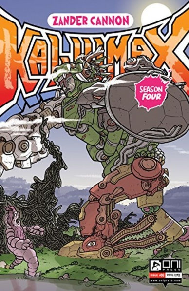
Written and illustrated by Zander Cannon
Colored by Zander Cannon and Jason Fisher
Lettered by Zander Cannon
Reviewed by Matthew Blair
It’s very clear that writer and artist Zander Cannon loves kaiju and monster movies, and while “Kaijumax Season 4” #6 does a very good job at paying tribute and subverting the tropes of these stories, the issue itself is something of a letdown. The issue shines when it portrays god-like cosmic beings and mech pilots as creatures with very human emotions and problems. However, the book seems to take place at the end, or very near the end, of a larger story arc and it doesn’t do a very good job at drawing new readers in. The issue gives very little background on what’s going on, and very few characters even named. This is a comic that caters to an established fan base and can be confusing for newcomers.
The artwork on “Kaijumax: Season 4” #6 is lovely. It appears that Zander Cannon draws a lot of inspiration from their two biggest sources of kaiju and mecha stories: Japanese manga and Western children’s cartoons. The monsters and mech suits are drawn and colored with exquisite detail and the humans are drawn in such a way that the reader sees the emotional trauma and fear that they feel while working in a prison that they barely have any control over. It’s an art style that blends Eastern and Western styles into something that is unique and special to the comic.
Continued below“Kaijumax Season 4” #6 is a beautiful comic created by someone with a passion for the monster movie genre. However, it is not a very good issue for first-time readers, who would probably be better off starting at the beginning of the story.
Final Verdict: 5.1 – A fun idea by a very passionate creator, but doesn’t work unless you’re caught up on the larger story.
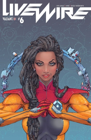
Written by Vita Ayala
Illustrated & Colored by Kano
Lettered by Saida Temofonte
Cover Illustrated & Colored by Kenneth Rocafort
Reviewed by Chris Egan
“Livewire” continues to be one of the more cerebral comics coming from Valiant and issue #6 is leading that change. Vita Ayala’s script is well crafted and she moves Amanda into position to learn more information about the organization, ‘PSEP’ that is holding her captive. The plot pulls you in completely and keeps your imagination captivated. The series is an excellent cyberpunk/futurist story and the intelligence behind the energy is what makes it so great.
Kano’s art is simply outstanding; keeping the tension taut within the quiet conversations and the action ablaze for the various fight scenes, it is impossible to not be completely engaged by it. The combined usage of light, shadow, and negative space is incredible. The overall style flawlessly moves between a softer character look to a more rigid action style. It works perfectly for exactly what the story is looking to portray at any given moment. This is one of the best looking series coming from Valiant Comics and fans should absolutely be picking it up.
Final Verdict: 8.0 – A smartly crafted sci-fi tale that dabbles between superhero adventure and layered mystery.
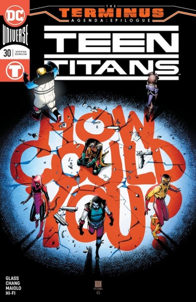
Written by Adam Glass
Illustrated by Bernard Chang
Colored by Marcelo Maiolo and Hi-Fi
Lettered by Rob Leigh
Reviewed by Vanessa Boney
Glass does a fantastic job at constructing a story with several layers in “Teen Titans”#30. The final installment to “The Terminus Agenda” serves more like a setup for what’s to come than it does as a finale to what has happened. By the close of this issue, the disagreements within the Teen Titans are not resolved, and the previous arc does not get wrapped up with a neat bow. Instead, the next story arc is established with the introduction of the Teen Titans’ next big bad in the midst of the team’s internal fallout. Yes; the story slows down a bit in this issue, and the script isn’t too exciting overall, but the art alone is a definitive reason to pick up this comic.
There is so much to love about the art in “Teen Titans” #30, starting with the cover. Chang and Quintana accurately convey the tensions in the pages of this issue; as everyone is at odds with at least one other Titan at some point, with Robin being the singular team member with whom everyone is at odds.
The vibrancy delivered by Maiolo and Hi-Fi helps each character stand out, and makes this issue an absolute joy to flip through. Djinn’s glowing pink swirly aura is attention-grabbing. Crush’s neon palette is refreshing to see as it deviates from the expected primary colors of most superhero threads. Even Kid Flash’s, Red Arrow’s and Robin’s primary color palettes are turned up a notch with brighter hues of their usual shades.
Chang illustrates one of the best fight sequences in comics. The interweaving of each dueling pair of teammates flows seamlessly as you move through each panel, and the way the issue jumps back and forth between normal views and bird’s eye views while maintaining consistency is incredible. Even when the panels are zoomed out, the pencils remain clean, and the colors remain steady.
Final Verdict: 7.0 – The art alone is worth the price of admission, and although not much is offered in terms of story, Glass does a great job at layering conflicts for the team to resolve in the future.

Written by Chip Zdarsky
Penciled by Mark Bagley
Inked by John Dell
Colored by Frank D’Armata
Continued below
Lettered by VC’s Travis Lanham
Reviewed by Matt Ligeti
What if superheroes aged in real time and characters choices had lasting consequences? The “Spider-Man: Life Story” series explores exactly that, with each issue tackling a decade in Peter Parker’s life, starting in the 1960s.
“Spider-Man: Life Story” #3 covers the ‘80s when Peter’s probably around his mid-40s. Not only does it tackle themes of trying to stay relevant as an aging crime-fighter, but it also covers many issues that took place in that decade, both in a “comics” sense and from a “current events” standpoint.
Writer Chip Zdarsky is one of the funniest people in the industry, and the old web-slinger is often portrayed as a lighthearted jokester, but some readers may forget that the Spidey comics in the ‘80s and ‘90s could get very dark and dramatic. Zdarsky remembers, absolutely nailing the tone in a heavy-as-hell issue of “Spider-Man: Life Story” that somehow covers the Cold War, ‘Secret Wars,’ Peter’s symbiote story arc, his declining relationship with Mary Jane, Aunt May’s dementia, and ‘Kraven’s Last Hunt’ all in the standard amount of pages.
Bagley and Dell work some impressive magic together this issue with line art that looks ripped from the pages of the ‘80s comics. Frank D’Armata’s colors definitely look more modern, but the three create an overall aesthetic that’s moodily lit, often to the point of being haunting. There’s a drama to character poses and the viewer’s vantage points in many panels elevate those moments. There’s also a little wink-and-a-nod scene where the creators’ names are represented on the gravestones, which was a nice personal touch to a historic moment.
Letterer Travis Lanham’s balloon and caption placement in “Spider-Man: Life Story” #3 also helps establish the dramatic tone through implied timing and flourishes that play up big moments. But it’s his font treatment for an unbalanced Symbiote Spider-Man later in the issue that’s the most effective. The typeface is jagged and savage, bringing a sense of danger and violence to the character and raising the stakes for Peter in a way that the line art couldn’t do alone.
If you felt drawn to the sad, older Peter Parker in Spider-Man: Into the Spider-Verse or you just want a new and fresh take on the classic character, “Spider-Man: Life Story” is a must-read. If nothing else, pick it up for Zdarsky’s gorgeous cover art!
Final Verdict: 8.5 – “Spider-Man: Life Story” #3 is an amazing new entry in an already spectacular series.
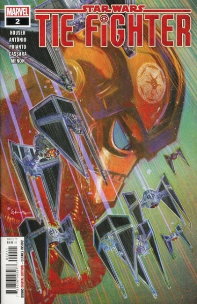
Written by Jody Houser
Illustrated by Rogê Antônio and Josh Cassara
Colored by Arif Prianto and Neeraj Menon
Lettered by Joe Caramagna
Reviewed by Gregory Ellner
In many ways, Jody Houser’s writing on “Star Wars: TIE Fighter” #2 is exactly what people would come to want from a story centered around Imperial pilots. A group of pilots who genuinely believe in the Galactic Empire facing off against enemies who may not be quite as noble as one would expect from targets of what many readers have seen as one of the prototypes to the “evil empire” scheme. The different members from Squadron 5 of Shadow Wing aren’t entirely unique, but each has some quirks to make them stand out as heroic people who just happen to work for the navy of a dictator. Unlike some other attempts at showing the Imperial side of things (most notably 2017’s Star Wars Battlefront II), those opposed to the Empire can be seen as just as bad or even worse in their own way, since even the Empire admits that the Rebel Alliance has some qualities that are slightly admirable.
Rogê Antônio and Josh Cassara work together on the artwork in the main and backup stories to provide a relatively cartoonish portrait to go along with the high-flying action, the attention to emotion on character’s faces helping to demonstrate their personalities beyond the stereotypical mild anger or annoyance to stoicism that is common of Stormtroopers. Most notably, there is a panel in which most of Squadron 5 is shown with transparent helmets for artistic effect in order to show their utter shock in a manner not dissimilar from some manga artwork. In all, the artistry from Antônio and Cassara provides an overall fun, approachable, even benevolent atmosphere to a group of characters that, in many other Star Wars properties, would be one-note and routinely villainous.
Continued belowArif Prianto and Neeraj Menon collaborate as well to provide a cool color palette that further enables readers to sympathize, on some level, with these figures that would otherwise be seen as enemies. From a bright light to show benevolence in the face of darkness to deeper shadows on those who are shown to be malevolent, feeling sorry for the state of Squadron 5 can be relatively easy.
Final Verdict: 7.5- Through writing, artwork, and colors, “Star Wars: TIE Fighter” #2 gives a view into a very sympathetic portrayal of Imperial pilots without requiring us to feel worse about the rebellion.
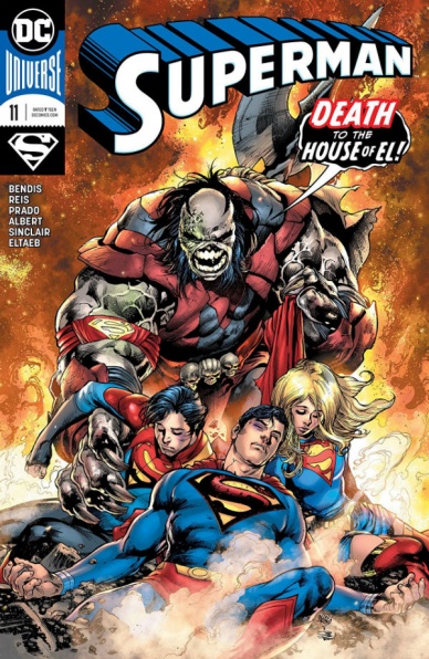
Written by Brian Michael Bendis
Illustrated by Ivan Reis
Lettered by Josh Reed
Colored by Alex Sinclair
Reviewed by Michael Govan
So far, Bendis’s “Superman” has been a bit of a mixed bag. His “Action Comics” is much better to me, it’s not even close. “Superman” #11 continues the ‘Unity Saga’, an arc that I’ve largely been indifferent to. I don’t know why Bendis chose to have Jon aged up but I suppose it doesn’t really matter. Jor-El (maybe) being a bad guy isn’t all that interesting and so far Rogol Zaar doesn’t inspire any fear or live up to his gruesome reputation. This issue focuses on the aforementioned characters as Superman finds himself in the midst of an epic space battle.
It is truly epic too, thanks to the artist, Ivan Reis. The visuals in this comic are phenomenal. Reis has always been fantastic at depicting superhero action and DC surely recognizes that, having him work on many of their more high-profile titles. Superman is a powerful character and Reis really conveys how incredible and mighty he is. There are multiple spreads depicting warring aliens and panels of Kryptonians letting loose with their full power. The final page stinger of Supergirl and Krypto charging into battle is just great. These pages demand the reader linger to absorb every little detail. The plot may be lackluster but it sure goes down easier this way.
Final Verdict: 6.5 – A teaspoon of fantastic art helps the so-so story go down.
Written by Brian Ruckley
Illustrated by Anna Malkova, Angel Hernandez and Sara Pitre-Durocher
Colored by Joana Lafuente
Lettered by Tom B. Long
Reviewed by Alexander Jones
IDW has curiously decided to structure the publisher’s newest “Transformers” title before the war broke out on Cybertron. This approach to the narrative has opened lots of opportunities to start the franchise in a completely different direction. In execution, however, the new era of IDW’s “Transformers” title has suffered from a slow pace. It can take a while to get any sort of pay-off for the complicated new direction of the series. Thankfully, the newest issue also serves as the conclusion to the first storyline, ‘The World in Your Eyes.’ Despite the generally happy and optimistic tone of the first few chapters, it now feels like Cybertron could be approaching the massive war teased in the marketing material.
This new chapter has functioned with a similar script and direction to entries from the previous series. The story focuses in on the newer additions to the franchise, showing what the more familiar cast members are up to through the eyes of the new recruits. The script for the issue does not become truly engaging until the end. Bumblebee and Rubble make a few huge revelations regarding the current state of Cybertron. Getting a story that takes a few issues to pay-off is nothing to be disappointed about, but I’m not entirely sure where this series is going next and if sticking around for future issues will be worth the commitment.
IDW’s editors did a great job pairing the trio of artists for the issue in a way that doesn’t feel cluttered. Anna Malkova, Angel Hernandez and Sara Pitre-Durocher have a seamless style that does not conflict. Each interior page carries a lot of detail. The publisher has assigned Angel Hernandez with most of the interior art for the entry. Hernandez’s artwork has always served the series really well with his precise line. Joana Lafuente’s bright colors complement Hernandez’s work incredibly well and make important scenes stand out with grace.
The first storyline of IDW’s new “Transformers” comic series is well-written but dull, especially in the early chapters. The last installment teases a new direction for the franchise and even adds insight to earlier installments. There are lots of characters from the first few chapters who were telling lies that are coming home to roost right now.
Final Verdict: 6.7 – “Transformers” #5 is slow-paced but the cliffhanger hides a surprising final twist.


