
There’s a lot to cover on Wednesdays. We should know, as collectively, we read an insane amount of comics. Even with a large review staff, it’s hard to get to everything. With that in mind, we’re back with Wrapping Wednesday, where we look at some of the books we missed in what was another great week of comics.
Let’s get this party started.
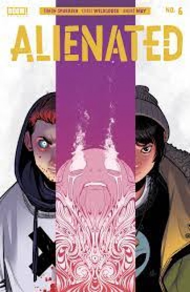
Written by Simon Spurrier
Illustrated by Chris Wildgoose
Colored by André May
Lettered by Jim Campbell
Reviewed by Kobi Bordoley
If you were to ask us how “Alienated” was going to end after reading only the first issue, we’d look at you wide-eyed and full of wonder. There’s so much we don’t know! There are so many directions Spurrier could take the story! Now, five issues later, we look at you again: wide-eyed, desolate, broken and reformed, all in the best way possible. “Alienated” #6 broke us in its first half, then patted our back and somehow, in the second half, told us that maybe not everything will be okay, but that some things will be.
All in all, “Alienated” #6 offers a satisfying conclusion to the story, leaning heavy into pathos without ever coming off as over the top or fishing for a reaction from the audience. Sam, Samuel, and Samir all receive endings in accordance to their actions. Their endings all involve bold storytelling choices, but each feels deserved, real, and emotionally impactful. The epilogue also feels natural and well-paced.
Wildgoose’s art choices are incisive as always, and in “Alienated” #6 he does a great job capturing readers’ final moments with these characters. We also get some of our cleanest shots of Chip, as well as some truly bleak yet beautiful renderings of Samuel.
In sum, Spurrier and the team went full throttle in “Alienated” #6, taking their emotionally intense story to its logical conclusions, based on the build-up. Our reward is a well thought out, exceptionally delivered piece of art about growing up surrounded by others but feeling isolated regardless. Oh, how the follies of youth can escalate to devastating consequences.
Final Verdict: 9.5. Raw and bold, this series is the calm before the storm, the storm itself, and the beautiful, empty sky that comes afterward. Wow.

Written by Geoff Johns
Illustrated by Jason Fabok
Colored by Brad Anderson
Lettered by Rob Leigh
Reviewed by Jim Malakwen
“Batman: Three Jokers” #2 is a spiritual successor to two seminal Batman comics of the 1980s: “The Killing Joke” and “A Death In The Family.” The shocking aftermath of these comics left physical and emotional scars on Barbara Gordon and Jason Todd when they encountered The Joker. Writer Geoff Johns and artist Jason Fabok explore dangling story threads from The Joker’s unresolved business with The Bat Family.
As with the previous installment in this series, the storytelling style is vastly influenced by the work of Alan Moore and Brian Bolland in “The Killing Joke.” Fans of Moore’s work in particular will appreciate the use of the 9-panel grid and how it enhances narrative progression via dialogue-free visuals. While the techniques are fairly retro, Fabok’s artwork can be jaw-dropping. His pencils are stunning. A standout panel depicts a rotting corpse as seen from the compound-eye POV of a fly.
Colorist Brad Anderson does a fantastic job of using different shades of purple to individualize the Jokers. The Gotham setting is brought to vivid life in the way the gloomy, night exteriors are rendered. Also, the use of green and red whenever The Joker wreaks havoc is effective in conveying the character’s menace.
“Batman: Three Jokers” #2 does falter in one area; the characterization of its leads. In this particular issue, Batman is more of a side character and thus the emphasis of the story is on the survivors of The Joker’s wrath. After Jason Todd murdered one of the Jokers in the previous issue, the stage was set for a confrontation with Barbara. As a victim of the Joker herself, it seemed like there was an opportunity for Geoff Johns to have these two beloved characters go into conflict after he crossed the line. Instead, that storyline was resolved in a somewhat contrived and cliche moment between the two at Barbara’s apartment. However, this being the penultimate installment, perhaps the resolution next issue will pay off what’s been set up so far.
Continued belowFinal Verdict: 8.1 – An excellent showcase for Jason Fabok’s extraordinary artwork.
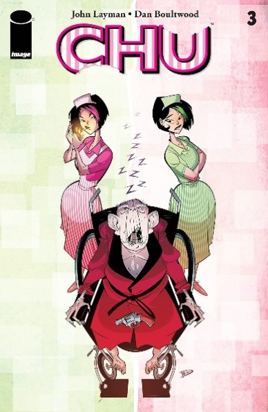
Written by John Layman
Illustrated and colored by Dan Boultwood
Lettered by John Layman
Reviewed by Joe Skonce
It’s always interesting to see how a comic’s art can transform the feel of a world. If done effectively, it can change the tone of a script, which isn’t always a bad thing. Sometimes a comic comes along that has a real odd couple feeling of style and tone that just works, elevating both the art and script creating a unique series. “Chu” #3 is one of those times, featuring a quick-witted but weirdly disturbing script, but using an art style that makes it feel like a forgotten cartoon.
“Chu” #3 is a bizarre comic, things happen in the comic that ranges from truly disturbing to weird and gross, but the art of the world makes everything heightened in an over the top cartoony way, making for a memorable read. A large part of creating this heightened world is character design. Most of the characters have unique and memorable profiles. The best example of this is Mr. Murder, a hired killer with a hulking torso, but slim arms and legs. When drawn in silhouette, Dan Boultwood makes him look like a monster in an episode of ‘Scooby-Doo.’ This Saturday morning cartoon style also helps in creating unique reaction shots, allowing Boutwood to utilize fun backgrounds. One of the highlights of the issue is when Detective Chu confronts his sister and the background is adorable unicorns, showing her innocence. The thing is, most of the things that happen in “Chu” #3 are pretty dark, Mr. Murder slaughtering an entire nursing home, Saffron killing two hitmen, Grandpa Chu maybe being an immortal cannibal. The art doesn’t hide the violence, but the art style doesn’t make it horrifying.
It also doesn’t hurt that John Layman creates some great character moments for the Chu’s in “Chu” #3. All of the siblings are funny, smart, and likable in a way you can’t help but find charming. It’s also fun to watch the siblings playing cat and mouse with one another, negating the cibopathic powers of their detective brother with beet juice and using some twin magic to use Saffron’s superior lying. It all serves an interesting larger story as well, watching Saffron go from situations that are bad to worse, and hopefully finding an opportunity to get out with the help of her family.
Final Verdict: 7.4 “Chu” #3 is a compelling game of cat and mouse between two siblings but truly excels thanks to fun art design.

Written by Greg Pak
Illustrated by Dan McDaid
Colored by Marcelo Costa
Lettered by Jim Campell
Reviewed by Matthew Blair
The Verse has been toying with Captain Reynolds. On one hand, he’s doing pretty well for himself. On the other hand, he’s in the uncomfortable position of being the sheriff for an entire sector of space. Now, Blue Sun is coming to town with an army of robots that threaten to replace him and all the hard-working humans of his sector.
The more things change…
Greg Pak is a well established and incredibly capable writer, and “Firefly: Blue Sun Rising” #0 is a solid reaffirmation of his talents and why he was a great choice for this book. What’s amazing about the script is just how many balls Pak has to juggle while crafting this book. On top of being true to the source material, Pak has to find a way to add something new to the series while providing a solid entry point into the long-running comic series for potential new readers. Pak pulls each requirement off beautifully, deftly combining the well-established character traits and quirks of the established characters, adding his own stamp with familiar sci-fi themes, and deftly re-introducing the current situation the characters are in the comic to new readers.
Artist Dan McDaid and colorist Marcelo Costa work together on “Firefly: Blue Sun Rising” #0 to create an art style that does a great job of being its own thing while meeting what are probably very stringent requirements for a licensed comic book of an established property. The art is functional above all else, all the characters look like they’re supposed to look and move the way they’re supposed to move, but it does have some leeway to experiment. The whole book has a rough, loose, and dusty feel to it, which is perfect for the themes and style of the Verse. On top of that, the robots are well designed and properly intimidating.
Continued below“Firefly: Blue Sun Rising” #0 is a rare book in that it does so much so well. It’s a great story that manages to provide something new and interesting in an already established and well-loved franchise.
Final Verdict: 9.2- A great jumping-off point for new readers who are eager to be reintroduced to everyone’s favorite space cowboy.

Written by Phillip Kennedy Johnson
Illustrated by Leonard Kirk
Colored By Rachelle Rosenberg
Reviewed by Derek Uibelhoer
“Marvel Zombies Resurrection” #2 started us off with an interesting premise but struggles to keep this undead story alive. Phillip Kennedy Johnson has done something novel in this series by flipping the script on a few old characters to a humorous effect. However, the little comic relief provided by a friendly British “Nanny” Sentinel is just not enough to enlighten this boring progression of desperate events. True to most horror cliches, Johnson has done little to make us care about any of the protagonists, but the story lacks any horror at all as Johnson has also failed to make us care about any of the threats they face.
Leonard Kirk’s artwork is the star of “Marvel Zombies Resurrection” #2. The opening image of Peter Parker does more to show us Spidey’s pain than any of the story that unfolds thereafter, and his final image of Atlantis showcases much of the detailed world-building peppered throughout the panels of this issue. Kirk uses thin hatches of broken lines and sharp angular black shadows which give his work a more traditional graphic look; it is just a shame the coloring on this issue doesn’t seem to follow suit. Rachelle Rosenberg’s noticeably digital colors feel just as thin as Johnson’s plot; with the muddy palette she has chosen none of her flats really pop, and the way she handles shading looks especially rushed and careless on her figures and faces.
Overall this story is lacking in depth, losses are grazed over too quickly to care and the character with the most heart is indeed a robot. While some intricate linework and worldbuilding help to bring this post-apocalyptic future to life, there is little else keeping it alive.
Final Verdict: 5.5 – While “Marvel Zombies: Resurrection” #2 features some great frames of our favorite old heroes and villains in creative new roles, its thin plot and dull colors do very little to make us want to read on about them in this undead romp.
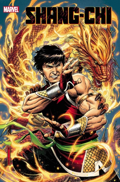
Written by Gene Luen Yang
Pencils by Dike Ruan and Philip Tan
Colored by Sebastian Cheng
Lettered by Travis Lanham
Reviewed by Quinn Tassin
It has been quite a while (over half a decade!) since the last time Shang-Chi was the star of his very own comic and with his new movie coming at some point after *gestures vaguely* all this, the master of kung fu is finally getting his proper spotlight once more. Scribe Gene Luen Yang does great work setting up a comic that basically feels nothing like it was spurred into existence by the MCU. Yang does extremely well rooting the issue in the history of Shang-Chi as a character while still keeping things fresh enough for more unfamiliar readers to drop in. That basic writing strength is actually well-reflected in the story Yang is telling. Shang-Chi has settled down in Chinatown in San Francisco only for his father’s cult to resurface. The story is compelling but the issue as a whole is bogged down a bit by its need to inform readers of the history it’s drawing from. That is, of course, preferable to being thrown totally into the deep end, and now that it’s not likely to be a problem that persists over the next four issues. But still.
Philip Tan does very good work in the flashback portion of the book. So good, in fact, that Dike Ruan’s is a bit hard to feels as fond toward. Ruan is good, to be clear. His small moments, though, left me wanting more. Normal discussion is fine they’re just not particularly nice to look at. His illustration of action, on the other hand, is stupendous. The sparring in the House of the Deadly Staff and Shang-Chi and Leiko’s big fight scene are both absolutely awesome and the action practically leaps off of the page it’s so filled with motion. Sebastian Cheng’s coloring is also great, complimenting both artist’s styles very well.
Continued belowOn the whole “Shang-Chi #1” is a good first issue but not a great one. That being said, this creative team is filled with genuinely great talents and the foundation they lay here is very strong. This is most definitely a comic to keep your eyes on.
Final Verdict: 7.8 – “Shang-Chi #1” is a welcome addition to comic store shelves, even if it doesn’t quite reach the heights its creative team is capable of.

Written by Chris Condon
Illustrated and Lettered by Jacob Phillips
Reviewed by Luke Cornelius
With the opening of “That Texas Blood” #4, you’d be forgiven for thinking you were reading the wrong comic. Condon’s script opens with Marsha concerned about having the essentials packed and her friend, Julie, concerned about Marsha following Randy when he has asked her not to. These events are a far cry from those that seem to occur with alarming regularity in the dark bubble of Ambrose County. Phillips’ artwork gives the opening a different feel too, with a panel detailed with a multitude of cars feeling incredibly busy compared to the expansive landscape of Ambrose County we’ve seen so far, as well as the empty, aching settings that follow in issue #4.
Before you know it, we’re back in Ambrose County with Joe Bob talking to Kit about Travis’ death. Condon’s dialogue here excels, with both characters having clear voices that reach out of the page. It’s one of few exchanges in the issue, but it feels so rich that it lingers in your mind and the subject of clinginess and unshakable habits reverberates throughout the issue. This scene does move the mystery forward slightly too, revealing an alibi for one of Joe Bob’s suspects. Condon then focuses on Randy, with him returning to his childhood home and eventually alcohol. The narration of Randy’s journey is slow and weighted which controls the pace of the book to great effect.
Phillips’ artwork throughout the issue is strong, while the colorwork is spectacular. After giving us a brighter start for Marsha outside of Ambrose County, everything inside is far more negative. Each scene is washed with blue, green, and orange, but rather than having the brightness of the opening scene, the colors are faded, encouraging the nostalgic qualities of the setting. When Marsha arrives her hopeful attitude seems to fight back against the weariness of Ambrose County and Phillips portrays her brightly amid the dark desert, promising a big impact on the issues to come.
Overall, “That Texas Blood” #4 is a slow-burning issue that follows Randy’s descent, which is brought to life through Condon’s authentic dialogue and weighted narration and Phillips’ atmospheric colors.
Final Verdict: 7.5 – “That Texas Blood” #4 is a fantastically colored, slow-burning depiction of Randy’s return to alcohol.
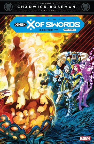
Written by Leah Williams
Illustrated by Carlos Gómez
Lettered by VC’s Joe Caramagna
Colored by Israel Silva
Reviewed by Michael Govan
“X-Factor” #4 marks the second chapter of the big ‘X Of Swords’ crossover event. One of the main things I appreciated about this issue was the truth in advertising. Often in giant crossovers, a lot of issues are just tie-ins, loosely related to the main story. This is truly the second chapter though, picking the story up right where we left off in “X Of Swords: Creation” #1.
I also expected the story to slow down after the giant-sized epic first issue but it never does. Meetings are filled with urgency, resurrections and healings are bursting with tension, the data pages are vital and move the story forward. I’m on the edge of my seat and I’m taking notes.
Another aspect of “X-Factor” #4 that jumped out at me is how true it stays to the current “X-Factor” series. It is a departure from the ongoing plot and most of the X-Factor crew is absent but it still manages to give the main character Polaris some much-needed character development while pushing the crossover along. It still revolves around resurrections, still asks questions about the process, and introduces a new wrinkle into the system that exponentially raises the stakes. Writer Leah Williams takes the identity of the series and the demands of the event and effortlessly molds them together into a satisfying whole.
Continued belowThis issue is generous to the characters of the X-Factor team too. Rockslide is going through some changes to say the very least. Apocalypse’s…whatever (I have no idea what is going on with this relationship but it is incredibly compelling) with Rictor is on full display. I also appreciate how concepts unfamiliar to our mutants such as magic and ritual and prophecy now feels right at home in the X-Men mythos. Even with war looming, it’s exciting new dawn.
The artwork is great too. Gómez is not the regular series artist but he knocked it out of the park this time around. So many stand-out moments. I loved the pages when the party that went to Arakko returned. It’s pure chaos. The mutants are covered in boils, bloody and injured, some barely clinging to life. Siryn using her powers to scream for help was amazing. Something as simple as Saturyne’s psychic firewall reflects her personality. The resurrections were haunting and suspenseful in all the right ways and Rictor looks practically angelic when reborn anew. Lorna’s distress and pain are etched all over her face as she struggles through the issue. When she triumphs at the end of the issue, however, speaking to her people with the sun shining bright behind her, it feels like a victorious moment. The stakes have been raised even higher if you can believe it. So far, this crossover is two for two and I can’t wait for the next issues.
Final Verdict: 8.0 – POUND THE WAR DRUMS.


