
There’s a lot to cover on Wednesdays. We should know, as collectively, we read an insane amount of comics. Even with a large review staff, it’s hard to get to everything. With that in mind, we’re back with Wrapping Wednesday, where we look at some of the books we missed in what was another great week of comics.
Let’s get this party started.
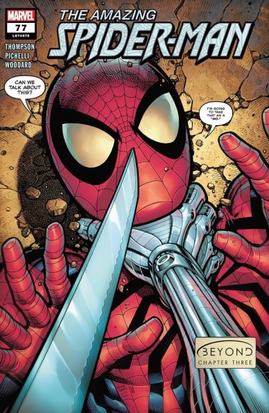
Amazing Spider-Man #77
Written by Kelly Thompson
Illustrated by Sara Pichelli
Colored by Nolan Woodard
Lettered by Joe Caramagna
Reviewed by Elias Rosner
Introduced in this issue is a new character with a name that is quintessential Big 2 Superheroes and even more quintessentially Marvel: Maxine Danger. I think that gives you all you need to know about what kind of kickass run this is going to be.
“Amazing Spider-Man” #77 continues to prove that the Beyond Board has the stuff to tell a compelling story that, despite the changing writers and artists, feels cohesive yet distinct. Thompson is bringing the funny in all forms – puns, snark, dark humor, absurdist background gags – without losing sight of the heart that beats within the characters new and old. Who else could make a 3 page walk-and-talk scene of Ben and Maxine contain important exposition, character establishment, meaningful emotional beats, and gags about killer koalas and the horrors of a sandwich testing lab without over-stuffing it?
Well, it wouldn’t be possible without Pichelli & Woodard’s art, which has a lighter feel to it than the pair of Gleason & Menyz from issue 76. The coloring and shadows have a more traditionally painted, somewhat water-color look to them that gives this issue an air of moody drama as opposed to huge action. While there are plenty of panels where Pitchelli’s art feels a bit slight, mostly during the Aunt May/Mary Jane hospital scene, with inconsistent facial details or a lack of defining lines not helped by the sometimes splotchy shading, there are just as many, if not more, that show off her eye for posing and simple conveyance of meaning.
For example, when Ben is recounting the story for Dr. Kafka, his face doesn’t change all that much but it is just enough for me to fully understand Ben’s mood without having to read the dialog. I know he goes from thinking wistfully about an old memory, to editorializing with self-reflection, to losing the thread and being confused as he tries to remember, to thinking hard and not coming up with anything, slightly frustrated by this. The change in angles at the moment he loses the memory is also an excellent touch to disrupt the usual pattern of these kinds of pages.
While “Amazing Spider-Man” #77 certainly feels like the middle of the start, it does so in a way that gives motion to the whole project, and does what every single-issue should do: keep me invested and excited for the next.
Final Verdict: 8.6. – This is another very strong issue of “Amazing Spider-Man,” despite some artistic hiccups that distract from the otherwise excellent art, proving the Beyond Board can do the impossible and not only make Spider-Man feel exciting again, they can make Ben Reilly’s adventures as compelling as, if not more than, Peter’s.
Post Script: I should also mention that this an historic issue in that it’s the first time “Amazing Spider-Man” has had a female writer & artist on the same issue and only the SECOND time a woman has written the flagship title – Ann Nocenti in 1987 did one issue as part of a Spidey title crossover- and, if I’m right, the first time a woman has drawn an issue of “Amazing Spider-Man.” And with the next issue, it will be the longest run for both, a fact that should be celebrated in the same breath as we acknowledge how sad it is that it took this long.

DC vs. Vampires #1
Written by James Tynion IV & Matthew Rosenberg
Illustrated and Colored by Otto Schmidt
Lettered by Tom Napolitano
Reviewed by Quinn Tassin
Listen, a story like the one we’re getting in “DC vs. Vampires” #1 isn’t quite difficult to pull off. Superheroes are great, vampires are cool, throwing them together in a story that has no impact on general DC continuity is a pretty sure thing. The thing is, in less writers’ hands, this would still be a slog- overly serious and try hard in its darkness. With the first issue of this miniseries, James Tynion IV & Matthew Rosenberg give us an absolute blast of an introduction to this world. We’ve got a good vampire trying to save the world! We’ve got a vampire conspiracy that reaches all the way to the Hall of Justice (and the Hall of Doom)! It’s not that the story doesn’t take itself seriously- it does- but it also aims to be fun first and it succeeds and then some.
Continued belowAndrew Bennet’s journey to the Hall of Justice and to get Lex Luthor’s blood to save the world…somehow- is awesome. It’s unbelievably in character for him to be preoccupied with getting the credit as he hands over the key to saving the world before he dies. Hal Jordan being a vampire is a very good twist ending that’s unpredictable without feeling cheap. The construction of the reveal, in particular, is really masterful. You’ve got what feels like a throwaway line about the Justice League being off-planet. It’s a boilerplate superhero comic line that no regular reader would think twice about.
It’s Otto Schmidt’s gorgeous pencils and colors that are really key to the success of “DC vs. Vampires” #1. Schmidt’s style is somewhere in between animated series and DC house style which is always a treat but especially in a book like this. Schmidt knows how to create an atmosphere and nowhere is that more visible than Andrew’s red-bathed flashbacks with their vague environmental details but acute focus on how scary the vampires are and how much damage they’re capable of doing. He also excels at illustrating characters’ physicality and expressions. The bared teeth of all of the various vampires we see are genuinely menacing. Schmidt really gets to flex when illustrating Hal Jordan, though. Through the Green Lantern, he’s able to show us charisma, irritation, and downright evil. They’re not exactly microexpressions- this is a 2-D cartoon-like character, of course. Still, it feels like we’re shown whole faces and not just specific exaggerated traits. It’s a small thing but it goes a long way.
Tynion and Rosenberg do exemplary work putting together an issue that gives you all the exposition you need in an engaging, energetic way and making you feel excited for what’s still to come. “DC vs. Vampires” is simple, it’s fun, and it’s got nothing but potential.
Final Verdict: 8.0 – “DC vs. Vampires” #1 marks the debut of a miniseries that’s sure to be an absolute blast.

House of Slaughter #1
Written by James Tynion IV & Tate Brombal
Illustrated by Chris Shehan
Colored by Miquel Muerto
Lettered by Andworld Design
Reviewed by Alexander Manzo
“House of Slaughter” is a spin-off story from the “Something Is Killing The Children” series written by James Tynion, but now he has the help of Tate Brombal for this new series. The story follows Aaron Slaughter and his rise in the House of Slaughter. Tynion and Brombal give a small glimpse of Aaron in his current hunt and jump back to struggling to get his sea legs amongst the white masks. Aaron is a black mask and is presented as a hunter and part of the group that goes after the monsters by themselves. The only problem is that Aaron’s emotions often get the best of him, even in a training simulation. The white masks hunt as a pack and are also more cutthroat to get what they want and do what they have to. After the sides in the house have been drawn by Tynion and Brombal in the final pages, we’re introduced to a new white mask named Jace, who not only seems to have a plan of his own but begins a new friendship with Aaron.
Throughout this opening issue, Chris Shehan’s illustrations create an easy-to-follow story that sets a foundation for what is to come. He balances more of Tynion and Brombal’s dialogue and sound effects during the scenes with faster movement, such as when Aaron is falling on the fifth page as opposed to some of the more quiet panels from the SIKTC series. This helps create a more calming tone for the reader and easier to fall into lull traps before it is followed with some action.
Miquel Muerto gets to have some fun in this issue by pairing it with Shehan’s contrasting past and present imagery. During the present scenes, his use of blacks, dark purples, and reds add this necessary pause during the story to see the change in the protagonist. These color choices paired with the different timelines help showcase Aaron’s confidence and actions since he is hunting on his own like he’d been training.
Continued belowFinal Verdict: 9.0 – This is was a dark and fun intro to a spin-off story that if the reader did not read the original materials, they would still be able to enjoy it.

Robin #7
Written By Joshua Williamson
Illustrated By Gleb Melnikov and Max Dunbar
Colored By Luis Guerrero
Lettered By ALW’s Troy Peteri
Review By Henry Finn
Excuse the bad pun, but right off the bat “Robin” #7 hooks you visually with Damian Wayne aka Robin being violently hooked in his back with a sickle. This grabs your attention because normally this would appear a severe wound by most standards, but if you have been following the series, you would know that he’s currently participating in a game of death tournament where the contestants are allowed 3 lives. This use of plot to bend the normal rules of bodily harm to comic heroes gives the book a video game feel. The action is more vibrant and intense, with contestants strewn about in pools of blood or with holes in their chest. The stakes are increasing as they get to their final lives, but for this issue it’s still fun and games. Writer Joshua Williamson is having fun with this book and if you suspend disbelief and enjoy Damian as a lead character, you will have fun too. Damian as a young hero with an ultra-violent past provides a unique opportunity to play with the boundaries of teen romance and violence, and Williamson tests these boundaries with aplomb.
Williamson sets the tone early with Damian getting violently hooked in the back and then kicking Respawn off a cliff to his death in response. There is plenty of action, but what Williamson does so well is make sure each issue pushes the mystery element of the plot forward. In this issue the young Wayne shows he is not just a fighter, but a thinker as well. He is a young detective who entered the tournament under false pretenses from the beginning. In a great whodunit moment he reveals advanced knowledge about the island of death, and a very important piece of information about the real identity of Mother Soul.
While Damien Wayne is no stranger to violence, this version of Robin has a softer side to him.. and her name is Flatline. Williamson crafts a lovely twisted teen romance that involves kissing one day (last issue) and limb-breaking murder in this issue. In a world where you know death is temporary, it is a silly but fun take on classic school-yard playing between boys and girls who don’t know any better. Instead of boys pulling pig-tails we have Flatline breaking Robin’s arm before getting flung to her death. I swear it’s cute; if you’re into that sort of thing.
Illustrators Gleb Melnikov and Max Dunbar bring a vibrant energy to the book with lots of fun manga-esque elements like speedlines while people are fighting. This is shown wonderfully in the opening fight scene between Robin and Respawn. Melnikov and Dunbar sling chains, feet, fists, and each action is blurred with speed lines and well-placed sound effects to sell the action.
The lines are very clean with very little cross-hatching or contour lines drawn by the duo. This allows colorist Luis Guerrero a lot of play to help define the style of the book. He fills the panels with soft gradients that create a brightness influenced by the island setting. All this works together to create a cartoon-like vibe filled with dynamism and expressive gestures.
Final Verdict 8.0 – A fun issue in a series designed for maximum lazy Sunday style comic enjoyment.

Task Force Z #1
Written by Matthew Rosenberg
Penciled by Eddy Barrows
Inked by Eber Ferreira
Colored by Adriano Lucas
Lettered by Rob Leigh
Reviewed by Gregory Ellner
Task Force X, better known as the Suicide Squad, has quite a resume across various stories. However, as shown with a new team in “Task Force Z” #1, Matthew Rosenberg is able to give life (figuratively speaking) to a very new take on the concept of villains forced to do good: a crew primarily composed of barely-active zombie supervillains. Rosenberg continues his run from the three-part backup story in “Detective Comics” #1041 through #1043, ‘What the #!$% Is Task Force Z.’ Brought together as a group of villains seemingly at least primarily having been killed in the A-Day event at the start of the ‘Infinite Frontier’ initiative (with some exceptions and a few newcomers), the brainlessness of the members, with the exception of their field leader and one other, makes for horror as much as comedy, demonstrating the logical and potentially logistical problems and solutions afforded by having what are essentially sanctioned zombies. When Jason Todd, the Red Hood, comes across as nearly the only sane man of the team, you know you’re in for something weird, and as it so happens, something very fun to read.
Continued belowEddy Barrows’ artwork, coupled with Eber Ferreira’s inks, creates a distinctive style that definitely feels like it could fit into horror, with thick lines that give way to detailed, terrifying visages as much as fear from the characters themselves. Body language is key, and Jason Todd in particular is given a lot of room to show his frustration with the situations he is placed in through how he is presented in various scenes. Physical scarring and decayed flesh are illustrated and inked in disgusting detail, drawing attention away from how a body, regardless of its state of dress, may look.
Meanwhile, Adriano Lucas uses dark color schemes to emphasize the darker side of what is going on with Task Force Z itself, regarding deep shadows and nighttime darkness in similar perspectives. In contrast, scenes in broad daylight or otherwise brightly lit are seen in an uncanny, falsely carefree point of view, terror still allowed even as the light itself is seemingly able to push back the darkness.
Final Verdict: 7.5- A fun introduction to a new team (barring their quasi-introduction as a backup story) provides much room to grow around a different take on a Suicide Squad-like team.


