There is a lot to cover on Wednesdays. We should know, as collectively, we read an insane amount of comics. Even with a large review staff, it’s hard to get to everything. With that in mind, we’re back with Wrapping Wednesday, where we look at some of the books we missed in what was another great week of comics.
Let’s get this party started.
Birthright #2
Written by Joshua Williamson
Illustrated by Andrei Bressan
Review by Vince Ostrowski
“Birthright” could have easily been another swords & sorcery fish-out-of-water tale, akin to what they’ve done with Thor lately. There’s a little bit of that there, in the moments where the once-barbarian now-captive Mikey’s inner child lets himself out for fleeting moments. In those moments, “Birthright” becomes a humorous comic that’s willing to wink at you. But most of the time, it’s a serious and heart-filled affair – a mature effort all the way around. Joshua Williamson takes a fantastical premise (a modern child lost to time and space, returning to the present from a barbaric fantasy era) and applies a strong sense of family and brotherhood to the proceedings. Andrei Bressan’s serious, harrowing art helps craft the illusion. The professionalism on the pages of “Birthright” is the book’s greatest strength. The creators take the premise seriously, and therefore the gravity of the premise comes through. Bressan’s medieval settings and objects don’t look like they belong in this world, but they look very realistic, regardless. They belong in a world that has been worn down over time by scraping, and clawing, and fiery dragons breath. Mikey, too, has been worn down. And as good as “Birthright” has been at stringing us along, perhaps the best is yet to come, as Williamson and Bressan have a chance to explore his reintegration with the same careful and serious hand that they introduced the premise with at the start.
Final Verdict: 8.5 – “Birthright” might not make you misty eyed this time around, but it’s filling out its maturely-told story with plenty of heart
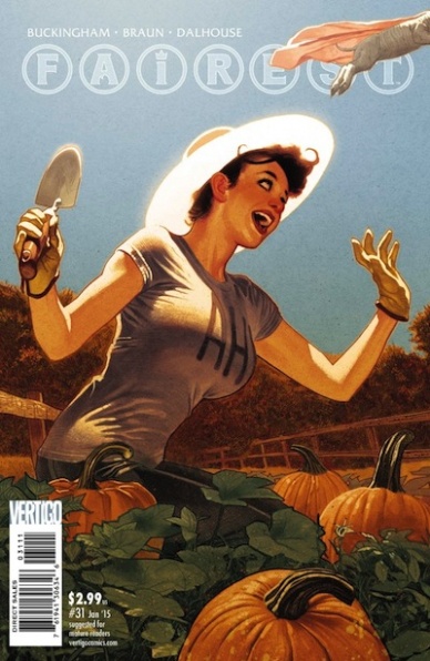
Fairest #31
Written by Mark Buckingham
Illustrated by Russ Braun
Reviewed by Jess Camacho
“Fairest” #31 is a real mixed bag. Reynard became a character we really rooted and, because we’re coming to the end of this whole world, we’re seeing his ending here. I like Reynard, and I always have, but this almost feels too drawn out. On top of this, another storyline has been introduced with some of the younger Farm residents starting up their own superteam. It ends just as quickly as it starts and feels completely unnecessary. I think the appeal of “Fairest” was that we were going to get more individual stories focusing on the women of Fable-verse. Instead this last arc has focused so much on The Farm and some of the less famous inhabitants there. The last pages of the last few issues of “Fables” have been very short, tiny epilogues called “The Last Story” of a certain character. I think “Fairest” would have been the right place for that. The direction clearly changed so the end of this series could have been used as one-shots, instead of a couple of pages within the main series. The writing is fine and the art from Russ Braun is very good but overall I think the last arc of “Fairest” has been a big missed opportunity.
Final Verdict: 6.0 – Reynard’s last story has been dragged on too far and there are far too many characters I have no attachment to.
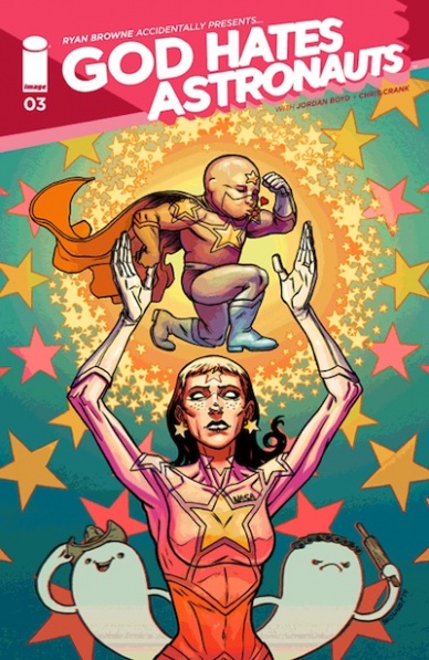
God Hates Astronauts #3
Written and Illustrated by Ryan Browne
Reviewed by Brian Salvatore
“God Hates Astronauts” is a book that is packed to the brim with information – although, to be fair, a good chunk of that information is dick jokes and hilarious sound effects. Each panel reveals unparalleled care and thought, and despite that, it can be a little hard to write about. Sure, there’s plot, but it is secondary to jokes, and because of that, the traditional conversations about the title are rendered a little moot. Sure, I guess it is possible to wish that Star Grass was little more developed, but fuck you if you really think about this book in that way.
Continued belowBut because it is, at its essence, a joke delivery system, all of the energy is put into delivering jokes, which range from funny to ‘uncomfortably loud laughing in a coffee shop and everyone is staring at you reading a comic’ funny. On top of that, Browne is one of the most talented artists working in comics today, and the images tell a story that is funny without a single word being on the page, and that is really, really hard to do. His design work on even the smallest elements feels well considered and super fun.
And, not to beat a dead horse, it is really, really funny. This isn’t a book you pick up if your primary goal isn’t to laugh, and if you don’t want a good laugh, what’s your deal?
Final Verdict: 8.2 – The black boxes covering Dr. Professor’s penis are the best.

Grayson #4
Written by Tom King and Tim Seeley
Illustrated by Mikal Janin
Reviewed by Brian Salvatore
It is a consistently pleasant surprise how much fun “Grayson” is, especially because it was launched out of an incredibly dark premise, and deals with all sorts of secrecy and covert operations, not exactly the chuckle-hut of comics premises. This book doubles down on a few ideas – that Dick is a bit of a slut, that he is the heart of the Bat-family, and that the DCU is place full of complicated relationships and tested allegiances.
The book is brought to life in such a beautiful way by Mikel Janin, who doesn’t shy away from showing Dick enjoying the shit out of jumping out of planes or, in this issue’s most fun sequence, being chased after by college girls. Janin also is able to, when the scene calls for it, give Dick some real fear on his face. For all his bluster and joking around, his mission is damn serious, and he understands that. Janin’s art is really the perfect foil for King and Seeley on this book, and each issue just builds their working relationship into something even greater.
This issue also begins to draw in more of the DCU as a whole – we see Midnighter again, but we also get Apollo, and the first mention of Stormwatch. There’s also a discussion of Checkmate, and even a reference to the events of “Batman Eternal.” This is a pretty great example of DC’s recent run of creating singular books that still manage to make sense in the grand scheme of their line.
Another interesting facet of the book thus far: all one-shots.
Final Verdict: 8.8 – A really great issue in what is shaping up to be a really great series.
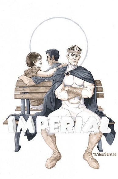
Imperial #4
Written by Steven T. Seagle
Illustrated by Mark dos Santos
Review by Vince Ostrowski
The dopey lead character of “Imperial” can’t seem to get out of his own way, even as he seems to finally be getting it together. As Mark finally reaches his “destiny”, he begins to lose sight of the things that were important to him. He begins to lose balance. This isn’t novel territory for cape comics, obviously. In fact, you might say that “Imperial” is a thematic rift on perhaps the most famous issue of “Amazing Spider-Man” of all time – with a twist of course. And what a twist it is. If this is the last we read of “Imperial”, while it might have all been wrapped up a little too neatly, it provided the flip side of having great power and the responsibility to use it for good – all through the eyes of a goofy simpleton that was honestly fun and fresh to follow. If the morality tale and giving Mark a shot at redemption aren’t enough for you, the humor and the art are more than charming enough to keep the reader engaged. Mark dos Santos has a playful style, pop art style that’s perfect for mixing 15% heart with 85% humor. Visually, “Imperial” is the static, comic book equivalent of Archer or Sealab style of cartooning. The visual humor comes mostly from the facial expressions, timing, and the stoicism of the titular character mixed with the absurdity of his place in the world. Like its lead character, “Imperial” was a scrappy and hopeful entry to the comic racks – and one you should take a chance on.
Continued belowFinal Verdict: 7.5 – true to the nickname “funnybook”, “Imperial” perhaps ties up a little too conveniently, but wins you over on its endless charm.

John Carter: Warlord of Mars #1
Written by Ron Marz
Illustrated by Abhishek Malsuni
Reviewed by Brian Salvatore
John Carter is a weird property – beloved by readers of a certain age, and all but abandoned in pop culture otherwise (a trend the Disney-produced John Carter film tried – and failed – to reverse). Carter is one of the first heroes, period, and has been an archetype borrowed from, either in pieces or whole hog, for over a century. Like many of Dynamite’s licenses, the character harkens back to the comic strip era, and has been in need of the right creative team to get readers interested again.
Dynamite has half of that creative team in place with Ron Marz, who called this “a lifelong dream” to work on the property. In his first issue penning the character, he gives the character a compelling villain, introduces readers to the world of Barsoom (Mars, to us Earthlings), and sets a tone that very much matches the classic novels. Unfortunately, artist Abhishek Malsuni’s work renders this book into the lower-tier license ghetto. A veteran of Zenescope, his work has the cheesecake aesthetic that feels absolutely out of place in today’s mainstream comics landscape. I know that the skimpy gold bikini of Dejah Thoris is a one of the iconic aspects of the property, but it instantly dates the book. Look at “Flash Gordon,” another Dynamite license that recently made a splashy return: while still rooted in the classic stories and look, everything was updated just enough to differentiate from the past.
That isn’t done here, in the slightest. As I said before, Marz is a huge fan of this property, and you can tell from reading the book. However, perhaps he is a little too beholden to his fandom, and doesn’t take the story in a place that feels fresh. Sure, the villain introduced is a really fun one, but everything else about the book feels a little too safe to me. Perhaps the goal was just to make a comic for the pre-existing Carter fans – if that is the case, this book has achieved its goals. However, if people are looking for a retooled take on a classic character, this isn’t the book for them.
Final Verdict: 5.8 – An unnecessarily small stakes relaunch.
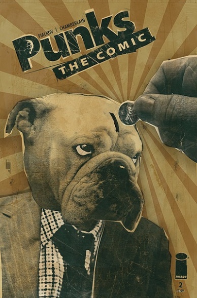
Punks The Comic #2
Written by Joshua Hale Fialkov
Illustrated by Kody Chamberlain
Reviewed by Jess Camacho
To say that “Punks” is funny is an understatement. “Punks” is the funniest comic book I’ve had the chance to read this year; keeping in mind this is only at issue two. This month’s issue follows Abe, Skull, Dog and Fist as a Superdog comes down from outer space. Superdog looks exactly like Dog but has powers so of course the gang replaces their Dog with this Dog. I was not even reading comics yet when “Punks” originally ran so I wasn’t totally ready for the humor that Fialkov infuses in this script. It’s off the wall crazy, and not a page goes by that you aren’t cracking up. All the humor is in the natural interactions between these four guys and it all comes off very naturally. Kody Chamberlain’s collage work is on a whole other level. It’s a style that fits the rebel spirit of the series and when you start thinking about the kind of work that goes into creating these pages, you become even more impressed. I wasn’t a comic fan when the first version of “Punks” was going so the flashback stories in the second half of the book are much appreciated. Both Fialkov and Chamberlain have really grown as creators. If you’re looking for something really different than everything else being published then “Punks” is your book.
Final Verdict: 8.8 “Punks” evokes the spirit of punk rock. This is the definition of must read.
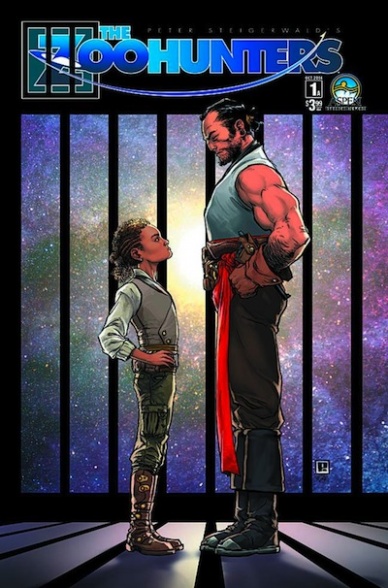
Zoo Hunters #1
Written and Illustrated by Peter Steigerwald
Reviewed by Drew Bradley
Based on the solicitation, this sounded like a sci-fi adventure story that could be a lot of fun. It may still turn into that before it’s all over, but it’s starting off as a surprisingly touching story about a caring-but-distant father and his son. The introduction was well paced, using the tension before bad news is delivered to develop an emotional connection with the main cast. There are a lot of beat panels, and the repetitive images are almost overdone, but the small changes in them keep the story moving with good momentum. The art presents the sci-fi elements in subdued manner, treating it matter-of-fact instead of emphasizing how cool it is. This plays well with the tone of the story, and keeps the focus on the emotional elements where it belongs.
This issue wasn’t perfect, though. After spending almost the entire issue with the father and son, the final pages shift suddenly to some new character. Since Steigerwald gives us no clear indication who she is, her predicament and the last page reveal falls flat. Also, it may have just been the copy I bought, but the pages had a strong curl to them and I had to put extra effort into holding them in a way that was easy to read. This isn’t a major problem, but it did take me out of the story a couple times. This is the first Aspen book I’ve read, so maybe this is normal for their paper stock?
Final Verdict: 8.0 – A strong debut, and I look forward to #2


