There is a lot to cover on Wednesdays. We should know, as collectively, we read an insane amount of comics. Even with a large review staff, it’s hard to get to everything. With that in mind, we’re back with Wrapping Wednesday, where we look at some of the books we missed in what was another great week of comics.
Let’s get this party started.

Batman #47
Written by Scott Snyder
Illustrated by Greg Capullo
Reviewed by Keith Dooley
Everyone is talking about the ending of “Batman” #47. And for good reason. However, the usual artistic team of suspects on this title have delivered more than just flash. They have also, once again, put the focus squarely on character and heart. Scott Snyder continues to surprise and delight with how much a book that has James Gordon as Batman, Bruce Wayne as an amnesiac, and the relatively new character of Duke Thomas as the focal characters of this arc can work so seamlessly. We know that the good guys are (probably) going to win, but Snyder’s intimate writing and the artistic team’s superior dedication to detail make the journey a memorable one.
Greg Capullo shows how he is so brilliantly able to illustrate bombastic and frightening action scenes as well as the small intimate moments that are called for in “Batman” #47. His versatility cannot be overstated. The scenes between Gordon and Mr. Bloom are ingredients of pure horror. A character who could easily become ridiculous is instead imbued with a veil of haunting mystery and given a physical form that stretches into unimaginable grotesqueries. He even adds dashes of humor into his action in two particularly small, but great scenes: one involves a helmet and the other involves a baseball bat. Small touches like this are just an example of the depth and thought he brings in his contributions to the overall story and characterization.
That characterization is especially powerful in “Batman” #47. Snyder writes a scene between Bruce and Duke that is a spot-on distillation of what Batman means to so many people while Capullo illustrates it with such passion and creativity. Without reading Snyder’s words, one can look at Capullo’s faces and see them overflow with such complex emotions as pain, confusion, realization, and unbridled joy and confidence. After getting over the shock of that last page, just take a closer look at the face and then that last panel on the same page. Subtlety is a powerful tool of Capullo’s and he uses it to demonstrate his mastery of transforming small moments into powerful scenes that pop with vitality and symbolism.
Every moment that Capullo illustrates is given that much more depth by Danny Miki’s inks and FCO Plascencia’s colors. Whether they are scenes in the shadows or ones of a lighter quality, Miki inks “Batman” #47 with as much subtle flair as Capullo. Miki assists Capullo in making the story’s proceedings crisp, clear, and mixing the grounded with the fantastical. Plascencia does this as well. His colors, as evidenced with the opening scene involving a yellow flower, can evoke horror while brightening the page. Like a combination Batman and Robin, Plascencia works well in the light and the dark while bringing symbolism into both.
With the inevitability of Bruce Wayne regaining the mantle of the Bat on the horizon, “Batman” #47 is another example of how experimentation with a decades-old character can still reveal new and exciting facets of him and his world.
Final Verdict: 9.0 – “Batman” #47 shows us that Snyder and Capullo are having just as much fun with this title as they have since issue one. They are definitely still inspired.
Harrow County #8
Written by Cullen Bunn
Illustrated by Tyler Crook
Reviewed by Matthew Garcia
Horror, like comedy, relies on the element of surprise in order to survive. It has a set-up, punchline, and payoff of its own, and really the only thing that differentiates the two genres is the context. Also, like comedy, we’ve encountered so many scary and terrifying narratives already, that a story has to truly cast a tight spell in order to get to us. Cullen Bunn and Tyler Crook have most definitely captured that, especially with “Harrow County” #8. It’s the climactic issue of the second arc. It’s where evil sister Kammi finally makes her move. It’s where Emmy is forced to react.
Continued belowBy this point, Bunn and Crook have us entirely in their grip, and there’s no relief from the tension until the very end. (And even then.) They pack a lot of story into these 25 pages, moving Emmy from setpiece to setpiece, casting the familiar locations we’ve seen in the previous issues in a new and terrifying light. The pace is relentless and heart-pounding, and it never falters, and they’ve reach that stage in the narrative where they could get away with nonsensical plot points. Even the final dénouement, though probably familiar to fans of the genre, lands with aplomb.
Overall, Crook and Bunn offer a satisfying and thrilling conclusion to the latest arc. “Harrow County” continues to have the capability to surprise us and ensnare us in its narrative. It’s a truly fine comic and it’s going to be interesting to see which direction it heads in next.
Final Verdict: 8.8 – Second maybe only to “Sabrina” as one of the strongest horror comics out right now.

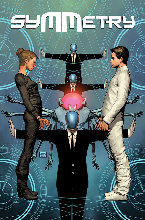
Symmetry #1
Written by Matt Hawkins
Illustrated by Rafaelle Ienco
Reviewed by Stephenson Ardern-Sodje
Dystopian/Utopian futures have been a staple part of popular culture for the better part of a decade now (the first novel in “The Hunger Games” trilogy was release almost eight years ago; a fact which makes me feel all-but ancient). But, long before Katniss and her intrepid band of starving youths attempted to assault The “Capitol”, we as a society had already decided that perfection in society was an almost impossible objective.
The first issue of “Symmetry” has a lot of ground to cover to set up its perfect future. Hawkins is attempting to build a modern, nuanced, and unique society, and he’s clearly got a lot of history mapped out that he can’t wait to share with us. This eagerness, however, comes across as a little overwhelming. From a page of written prologue, to a near-constant internal monologue that narrates elements of Michael’s (our protagonist, and resident social deviant) life, we’re bombarded with facts about this futurescape that are delivered seemingly with no regard to whether they impact the story or not.
We’re introduced to the world at large, a technocratic benevolent dictatorship run by AI and certain choice humans, we find out about the RAINA, personal robots each human is connected with at birth, (think Siri on steroids) and we witness the fittingly YA-esque ‘Choosing’ ceremony each child goes through at thirteen, when they become official citizens and choose their gender.
There’s so much set-dressing on show here that Hawkins doesn’t really get much of a chance to set up his story. Life in his utopia is every bit as monotonous as you might expect, and so his scripting came across as a uncharacteristically sterile, penned in as it was by the relative mundanity of a protagonist who has never experienced any form of conflict. There are subtle hints to the internal conflicts that Michael is heading towards, striving for love and independence in a world where they’ve been effectively eradicated, but it’s hardly unique ground for any story about class-divided future societies.
Ienco’s heavily computerised art feels very well suited to a story about the not-too-distant future. There’s a distinctly cell-shaded, retro-futurist aesthetic to his city-scapes and personal robots that reminded me of “BioShock: Infinite”. As much of this issue is delivered in the form of an overarching narration, Ienco shows off his visual world-building skills nicely, with a consistent, clean-living design that feels a little like what a high-tech Amish society might create.
There are a few slight inconsistencies between Ienco’s art and Hawkins’ narrative, mainly in the obvious designation of gender roles. Hawkins seems to have gone out of his way to suggest that gender and sexualisation play an almost vestigial role in the world of “Symmetry”, and yet Ienco’s characters still sport very traditional visual signifiers of their gender, including some Power Girl-esque boob windows in female clothing which seem out of place in a society that doesn’t promote sex as anything other than a reproductive necessity.
There are certain tropes that the Utopian/Dystopian genre seems intent on propagating until the singularity actually does occur. Utilitarian white jumpsuits, relatively two-dimensional representations of asexual relationships between men and women, and aggressively polite robotic overlords all dominate Hawkins and Ienco’s first issue, leaving them with little room to develop a unique and personal storyline in the spaces in between. There’s nothing inherently wrong with setting your first issue up in the conflictless zone of a Utopia, but it doesn’t make for the most captivating reading.
Final Verdict: 5.7 – If you’re a fan of Hunger Games, Scorch Trials, or whatever a ‘Divergent’ is, then you’ll probably love this book. If not, there’s not much new on offer here.


