
There is a lot to cover on Wednesdays. We should know, as collectively, we read an insane amount of comics. Even with a large review staff, it’s hard to get to everything. With that in mind, we’re back with Wrapping Wednesday, where we look at some of the books we missed in what was another great week of comics.
Let’s get this party started.
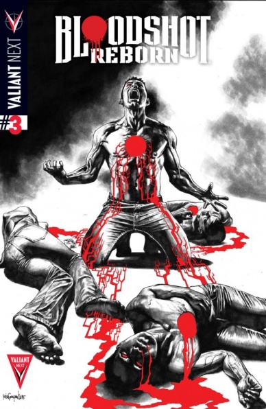
Bloodshot Reborn #3
Written by Jeff Lemire
Illustrated by Mico Suayan
Reviewed by Ken Godberson III
Jeff Lemire is some kind of sorcerer. He’s working the same magic he worked with “Green Arrow” for a character I never been a real big fan of. Weaving the mystery of Bloodshot’s past, his mental state, along with very relevant issues these days, considering the incredible problem the United States has with guns, the retooling of this character provides an incredibly dark and serious counterpoint to other books in Valiant’s line like “Ivar, Timewalker”. What Ray Garrison called a life is crumbling down around him as Agent Festival begins closing in and it is compelling as it is awesome.
A great deal of the praise deserves to be give to Mico Suayan and David Baron. The idea of “dark and gritty” art seems to get scoffed at for some reason, but Suayan’s ultra-detailed pencils does add a certain amount to weight to events that need such weight. The ultra detail can work against itself in some places, where some scenes will look more stiff than they should.
What adds to the art is the contribution Lemire himself puts in, and on that note: Bloodsquirt. Bloodsquirt is one of the more bizarre creatures to come out of Valiant. This Who Framed Roger Rabbit-esque insertion of cartoon innocence infused with the blind naivete American culture has in relation to guns and shootings is as adorable as it is terrifying. It really is the driving force behind many of the themes that are being discussed in this book, especially about violence (and these words are coming from the guy that has been cheering Assassin Empress Emily Kaldwin from the Dishonored 2 trailer all week).
Final Verdict: 8.8- Within three issues, Lemire, Suayan and Baron have turned me around on what I thought was a flat character by injecting great amount of cultural commentary.
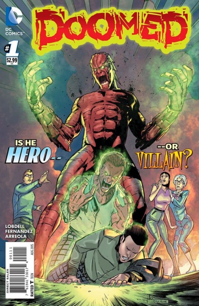
Doomed #1
Written by Scott Lobdell
Illustrated by Javier Fernandez
Reviewed by Matt Dodge
Reiser has all the concerns of a regular freshman at Metropolis U. He worried about getting good grades, doing well in his new internship, not embarrassing himself in front of potential love interests, and what will happen when he spontaneously turns into a giant monster bent on destruction. “Doomed” is a new series from the creative team of Scott Lobdell and Javier Fernandez, which takes a different look at the city of Metropolis and the legacy of one of Superman’s most infamous opponents.
Readers are used to seeing Metropolis primarily from the perspective of the staff of career professionals at the Daily Planet and the occasional super-powered visitor. Lobdell writes Reiser as a different sort of character, one who actually has to worry about making rent, dealing with roommates, helping his aunt and getting good grades. While the premiere issue wisely avoids a lengthy exposition regarding the nature of sudden transformation, what is clear after the first two dozen pages is the Reiser is a relentlessly positive character. Lobdell gives him such an optimistic outlook that it’s next to impossible not to root for him.
Javier Fernandez steps into the well-pencilled world of Metropolis with relative ease. His style definitely leans to the more realistic side of things, while still including some slightly exaggerated facial expressions. He shows Reiser in his “Doomed-out” form in the first pages, using it to hook the reader. Fernandez obviously tried to avoid too many similarities to any large green heroes, and creates a look that feels unique and different. The only complaint to be had about the artwork is that there are a couple pages where the panels start to become cluttered, and could have used just a bit of streamlining.
“Doomed” is a very charming and enjoyable read. It sets up the world and the characters in a fairly straightforward and understandable way. Lobdell creates a very sympathetic lead in the character of Reiser, and crafts the story that is not necessarily ground-breaking, but it still perfectly decent. Fernandez delivers solid art for the entire issue, give or take a couple moments of overcrowding. It feels like DC is actually trying something a little different with this book, and the other recent additions to their line, and “Doomed” at least deserves a shot.
Continued belowFinal Verdict: 6.5 – A perfectly charming and entertaining book. There is some real potential here, so I am more than willing to give it another couple of issues to find its footing.
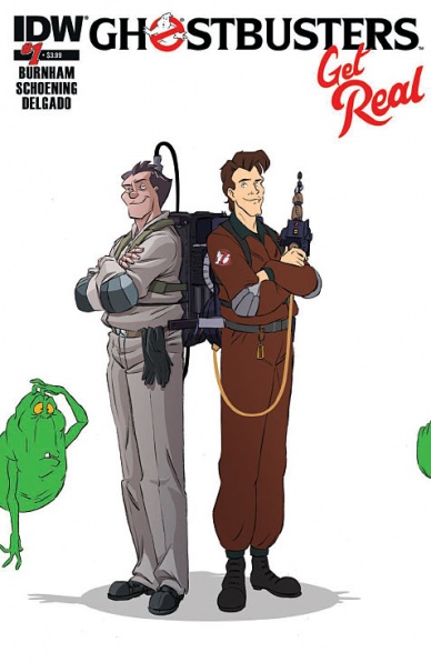
“Ghostbuster Get Real” #1
Written by Erik Burnham
Art & Colours by Dan Schoening & Luis Antonio Delgado
Reviewed by Stephenson Ardern-Sodje
The first in a four part mini-series for IDW’s surprisingly inventive take on the Ghostbusters’ mythos, Burnham, Schoening, and Delgado return after another recent cross-over “Teenage Mutant ninja Turtles/Ghostbusters”, to get even more meta with a Ghostbusters-meets-Ghostbusters story.
As far as crossovers go, I’m not sure anyone was particularly clamouring for a Ghostbuster/Real Ghostbusters team-up, but the idea is definitely a cool one, ripe with potential. That being said, this first issue feels like it’s a little too enamoured with its high concept to offer anything truly unique in terms of narrative. The issue opens in the TV world of The Real Ghostbusters, who are responding to a standard ghost busting call-out. Schoening and Delgado manage to capture the classic, technicolour feel of the original cartoon with aplomb, with bold colours and smart, simplistic backgrounds immediately giving off a rad, retro vibe.
After a magical mishap with long-time enemy Proteus, The Real Ghostbusters find themselves transplanted to the world of “The Ghostbusters”, specifically a slightly more drab ‘real-life’ version of their New York offices. While the transition is smooth enough and provides some solid opportunities for spit-take style shock from the twin sets of Ghostbusters, there isn’t that much that will surprise you in this initial interaction. Each Ghostbuster team quickly splits off into their transdimesional pairs and engages in some solid bickering, but the similarity in tone and conversational style between each Ghostbuster and their Real counterpart means that there’s not much in the way of real conflict.
There are the glimmers of some danger in the form of Proteus, ranting and raging with the kind of 80’s animated panache that would impress Mumm-Ra or Claw, but it all feels a little too paint by numbers at this point. While Saturday morning cartoons thrive on regularity, I would have preferred something a little more off the wall with this book, especially given the concept.
Final Verdict: 6.2 – Some sharp visuals and heavy nostalgia value here, but it feels a little like they chose style over substance.

Justice League of America #1
Written and Illustrated by Bryan Hitch
Reviewed by Brian Salvatore
This is widescreen comics. This is over the top action. This is blockbuster-style explosions. This is DC’s “Big 7” taking on a threat so large, that none of them could handle it together.
This is not a good comic.
Sure, many of the elements of a good comic are here: Hitch’s detailed (and heavily assisted) pencils, the shocking visual of a pile of dead Supermen, a mysterious organization trying to save humanity. But at the core of this book, there is something hollow and vapid, as if these are the storyboards for the Justice League movie, and instead of casting actors and filming it, they decided to just release the storyboards. Sure, it looks like a comic, and feels like a comic, but this book doesn’t do any of the things that make comics my personally preferred medium.
It also does little insulting things, like make the Flash and Green Lantern into idiots, or have Parasite call Wonder Woman a bitch. This book, more than any on the shelves, is a perfect space to tell stories that aren’t beholden to the New 52 mythology – as evidenced by the presence of Bruce Wayne as Batman, and heroes without their post-“Convergence” looks. This could be a book that could act as a fishing pole for new readers, young and old, to see the world’s greatest heroes fighting gigantic threats together. Instead, we see Superman and the rest of the Justice League duped time and time again; it is as if Hitch doesn’t realize that heroes can be beaten or tricked without making them simpletons.
Continued belowThe last page has a ‘reveal’ that is ridiculous for a number of reasons, but could be played interestingly. I don’t see that being the case here; there’s no evidence to suggest that this won’t be done like everything else in this issue: big, dumbed down and, ultimately, disappointing.
Final Verdict: 4.6 – A bloated, expensive, disappointing comic

Kaijumax #3
Written & Illustrated by Zander Cannon
Reviewed by Kevin M. McConnell
The world of kaiju and anime are new worlds for me. Sure, I have seen all the cheesy Godzilla movies, but that is really where it started and ended for me. There is vast world containing many different creatures in personalities. And what better place to find out more than prison. On paper, “Kaijumax” has the perfect mix of out there goofiness and true dramatic conflict. This being my first review for the book, I am happy to report the book has this in spades.
Part of this enjoyment comes from Zander Cannon’s artwork. In this issue, the focus is on the non-violent inmate MechaZon. It is clear early on, MechaZon is a very complex animal. Like others in KMAX, he has perpetrated violence and he has felt the after effects of his actions. He has found technology, a metaphor for religion, to help him through this difficult time.
The description does sound a little boring, but Cannon’s work within the panels shows a clear grasp he has on his character’s motivations and feelings. The idea of a cold emotionless robot is shattered during a conversation with MechaZon’s father. His heartbreak is shown through his eyes, he is reliving his past with his new found sense of self and it is a wonder to behold. Set against the bright and shiny world, Cannon hits all the right notes. The expressiveness helps you root for a character who wants to change.
As the story progresses, MechaZon is put to the test. In a moment, that can best be described as gut-wrenching, MechaZon comes face to face with his past and he is clear what he wants to do, but what he is obligated to do it another thing entirely. This big reveal, and MechaZon’s eyes, set the stakes. I am not going to spoil the ending, but it was surprising to say the least.
To further play on your emotions, the story between Electrgor and the Creature From Devil’s Creek furthers the point of emotion shown through art. Cannon tells the story in such a way in the panels, you get a sense of what each face is going to look like. Creature’s words are simple, the flashback give you an idea of what happened (without saying too much) and it is the expressions that drive the point home. I am a sucker from an artist who can capture real emotion in the character(s) face and Cannon has done this with the utmost precision.
It is with this, you forget that this is a prison. But then again, isn’t that the point? The story isn’t about why the characters got there, it is about what they are going to do now that they are indeed stuck here. Zander Cannon has created a fascinating world, that while unbelievable though it may see, he has truly put a human face on the monsters who are imprisoned there. If anything, it seriously makes you question who the real monsters are. The ones on the inside or the ones on the outside of the prison walls. One of the more interesting aspects on display, is there is a drug lab operating within the prison itself. This particular plot point advances the story of Electrogor and trying to find his children. It is a strong undercurrent to the book as whole. It allows for the main plot to feature different inmates, while seeing the inner workings and underbelly of the prison.
It is hard not to be reminded of “The Shawshank Redemption” while reading this. Even when you start to feel for a character, the rug gets pulled out from under you. And as I said, this is a prison you are dealing with. Not everyone is a hardened murderer, but they are here for a reason. Perhaps this is Cannon’s way of dealing with all the real world drama we face in modern society today. If it is, he has done an excellent job crafting the human side of imprisonment, even if there is a monster inside them.
Continued belowFinal Verdict: 8.1 – The bright and cartoonish nature of the art disarms you to a story about the human (er, monster) condition and shows the true prison is the one inside ourselves

Lazarus #17
Written by Greg Rucka
Illustrated by Michael Lark
Reviewed by Walter Richardson
A common criticism of “Lazarus” has been that it has been too slow. While I don’t agree with this assessment, I can see why it might appear that way to some readers — for the most part, the action has been more in the verbal sparring and political duels of these families than in the punching-and-kicking type of action in most comic books (though there has been a good bit of that, too, including an issue-spanning fight scene). Now, though, the pieces are more or less in place, and the world that the Carlyle family and their ilk squabble over is going to burn.
The issue begins with a military conflict, and a harsh one at that. Although Forever and her fellow Lazarus can accomplish great feats, the world of “Lazarus” is still one inhabited by people of simple flesh and blood, and war on this earth is no more glorious than it is on ours. Rucka and Lark give us a clear look at what war between the Families means, and it isn’t pretty. Rucka’s dialogue reeks of that paradoxical balance between desperation and determination, and Lark’s brutal linework can almost make you hear the bullets whizzing by and the explosions in the distance. Note the lack of lettered sound effects — they’re unnecessary when an artist of Lark’s caliber is on duty. The scene is a little bit less than a quarter of the issue, but it effectively gives us a look at the horrors of war that are to come.
The rest of the issue maneuvers the remaining pieces into position for what is sure to be the most hectic arc of “Lazarus” yet. Those who have been waiting for the story to shift up a gear might be slightly annoyed that we are back to politicking and the like (though I’m surprised you’re still reading if that’s the case); on the other hand, those who appreciate Rucka’s smart dialogue, world building, and great sense for character development, plus Lark’s clear storytelling and excellent knack for body language will find a lot to love. It’s the last calm before the storm, and boy is it going to be a tempest.
Final Verdict: 8.0 – As a reader, I can’t wait to see where this is going. Were I a serf under any of the Families, though, I’d be scared shitless.
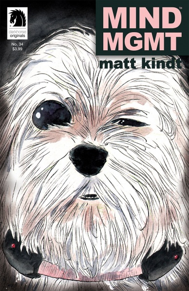
“MIND MGMT” #34
Written and Illustrated by Matt Kindt
Reviewed by Matt Garcia
Matt Kindt turns in essentially a 20-page action scene, throwing in whatever he can imagine as Meru and her crew infiltrate the new Mind Management headquarters. He doesn’t just offer slugfests and sword battles, but also psychic tandem showdowns and magic-esque duels. Warrior Meru makes and appearance here, dicing her way through the oncoming hordes.
I think this issue clearly demonstrates not only how far Meru has come as a character — because the woman leading the charge is not the same one from the opening moments of the series, the one trying to put together her new book; her evolution has been as fascinating to watch as all the mind-bending stuff we’ve seen month after month — but also how far Kindt has come as a creator. “MIND MGMT” is his first monthly work and telling a singular story for the last three years has improved his pacing, his staging, and his storytelling.
There are only a couple issues left and this one leaves us hanging on a steep cliff. But if Kindt can deliver the remainder of the story with the same precision, aplomb, and emotion as he demonstrated in this issue, I don’t think we’ll have to worry.
Final Verdict: 8.8 – another strong chapter in one of the most memorable series.

Ms. Marvel #16
Written by G. Willow Wilson
Continued below
Illustrated by Adrian Alphona
Reviewed by James Johnston
In this issue, Kamala tried to solve her problems by eating at a hot dog cart until the vendor told her to go away. She has finished her transformation into Liz Lemon. 10/10.
No but really, “Ms. Marvel” #16 ties into the “Secret Wars” crossover by taking place before everything exploded and Dr. Doom turned everything into his Game of Thrones LARP session. Pile on the fallout from Kamala’s recent encounter with some rogue Inhumans, and Ms. Marvel has her hands full as the world tumbles around her. What’s really interesting about “Ms. Marvel” #16 is how its clearly the next step in building Kamala as one of Marvel’s big heroes. We’ve seen Khan fight for her life before, but now she’s fighting to save everyone in Jersey City from a threat that has nothing to do with her book in the first place. She’ just had her first crossover derail her own storyline. This is like watching your child grow up.
As per usual, Adrian Alphona impresses me with his art on “Ms. Marvel”, and I think a lot of it has to dow with the indie vibe of it. Kamala’s adventures have typically taken place outside the major Marvel scene so it’s interesting to see cataclysmic events like an Incursion barrel into Jersey City. That contrast between Kamala’s world and Marvel’s is neatly noted in the comic’s final page where Big Honking Spoilers Captain Marvel finally shows up. It’s a nice twist compounded by how everything is going wrong and how it bears on Kamala. Her face is utterly flabbergasted, not just by the red skies but by Carol Danvers’s sudden appearance. Carol, however, is a stone cold statue ready to fight. Love Kamala all you can, but this scene makes it clear that she still has a lot to learn before she can get onto Carol’s level. And we can’t wait to see her get there.
Final Verdict: 7.4 – A comic that uses a crossover to further its own themes and storylines? Wild! And also really fun. Kamala’s slowly but surely becoming one of Marvel’s top heroes and this issue is a huge step forward for what the character can be capable of.
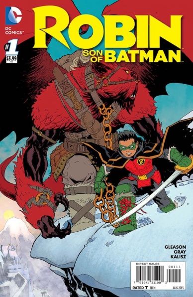
Robin: Son of Batman #1
Written by Patrick Gleason
Illustrated by Patrick Gleason
Reviewed by Keith Dooley
Patrick Gleason adores the character of Damian Wayne and it is gleefully evident in the first issue of “Robin: Son of Batman”. After having been artist on the excellent and underrated “Batman and Robin” with writer Pete Tomasi, it was appropriate that Gleason would be chosen as writer of Damian’s further adventures. It isn’t always a success when an artist also attempts to write, yet Gleason succeeds beyond this reviewer’s expectations. He weaves in the mysterious past of Damian’s “year of blood” with present day adventures that contain a history that is accessible and thrilling to both longtime readers and newbies who are curious about the only Robin that is blood related to Batman himself.
The biggest enticement to pick up “Robin: Son of Batman” #1 is for the extraordinary art. Gleason continues to impress with his pencils and his distinctive art style. He takes risks with his art and surprises with his layouts, dynamic action scenes, and deeply emotional moments. Damian’s facial expressions range from anger, sadness, fear, and defeat. It’s imperative to remember that, despite being a trained assassin, Damian is still just a boy. Gleason visually depicts Batman’s son as a fully developed character while also writing a story that compels us to become invested in Damian’s future. We relish the journey that is just beginning to percolate.
Mick Gray and John Kalisz, who respectively ink and color Gleason’s pencils, did such an amazing job bringing Gleason’s art to life in “Batman and Robin” and continue to do so in “Robin: Son of Batman” #1. Gray’s inks bring a humanity to particular panels like the one where Damian declares himself “son of Batman”. In that panel and throughout the issue, Gray adds shadow and depth that transform Damian into someone very real and powerful. Kalisz’s color palette retains a bright aura throughout every page and even in the darkest moments. A black and white scene that contains very occasional hints of color is both shocking and affective in its ability to be both harrowing and vibrant. The teal stormy night sky is a poignant backdrop to the purple costume of the daughter of one of Damian’s villains.
Continued belowPoignancy is an appropriate description for the contributions of Gleason, Gray, and Kalisz. Throw in awe-inspiring action and you get a more than promising first issue. Goliath, who is Damian’s new sidekick and is “not a man-bat”, is the best new character so far in the new DCYou and accentuates the conflicting traits of brutality and tenderness that resides within the former boy assassin. With Bat-Cow, Pennyworth the cat, and now Goliath, Damian’s supporting cast is a perfect group that is able to temper his fiery nature. “Robin: Son of Batman” #1 re-introduces us to a character with so much promise. It’s satisfying to see the resurrection of Damian was not performed in vain and that he is in the hands of consummate creators.
Final Verdict: 9.0 – Patrick Gleason, with the assistance of Mick Gray and John Kalisz, infuses “Robin: Son of Batman” #1 with complexity and heart. Plus, Goliath is going to be a guaranteed breakout star.
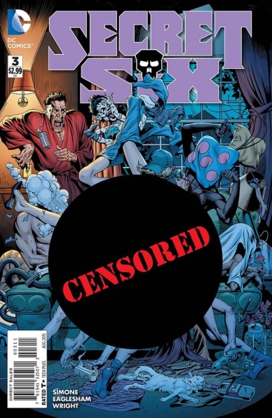
Secret Six #3
Written by Gail Simone
Illustrated by Dale Eaglesham & Jason Wright
Reviewed by Jess Camacho
“Secret Six” has gotten off to a little bit of a rough start. The story hasn’t really taken off yet and despite my sympathies towards the reasons for the art delays, it still hurt the momentum. This issue begins two days after the team escaped the ship they were trapped on and they’re now living at the suburban home of Big Shot. Their goal here is to make nice, have somewhere to stay and keep out of the crosshairs of their former captors. “Secret Six” #3 is the best issue of the relaunch because it’s the first time this felt like a “Secret Six” series. The humor is executed well and there are some very good character moments, specifically with Catman and Strix. The relationship between Black Alice and Big Shot could be a very cute father/daughter kind of bond but I feel like we’ve been here already.
Artist Dale Eaglesham does a great job but honestly, when doesn’t he? Catman has become a sex idol nd he doesn’t shy away from this. He’s shirtless most of the time but it works for him where it wouldn’t work for other characters. There are some serious moments that call for less comedic art and he does a great job conveying this. Black Alice’s age comes through as she is basically the child among this fighting group of adults. Porcelain is always where your eyes are drawn because her design and demeanor are so great. Jason Wright’s colors are bold and he really captures this bizarre sitcom mood.
“Secret Six” has a big cliffhanger that’s going to keep me around but there’s just something that feels a little off about this team that I can’t pinpoint totally. It may have something to do with my lack of background with some of these characters and it’s been tough for me to immediately connect. Overall though, this issue finally starts to feel like “Secret Six” and is a pretty good place to jump into the series.
Final Verdict: 7.0 – “Secret Six” #3 is an okay issue that is heavy on humor and features a great cliffhanger.

The Surface #3
Written by Ales Kot
Illustrated by Langdon Foss
Reviewed by Alice W. Castle
Why is this story being told?
I wonder if it’s possible to review a comic when you don’t fully understand it. Thankfully , this is only a micro review and I can boil this down to: if you’ve already been reading “The Surface”, you know that Ales Kot, Langdon Foss and Jordie Bellaire are creating a masterpiece of fiction. If you haven’t been reading “The Surface” then this sure as hell isn’t going to be your jumping on point, but this issue seems to be the turning point that shows that series will go down as simply fantastic.
“The Surface” is dense. At this point, I’m not even sure what the narrative of the series actually is, but I can tell you that I am enjoying it immensely. Ales Kot writes with a deft touch, blending realistic human emotions with an incredibly dense narrative that blurs the line between fiction and reality. In this issue we see the ramifications of the horrors that befell our protagonists last issue fall on the shoulders of those who are left while the machinations of the mysterious narrator are finally revealed. This gives us an inkling of the endgame that Kot is building to in his writing, but also deepens the mythology of the series to a degree I don’t think anyone was expecting.
Continued belowWhile the writing is incredibly dense and will likely take repeat readings upon completion of the series to fully appreciate, the artwork by Langdon Foss and colourist Jordie Bellaire can be fully appreciated on the surface. Foss is tasked with bringing Kot’s incredibly idea rich writing to life and does it remarkably well by creating a minimalist style that eschews burdening the action in the panel with too much detail. Instead, Foss opts to use a lot of larger panels focusing on one subject and allow the reader to digest its importance by framing it as the only thing of detail in the panel. Jordie Bellaire then brings Foss’ artwork to life with a palette of constrating, muted colours to bring a realistic hue with just an edge of the fantastic. This really helps bring home the concept of the line between fiction and reality blurring as the colours themselves are muted, but chosen in contrast to make the page appear vibrant and full of life.
Ales Kot’s writing continually pushes the boundaries of how enjoyable a series can be while being dense and full of narrative symbolism that will likely not become clear until a re-reading. However, with a focus on characters who are human and well rounded and interesting because of their flaws and the tragedies they push through, “The Surface” has been a blast so far. And with Langdon Foss and Jordie Bellaire’s artwork. it has been a simply gorgeous reading experience even if I can’t describe what happened in this issue.
Final Verdict: 8.8 – For fans of “Change”, this is a must read. For everyone else, go read “Change” and then come back to this.


