
There is a lot to cover on Wednesdays. We should know, as collectively, we read an insane amount of comics. Even with a large review staff, it’s hard to get to everything. With that in mind, we’re back with Wrapping Wednesday, where we look at some of the books we missed in what was another great week of comics.
Let’s get this party started.
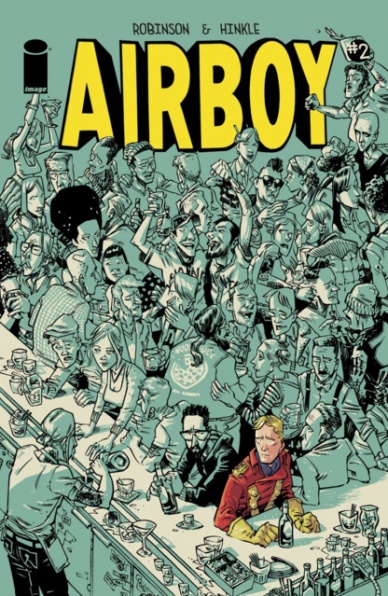
Airboy #2
Written by James Robinson
Illustrated by Greg Hinkle
Reviewed by Brian Salvatore
Let’s get the elephant in the room out in the open: there is some horribly offensive content in this book. James Robinson has apologized for it, as well as ‘explained’ why it was in there in the first place. Whether or not you buy his logic, or his sincerity, is up to you – I’m not going to get into that here. Hell, I’ve only three more paragraphs to get all my thoughts out, and this requires a more in depth conversation – one that is being planned. I decided I was going to review this book before reading a page of it, or hearing about the controversy, so I’m going to try to review it while ignoring that chunk of it. We’ll see how I do.
So, this is the issue where the other shoe drops – Airboy – the fictional character – seemingly crosses realities, and walks into ‘our’ world – or the world that looks a lot like ours where Robinson and Hinkle set the book. The first issue was very much about getting inside the heads of Robinson and Hinkle, whereas this issue is more about them dealing with the situation they’ve found themselves in.
Hinkle continues to impress with every panel, managing to combine expressive detail with an effortlessly fun, cartoony style. Images like Robinson getting blown in a bathroom stall are rendered in such detail that they manage to be sad, funny and, if one were looking for something titillating, might find it there, too. Hinkle’s talents are most on display when he’s mixing Airboy into the ‘real’ world, showing this shining beacon on goodness placed in some less than high morality situations. In a way, he looks like a reflection of Robinson in a funhouse mirror – less hard edges, blonder hair, more elegantly dressed.
The story flips the script in the last few pages, and the third issue seems like it will be a completely different beast than the first two, which is a fun development. The series, in general, is a really interesting take on both the autobiographical comic and the superhero genre. The closest analogue I can think of in pop culture is the Spike Jonze/Charlie Kaufman film Adaptation. Much like that film, a real life event (Robinson bottoming out and quitting DC) is fictionalized with the help of some fictional characters, and some real people turned fictional.
Final Verdict: Sorry folks, too much controversy here to sum up my thoughts in a neat little package. I thoroughly enjoyed many aspects of this comic, and was made very uncomfortable by others. Read it for yourself, and look for a piece later this week where we can all talk about it.
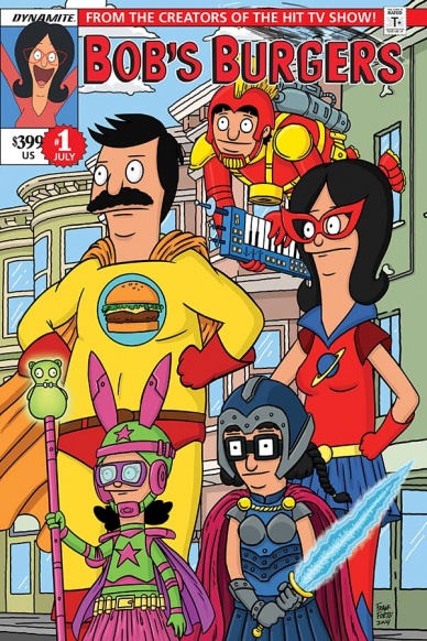
Bob’s Burgers Vol. 2 #1
Written by Various
Illustrated by Various
Reviewed by Michelle White
If you aren’t already a fan of Bob’s Burgers – if you haven’t already been seduced by Bob’s punnery, enamoured by Linda’s songs, and drawn in by the awkward enigma that is Tina – there’s not much I can say to make you get it. Happily, those who do get it will certainly get this comic, put together by the creators of the show itself; it remains true to the spirit of the cartoon while exploring some of its more obscure avenues.
There’s actually a whole first volume of Bob comics at Dynamite, but this issue is my first look at the series. And, as I might haved expected from a comic of a show that is already pretty silly, it’s lightweight and various. Short stories alternate with pin-ups, but they all keep to the same safe, spoofy tone.
Continued belowFrom Brian Hall and Frank Forte we get a taste of Tina’s erotic friend fiction – and while it’s not quite as cringe-inducing as Tina’s best, most pubescent moments on the show, it gets the job done, conjuring up a suitably fantastic scenario. Forte’s rubbery art is the farthest departure from the show’s style in the issue, and also the most interesting to look at, filling tight compositions with loose, rubbery figures.
“Full Moon Lounge Gene” might be the strongest entry; Derek Shroeder evokes a storytime feeling with narrow panels and watercolour textures while Mike Olsen sets down a fable that explores Gene’s love of crooning. But the whole ensemble is at its best in “What Lies Beneath Bob’s Burgers”; courtesy of Justin Hook and Ryan Mattos, this jaunt beneath the restaurant pairs great one-liners with tightly-packed pages of brusque, vaguely lowbrow, art.
I don’t think one really needs to read more than one issue of this – not unless one has a pressing addiction to the show, anyway – but “Bob’s Burgers” does do particularly well by the shift in medium. The different art styles emphasize, rather than take away from, the show’s loose and energetic feel, and the humour is on point while still feeling fresh.
Final Verdict: 8.0 – Pretty much exactly what you would expect, but pleasantly so.

Darth Vader #7
Written by Kieron Gillen
Illustrated by Salvador Larroca
Reviewed by Ken Godberson III
With an arc under their belt, Gillen, Larroca, along with colorist Edgar Delgado and letterer Joe Caramagna, continue their journey with the Dark Lord of the Sith in what has been the more interesting title between it and its sister book, “Star Wars”. After the shattering final scene of the last issue, the Luke Skywalker plot goes on to the backburner for a bit to focus more on the criminal underworld in the Empire. However, it doesn’t appear that certain underlings of the Dark Lord are as loyal as they appear to be.
Let’s get the first thing out of the way: when characters are introduced in expanded universe material… they are usually not great. I’m still very up-and-down on the addition Aaron put in over on the main book. However, the characters Kieron Gillen has introduced to the Star Wars mythos have been utter delights. Doctor Aphara brings a much-needed foil to Vader’s… hmmm…. Vaderness and the homicidal droids (of which there are three now) add an incredibly dark humor to a book starring a character that is grim and terrifying.
This book makes the conscious choice to have no internal narration (perhaps in the effort to make it more “cinematic”) and as such, it requires Larroca and Delgado to really sell visual emotions, especially considering the unmoving face of the protagonist. And I say, they do a really good job of this all around. This is especially shown off when Team Vader investigate not only the destroyed Lars Homestead, but Obi-Wan’s home on Tatooine. The use of shadow and slight hand gestures help us go through Vader’s thought process even more than the dialogue. We also had a nice dark homage to another of Luke’s iconic scenes from the films like back in issue #1. That’s always fun.
If there is one thing about this issue that does drag it down a bit is the same problem most first issues of an arc have- It’s about 85% setup for plots to come. There is nothing wrong with that, but the raid on a crime lord’s base came off, while visually impressive (especially Vader’s almost nonchalant killing of a giant space beast), just a bit less interesting in comparisons to the plots dealing with Luke or Aphara at the end of the issue.
Final Verdict: 7.8- Gillen, Larroca and co. are setting up the pieces of Arc 2 with some impressive visuals.
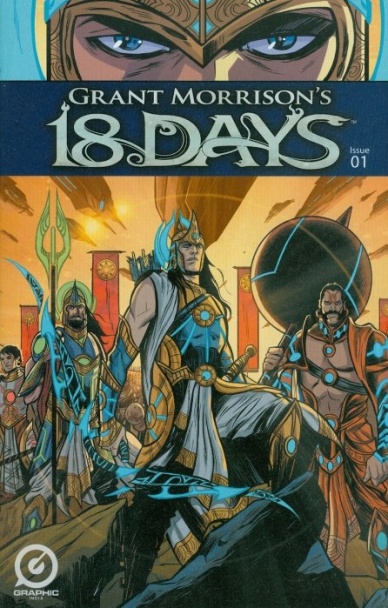
Grant Morrison’s 18 Days #1
Written by Grant Morrison
Illustrated by Jeevan J. Kang
Reviewed by Keith Dooley
Indian mythology and Eastern philosophy inform this series featuring an epic battle between warring gods, or “superwarriors”. Morrison uses the ancient Sanskrit epic, the Mahabharata, as inspiration in “Grant Morrison’s 18 Days” #1 and infuses the issue with science fictional elements and his own unique voice. In the back matter, Morrison is interviewed and says he wanted to transform these characters’ epic struggle into something “universal and global”. He does so throughout his script and entertains us with squabbles that pit cousin against cousin. These warring factions of superwarriors will battle in the third age and usher in the fourth and final age. That is when humanity will rise again. The story is straightforward and, like the Mahabharata, reads like the epic poem it’s supposed to be. Monumental ideas are expressed on a grand cinematic scale that mirror the greatest classic stories that contain a cast of thousands and every characteristic you would expect of ancient adventures.
Continued belowJeevan J. Kang’s art and colors match Morrison’s grandiloquent adaptation. The panels are drawn in a Cinemascope style, with close-ups utilized on almost every page. Kang depicts gods upon the page and does so with simplicity and emotion with every stroke of his pen. We believe these beings are all-powerful and contain pure, universal emotions that range from hubris to humility. His characters’ faces are very reminiscent of Becky Cloonan’s art, with their expressive eyes and smooth features. The simple, uncluttered backgrounds place full focus on the cast and lend that feeling of ancient and universal struggle. Kang’s colors add a science fiction element to the proceedings, with the neon colors of the gods’ battle-wear and weaponry imbuing their ancient surroundings with a touch of the fantastical. Kang is attempting, like Morrison, to entertain readers of today.
“Grant Morrison’s 18 Days” #1 is a fun introduction to Eastern philosophy that will compel many readers to seek out even more information about concepts they know very little to nothing about. Or you can just enjoy such universal concepts as war, misunderstanding, and virtue being played out in an exciting and thought-provoking manner through Morrison and Kang’s storytelling skills.
Final Verdict: 8.0 – “Grant Morrison’s 18 Days” #1 is fun, informative, and the best deal of the year at only one dollar.
Green Arrow #42
Written by Ben Percy
Illustrated by Patrick Zircher
Reviewed by Kevin M. McConnell
I have long been a fan of vigilante stories, mostly because they do not play by the same rules that traditional heroes do. “Green Arrow” is an example of a good vigilante story: he is in a city not typically highlighted, he is not afraid to kill and he has had a bad attitude in the past. These elements keep him interesting, but how does the story fare when he acting less like a vigilante and more like a regular man?
Unfortunately, it does not fare as well as I hoped. First let’s look at the positives: the story itself is very provocative given the racial climate in America, and Ben Percy does not shy away from telling that story. In fact, he advances this story into Robocop territory with the introduction of the Panopticon, which works on a few levels. It demonstrates a bleak alternative to regular policing, as well as bringing up racial tensions through an accusation of, and quick dismissal of, profiling. Suggesting robots can determine bad guys by just a glance is a terrifying commentary on what is going in society.
Another positive aspect of the book is Patrick Zircher’s art, which once again sets the mood. When the Panopticon is introduced, Zircher does not waste any space in displaying how awesome it is; Zircher’s attention to detail really shines here. When Panopticon attacks a petty thief on the street there is a panel solid red with the Panopticon “enforcing the law,” it reflects the way that Andrea Sorrentino and colorist Marcelo Maiolo used to render the look when they were on the title. This adds to the mystique of this impressive piece of technology – ut could have come off as corny, but the art makes it believable.
Sadly, once again it is Oliver and his interactions with his sister that grind the story to a halt. I am not sure what Percy is trying to do or if DC editorial is trying to make Oliver more likable, in part due to the multimedia properties the character is involved in. Simply put. it does not work. Oliver trying to be “hip” and speak like the youth of today sounds forced, almost to the point of groan inducing. With the continued use of Emiko, it feels like Percy is humanizing a vigilante for no reason, and it doesn’t work.
Once again, Percy has a great story he is dancing around. It would be high time to raise the stakes, and make “Green Arrow” a little more entertaining. Otherwise, this is going to fall into the same trap the book was in early on.
Continued belowFinal Verdict: 5.8 – Solid art and a perfectly topical story are again ruined by ancillary characters who serve no purpose. As a Green Arrow fan, this is again a major let down.
Midnighter #2
Written by Steve Orlando
Illustrated by Alex Morgan
Reviewed by Matthew Garcia
There are two plotlines running parallel throughout “Midnighter” #2, both revolving around the same theme: “Doing the right thing, but the wrong way.” In fact, that may sum up what I’ve seen of Orlando’s “Midnighter” so far. This month, he’s joined by Alec Morgan, in a plot that involves a girl named Marina receiving a magic artifact and destroying all these people in a high ranking, uncaring corporation. Running parallel to this is a story where Midnighter and his current flame are visiting Moscow and reflecting on relationships. While this series is still very new and very much trying to find its identity, I like that thus far the overarching focus has been on Midnighter and his interpersonal relationships and responsibilities — and how he approaches all of these in the worst way imaginable — rather than some nefarious secret organization.
Morgan takes over for Aco on this issue, and his art is serviceable. It’s clear, understandable, and staged well. Morgan knows when it’s best not to overflood the panel with information, and he can draw a punch that you can feel. It exists in this in-between zone of like the New 52 DC house-style and the more “2000 AD”/European influence.
But for those who still undervalue the impact of a colorist, “Midnighter” #2 shows what can happen to the tone and flow of a story when one gets interrupted. About halfway through the book, the colorist switches between Romulo Fajarado Jr to Allen Passalaqua, and though the palette remains the same, the way each of them approaches their shading and redering is just different enough to jolt you out of the story. It’s one of those things I noticed but couldn’t vocalize until I was rereading the credits, and while both Fajarado and Passalaqua do a fine job, it still came off as unnecessarily unsettling.
Final Verdict: 7.0 – An tense issue that does well to establish the themes I think will be present throughout Orlando’s (and mostly Aco’s?) run on the series.

Nailbiter #14
Written by Joshua Williamson
Illustrated by Mike Henderson & Adam Guzowski
Reviewed by Jess Camacho
For the last year, “Nailbiter” has built up the mystery of Buckaroo and it’s serial killing population. “Nailbiter” has sort of been like a chess game where every move people in the town have made is leading to a final checkmate. “Nailbiter” #14 is the beginning of that checkmate. In this issue, Finch, Warren and Crane head down underwater to the mysterious pyramid under the town. Through some flashbacks, we’re given a little more background about Warren and Crane’s relationship during high school and it serves a purpose to framing Alice a bit more as a character. Williamson is starting to clue us into what makes so many of this town’s citizens kill and there’s this supernatural aura to it all which makes this series become all the more exciting. The interactions between these core three characters is delightful because so much work has already been done establishing their personalities that now we’re finally seeing some payoff as they’re forced to work together. Williamson and Henderson have really settled into a groove here an with this issue they offer a true shocking twist but again raise more questions about our still unknown killer. I love this series but I think it’s time to get a bit more about this still fairly unknown character.
Henderson’s art is very creepy as he does cool things with shadowing and building tension. It’s tough to do that in a comic book when you can peek ahead a bit but he’s able to keep you engaged and retain the sense of horror the series needs to succeed. Warren is definitely the best drawn character because he channels dark humor. His facial expressions are very animated and he has a certain swagger to him that no one else in this book has. In many ways, “Nailbiter” offers a sort of comic book successor to Hannibal when that show goes off the air soon.
Continued belowFinal Verdict: 8.0 “Nailbiter” continues to be one of the best horror comics going.

Princess Leia #5
Written by Mark Waid
Illustrated by Terry Dodson
Reviewed by Matt Dodge
In retrospect, one of most peculiar moments in Star Wars Episode IV: A New Hope, is the scene when Leia comforts Luke after Obi-Wan Kenobi is killed by Darth Vader. He is upset, understandably, that one old man was killed, while she just watched her entire planet and its billions of inhabitants be blown to pieces by the Death Star. At best it’s just a strange oversight, while at worst is just solidifies Leia as a supporting character in Luke’s story. This imbalance is what Mark Waid and Terry Dodson have tried to address in their “Princess Leia” miniseries.
After five issues, Mark Waid has done a tremendous amount of work to highlight the base elements of Leia’s personality and explore her as a fleshed-out character. He has written Leia as a strong leader, one who is intelligent, resourceful and determined, but not infallible. The issue opens with Leia in the hands of the Empire, having turned herself in as part of a prisoner exchange and to defend the Alderaan survivors that she has gathered. While we can surmise that Leia makes it through this to appear in The Empire Strikes Back, there’s no guarantee that the team she has assembled around her will also survive. Waid has created a group of characters and endowed them with enough personality and motivation that the readers have quickly come to care about them.
Terry Dodson has stepped right into the Star Wars universe with ease. His art has captured the distinctive look of Leia and the other film characters, while also adding his own unique visual style. Dodson captures the look and feel of the films, without simply copying frames and moments from the big screen. Even when there are literally dozens of space ships whizzing through the panels, it never looks overcrowded or confusing. Every image that Dodson has penciled is highly detailed, clear and exciting. He even nails the classic Leia doughnut haircut.
This miniseries concludes with Leia arriving at some sort of peace with her history, and doing everything she can to ensure the legacy of Alderaan can live on. She proves to herself that she can be a strong leader, while still acknowledging the personal toll that the fight against the Empire is taking on her. Far from being a weakness, Leia has decided these parts of her identity make her powerful, and give her the strength to keep fighting.
Final Verdict: 8.5 – Mark Waid and Terry Dodson have shown that Leia is every bit the hero, just like Han and Luke. It’s a great miniseries and a great reminder as to why this character has remained popular and important, both in and out of Star Wars, for so many years.
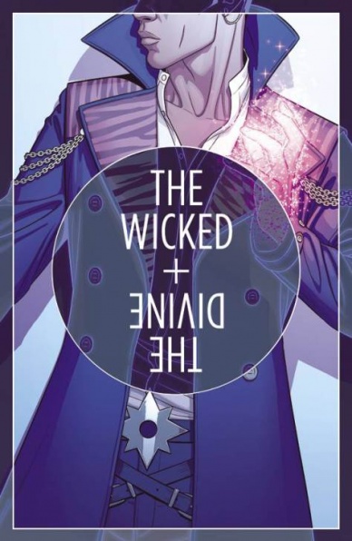
“The Wicked + The Divine” #12
Written by Kieron Gillen
Illustrated by Kate Brown
Reviewed by Stephenson Ardern-Sodje
As the second arc of the unexpectedly breakout hit ‘WicDiv’ comes to a close – simultaneously released as a monthly and in a collected trade, great move btw – Gillen and McKelvie throw a curve ball into the mix. Guest artist Kate Brown takes on the main issue duties, with McKelvie relegated to a couple of pages at the end of the issue. What’s more, Gillen confirms that, for the foreseeable future at least, they’ll have a new guest artist every issue for the next arc, ominously titled ‘Commercial Suicide’.
I’ve been a fan of the series since its initial sketches started showing up floating around the internet, and the first arc was pretty amazing from cover to cover but, as Fandemonium draws to a close I can’t help but feel it lacked the same drive and impetus as its predecessor. Traditional as it may have been, using the Everyman character of Laura to help ingratiate the audience with his mysterious Pantheon was genius. The enigma and allure of celebrity and deity was perfectly funneled through a teenaged lense and it almost felt as though the less we knew about the gods themselves the more we wanted to know. What’s more, there was a clear endgame in sight. Laura wanted to taste the power of the gods, she wanted fame and fortune and, naive as it might have been, she was willing to sacrifice anything to get it.
Continued belowAnd [SPOILERS] in Fandemonium, she got it. And suddenly ‘WicDiv’ was left without a goal. The latter few issues have been centred around hunting down Luci’s killer and bringing them to justice. They’ve been a God heavy affair that has dragged since Laura’s trademark tenacity was taken out of the mix. What’s more, with such a multitude of partially fleshed out characters and no primary viewpoint to read them through, it becomes increasingly difficult for us as an audience to know who to root for. More importantly, it becomes increasingly difficult for us to care.
This lack of focus isn’t helped much by the inclusion of a new artist. Just to confirm, I don’t think there’s anything wrong with Brown’s art, she does a solid job and plays to her strengths (subtle facial expressions and a more introspective physicality which could be said to be lacking somewhat from McKelvie’s work). But what drew me in originally to the story was the crisp, focussed, unified feeling of each issue. They existed inside a bubble of their own making, complete and controlled. Now, as Gillen teases an increasingly fractured narrative approach, eschewing a single protagonist for a more multinarrative approach, losing the artistic anchor of McKelvie certainly isnt going to help the book hold on to its aesthetic.
This was an odd review to write. While it reads pretty scathingly, I did quite enjoy the issue and I am impressed at the bravery it takes to push your book in a whole new direction. I just worry that The Pantheon may end up suffering from the same shortcomings as real celebrities do. While they seem captivating in short bursts, switching focus to them on a more intimate level often reveals that they are just as flawed (or worse, boring) as their human worshippers.
Final Verdict: 6.4 – A bold step, for sure, but not necessarily a better one.
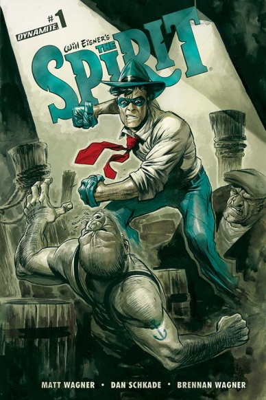
Will Eisner’s The Spirit #1
Written by Matt Wagner
Illustrated by Dan Schkade
Reviewed by Alice W. Castle
When picking up your copy of “Will Eisner’s The Spirit” #1, you may be startled by the distinct lack of The Spirit himself, as I was. Instead of rebooting the character or trying to spin a new take on Danny Colt for a new generation of readers, Matt Wagner and Dan Schkade have taken a different approach: they’ve killed The Spirit. What this issue is, then, is the beginning of the mystery to explore what happened to The Spirit.
While the swerve of what this issue was actually about was unexpected, it was still enjoyable. Matt Wagner is an accomplished writer and he injects this issue with a lot of humanity. The issue follows a rather large cast of characters, delving into how “The Spirit”‘s supporting cast is reacting to his supposed death. This allows Wagner to bring varied voices to the world and flesh out the universe of the comic. However, this also means that as a first issue, this works more as an introduction to the characters than anything else. Those looking for an action packed comic should look elsewhere. Those looking for the opening chapter in a hard boiled mystery explore the supposed death of a pulp vigilante? Now this is the comic you’re after.
Bringing the world of “The Spirit” to life through writing is one thing, but through art is something else entirely. Dan Schkade, however, manages to pull it off seemingly effortlessly. Schkade’s art feels like a cross between Eisner’s watercolour style and Matt Wagner’s heavily inked pulp style, fusing the two to bring two eras of “The Spirit” together. Unfortunately, some of Schkade’s linework is noticeably inconsistent, particularly in the character’s faces, but the art more than makes up for that in personality.
This is, for sure, a very unique way to begin a new series of “The Spirit” and I’d say it paid off. It certainly won’t work for everyone, but it brings the pulp mystery aspect of the character to the fore much more than the vigilante heroics and it allows for a closer look at the supporting cast because of it. Combining that with the talents of Wagner and Schkade, who certaintly know their way around this world, and you have a damn fine comic.
Final Verdict: 7.0 – A slow burn beginning to a very intriguing mystery, this is like nothing else on the shelves today.


