
There is a lot to cover on Wednesdays. We should know, as collectively, we read an insane amount of comics. Even with a large review staff, it’s hard to get to everything. With that in mind, we’re back with Wrapping Wednesday, where we look at some of the books we missed in what was another great week of comics.
Let’s get this party started.
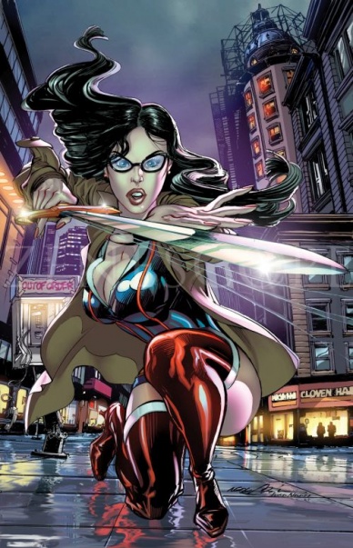
Grimm Fairy Tales #100
Written by Joe Brusha and Ralph Tedesco
Illustrated by Anthony Spay
Reviewed by Walter Richardson
We all know Zenescope. They’re often the butt of jokes in the comic community, and considering their usually… questionable covers, one can see why. But in my time I have rarely come across anyone who has actually picked up and flipped through one of their comics — or, at least someone who fessed up to it — and so I decided to pick up the landmark hundredth issue of “Grimm Fairy Tales” to see if it was really as bad as it looked.
Surprise: it wasn’t. Not really, anyway. Sure, there’s nothing to make “Grimm Fairy Tales” stand out from all the other fairy tale mash-up stories out there besides its… well endowed cover ladies, but #100 was a fairly decent read that lead into publisher’s Next Big Thing just about as well as DC’s “Flashpoint” did. Now, I fully admit that this is a back-handed compliment — Flashpoint was widely considered a failure, but that was mostly because of the pedigree of the creators. Here, the plot is just fine; again, maybe a bit by the books, but it hits all the right beats for a story like this. And, hey, it certainly does a better job than your average DC or Marvel event at allowing you to come in at the climax of an arc and still get the basic gist of what is going on. However, the characters seemed to only exist to move the action and the plot forward, with none making any sort of impression on me as far as their personalities (granted, the lead was incapacitated for the majority of this issue, but still).
The art, too, was a pleasant surprise. Spay seems to be a pretty solid draftsman, and the final page was particularly well composed. And, joke as people might about the covers, the interiors in this issue didn’t have anything worse than you’d see in your average Big Two comic when it comes to the female form (not that this makes it any better, but you get my point). Spay’s main weakness has nothing to do with his technical skills or his designs, but with his sequentials. Even his most visually impressive pages don’t have much life to them, and, while sometimes nice to look at, they aren’t exactly nice to read. Joke all you want, however, but this is a common problem across the comics board — and at least his fans can appreciate his solid grasp on the human figure. And I’m sure they really, really appreciate it.
(Sorry, I had to get at least one wisecrack in there.)
Final Verdict: 5.5 – Like I said, about on par with “Flashpoint,” but that still isn’t completely awful

Harley Quinn Invades San Diego Comic Con #1
Written by Amanda Conner and Jimmy Palmiotti
Illustrated by Paul Pope, Javier Garron, Damion Scott and Robert Campabella, Amanda Conner, John Timms, Marco Failla, Dave Johnson, and Stephane Roux
Reviewed by Brian Salvatore
I literally am speechless.
Let me try to sum up this book: this takes place in the “real” world. But, Harley Quinn is there – the Harley from the comics, the fictional character, is walking around in the real world, working for her friend’s booth at San Diego Comic Con, trying to get her portfolio reviewed. It features cameos from various DC staff – Dan DiDio, Geoff Johns, Jim Lee, Bob Harras, Bruce Timm, Paul Dini, and former DC editor Katie Kubert (oopsie).
It is also batshit insane.
There are some really funny parts (like DiDio talking about 4-D September covers – the fourth D is for “DiDio”), and there are some really dumb parts, like Harley having sex with a room full of Joker cosplayers and her shooting a cop in the ass after mistaking him for a stripper (and thinking the gun is a fake).
Continued belowA bevy of great artists do decent work throughout the book, but this is the most self-serving thing I have ever read. There is a dig at Marvel not looking for original talent, an almost laughable accusation coming from DC, and this acts as basically one giant commercial for DC, in the least subtle way possible.
Final Verdict: Huh. What – who knows?

The Last Fall #1
Written by Tom Waltz
Illustrated by Casey Malone
Review by Vince J Ostrowski
What initially looked like a visually unique and easy to execute premise ends up falling quite short due to a reliance on cliches and characters that fail to engage the reader. Taking place in a galactic war between planets, “The Last Fall” ends up mostly just dwelling in the misery of its central character, Marcus Fall. Fall checks off most of the boxes of a character “hardened by war” who has already lost everything he had. He’s surprisingly one-dimensional, brooding and melodramatic. This is unfortunate, because you do get the sense that the world(s) behind “The Last Fall” are more interesting. Waltz definitely crafted a full background for the story, but seeing as those aspects are more interesting than the story at the center, the book would have benefited from spending more time on the world-building.
It’s difficult to say that Casey Malone’s is perfectly suited to the material, as it’s got a softer, more stylized edge than the hardened feel that the story feels like it wants. But that’s actually a good thing, because it’s one of the few areas where “The Last Fall” takes a chance or does something different. Malone’s work lightens up the book a bit and there is some engagement generated by some of his perspective choices and the subversion of how we would expect the book to look. Dusty Yee’s colors are also a boon. Again, they are surprisingly varied and colorful more often than you’d have guessed from the hard sci-fi the book is attempting. It gives the book atmosphere that it otherwise lacks.
“The Last Fall” isn’t bad, but its story doesn’t do anything that we haven’t seen before in science fiction – and quite recently, at that.
Final Verdict: 5.0 – “The Last Fall” focuses on the generic while losing sight of its more interesting aspects
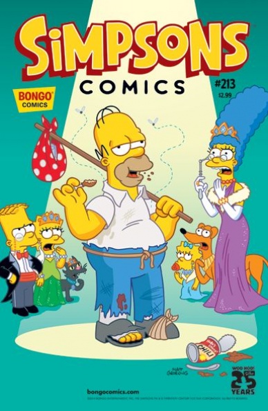
Simpsons Comics #213
Written by Ian Boothby
Illustrated by Phil Ortiz
Reviewed by Drew Bradley
The best thing about comics from Bongo, and Matt Groening properties in general, is how accessible they are. Whether you’ve seen every episode and read every issue, or if this is your first exposure to the Simpsons family, you’ll understand this issue. What’s more, you’ll get every joke. This particular issue sees the Simpsons pretending to be Flanderses so Homer can avoid a debtor’s prison, which is the kind of wacky adventure that’s par for the course in these books. Boothby is a master at puns, slapstick, and maintaining the distinct voices and mannerisms of the cast. This issue is slightly more continuity heavy than others, requiring two notes from the editor mentioning which episodes are being referenced. Also, Ms. Krabapple married Flanders? When did that happen?
It’s hard to evaluate the art, because Bongo has a pretty distinct house style. There is one scene where Homer and the kids paint the house which is brilliant though. Especially the background gag a few pages later when you see they only painted the front of it. Overall, this is a solid comic. Then again, Bongo titles usually are.
Final Verdict: 8.0 – If you think quality all-age comics are hard to find, I know 213 places you haven’t looked

Stray Bullets: Killers #5
Written and Illustrated by David Lapham
Reviewed by James Johnston
After following the events of Applejack and her new beau for the first four issues, David Lapham takes an issue to reflect on the story at hand by bringing back one of his fan favorite characters. Condensing the story at hand into an Amy Racecar fantasy gives a new perspective on many of the players at hand by breaking them down into their most primal archetypes. A shy boy becomes crippled, blind, and more than a little cowardly and overbearing mothers turn into complete monsters. It’s interesting to see how Virginia Applejack’s perceptions have changed over the course of the series, since Racecar is starting to become more and more like the actual Applejack and less like an ideal to aspire to.
Continued below“Stray Bullets” may be well known for its gritty storytelling (and that’s certainly present here) but the fantasy premise behind the issue gives Lapham a lot more space to have fun, from outrageous shootouts to dystopian cities full of freaks, we get a lot of scenes that would never fly in the ultra-real world “Stray Bullets” usually finds itself in without losing the solid visual storytelling that’s made it one of the best “new” series coming out of Image.
Final Verdict: 8.3 – A solid issue that strays away from the main story yet makes it feel that much larger
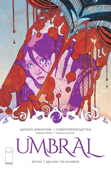
Umbral #7
Written by Antony Johnston
Illustrated by Christopher Mitten
Reviewed by Drew Bradley
“Umbral” is a hard book to pin down. It has a lot going for it in terms of characters, world building, and conflicts. It’s also a little tough to follow sometimes. Scenes change suddenly, and the lead character moves from being wide awake in a barn talking to one person, to being in an alternate dimension talking to a second person on the next page, to be waken from that dream state by the same second person in a different body two pages later. It makes sense after reading it a couple times, but it’s spoils the magic of the story when you have to turn back because you think you skipped a page. It’s also a book you need to read from the beginning. This is the start of the book’s second arc, but there’s not really enough backstory here for new readers to make a connection. If you haven’t been reading “Umbral,” you’re much better off buying the first trade before you buy issue 7.
This is probably sounding negative, but don’t be fooled. “Umbral” is a book you should be reading. Johnston’s a first class writer, and Mitten’s work is far better than average. It’s worth going through the book a second time just to marvel at his skill at making your eye look exactly where he wants it to go. It’s a very different style, but this is some Alex Toth worth work on some pages.
Final Verdict: 7.5 – Worth a buy, but start at number one


