
There is a lot to cover on Wednesdays. We should know, as collectively, we read an insane amount of comics. Even with a large review staff, it’s hard to get to everything. With that in mind, we’re back with Wrapping Wednesday, where we look at some of the books we missed in what was another great week of comics.
Let’s get this party started.

“Constantine the Hellblazer” #2
Written by Ming Doyle & James Tynion IV
Illustrated by Riley Rossmo
Reviewed by Matthew Garcia
For all its big monsters and supernatural forces, for all the black magic and strange hauntings, “Constantine the Hellblazer” #2 is a relatively quiet book. The story follows Constantine as he’s given an assignment to combat a ghost-destroying creature and his trip around New York City trying to find a place to lure it in. Doyle and Tynion mostly strive to build John’s character and his supernatural world and how bored he is by it in this issue, giving him dense pages of interpersonal dialogue and a haunting spirit to keep him from denying his more horrible natures. “Constantine the Hellblazer,” like any strong supernatural book, is a story made up of other stories; the main narrative plot is considerably less important than Constantine’s interacting with this world, and there’s a lot going on in this world, though Doyle, Tynion, and Rossmo mostly keep it relegated to the background.
Luckily, Riley Rossmo is more than capable of handling all these moments. He’s thin and jittery lines blend and warp the figures on the pages. His style varies enough that you can tell the different time periods of the book even without the sepia tones from Ivan Plasencia (who’s color choices definitely help to keep the book moody, atmospheric, and like there’s some magic just around the corner that if you reach enough you might –). I was particularly fond of a scene with Constantine walking through the corridors of this hotel and all this crazy stuff was going on behind him. Rossmo never shoves your face into the spooky elements, and the way the entire creative team plays this straight only helps keep the book more grounded and interesting.
Final Verdict: 7.0 – Introspective and gradual, “Constantine the Hellblazer” #2 offers some nice character work for John
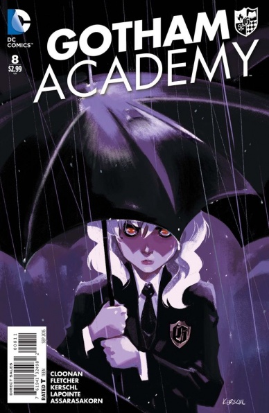
Gotham Academy #8
Written by Becky Clooney & Brendan Fletcher
Art by Karl Kerschl
Review by Ken Godberson III
You’ll be happy to know that, despite the absolute lack of the Ultimate Power Team of Maps and Damian, this issue was still quite good. This issue begins tying some plot strings together with focus on a character that has been really background for the most part: Kyle Mizoguchi.
Up until this point, Kyle has really been the role of the “understanding sorta-boyfriend” to further Olive’s story. It is a nice change to get inside his head; seeing his doubts, his protective side in regards to Maps, and his own adventures in the spooky side of the Academy. My big thing is: For as great as this look into his mind, there is still the feeling that it’s most in connection to Olive.
It’s probably dawning on you: for as much as I love this book’s cast, Olive is my least favorite. And she was the full focus of the first, 6-part arc. Now, considering the end of this issue, it seems like we’re going that direction again.
Karl Kerschl’s amazing cartoon work, alongside the coloring work of Serge Lapointe and Michele Assarasakon, made this issue a wonderful visual spectacle. It is a refreshing feeling to see young adults look like young adults rather than mid-20s models. One scene in particular that stuck out was one of the ending scenes (yes, aware I just went off on it in the previous paragraph). Kerschl, Lapointe and Assarasakon make a great use of subtle body language to help convey what Olive and Kyle are feeling, without dialogue.
Final Verdict: 8.3- My feelings on how I wish the story was going aside, Cloonan, Fletcher and Kerschl continue to create one of the most unique and interesting books at DC.
Continued below
Harrow County #3
Written by Cullen Bunn
Illustrated by Tyler Crook
Reviewed by Michelle White
We’ve been waiting a while for this third issue of the highly-praised series from Dark Horse. Since this witch of a tale is a, erm, slow-burning affair, this issue doesn’t stand out too far from the first two. It does, however, deliver subtle shivers.
Since the first issue, Crook’s art has struck me fairy tale-like, almost – almost – friendly, with watercolour washes and charcoaly linework encouraging immersion in these imagined spaces. The woods that surround the events of this issue are particularly spooky – gnarled and sketchy, the perfect hiding place for haints (evil spirits). But it’s in Emmy’s characterization that Crook’s art shines the brightest; Emmy’s going through some major revelations in this issue, and realizations both wonderful and horrific flit across her face.
Hunted by her neighbours and stranded in a graveyard, Emmy is finally getting to understand her newfound powers. Not only is she able to do things that are beyond human ability; she also has a terrifying kinship with the beings that haunt the woods. Fending off a horde of them as the angry mob comes near, her dialogue with a local woman, Bernice, takes several deft turns. Bernice – good-natured but afraid – shows her fear in reluctant bursts, while the free indirect discourse of the narration takes us to the darkest corners of Emmy’s mind.
Crook mines a particularly shocking element in the last few pages for further scares, then scales back for a more atmospherically frightening final page. There are monsters aplenty in this story, both human and supernatural, and as Emmy’s situation grows dire, Crook finds the horrific in each.
Overall, this is a solid issue that does its job, pushing us deeper into a dark place. Slowly but surely, Cullen Bunn and Tyler Crook are building a rare thing – a satisfying scary story with depth. Certainly worth catching up with if you haven’t had a taste.
Final Verdict: 8.0 – Sophisticated shivers accompany well-thought-out character development. Haint bad at all.

“Injection” #3
Written by Warren Ellis
Illustrated by Declan Shalvey
Reviewed by Stephenson Ardern-Sodje
As Ellis and Shalvey take their feet off the gas and start to reveal some of the mystery behind “Injection” as they delve deeper into the weird world of their own creation.
The premise of “Injection” was vague enough that, going in, I had pretty much no idea what to expect, and I was okay with that. Ellis and Shalvey have more than the required pedigree to produce a brand new book on par with the best 2015 has to offer. Two issues in and I still had no idea what was going on, but the helter-skelter plot dragged me head-first into the misty Scottish highlands and the ethereal, netherworld of the mysterious ‘Stones’; I was hooked.
Issue three marks a bit of a change of pace as far as the series is concerned. It’s a lot more text-heavy than the previous two, and there are certain pages where the amount of jargon gets a little overwhelming. Ellis makes some pretty big reveals with regards to the plot, but it’ll probably take more than a casual read to get a proper understanding of exactly what’s going on. Unfortunately, the increase in high-minded dialogue does slow the pace of this issue down considerably. While issues one and two both have some pretty impressive visual set-pieces, there’s a lot less narrative-propelling action in this latest issue. Even so, Ellis is more than capable of delivering an engaging and nuanced debate, even if you’re not always sure what the heck the characters are actually talking about.
Visually, while the majority of the issue isn’t hugely dynamic, Shalvey manages to create a pretty intriguing opening salvo. In a conversation between Maria and Robin, the CCU’s resident (not) wizard, Shalvey shapes a hugely creepy, Swamp-Thing-esque apparition that superbly solidifies the Gothic elements of this book. The rest of the issue hinges mainly on close-up, emotion-heavy panels. Shalvey executes the collective faces of the CCU with a hollow-cheeked, shadow-eyed kind of hunger that adds an element of real desperation to the numerous, tense conversations. Jordie Bellaire brings these ominous panels to life with a level of control that helps tread a fine line between magical realism and graphic melodrama.
Continued belowWhile not the most accessible issue, Ellis clearly has a lot of groundwork to lay before the grand designs he and Shalvey have in mind can be fully formed. What’s more, there is still more than enough meat on the bones of this issue to get your teeth into, with a sincere promise of much more to come.
Final Verdict: 7.2 – Slow but steady. This is a mammoth book in the making.
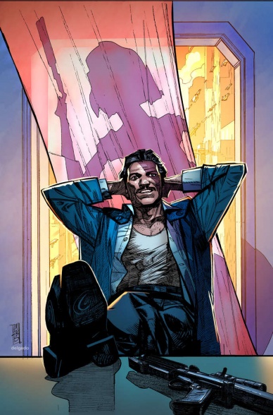
Lando #1
Written by Charles Soule
Illustrated by Alex Maleev
Reviewed by Brian Salvatore
Lando Calrissian is probably the 10th or 11th most important/iconic character from the original Star Wars trilogy – he’s not the most natural choice for a miniseries. But Marvel is really trying to make Star Wars comics that appeal to fans of the original trilogy, and have been giving those fans what they want. This book is a natural continuation of what they’ve been doing in their short time with the Star Wars license – filling in gaps in the backstories or between the films, not so much writing new stories as enhancing old ones.
On that level, “Lando” is a near flawless victory. We see a little of lothario that Lando was always teased as being, we get some Lobot action, and we see the shady businessman that Han knew before he ‘went respectable.’ Charles Soule gives the book just about everything that a Lando fan would want to see, almost to a detriment. There’s very little surprise here; just about every page turns out as you’d expect it to, and all we are is a Millennium Falcon away from the full Bingo board being filled in.
What keeps the book from feeling like it is shooting fish in a barrel is the artwork of Alex Maleev. Lando, and especially Cloud City, were presented on screen with immaculately clean lines and very little superfluous visual noise. By having Maleev as the artist on this book, it guarantees that the book won’t visually match the book in any real way. Maleev’s art has a scratchy, lived in vibe that goes against what we’ve seen from Lando and his environment in the past, and that makes the book feel surprising and dangerous when, plot wise, it is pretty far from that. His work is gloriously un-cinematic, and not obsessed with making each panel a perfect match for the on-screen versions of these characters. That’s not to say that his characters aren’t instantly recognizable; he just puts more of an effort to making an enjoyable comic than a photo realistic one.
There is one bit of the book that came as a general surprise, and that is the amount that Lobot talks. In The Empire Strikes Back, he doesn’t say a word, and here he’s practically a chatterbox. I’m sure his constant learning of/evolution of his implants will be discussed as a plot point and will explain the change in character, but it still came as a surprise in a book that is a little short on them.
Final Verdict: 6.6 – A valiant attempt at giving longtime fans something they want, but it could use a serious dose of the unexpected. Here’s hoping that comes later in the miniseries.

Negative Space #1
Written by Ryan K Lindsay
Illustrated by Owen Gieni
Reviewed by Walt Richardson
The first issue of “Negative Space” is difficult, in ways that are both good and bad. It’s a comic designed to evoke sympathy — sure, very few of us have had days as bad as what the protagonist, Guy, goes through, but we all sure have had days that feel that bad. That’s the type of difficulty art should strive for — making the reader face negative emotions thought best left forgotten. And this aspect is handled quite well — there’s a sense of inevitability in the pacing that captures the exasperated resignation one feels on a really, really bad day. On the other hand, it’s difficult in that the first issue gives very little answers. Now, that may sound a bit silly — it’s the first issue, right? But by introducing the Kindred on the fourth page, rather than as some sort of cliffhanger reveal, their presence raises questions that linger and distract from the narrative — namely, “Why?” All we know at the end of the issue (spoilers, but no more than the solicit says) is that there is some sort of organization that engineers human misery for… some reason. It feels like only half a pitch, and the difficulty lies in deciding whether the technical skills of Gieni and Lindsay are enough reason to pick up the next issue — it’s too early to tell based on plot alone.
Continued belowWhat can definitely be said, though, is that Gieni’s art is fantastic. First of all, it feels like it is rare to see a serialized comic these days with as few solid-background panels as this one, even a miniseries. This extra touch brings the dour world of “Negative Space” to life in a way that few comics manage to reach in debut issue. More impressive, though, is just how damn sad Gieni makes Guy feel. The way that gravity seems to pull on Guy’s face moreso than on anything else in this world makes it feel like it pulls on the reader in the same way. As mentioned above, we have all had days that feel as bad as Guy’s, but the somber, barely masked anguish he portrays is what changes a halfhearted “We’ve all been there” you’d give an acquaintance to a moment of quiet understanding and sympathy. The somber, deftly-rendered colors give each page just enough light tones to make the world feel lived in, while still going a long way to establish a gloomy mood. It’s a gorgeous book, but gorgeous in a way that sad poetry is.
“Negative Space” #1 definitely has a lot going for it. It’s visually beautiful, in a way that effectively fits the story’s tone, and the scripting displays both a pretty good grasp on pacing and dialogue. But it’s hard to tell yet whether Lindsay and Gieni’s admitted talents have combined to make something of substance. Nevertheless, the art alone is well worth the price of admission, and the premise, clouded though it may be, is interesting enough that I’m in for the next weekend — but not so in that the $3.99 price tag doesn’t sting a little.
Final Verdict: 7.5 – A gorgeous book that could end up being damn good… but that emphasis is on could.

Providence #2
Written by Alan Moore
Illustrated by Jacen Burrows
Reviewed by Alice W. Castle
Continuing their slow burn exploration of the works of H.P. Lovecraft, Alan Moore and Jacen Burrows turn up the mystery in this issue of “Providence” #2. Much like the first issue, this is a story which requires patience on the part of the reader. Moore is clearly a talented writer and is putting an emphasis on building a layered, character-focused narrative which means the bulk of this issue is dialogue scenes. The dialogue is crisp and engaging and the characters are rounded and realistic which helps this issue feel engaging. This slow pace captures the essence of the writings of Lovecraft much more than Moore and Burrows’ previous work, “Neonomicom”, which was already engaging in Fishmen orgies by this point.
Burrows does not use this focus on dialogue to slouch as an artist. His linework is immaculately clean and builds a lot of period-appropriate detail in the characters and the location. This style brings a realism of the world that grounds Moore’s writing even more. It feels like the kind of story you might find as a BBC drama except brought to life as a comic book. Burrows’ storytelling is clean, but a little stifled. Almost every page has four page-wide panels stacked on top of each other. This gives the storytelling a very measured pace, but never allows itself to break that pace. The closest it comes is a sequence where the horizontal panels change to four vertical panels per page for a few pages to showcase the character’s skewed state of mind. It’s a choice that makes the sequence feel startling and dreadful after the methodical pace of the previous pages and is a subtle sense of horror that will likely build throughout the series.
Overall, this issue was just as enjoyable as the first in that those with experience with Lovecraft’s writing will likely get the most out of it. I don’t need to tell anyone who good a writer Alan Moore is and here he is channelling the same drive for historical detail he showcased in “From Hell”. Jacen Burrows shares that same drive and brings the world of Providence, Rhode Island in the 1920s to life with stunning detail, even if I feel the choice in panel structure hampers the storytelling slightly.
Continued belowFinal Verdict: 7.7 – Don’t go in expecting Cthulhu to show up any time soon and you may be swept up in an engrossing mystery instead.

Saga #30
Written by Brian K. Vaughan
Illustrated by Fiona Staples
Reviewed by Jess Camacho
Honestly, what is there to say about “Saga” at this point? SDCC has passed us by and this team took home more Eisners for this series with good reason. “Saga” #30 is a really strong finale for this arc. Staples and Vaughan don’t leave us with a ton of questions this time around as we’re taken to each of our major characters and get some kind of closure for this part of their story. I don’t want to spoil what happens here but this is probably the most heart wrenching arc finale we’ve gotten yet. Vaughan and Staples continue to really push themselves with what they’re doing in this series and it would be easy to say that “Saga” relies too much on the “OMG moments”. However, all that’s happened so far has built up to what happens between Alana, Marko and Hazel in this issue and this feels like the beginning of the next major phase of this series.
Fiona Staples keeps winning best penciller awards because she’s the best artist working in comics right now. “Saga” #30 not only boasts a really beautiful and simple cover, it also has the best monthly interior work. “Saga” #30 features some action scenes but it’s really heavy on the personal aspect of these now converging storylines so the character work is what’s most important. The facial expressions are obviously, like always, on point and there’s a lot of movement in even the dialogue heavy scenes. Staples’ character emote from their heads to their toes and Alana yelling at someone becomes a panel with little details worth looking at closer.
Final Verdict: 8.5 – “Saga” #30 ends a major arc for the series and sets up the next phase.


