There is a lot to cover on Wednesdays. We should know, as collectively, we read an insane amount of comics. Even with a large review staff, it’s hard to get to everything. With that in mind, we’re back with Wrapping Wednesday, where we look at some of the books we missed in what was another great week of comics.
Let’s get this party started.
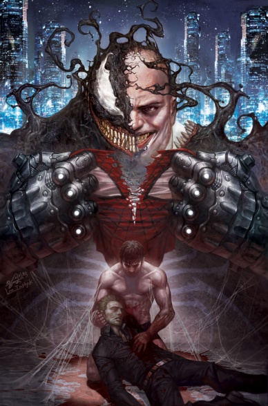
100th Anniversary Special: Spider-Man
Written by Sean Ryan
Illustrated by In-Hyuk Lee
Reviewed by Brian Salvatore
Last week’s “100th Anniversary” issue sent the Fantastic Four on a voyage to 2061 felt bold and new, and like nothing else that book has ever really produced. This week’s installment, focusing on Spider-Man, didn’t exactly feel forward looking or take many risks. If anything, this looks like how a creative team in 1995 would predict 2000, not 2061, to be. And they wouldn’t exactly be wrong – we are supposed to be oohing and aahing over technology that seems not just possible in 2014, but probably even – woah, holograms! Haven’t you guys seen 2Pac at Coachella?
What doesn’t help is that In-Hyuk Lee’s art looks like cut scenes from a PS1 game about Spidey – everything is overly rendered, too crisp and clean, and lacking any sort of character whatsoever. This art – this precise art – is why people fear digital means of creation. Nothing about this feels organic, or creative, or fun. This is as paint by numbers as any Spidey comic I’ve seen in quite some time.
The story, while not perfect, at least tries to do something bold. Featuring the Kingpin killing Eddie Brock for his technology-enhanced symbiote, the story has a fun concept, but most of the issue is just Peter getting his ass kicked and trying to find out which way is north (seriously). The end of the issue tries to tug at the heart strings a little, but by that point, I was so checked out I didn’t even care.
Marvel has been doing such fine work over the past few years – if this is what their books will look like in 2061, I’m pretty sure I won’t be buying them.
Final Verdict: 3.2 – Passionless and dull, with a healthy dose of meh thrown in for good measure.

Avengers #32
Written by Jonathan Hickman
Illustrated by Leinil Francis Yu
Reviewed by Matt Dodge
Spinning of the “Original Sin” crossover storyline, this issue follows Captain America, Black Widow, and Starbrand on a trip five thousand years into the future, where an unexpectedly familiar face informs the trio of the deadly events soon to occur in their present. The last time Jonathan Hickman’s “Avengers” series had a big event crossover it was with the Hickman penned ‘Infinity’ storyline, effectively elevating those issues above mere tie-in status. While Hickman might not be the mastermind behind ‘Sin’, but that doesn’t this months “Avengers” feels any less grand or important. Cap’s journey into the future is just as impressive and engrossing as anything going on in main event, and Hickman crams an incredible number of ideas into two-dozen pages.
The far future setting gives Leinil Francis Yu plenty of opportunities to show off, and the result is very impressive. His style is realistic, built around solid lines, which makes the fantastical sights in the future feel grounded and plausible. The pacing of the issue helps create a real sense of grandeur, and the moment when the faux-forest setting gives way to the deep solar system is a real show stopper. There isn’t a real big action scene in the issue, but it never feels boring or dull. The glimpses of destruction and catastrophe succeed in upping the stakes with only a panel or two to work with.
Final Verdict: 9.0 – This is one tie-in definitely worth checking out, and Jonathan Hickman should win an award for least-boring-massive-amount-of-exposition.
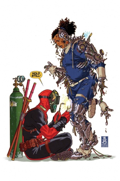
Deadpool #31
Written by Brian Posehn & Gerry Duggan
Illustrated by John Lucas
Reviewed by James Johnston
Agent Preston forever. Ever since Deadpool got married in an issue that confused some readers and certainly confused readers who hadn’t been keeping up with the digital-first “Gauntlet” series, “Deadpool”‘s taken time off from being the star of his own book to let Agent Preston, the character find of 2012, shine even more. Deadpool running away from his problems regarding his maybe-daughter into easier problems like vampires and Dazzler haven’t been terribly interesting on his part, but they set up a nice contrast for Agent Preston to do the actual work in this series. And with her new robot body, she steals the entire issue with a fight scene that’s sharing page space with another fight scene involving Dazzler and vampires. Preston is just that good.
Said scene has also sold me on John Lucas’s art. I’ve been a bit wary on it since he came onto the series a couple issues back (what the heck is going on with Dazzler’s chest… and face… everyone’s face, really) but he still knows how to illustrate a brutal fight scene or two.
The New 52 “Deadpool” series is shockingly one of the smarter series coming out of Marvel and this issue just proves that point further. . Agent Preston times a hundred. AgentPreston.com Agent Preston Forever!
Final Verdict: 7.8 – Though the vampire subplot that’s cropped up lately isn’t too compelling, Agent Preston manages to salvage this issue.

Eerie #5
Written and Illustrated by various
Reviewed by Drew Bradley
Dark Horse has a pretty good track record for anthologies (see: “Dark Horse Presents”), but this specific issue failed to impress. It contained four stories, although one of them was only one page. They are all pretty well told and drawn, but none are particularly memorable. John Arcudi and Aaron Conley present the most creative story of the bunch, but the ideas in it don’t feel properly explored or thought out. A second read or any kind of inspection of the story makes it feel rather hollow. Brandon Montclare and Henry Flint deliver a fun monster story that feels like it could have been an interesting morality tale, but ends up being just a twist on the Godzilla mythos. Bill Parente and Ken Barr had the most entertaining tale, but it doesn’t seem to fit in a horror anthology. Sure, the main character is hideous, but it’s not particularly scary. It doesn’t even try to be. When it’s all said and done, the best part of “Eerie” #5 is Jim Pavelec’s cover, and you don’t need to shell out five bucks to enjoy that.
Final Verdict: 4.0 – “Eerie” (and its sister book “Creepy”) has a good track record, but this issue just doesn’t measure up.

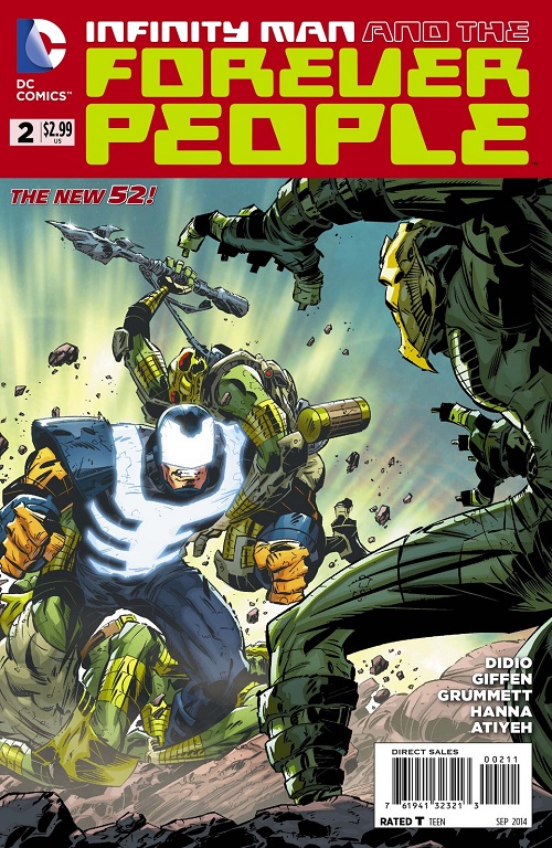
Infinity Man and the Forever People #2
Written by Keith Giffen and Dan DiDio
Illustrated by Tom Grummett
Reviewed by Greg Matiasevich
Issue #1 was a pleasant surprise. Actually, the fact we have this series at all is a pleasant surprise given the climate at DC right now. And coming from the same team that brought us the gone-too-soon OMAC revamp, “Forever People” plants its flag in that same Kirby territory of the New 52; not so much re-imagining as re-configuring. The problem in this issue is that a large part of that creative team is missing.
For unavoidable reasons, Keith Giffen had to pass off art chores for issues #2 and #3 before coming back to the book full-time with issue #4. Tom Grummett, his replacement for this issue, is a good artist. He’s a solid superhero storyteller and those chops are on display here, which puts this book in the upper tier of DC’s line-up for that reason alone. He’s done great Kirby-infused work, particularly with his “Superboy” run with Karl Kesel. But he’s not Giffen, and his zigging where Giffen zags keeps this issue from really capitalizing on the gonzosity of last issue.
Didio and Giffen’s basic premise of these young New Gods on a combination Peace Corps/study abroad mission is maintained here. The dialogue brings you up-to-speed if you’re starting with this issue. And while we don’t quick get to see the scene from the cover, there is action to be had. And Darkseid, looking quite a bit more bedazzled than when Kirby left him.
Continued belowFinal Verdict: 7.0 – Solid pre-52 values keeps this New 52 title on track, but not quite keep the same balance as last issue.

Justice League United #3
Written by Jeff Lemire
Illustrated by Mike McKone
The work that Lemire and McKone have been doing on this book, thus far, have felt like the start of a true “Justice League” story – heroes of various backgrounds, joining together to fight the big fights; what one can’t accomplish alone can be accomplished by a team. While the other Justice League books have been focusing on different aspects of the superhero team, “United” seems to be fine with taking that classic route.
That is a welcome change, but it shares one key component with the other New 52 books that holds it down: the pace. This is a book that takes a long time to get rolling, as Equinox, the new character, still hasn’t met the rest of the team, the team still hasn’t really coalesced, and everything feels very tentative. The lineup of the team is poised for interesting and fun stories, and this issue does a nice job showcasing a few members’ skills, but it still feels like a “coming together” type story. I think I speak for many fans when I say that the trope of every new series starting with an origin story needs to end. This team firing on all cylinders would be far more interesting than seeing the 5th Justice League origin story of the New 52 (count ’em: JL proper, International, Dark, of America, and now United).
The book’s art continues to be dazzling, and helps overcome some of the monotony of the story. McKone’s work is clean and sharp, and he feels just as confident drawing advanced alien worlds as he does simple characters talking together. The scene with the misfiring Zeta Beam was handled perfectly, and McKone’s art shows the scene as being tense, funny, and dangerous all at once.
The ending of the issue is meant to be a shocking cliffhanger, but due to recent events in “New 52: Futures End,” not only do we know it is a fake out, we know how and why it is a fake out. In fact, “Futures End” has had a strong tie to the series in general (due to Lemire’s presence on both, no doubt), as an early issue showed how Animal Man and Green Arrow grew, in 5 years together, to be great teammates and friends. That is a story I’d much rather see than having the rivalry continue unabated for the time being. DC seems to think that uncertainty and conflict is what makes a team work, whereas it is almost always the opposite.
Final Verdict: 6.0 – The seeds are there for a great series, but the pacing leaves the issue feeling a bit slight.

Spider-Man 2099 #1
Written by Peter David
Illustrated by Will Sliney
Reviewed by David Harper
I have to admit, I was extremely skeptical of this book. Sure, I like Peter David and Will Sliney, but conceptually this seemed pretty weak, and Spider-Man 2099? Really? Was that something we needed?
It’s not a question of need, however. It’s a question of quality, and this book is actually a highly entertaining yarn filled with sass and spectacle ably rendered by Sliney. Overall, Sliney’s someone that I have been up and down on, but in this issue he excels in moments both grandiose (like Miguel soaring through the sky in costume) and small (the whole scene where he’s renting his place), and he’s able collaborator for David as he hits the visual story beats very well.
David’s found a good place for his voice here, which makes sense given that he created the character. Miguel…errr…Mike is a pretty fantastic lead, and the voice David uses for him (is he a dick or just playing one for his own benefit?) is pretty snappy and inviting. The characters feel real, the villain is amusing in his futuristic pragmatism, and we’re entertained throughout.
Continued belowThis book is remarkably solid, but nothing you could truly call “spectacular” or “amazing.” At least not yet. I’m looking forward to #2, which is the most spectacular thing of all, as I picked this up truly on a lark. Well done Peter and Will. Now keep it up.
Final Verdict: 8.0 – this book was a very pleasant surprise

Usagi Yojimbo Color Special: The Artist
Written and Illustrated by Stan Sakai
Colors by Tom Luth
Review by Vince J Ostrowski
“Usagi Yojimbo” has been a quality mainstay in comics for 30 years running. It recently went on hiatus while Stan Sakai worked on the Dark Horse Comics “47 Ronin” adaptation, which was terrific, but the absence of Sakai’s samurai hare was certainly felt. The latest “Usagi” color special reprints a few past stories with the addition of Tom Luth’s colors. “Usagi” is a simple, elegant book that works just as well whether it’s in color or in its original black and white – and is really worth seeing in both styles.
“Usagi Yojimbo” is a book that you can pick up at any point and immediately understand and appreciate, because of how elegant it truly is. A conscious effort is made to display the core of Usagi’s character in every story, whether it’s a 2 page comedic interstitial tale (‘Cut the Plum’ for example, in this issue) or a longer harrowing story such as “The Artist”, the story for which the color special is titled. Sakai uses Usagi’s moral samurai code to inform nearly every “Usagi Yojimbo” story. Every story point relies on Usagi’s principles and lack of self-doubt. In the color special, whether he’s caught in the middle of a ghost samurai battle or protecting an artist from would-be assassins, Usagi simply does what’s right.
Sakai’s art is the straw that stirs the drink, no doubt. By now, Sakai has such a mastery over his cartooning that you can always expect consistent, careful quality every time you pick up an “Usagi Yojimbo” book. Nothing is rushed, nothing feels neglected. Sakai’s character work is expressive and conveys all of the nobility and honor inherent to the title character. Most of all, a Sakai sword fight is never a bore to experience and each move is carefully rendered. In this particular set of stories, there isn’t much variety to the environments, but he has that skill in his toolbox as well.
“Usagi Yojimo” is an enduring work of comic fiction and a mark of high quality for the industry. With Stan Sakai’s name comes a tradition of cartooning excellence that you can expect just about every time. There are few bets on the stands are sure as a Sakai comic, and “The Artist” color special is no different.
Final Verdict: 9.0 – A terrific reprint, whether you’ve read these stories before or not.
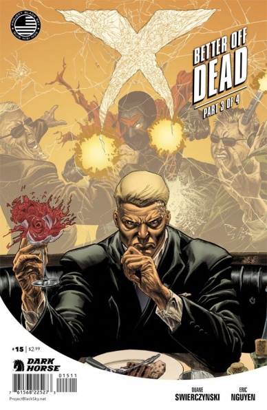
X #15
Written by Duane Swierczynski
Illustrated by Eric Nguyen
Reviewed by Drew Bradley
If you haven’t been following “X”, you’ve been missing some quality material. The tagline for the series was ‘super brutal,’ and that’s a pretty decent description. Yet, unlike some other violence-centered works, this one never feels gratuitous. Swierczynski writes X as a complex character with a very strict moral code that requires the violence. Nguyen depicts the injuries clearly, but never makes the blood and gore the central focus of the visuals.
This particular issue is part three of the four part ‘Better Off Dead’ storyline, but is still a great place to start reading if you haven’t tried the book yet. All the relevant details are recapped with natural sounding dialogue and narration to keep you on top of things without being forced or redundant to long time readers. It’s also a very satisfying read despite being in the middle of a multi-part plot. Swierczynski packs every installment of “X” with lots of material, but also manages to leave you wanting more when you reach the last page.
Final Verdict: 8.0 – Brutal in the best way possible


