
There is a lot to cover on Wednesdays. We should know, as collectively, we read an insane amount of comics. Even with a large review staff, it’s hard to get to everything. With that in mind, we’re back with Wrapping Wednesday, where we look at some of the books we missed in what was another great week of comics.
Let’s get this party started.
Avengers Undercover #10
Written by Dennis Hopeless
Illustrated by Tigh Walker
Reviewed by David Harper
The work Dennis Hopeless did on “Arena” and “Undercover” was not something I ever thought I’d love, yet love it I did. It was a story about the unfairness of being young and famous in all the worst ways, and had a lot to say even as it was tearing many of its main characters lives apart. Built on his deep understanding of the characters, Hopeless did a phenomenal job of making us love his work, and he had a perfect partner in Kev Walker in doing so. It’s sad to see it come to an end, but as these things tend to do, here it is ending before its time.
And therein lies the problem with this issue itself, as you have three issues worth of story piled into one, and the issue suffers from that weight. With the book needing to bring the plot to a close, find a satisfying conclusion for the characters, and tease what’s next, we’re given a book that’s at times the equivalent of trying to take a sip of water from a firehouse: you can do it, but it’s not advisable.
Buried in here though are some genuinely great elements. Arcade’s eventual role in the whole thing, God Mode, Cammi’s departure and more are amongst the highlights, but it’s just too much, too fast. Even beyond that, the book itself has some narrative inconsistencies – why is Alex back after he so notably departed last issue? – that make it an eyebrow raising endeavor as well.
Walker’s art doesn’t help, as it isn’t the right Walker – Tigh Walker, not Kev – and it feels to a degree like we’re reading a comic illustrated by someone in Kev’s family who understands what Kev tries to do, but doesn’t quite reach the same levels. A lot of the same look and feel is there, but the brilliant storytelling mind and raw energy of Kev’s art would have taken many of these moments to another level. Walker’s not a bad artist, just one that happens to be following an absolutely tremendous one who has become very well known for his work on this series.
So ultimately, as much as I wanted to love this, Undercover comes to an end in an unsatisfying fashion. I don’t really blame anyone involved for it, as it really feels like a book that had plans, but didn’t have the time to execute them properly. It’s an issue that wanted to tie up every loose end, but in the process, it ended with more of a thud than a bang.
Final Verdict: 4.0 – It came and it went too fast, and there in lies the problem
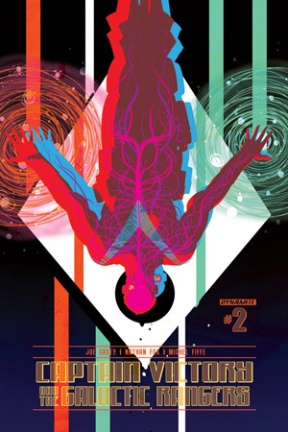
Captain Victory and the Galactic Rangers #2
Written by Joe Casey
Illustrated by Nathan Fox and Michel Fiffe
Reviewed by Brian Salvatore
Dynamite has really been stepping up its game over the last year or so, and “Captain Victory” is one of the clearest example of them really committing to bringing in top tier talent. Casey and Fox are the main contributors to this story, but almost equal credit needs to be given to colorist Brad Simpson, who does some stunning work here. On his Fox pages, his work is more raw and risk taking, to match Fox’s unhinged moments of space-insanity.
Casey’s story splits the action into three parts – one in space, and two on various planets, including a 1970s Earth (including a great Television pre/post Richard Hell discussion), and each one is fascinating in a totally different way. This issue also includes a flashback, illustrated by Michel Fiffe, which showcases Simpson’s talent again, matching Fiffe’s tone perfectly, and creating a nice intermezzo in the action to tell an important piece of Victory’s origin.
Continued belowOverall, this doesn’t feel as indebted to Kirby, visually, as I expected, and in a way, that is a relief. I love Kirby, but I am glad to see everyone here following their own muse, instead of trying to replicate a style that few can master.
Final Verdict: 8.2 – A really fun issue, and a masterclass on how to revive an old property.
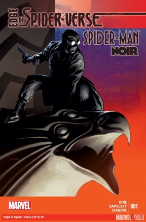
Edge of Spider-verse #1
Written by David Hine and Fabrice Sapolsky
Illustrated by Richard Isanove
Review by Vince Ostrowski
David Hine’s original creation, “Spider-Man Noir”, returns to kick of the latest Dan Slott event “Spider-verse.” Because Spider-Man is so deeply entrenched in what it means to be a New Yorker, the character slips into a noir setting like a velvet glove. Pitting Spidey against Mysterio, depicted here as a vaudevillian magician, proves that with just a few tweaks, Spider-Man can play in most any genre. He’s a bit like Batman in that regard, another character that David Hine had a particularly good handle on. Hine examines what a Spider-Man with more rudimentary and dark methods would look like, and the results are familiar enough to feel true to the character, while being novel enough to maintain interest.
The art from Richard Isanove gives off the same ethereal vibe that Jae Lee gave to a similar period piece in “Before Watchmen: Ozymandias.” The characters seem to glide through a smoky 1930’s noir, all the while evoking the same strange sorts of villains that populate the version of Peter Parker’s Manhattan that we already know and love – just maybe a little less garish and colorfully. The character designs look incredible – most notably that of Spider-Man, who sports a getup that absolutely should not work half as well as it does. Everything about the art in this book screams elegant and accurate – the perfect use of a multiversal gimmick.
“Edge of Spider-verse” couldn’t have kicked this off in a better manner. Perhaps the best is yet to come, but this issue will help toward pulling you down the rabbit hole.
Final Verdict: 8.0

Superman by Geoff Johns and John Romita Jr. #1 Director’s Cut
Written by Geoff Johns
Illustrated by John Romita Jr.
Reviewed by Brian Salvatore
DC has done a number of these “Director’s Cut” issues before, but I had never held one in my hands and read it before (full disclosure: I received this from DC as an advanced review copy). And while I can see the appeal of an issue like this, I do have a few problems with this book. First of all, the price point. This comic is selling for $4.99 – and while I understand that it isn’t every day you’re able to look at raw pencils or read an un-illustrated script, this is only for people who read and, presumably, loved “Superman” #32, the issue this is reprinting. That means that, if you bought both the original issue, as well as this “Director’s Cut,” you’re selling out nearly 9 dollars for 20 pages of story.
In addition, the title is a bit misleading – yes, it is reprinting the first issue of the Johns/Romita “Superman” run, but that issue is #32. Granted, this is for super fans, but it still doesn’t make it easy for a fan of that issue to find this and pick it up. And, while we’re on the title – what exactly is a director’s cut? It is a director’s vision for the story, which is different than the released version. It usually involves longer sequences, different takes, a different edit, etc. This issue is simply the component pieces of the issue – the pencils and the script. There is nothing different about this issue at all, besides the lack of color and ink. Finally, we have the “raw” pencils with digitally inserted lettering. That makes them, well, not raw anymore. The pencils are, therefore, compromised.
This seems like a lazy attempt at doing something like the IDW Artist Editions, but doing it on a much smaller scale, without the care, the oversized format, or the deluxe packaging. I suppose, if Johns and Romita produced one of my favorite all-time comics, then I’d pick this up. Outside of that, I don’t know who this is for.
Continued belowFinal Verdict: 2.0 – This is expensive collection backmatter without a clear purpose.

Teen Dog #1
Written and Illustrated by Jake Lawrence
Review by Vince Ostrowski
Boom! Studios has been giving opportunities to some very cool creators lately, resulting in a slew of cool new alternative books like “Lumberjanes” and “Bee and Puppycat.” It’s worth mentioning that Boom! also handles the comic publishing rights to some irreverent animated properties such as “Adventure Time” and “Regular Show”, to which these aforementioned books definitely spiritually relate. “Teen Dog” is yet another entry into a line that is full of irreverent, catch-phrasey humor mixed with sneakily wonderful art sensibilities. It’s easy to look at something like “Teen Dog” and think that it’s too cartoony or simple-looking for its own good without reading the book and actually seeing all the ways that this not only benefits the tone of the book, but doesn’t give the art enough credit to begin with.
At this point, “Teen Dog” basically revolves around a too-cool teenage dog rolling into school and the shenanigans that ensue from there. Each page has a punchline or two, or a fun use of perspective. What makes Jake Lawrence’s creation so potent is the way that it tells jokes at the expense of no one in particular, and engages with the reader through a rapidfire pacing.
Final Verdict: 8.5 – “Teen Dog” is a riot
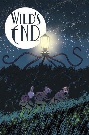
Wild’s End #1
Written by Dan Abnett
Illustrated by I.N.J. Culbard
Review by Vince Ostrowski
Abnett and Culbard set out to do their version of an anthropomorphic epic fantasy adventure. I’d be hard-pressed to name two creators I’d rather see attempt this, and the duo doesn’t let us down. As we all know, Dan Abnett is thoroughly British, which I only bring up to illustrate just how acutely suited he is to a story set in a quaint rural briar town, filled with charming animal-people saying charmingly British, sometimes folksy things. But each character has their own voice and their own motivations for participating in the story. Some are self-serving, some stem from curiosity, and some are still very mysterious to the reader. This is an established bustling town that we start to learn about through the eyes of a relative newcomer, a strangely low key dog.
I.N.J. Culbard comes with the amazing consistency we’ve come to expect. He’s got so much work coming out that it’s hard to believe how good it all looks. I’m not sure what the timeline was on the art for “Brass Sun”, “Wild’s End” and “Dark Ages”, but these are all gorgeous books worth picking him. Here, Culbard opts for a cartoonists take on the anthropomorphizing of his characters, rather than a more realistic approach. He presents and dresses these characters like ordinary men and women who just happen to be animals. The visual jokes are subtle and appreciated all the more for it.
With a timeless look, a strong sense of character and relationships, and a twist ending that makes the conceit of whatever comes next incredibly intriguing, “Wild’s End” is another Abnett and Culbard book not to be missed.
Final Verdict: 9.0

X #17
Written by Duane Swierczynski
Illustrated by Eric Nguyen
Reviewed by Drew Bradley
This issue was billed as a Starting Point, and the story holds up pretty well if you’re a brand new reader. If you’ve been following the series, though, this issue feels a little…off. Through a natural source of exposition, Duane Swierczynski sets up the status quo, but it’s the status quo from eight issues ago! A character who’s recently been turned into a brainwashed drug addict is suddenly X’s friend again. A good cop who was in prison just two issues ago for conspiring with X is now out patrolling the streets again without explanation. All of this was so out of left field, I even double checked for one of those “Two months ago…” captions, thinking maybe I’d missed it, but nope. Nothing there. Hopefully the plot points which have magically undone themselves will be covered at some point, because it cheats the reader for them to be resolved off panel.
The art also had a few awkward moments which didn’t seem to fit the story. At one point, a woman is pretending to be a prostitute as bait for a serial attacker. Over the course of a couple pages, she turns down several potential johns, which is fine. In one panel in particular though, she’s appears to be turning him down by bending over in front of him while he pulls his pants back up. Making matters worse, the perspective makes it look like she’s supporting herself by leaning on the top of a streetlight which is across and above the street. Eric Nguyen has done great work on “X” in the past, but this was not his best showing.
Final Verdict: 7.0 for new readers, 5.0 for old ones


