
There is a lot to cover on Wednesdays. We should know, as collectively, we read an insane amount of comics. Even with a large review staff, it’s hard to get to everything. With that in mind, we’re back with Wrapping Wednesday, where we look at some of the books we missed in what was another great week of comics.
Let’s get this party started.

“Awake” #1
Written by Susan Beneville
Illustrated by Brian Hess
Reviewed by Stephenson Ardern-Sodje
Beneville and Hess’ latest offering via Action Labs Entertainment may be a little off the beaten track as far as comic books go, but it’s definitely worth looking for. The initial concept is beautifully simple: we follow an teenage alien with the ability to talk to planets, and yet, even from the first few pages, it’s obvious that under Beneville’s guidance there’s enough material for a really meaty story to develop.
Beneville’s scripting feels smooth and unforced from the get-go. We’re introduced to Regn, our uncertain protagonist, and her companion Operi, through engaging dialogue, and Beneville quickly manages to build both a sweet and realistic pairing and draw in the reader with a sense of looming unease that makes for pretty page-turning reading. The first issue deals largely with Regn’s inexperienced attempts to communicate with her first planet, and Beneville really manages to make this process enigmatic enough that by the time Regn makes first contact you’re completely on her side. Beneville’s writing has echoes of Avatar: The Last Airbender and the book, which is clearly aimed at a similar demographic, should definitely find a home with fans of heartfelt, coming of age sci-fi.
Hess’ art is perfectly paired with Beneville’s light accessible script. His disney-esque character design is heavy on expressive features, to the extent that I’d argue some of the most effective panels of storytelling in this issue are the silent ones. However, Hess doesn’t let the cuteness of his work detract from the drama and there are still several points throughout the issue that manage to feel pretty threatening. At the moment it’s still nothing much heavier than PG-13 mild peril, but it definitely hints at Hess’ ability to up the ante visually when the need arises, without breaking too far from his fun loving style.
This is a book with some pretty distinctive and specific story points to accomplish. Most specifically, to display the idea of a person ‘talking’ to a planet. In such a visual medium, these exchanges could’ve ended up feeling slow and stagnant, but Hess manages to inject some real energy and a sense of almost dizzying scale into Regn’s first encounter with the planet. His construction of the planet personified lands somewhere between an old-school golem and the volcanoes from Pixar’s latest short Lava, a balance that works so well that I’m confident he’ll be up to keeping the reader’s interest through numerous interplanetary exchanges.
I may not be the primary audience for this book, but I thoroughly enjoyed it. It’s great to see indie producers making books for younger readers that still pack a real storytelling and visual punch. This book has been billed as quite a passion project for both creators and I’m looking forward to seeing where they take it next.
Final Verdict: 7.9 – Cute, quirky, and full of heart, “Awake” is a book that proves good storytelling knows no age limits.
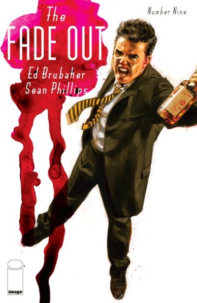
The Fade Out #9
Written by Ed Brubaker
Illustrated by Sean Phillips
Reviewed by Matt Allegretti
Ed Brubaker and Sean Phillips’ boozy, Hollywood noir story begins its final act in “The Fade Out” #9, an issue that primarily focuses on the backstory of our two main characters, Charlie and Gil. Keeping in line with the series, Brubaker elects to focus more on characterization than plot. Without spoiling too much, we learn how Charlie and Gil, two struggling screenwriters, met in Hollywood before the war, sharing an office to work on studio scripts during a happier and more productive time. Of course being a Brubaker story, we know things are going to go bad and they do. Although Gil respects Charlie, his jealousy gets the best of him and leads to a drunken decision at a bar that alters both men’s lives and careers. Brubaker’s rich characterization makes you care for these flawed characters whose fates are linked. The hard-boiled narration complements the dialogue perfectly.
Continued belowAs good as the writing is, Sean Phillips’ superb visuals make the 1940’s come to life. Phillips is able to convey so much by the way a character gestures, holds a cigarette, sips a drink. Although he’s influenced by the noirs of the time period, his style is unique. There is a flawless consistency to his panels that perfectly tells the story Brubaker wants to tell. I was particularly impressed with the way he draws Gil’s eyes, lost and lifeless, especially in the scene where he lays on the couch in a drunken stupor. The image is haunting. Elizabeth Breitweiser’s use of color perfectly complements the writing and art without drawing unneeded attention. Her palette is refined and doesn’t have the digital-look that plagues so many comics these days.
If you’re reading “The Fade Out,” you already know how great it is. For anyone who isn’t, pick up the first two trades before reading this issue. “The Fade Out” is a complicated story, each issue building on the last. It’s a comic that needs to be read more than once to discover its subtle intricacies. By the end of this issue, the tension is rising and there’s a real sense that Charlie and Gil may be doomed by the decisions they make. I can’t wait to see what happens next.
Final Verdict: 8.2 –”The Fade Out” #9 is a superb installment in a series that keeps getting better with each issue. Highly recommended.

The Fiction #4
Written by Curt Pires
Illustrated by David Rubin
Reviewed by Michelle White
I hate to say it, but I’m getting burnt out on miniseries. Especially science fiction and fantasy miniseries, and “The Fiction” from BOOM! embodies a few of the reasons why. It’s had exposition dumps that have taken up too much space; characters that haven’t had room to grow; and now, with this last issue, an ending that feels sudden, with a hint of deus ex machina. There’s even an “Oh, what a fool I’ve been!” romantic climax.
I am being a little mean here, but my point is that miniseries are suited to a particular kind of tale, and I don’t think the themes that Pires and Rubin have been exploring could ever have fit in such a small container. The story so far has been about reading, and about corruption, I guess, and growing up, and the nature of reality. And those are some pretty big ones. Meanwhile, a lot of the questions concerning the rules of this universe remain unanswered.
David Rubin’s efflorescent art is what drew my attention to the series, and what kept me reading. The character work is unique, giving us interesting faces to look at and interpret. The backgrounds are vast, implying the grand scope of the book-world. And, highlighted by Michael Garland’s vivid colours, the pages of this final issue are arresting, full of unusual textures. The last confrontation is wonderful to look at: the way the grand, archetypical figures are rendered injects extra surrealism into the proceedings.
Considering its overall beauty — and awarding it a some extra points for ambition – “The Fiction” is definitely an accomplished series, and an enjoyable one, if you plan to read it slowly and give it all time to digest. It just hasn’t been a great example of short-form fantasy, however eye-scorching the art.
Final Verdict: 6.0 – A feast for the eyes but ultimately unsatisfying in terms of story.

Harley Quinn #20
Written by Amanda Conner and Jimmy Palmiotti
Illustrated by John Timms
Reviewed by Jess Camacho
Harley Quinn has become slightly divisive among comic books fans. Many cosplay her and buy her merch but for some she’s approaching the point of overexposure. Regardless of how you feel about that, “Harley Quinn” has been one of the most consistently enjoyable comedy series that either one of the “Big Two” are putting out. Conner and Palmiotti have a wicked sense of humor and taking Harley out of Gotham City and sending on her own wacky adventures has proven to be a lot of fun.
“Harley Quinn” #20 is the start of another one of these adventures as Harley heads back to the west coast to help find the daughter of Borgman’s nurse. By now, Conner and Palmiotti have settled into a groove. The stories are violent, off the wall and sort of kind of tied to New 52 continuity. I’m not a stickler for that so it’s fine that she exists on her own like this. The comedy in this issue isn’t so different from what we’ve seen before and at times, the jokes get repetitive. This is one of the biggest complaints I’ve had over the last few issues. They’re creating fine scenarios, with “Harley Quinn” #20 being a good if not groundbreaking plot, but some of the jokes can fall a little flat. What does work excellently here is the way Conner and Palmiotti make Harley Quinn care. She’s working for money but along the way she makes friends and she’s only here because she wants to help Borgman’s nurse. The final page cliffhanger isn’t really surprising but it could get weird very quickly given the history between these two characters in the New 52.
Continued belowJohn Timms is a frequent artist on this series and he’s a great compliment to regular artist Chad Hardin. His work is a lot more suited for action heavy sequences. Body motions, body angles and positioning all come together to make for a really quick moving, action heavy story. The only problem with this is that Harley can get a bit too stealthy. Harley isn’t really all that stealthy and should move more like a brawler. Timms does a really nice job overall with sight gags. There are moments that don’t need dialogue and they sometimes work better than scenes with dialogue. Alex Sinclair continues to do a fabulous job on colors. He brings a really nice sun soaked and neon light tinged vibe to the Los Angeles scenes.
Final Verdict: 7.0 – “Harley Quinn”, while not the most ground breaking ongoing series, is a blast and this issue is no different.

Ivar, Timewalker #9
Written by Fred Van Lente
Illustrated by Pere Perez
Review by Ken Godberson III
Bad News: With the release of Valiant’s December solicitations, “Ivar, Timewalker” will be concluding at issue #12.
Good News: Yes it’s ending, but according to writer Fred Van Lente, it was always meant to be twelve issues.
And as we get into the last arc, “Ending History”, Van Lente has been crafting what has been my favorite time travel story in the last few years, including pretty much the last three years of “Doctor Who”. A majority of that is because the time travel is really not that important. Well, at least not as important as to the two characters that have led this book: Ivar Anni-Padda and especially Doctor Neela Sethi, who has now taken the reigns of protagonist after issue #8’s conclusion. While her awkward clumsiness, geeky references and deadpan humor are still here, she is clearly changed, more mature and stronger. Which is good because her companion is not the Ivar we were accustomed to. At the earliest stages of his life, closest to his ancient Ur roots, Ivar got a bit of…well, sexist. Will say though, Van Lente plays the behavior off as a pretty damn bad thing and we do get quite the few jokes at this younger Ivar’s expense. Neela’s going to have a big headache on her.
Pere Perez is on pencil duties and I have been a fan of his since Stephanie Brown’s Batgirl series. The artists of this series have had the mastery of facial expressions to implement comedy and Perez is no different. There is a smoothness and fluidity to the work that fits the breezy and fun tone that the book has become synonymous with. As for coloring, I’ve had problems with Andrew Dalhouse’s work in the past (mainly his DC work that seems to have some kind of filter over everything that saturates the color) but here the color work does pop and is vibrant to carry some of the sillier moments like the Clown Vikings and the T-Rex Centurions.
Oh yeah, did I mention those? Well, they’re here and they’re awesome.
Final Verdict 8.5- “Ivar, Timewalker” is on the homestretch and it looks like it’s leaving as it started, with a lot of heart and laughs.
The Paybacks #1
Written by Donny Cates & Eliot Rahal
Illustrated by Geoff Shaw
Reviewed by Alice W. Castle
The best aspect of any good spoof or satire is that it should be able to work as a legitimate example of whatever it is spoofing. For example: Shaun Of The Dead spoofs zombie films while also being a legitimately good zombie movie in and of itself. This is the thing that really makes “The Paybacks” #1 stand out. Not only is it built around a solid high concept – the repo men of the superhero world – with an excellent sense of satire aimed squarely at the melodrama and ridiculousness of superhero comics, but it also serves as a solid superhero story itself with an amazing level of worldbuilding. The characters and settings and world that “The Paybacks” conjures in just one issue would be enough to make this is a worthwhile read, but the fact that it comes packaged with a satirical story with a real sharp wit sprung from a clear love of superhero stories makes it almost essential reading.
Continued belowThis is all brought together by simply gorgeous artwork by Geoff Shaw which, again, would not feel out of place in an actual superhero comic, but is allowed to run wild with how ridiculous the world is and that makes it all the more interesting. There’s also a solid bit of action that Shaw renders incredibly well, building to a lot of really hype moments throughout the issue. It punctuates the introduction of such an interestingly built world with some great action setpieces and balances out the issue a lot. But Shaw makes sure to always keep a touch of visual comedy to the action scenes that really rounds out the humour of the issue. All in all, “The Paybacks” really surprised me with how well it spoofs superheroes while also being a love letter to them.
Final Verdict: 8.6 – A really strong debut issue that may poke fun at superheroes, but it clearly does it out of love.

Secret Six #6
Written by Gail Simone
Illustrated by Tom Derenick
Reviewed by Brian Salvatore
From a horrendous opening issue, “Secret Six” has made quite the comeback. What was then a needlessly scratchy, dour book has become a weird, and glorious family story. Sure, it isn’t the most subtle thing on the stands, nor does it really compare to the past Secret Six books. But talking about what the book isn’t, instead of what it is, is missing the point.
Tom Derenick fills in for the team of Dale Eaglesham and Ken Lashley, who were supposed to be alternating arcs, but Lashley hasn’t been seen in some time. Derenick has a good handle on these characters, and continues the tradition of the book having some of the best ‘background stuff while big fights are happening the foreground’ in all of comics. He does a really nice job of capturing everyone’s (bizarre) personalities and continuing the feel that Eaglesham has been building in this arc.
Simone has assembled this strange cast, and has given each of them interesting qualities, but no one stands out like Ralph Dibney, the Elongated Man, who looks nothing like you’d expect him to, but is ever the gentlemen, the husband, and the detective. Simone, by centering the book around him, lets the book’s slightly cheesy ‘we’re a family now’ attitude work, whereas most other characters just wouldn’t fit that approach. Dernick does wonders in this issue with him as well, playing with his size and malleable form to create some stunning sequences.
The issue ends on a cliffhanger, and because of the tone of the book, it feels more dramatic than it probably, in reality, is. But again, the book’s tone is so specific and unique, that maybe we really are in for a dramatic event next issue. This book, with one foot in the Bat-verse, one foot in the ‘Dark’ line, and with its ass clearly in the classic ‘bwahaha’ Bronze Age DC, is a real under-appreciated treat right now.
Final Verdict: 7.5 – Fun, sad, popcorn comicbookery.

Sex Criminals #12
Written by Matt Fraction
Illustrated by Chip Zdarsky
Reviewed by Keith Dooley
The latest issue of “Sex Criminals” is not only titillating, but informative as well. Suzanne and John are still on their quest as they interact with an ex-porn star professor, a Sailor Moon-looking “cum angel”, and a strange sex totem that looks positively religious in nature. Fraction and Zdarsky also continue to push forward the subplots of various supporting characters. Like the previous eleven issues, the team of Fraction and Zdarsky maintain their expert juggling of zany sexcapades, empathetic characters, and intelligent writing. “Sex Criminals” #12 is a perfect distillation of those features that they continue to excel at with ease.
Zdarsky has gleeful, creative fun with the situations that Fraction imposes on Suzanne and John. The aforementioned “cum angel” is simultaneously cute, scary, and downright monstrous but always hilarious. Zdarsky has a clean, smooth style that infuses the craziness with a sense of reality. Characters have highly expressive faces and the setting, whether real-world or fantastical, has an aura of believability that transforms the book into something much more powerful with Zdarsky’s contributions.
Continued belowFinal Verdict: 8.5 – Sex toys, cum angels, and endearing characters. What more could one ask for in a comic book?

Shutter #15
Written by Joe Keatinge
Illustrated by Leila del Duca & Owen Gieni
Reviewed by Matthew Garcia
For their third arc of “Shutter”, Joe Keatinge and Leila del Duca wisely decided to take a step back and let us all catch our breath. Numerous story elements are settling into place to get ready for the next levels of insanity. And while Keatinge and del Duca take the time to give us some answers we’re also given more and more questions. Even a more expository episode of “Shutter” reveals an incredibly imagined and expansive world, while maintaining its overall tension.
Keatinge and del Duca are obviously having a blast creating this world. Del Duca tackles each new location with relish and delivers these incredibly imagined landscapes. Her art remains as expressive and mysterious as it did when “Shutter” started, but the stuff she’s able to accomplish continually becomes more and more impressive. Her delivery of splash pages, her intuition for the close-up, her sense of space within the panel all lead to make the story engaging and fascinating, even when there’s not loud action occurring on page.
Keatinge is probably turning in some of the best and most interesting writing of his entire career. He juggles about three different character groups as they spread out over the world and gives each just enough time for characterization that you can feel them growing.
Their collaboration is also becoming more assured and confident. I don’t think the Joe Keatinge and Leila del Duca of “Shutter” #1 would have been able to pull off the first six pages of this issue. What might have been some weird po-mo, self-indulgent l’art pour l’art instead is delivered just as fascinating and enchanting as the rest of this series.
Final Verdict: 8.0 – No doubt “Shutter” reads better with a stack of issues or as a trade than on its own, but goddamn is each installment a monthly treat.


