
There is a lot to cover on Wednesdays. We should know, as collectively, we read an insane amount of comics. Even with a large review staff, it’s hard to get to everything. With that in mind, we’re back with Wrapping Wednesday, where we look at some of the books we missed in what was another great week of comics.
Let’s get this party started.
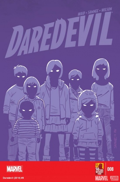
Daredevil #8
Written by Mark Waid
Illustrated by Chris Samnee
Reviewed by Drew Bradley
This issue marks the start of a new arc and, maybe it’s just me, but the ‘writing for the trade’ element really stands out here. Don’t get me wrong – this was a fun read like always. Fifteen years ago, the events of this issue would have been scattered as a subplot over four or five issues, building in a way so that when the ‘Purple Children’ arc started, it would already be in full swing. But, this being 2014 instead of 1999, we get the whole story fed to us in one easily digestible arc, and this issue feels slow and underwhelming because of it. This is nothing but setup, and that does not make for the most exciting comic reading.
Samnee’s art is great as always, but there were two particularly weak spots in this issue. The first has nothing to do with Samnee, and everything to do with Waid and colorist Matthew Wilson. In comics, purple is often used to color shadows. Most people understand this intuitively. As such, the drama is severely hurt in a scene where a boy in a dark room is being attacked by purple children, and himself turned purple. The “transition” panel where he’s turning purple just looks like a regular but poorly blended shadow effect. The other weak spot was the last panel, where San Francisco is shown in the children’s silhouette. Or their silhouette is framed by San Francisco. It’s hard to say for sure, because Samnee appears to have changed his mind halfway through on which element of the panel would be the negative space.
It sounds like I’m really knocking “Daredevil” #8, and I don’t mean to. I like the creators and the series. This issue was weak compared to the rest of the series, but is still head and shoulders above most of the other superhero comics out this week.
Final Verdict: 6.0 – A weak “Daredevil” is still a strong book.

Dark Horse Presents #2
Written by
Illustrated by
Review by Vince Ostrowski
There are a half-dozen reasons within this issue of “Dark Horse Presents” to give the anthology series a shot. There’s not a dud in the bunch, though the “Aliens” preview story by Chris Roberson and Paul Lee depends heavily on your interest in that property to begin with (it’s clearly a part of a bigger whole that requires some investment). Aside from that, you get an experimental dreamlike story from one-of-a-king artist Brendan McCarthy, complete with his signature psychedelic color choices. Another installment of “Wrestling with Demons”, a gritty but humorous story from Palmiotti and Gray – the plot of which can be taken quite literally from the title of the story. Andy Kuhn’s art is expressive and dynamic, making a talky “middle” segment of the arc pretty captivating.
“Action Philosophers” is back too, and full of the typically witty and informative angle you’ve come to expect from Van Lente and Dunlavey. This time they take on the art of the argument, applying it pointedly toward the way that debates happen on the internet. Spoiler alert: nobody usually ends up looking good. Taken literally, “Action Philosophers” is a nice guideline for how to behave in an internet debate – as a comic, it’s a hilarious and potentially accurate look in the mirror for all of us.
I’d be remiss if I didn’t feature my favorite comic in the bunch: “Resident Alien”, which continues to be a satisfyingly slow-paced look at a literal alien integrating into society and solving mysteries. Hogan and Parkhouse continue to craft an unstated character exploration that keeps you wanting more, even though there’s little that’s controversial, traditionally exciting, or action-packed about it. It’s just sneaky good comics.
Continued belowBut perhaps the most quality segment of all comes in the form of “Banjo”, a writer’s turn for colorist Jordie Bellaire. Declan Shalvey draws a melancholy and harrowing historical tale that starts with a simple night of banjo practice. Bellaire shows a keen sense of restraint in her writing, and allows Shalvey to tug on your heartstrings by contrasting the images on the page with the song that narrates through the story. Bellaire also colors, choosing a nostalgic and muted color scheme to highlight the feeling of melancholy.
Understated and beautiful, “Banjo” is one you should be checking out. “Dark Horse Presents” may be back with an all-new lower page count format, but the quality is as good as ever. As I stated at the top, there’s not a story here that you’ll want to skip.
Final Verdict: 9.0 – Nothing but bang for your buck
Fables #144
Written by Bill Willingham
Illustrated by Mark Buckingham
Reviewed by Jess Camacho
By this point of “Fables” you’re either a long time reader or you’re not. There’s nearly nothing here that will be understandable to a rookie. Bill Willingham and Mark Buckingham cover a lot this issue. With six issues left they’re clearly not wasting any more time. There’s still a lot to cover before #150. The issue’s main focus is on Ozma and Beast as they take up their former Super Team mantles and face down the zombified, monster Bigby Wolf.
“Fables” #144 is a chapter full of heartbreak and violence. Neither is new to the series but it’s much more effective at this point since we’re so close to the end. There’s little room to come back from any of this. Using the Super Team concept again allows us to get a perfect superhero vibe from Willingham’s script without him being confined to a superhero comic. He hits all those beats but adds his own spin to them.
Mark Buckingham as always does a really great job on art. This issue is very heavy on the action. Ozma in particular looks very Wonder Woman like. She flies majestically and exudes confidence. The reveal at the end is one part fan service and one part logical story progression. It’s going to be a tense ride leading up to the grand finale but I wouldn’t have it any other way.
Final Verdict: 8.0 – The night is darkest just before the dawn right?
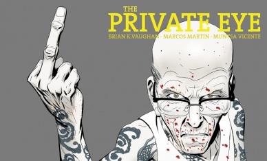
The Private Eye #8
Written by Brian K. Vaughan
Illustrated by Marcos Martin
Review by David Harper
In another highly enjoyable chapter from the Panel Syndicate, everything is coming to a head as P.I. and Raveena are hot on the heels of DeGuerre, and we’re given an added layer of intrigue to the book as it increasingly resembles the real world with the constant invasions of people’s (particularly celebrities’) privacy.
I think the thing that stands out the most about this issue is the humor that comes from some of the technological ideas people have in this world. Whether it’s P.I. openly wondering how long it will take for an iPad to wake up or DeGuerre’s unveiling of the reasoning behind his plan (and it being the idealized version of the internet), there’s some laugh out loud moments involving the perception (or misperception) of the internet in this future. Vaughan’s voice works very well here, as the characters amuse and delight even to potentially their bitter end (in Melanie’s case). Maybe even more than Saga, this book highlights what works so well when Vaughan is on, as the old timey feel of this future and the gumshoe like storyline pairs perfectly with his dialogue.
Plus, the badassery of CNN in the future makes me yearn for them to be real.
So much of this world is Martin’s, however, and his highly expressive characters – DeGuerre in particular is a tour de force – help make every story beat hit all the more. He’s an incredible artist, and the biggest reason why is his abilities to tell a story. Whether it’s the aforementioned characters or the depth of the world he gives us or the way the story flows together, this book would just not be the same with anyone else. Also, anyone who can give us a page like Gramps’ in your face close-up with CNN is a genius in my book. It helps immeasurably of course that Muntsa Vicente is providing colors, and her solid tones and atypical, unreal choices to some situations help keep the story focused where it belongs: up front and in our faces.
Continued belowThis is a remarkably well crafted book that is near its end. If you haven’t caught up now, you might as well just wait ’til it wraps, but don’t miss this gem. It’s online only, and it deserves your love completely.
Final Verdict: 8.0 – things are really getting good towards the end
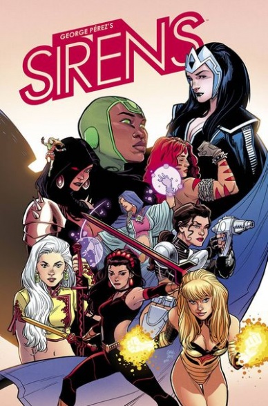
Sirens #1
Written and Illustrated by George Perez
Reviewed by Brian Salvatore
George Perez doesn’t need to convince anyone of his credentials – the man is a living legend. And so, with that reputation, it would be easy for Perez to rest on his laurels, do the convention circuit, and never feel the need to create anything new again. But, that’s not Perez, and “Sirens” is his attempt to create a new team all of his own, for no reason other than he feels it is a fine story to tell.
And, perhaps, there is a good story within his plans for the series, but “Sirens” #1 doesn’t really tell a story at all. It is a jumbled mess of time travel and parallel lives that borrows heavily from a number of tried and true tropes without adding anything too exciting to the mix. The good news is that Perez is also doing the art for the book, and his skills are still what they were a decade plus ago. Despite much of this, presumably, being created while Perez was forced to wear an eyepatch, the work is no worse for the wear. Perhaps his skills aren’t quite what they were in the 80s, but they aren’t too far off.
But, sadly, the story is so cliched and dull that the art takes a backseat to the yawns from trying to get through these 20 pages. I am a huge Perez fan, and would love to see him do more work than he has in the past few years, but not if this is what it will look like.
Final Verdict: 4.2 – A disappointing work from one of the all-time greats
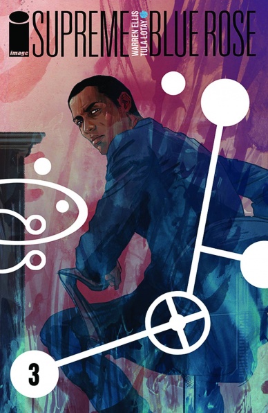
Supreme: Blue Rose #3
Written by Warren Ellis
Illustrated by Tula Lotay
Review by Vince Ostrowski
“Supreme: Blue Rose” is Warren Ellis at his most obtuse. Ellis has always been a man of higher thinking and deeply speculative fiction, but he’s never been this abstract about it. That’s a definite change for the “Supreme” property, which up until now has mostly been known for being a Superman facsimile that dealt a lot with complicated science, but never really had a complicated plot to go with it. Ellis utilizes dreams, strange visions, and interspersed fictions within the “Supreme” fiction to keep the air of mystery and discontent high. Tula Lotay is the secret weapon, as her gorgeous pop art blends all of these together, delineating them visually when the script does not. As more and more of the mystery of “Supreme: Blue Rose” unfolds, much of the fascination arises from how we get to see Lotay unveil it. But don’t get me wrong, Ellis deserves every bit of his share of the credit, as well. He’s taken a Lois Lane approximation in Diana Dane, and made her an incredibly complex, flawed, and fascinating character in less than 3 issues. She’s a real world Lois Lane, who comes across as both an incredibly capable journalist (she definitely feels like the person for the job at hand) and yet totally in over her head. In a book with growing ties to the “Supreme” fiction you may already know, she’s become easily the best character in the bunch. “Supreme: Blue Rose” may feel abstract, but it’s worth getting into. There are books you read in a breeze and then there are books that you sink your teeth into and they end up rewarding you deeply.
“Supreme: Blue Rose” is just that book, and it looks absolutely gorgeous the whole way through.
Final Verdict: 9.0 – This is going to have a place on some year end lists, for sure.

Thor: God of Thunder #25
Written by Jason Aaron
Continued below
Illustrated by Esad Ribic, R.M. Guera and Simon Bisley
Review by David Harper
This series has been one of my favorites since launch despite the occasional hiccup (namely, the Malekith arc), and this issue that acts as the series finale – at least this iteration of it – is a fitting conclusion in that it isn’t really one. One of the things I love so much about this series is how Jason Aaron approaches Thor as a god, as a warrior and as a person, while maximizing the characteristics that makes him each of those things.
Sometimes (often) this is done by actually showing off a young version of Thor, the present day Avenger Thor, and King Thor, the god king at the end of time. This issue does a good job of giving finality of sorts to each version, and it’s told in the form of storybook tales from the library of Asgard. As a plot device, it works incredibly well, and I like that Thor’s granddaughters are worked in so seamlessly.
Of the tales, only the frost giant/young Thor story drawn by Simon Bisley stands out as featuring any real serious negatives, as Bisley’s art feels a roughhewn to the point of distraction, occasionally making the pages a bit tough to track on, and the story itself is a pretty basic one that clearly acts as set-up for a future tale and little more. I enjoy Thor hanging with Vikings and doing Viking things as much as the next guy, but its transparency in getting Laufey back on the board of play is pretty obvious.
The other stories are much bigger successes, with Aaron’s “Scalped” collaborator R.M. Guera pairing with him to tell an incredible and haunting origin story for Malekith, and Esad Ribic is there to do Esad Ribic things throughout. The page where King Thor dusts off the cover of the forbidden book at the end is worth the cover price alone, and Ribic crushes it. The fact that Ribic isn’t carrying on to the next book is the single biggest flaw of that upcoming series to me, and I’ll truly miss his work on the book. However, if that teaser towards the end of the future of the book is any indication, we’re in store for another classic coming soon.
Overall, this was a very solid, occasionally great issue. However, the Bisley/frost giant story left enough of a sour taste in my mouth to push the book down a couple notches. Regardless, I’ll miss this book, and I have high hopes that the next iteration will continue its spirit on very well.
Final Verdict: 7.0 – a good not great conclusion to the epic series that shows a promising future for the next iteration of the series

Uncanny X-Men #26
Written by Brian Michael Bendis
Illustrated by Kris Anka
Reviewed by Jess Camacho
Given the events of the “Uncanny X-Men” “Original Sin” tie ins, the story was naturally going to follow the major reveal of Xavier’s biggest secret Matthew Malloy. X-Men history was forever changed by this development however it’s an addition that has allowed for Cyclops and the things he’s done a bit differently. While the Original X-Men are out meeting Miles Morales, this team is struggling with the bigger issues which is why “Uncanny X-Men” continues to be the stronger X title.
This issue sets up a potential game changer for the X-Men and that’s why it’s such a great issue. Bendis really shows off the work he’s done with these characters. Particularly Cyclops. Again he comes out as a supporter of the character but uses Firestar to do. The outsider perspective is a smart choice as she’s totally unconnected to the deeper drama.
However, with the strong writing by Bendis, it’s Kris Anka who really shines. Chris Bachalo is a fantastic artist but Anka brings in something else entirely. Their styles are very different. Anka has very firm lines and it’s far less sexy. He also adds just the right amount of creep factor to a few scenes involving Matthew Malloy. Things are getting bad very quickly for the characters in this book but with AXIS on the horizon, this is a series you’ll want to get involved with.
Final Verdict: 8.3 – Cyclops was actually right. Take that!


