There is a lot to cover on Wednesdays. We should know, as collectively, we read an insane amount of comics. Even with a large review staff, it’s hard to get to everything. With that in mind, we’re back with Wrapping Wednesday, where we look at some of the books we missed in what was another great week of comics.
Let’s get this party started.
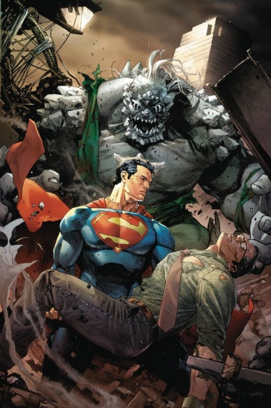
Action Comics #959
Written by Dan Jurgens
Illustrated by Tyler Kirkham
Reviewed by Alice W. Castle
“Action Comics” is a comic with so much going on, nothing has actually happened. After only three issues, we have made zero story progression past what was made in the first issue. Writer Dan Jurgens has been juggling roughly four different story threads through yet another fight between Superman and Doomsday with not enough space to give any of them their due.
Pacing of a series as a whole is not something I generally want to decry for the fear that my criticism comes off as impatience. However, this time I’m making an exception. After three issues, “Action Comics” is in the exact same place it was at the end of the first issue. Sure, Superman and Doomsday have fought a whole bunch, but none of the major story threads have been expanded on. The new Clark Kent is still a walking enigma whose every scene plays out the exact same. Jonathan and Lois continue to just sit on the couch watching the fight while having the exact same conversation in every scene. Lex Luthor, meanwhile, gets to have scene after scene of him saving someone while Superman muses that this Lex Luthor might not be as all consumingly evil as the one he’s used to.
My point is that this is the third straight issue in a row where the exact same plot beats have played out and it’s exhausting. It bogs down the art of Tyler Kirkham, who could create a genuinely epic feeling superhero brawl if his pages were given space to breathe. If Jurgens could calm down for like five seconds, pick one story thread and play it out in full before moving to another this wouldn’t feel like “Action Comics” is a whole lot of wheel spinning and not a lot of action.
Final Verdict: 4.4 – For all the bombast of the brawl between Superman and Doomsday, this is an exhausting yet middling comic that already feels played out after three issues.
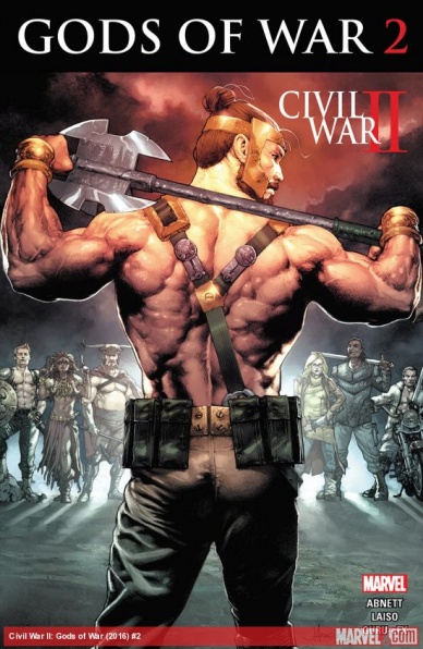
Civil War II: Gods of War #2
Written by Dan Abnett
Illustrated by Emilion Laiso
Reviewed by Robbie Pleasant
With the Avengers all off fighting each other, Hercules calls together all the heroes of old he can get together to fight the Uprising Storm. It’s sort of his own mythical Avengers team, or would be if they could ever get along. While “Gods of War” is technically a “Civil War II” tie-in, it’s really so disconnected from the event that it’s really just a continuation of Dan Abnett’s “Hercules” run with a few nods to the “Civil War II” events.
Still, the Gods of War features some characters from throughout various mythologies, who may or may not have appeared in comics before. Each has adapted to the modern world in a different way, an idea that worked well in the earlier “Hercules” comics and continues to work well here. It’s assisted by the fine artwork and character designs by Emilion Laiso, giving them physiques, scars, and a general sense of presence befitting legendary heroes, give or take the occasional jawline of exceptional thickness.
The action sequences are well-paced, and each hero or deity has a unique fighting style (even the ones whose strategy tends to be “Hit it, and if that doesn’t work, hit it again but harder”). In both pacing and art, the battle seems fierce, and the hits have an impact to them. All things considered, it advances the Uprising Storm storyline nicely, and frankly, considering how “Civil War II” has been so far, it’s to the comic’s benefit that it doesn’t shelve anything to get involved in a debate over the morality of precognition.
Continued belowFinal Verdict: 6.7 – A great team and some good action, although it feels a little rushed in terms of progression. One of the better “Civil War II” tie-ins, considering it uses the event comic as a backdrop to the continuing story from the “Hercules” comics.

The Flash #2
Written by Joshua Williamson
Illustrated by Carmine Di Giandomenico
Reviewed by Brian Salvatore
Of all of the ‘Rebirth’ titles, “The Flash” is, so far, the one with the most high concept, big picture hook yet, and we see that play out in the closing pages of issue two: what if there were suddenly a lot of speedsters? This doubles down on a few of Barry’s traits (he’s a natural leader and teacher), and makes Central City a truly interesting place to spend forty or so pages a month.
All of this is delivered with a frenetic, freewheeling energy from Di Giandomenico, whose pages give the impression of speed from jump street. Everything he does looks like it is moving faster than comfort, and the loose nature of his pencils fits the story like a glove. I’m still getting used to his Barry, visually, but in terms of overall storytelling, he is making something truly, truly special thus far.
This issue is mainly focused on Barry and August, his fellow police officer turned speedster, but we get nice interludes with Iris and Wally, both of which do a nice job of giving Williamson’s versions of the characters some footing. Wally, especially, is a character in need of some definition, and I look forward to Williamson’s continued efforts to make him not just ‘the other’ Wally West, but the Kid Flash, and an important supporting character for this book.
Final Verdict: 7.9 – A really fun issue that, while a little decompressed for my tastes, promises a really fun story going forward.
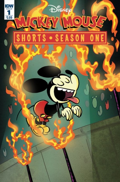
Mickey Mouse Shorts Season One #1
Created by Paul Rudish
Adapted by Scott Tipton
Layouts by John Green
Reviewed by Matthew Garcia
Disney will probably never produce another feature like “The Emperor’s New Groove” again. Fast paced, irreverent, with fantastic set pieces, exuberant animation, and boasting the only good performance ever from David Spade, the film is a bonafide cartoon. And while the feature animation department nowadays might be going for epic, Paul Rudish’s Mickey Mouse shorts have thankfully carried on that spirit. They are wonderful little gems and this new book from IDW takes a handful of them and tries to translate them into the comic form.
“Mickey Mouse Shorts” #1 is essentially one of those Cinestory things Disney likes to put out, where they take some choice frames from the movies and lay them out and letter them for a comics page. Typically, these have worked better for the 2D animated features (check out “101 Dalmatioms”) than the 3D animated things, but then again, 3D animation has never looked as strong as 2D animation. Rudish’s Mickey Mouse series looks like it was made by hand with Flash animation and the frames actually have a nice presence on the page. Layout artist John Green chooses some wonderfully communicative shots and has a nice sense of panel and page composition to make them catch the movement and mania of the scenes.
Sometimes, however, Scott Tipton’s adaptation script comes out overdone. This was exceptionally noticeable in the ‘Tokyo Go’ segment. The original short was told through gesture and select noises, loaded with visual gags. But in this, Mickey’s constantly talking, muttering to himself, and barking out orders. Maybe IDW wanted it to feel like there was more material being offered, but this choice upset the pace of the scene and made it less fun.
According to the back matter, this will be a four-issue limited series. “Mickey Mouse Shorts” #1 captures the delight and spirit of the show. Most of all, seeing these key frames really helps clue you in to the amount of work and effort the animators put into each and every shot. It could almost double as an “Art of…” book as a comic. Irreverent and fun, it’s capable of making your grin broadly the entire time you’re reading it.
Continued belowFinal Verdict: 7.5 – A solid translation and one of the better Disney Cinestories.

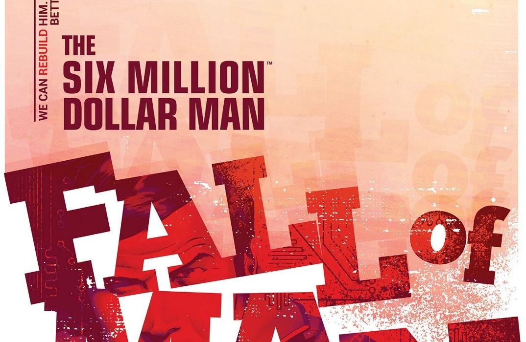
“The Six Million Dollar Man: Fall Of Man” #1
Written by Van Jensen
Illustrated by Ron Salas
Reviewed by Stephenson Ardern-Sodje
Reboots, reworks, and revisits to classic concepts are huge both in Hollywood and in the comic-book world, and as Jensen and Salas get their hands on Steve Austin, the world’s most expensive man, we get a chance to see another seventies classic character ‘rebuilt’ for the 21st century.
Jensen’s script is tight. From the title to the very last page, he works hard to make sure there’s pretty much no wasted space. The subtitled ‘fall’ of man hits you literally, as we open with Steve spiralling headlong out of the wreckage of an exploded plane, before moving on to set the scene at OSI, the Office of Scientific Intelligence, with a MI5-like supporting cast of slick scientists, and mysterious bureaucrats who contextualise the setup of the first arc. The Medelin Cartel have been shipping larger quantities of drugs than ever before, and Steve is the only person physically and mentally qualified to crack their covert patterns. The structure of the first half is relatively standard, but as the issue progresses, we start getting increasingly gonzo. Jensen isn’t afraid to really push the 70’s era silliness to its limit, with surprise appearances from a gang of ninjas and an unexpected artificial antagonist/ally that manages to really spin this story out in a direction that you might not expect.
Salas’ art feels vaguely reminiscent of fellow Dynamite alum James Masters’ work on Warren Ellis’ recent Bond run. There’s something controlled and utilitarian about the way he draws bodies, veering away from the hyper-exaggerated forms of superheroes for a much more relatable human aesthetic. There’s a very televisual air to Salas’ panelling that plays nicely against the more conversational sections of Jensen’s script. His pacing and choices of angles help even the more wordy stretches of the story based in the rather drab bowls of the OSI building seem lively and full of energy. Salas manages to use Steve’s cybernetic enhancements sparingly enough that they really pack a punch when we see them in action. There are a handful of compressed panels that show the true range of his movement, but there’s still a sense that we’ve got a lot more to see from this cybernetic secret agent.
This first issue is a great example of embracing the campy, OTT elements of a franchise rather than shying away from them in favour of the dreaded ‘gritty reboot’ fever that Hollywood still seems unable to shake. Jensen and Salas manage to meld the routine with the ridiculous in a way that the TV show could never fully do, alleviating the restrictions of the era and allowing for smooth, seamless cybernetic fun.
Final Verdict: 8.1 – A sleeper success for a seventies reboot that feels like it’s rebuilding a franchise that could just as easily have been forgotten.
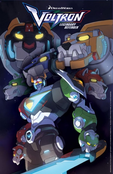
Voltron: Legendary Defender #1
Written by Tim Hedrick & Mitch Iverson
Illustrated by Digital Art Chefs
Review by Ken Godberson III
Voltron: Legendary Defender is the Netflix reboot of the 80s Big Mech anime that effectively took over my life for the week that I binged it. With creative alums from Avatar: The Last Airbender and The Legend of Korra running the show, the animation is crisp and the character work a joy. And because it is an entertainment property, naturally it is going to have a comic adaptation. And I have say, after reading it, this may be the best “okay” issue of the year.
A difficulty with comics such as these is just how limited they really are in how much they can affect things in the world. That isn’t to say that it can be a hindrance, both the Aaron “Star Wars” and Gillen/Larocca “Darth Vader” at Marvel are in the same boat and have both been able to either create some fun stories or enhance scenes from the original source material with added emotional depth. “Voltron”’s story here is very basic: Coran, attendant to Princess Allura and kind of a cross between Varrick from Legend of Korra, Nigel Thornberry and a Clone Trooper, takes the five Paladins (Shiro, Keith, Lance, Pidge and Hunk) out for training with the giant robot lions they pilot, only to run into some old enemies. With Coran captured, they want the Paladin’s to use Voltron to stop a great beast, only for everything to not be what it seems. Like I said, very basic, the big benefit to the comic being that Hedrick and Iverson are writers for the show, so the characters all do feel authentic to the source.
Continued belowThe art by Digital Art Chefs also has the same kind of basicness as the plot. It does a decent job of capturing the art style of the show and does provide some fun character expressions and a bright color scheme, especially when these kids are in the thick of battle. Combat choreography could have been a bit more extensive. It does have a decent expression of motion (ANIME SPEED LINES!) but even then there are some cases where it is hard to guess how one action flows into the next.
At the end of it, this is a decent story, but you won’t miss much if you just watch the show.
Final Verdict: 5.3- An average start to what hopefully won’t be an average comic adaptation.

The Wicked + The Divine #21
Written By Kieron Gillen
Illustrated by Jamie McKelvie
Reviewed by Liam Budd
Kieron Gillen has said that this current arc of “The Wicked + The Divine” is unofficially titled ‘Civil War’ and going off the past three issues, it has certainly lived up to that moniker. Yet no issue has provided us so much bombastic action and actual warfare as #21 wherein Laura/Persephone finally takes the fight to Ananke. It has been very satisfying seeing Ananke getting her comeuppance at the same time as discovering her masterplan. A lot of comics try to hold on to their secrets as long as they can before revealing the truth, to the point where it can become frustrating, but not here. It seems pretty clear what Ananke is after, but what Gillen is keeping to himself for now, is just how she’s going to get it. With only one issue to go before this Volume is over, there is just enough to keep us invested, the precision of Gillen and Jamie McKelvie’s plot is almost surgical. The pacing does feel a little off although with scenes shifting focus too quickly for anything to sink in. I’d especially would have loved to have spent more time with Baphomet and Baal, but unfortunately we’re interrupted with the arrival of the Valkyries.
The artwork in this issue is also a little less polished than usual, don’t get me wrong, McKelvie is one hell of an artist and his ingenuity and skill shines through once more. I don’t think there are many artists out there who can not only choose the most perfect expressions for their characters but also execute them so accurately. Though this is the most action I’ve ever seen him deal with and at times his inexperience is evident. The flow of action is lost within panels filled with lightning bolts, motion blurs, energy talons and countless ethereal party soldiers. There a lot of concepts like these for McKelvie to juggle, but thankfully each are cooler and brilliant as the last and he does show off each at least once on their own, just so you can appreciate something like battling glow sticks all the more.
It’s a blessing that such a skilled colourist like Matt Wilson is involved. He has unleashed all the electric colours he can muster to give the issue an astonishing finish, McKelvie’s art is only complimented by Wilson’s colours. Unfortunately, just like everything else in this issue, it can feel overwhelming at times, especially in the aforementioned action scenes, but I guess if there is a time to turn it up to 11, then this is it.
Final Verdict: 7.9 – Lots of energy, lots of fights, lots of lots. Earplugs advised.


