“Wyrd” #1 promises a dose of dark humor and gritty realism that doesn’t entirely land thanks to inconsistent layouts, a box-standard hero and not enough, well. Weird.
Written by Curt PiresCover by Antonio Fuso
Illustrated by Antonio Fuso
Colored by Stefano Simeone
Lettered by Micah Myers
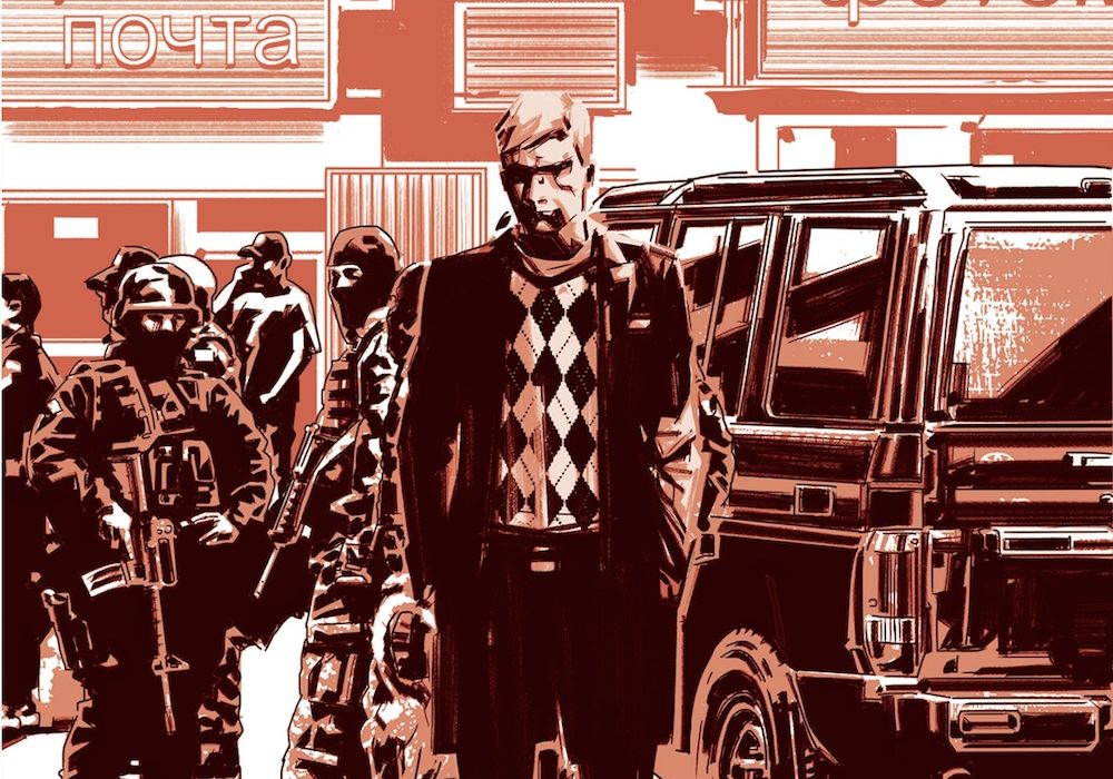
There are problems, cases, too strange for US law enforcement to solve. Pitor Wyrd is the one who solves them-for a fee, of course. An unaging, invincible detective with a penchant for the strange, Wyrd is the one the government calls when things go very badly and very strange.

“Wyrd” #1 does have some good points, so let’s dig in: first, the colors are gorgeous. Simeone does a lot with a little. The sunset-esque palette lends the book a melancholy that the plot can’t entirely handle on its own, and the villain reveal is done well largely because of the mood Simeone brings to bear on those measured panels. Two, the book utilizes a lot of great, over-the-top sound effects that liven up the action scenes and give “Wyrd” a bit of levity that’s otherwise lacking. And three, I will mark out over a Baba Yaga story any day of the week.
That said, “Wyrd” is, unfortunately, pretty normal. In comics, there’s nothing weird about a soldier who’s gone through genetic experimentation and become a weaponized brute at the expense of his humanity. Pires is tossing us a trope-laden softball in issue #1, perhaps to test the waters of our imaginations, and for me it doesn’t work. Sure, the force of the guy is something to be reckoned with, but in terms of strange? I’ve seen it many times before, and with so many chances to stand out from the herd not taken (dialogue, character design, powers) the reveal and high action in the last pages are underwhelming. So, too, are the Captain America send-up, the typewriter font, the heavy poetry of the dialogue and the disjointed action. The discrete elements on the page fit together, but they feel like checkboxes that are being ticked as we go.
To give Pires some credit, tropes exist for a reason, and in comics they can always be done well, no matter how much we’ve seen them. To wit, the opening of the book is a strong example of how to introduce a hard-nosed character. The panels that detail Wyrd’s bones breaking are a nice touch, if a little jarring when the layouts deteriorate, and the message is clear: this is a man who’s desperately, dangerously, suicidally bored. Pires does make this moment count, but the rest of the issue doesn’t hold up – especially as we get to know our foul-mouthed, grim, reckless and recognizably blond European protagonist. Seem familiar?
Layout-wise, “Wyrd” sinks under the weight of its own attempts to be bare and oddly enough, we’re left with a lot of clutter. Disjointed panels don’t flow together and often sport too much, or in one painful instance, only dialogue, for no discernable narrative reason. Keep going, and narrative boxes almost recede into the textured backgrounds, making the flow of information even harder to follow. Read on, and we find a 9-panel grid that feels entirely out of place with the previous pages’ stylings, followed another page of overbearing panels meant to filter our attention down to a single, cold reaction from Wyrd. What’s actually happening is Wyrd’s almost crowded out of the moment, and his slender, unmoored close-up feels like an afterthought. And that’s if you managed to follow the smorgasbord design approach thus far. “Wyrd” seems like it’s fumbling toward an isolating, cold tone in its layouts, but the book’s a bit more chaotic and varied than it should be to start.
While i think Fuso’s style matches Pires’s storytelling, it’s not one I particularly enjoy. Heavy shadows mean Wyrd’s face is often almost obliterated by ink, so if the goal is to keep him at a distance, well done! If the goal is to pump up the dark mood and illustrate how this man’s an army of one, there’s a bit of a disconnect. The city details also don’t feel like they’re cohesive with Fuso’s line in other parts of the book – are we dealing with cartoonish darkness, impressionistic strangeness or gritty realism? There’s a lack of balance in “Wyrd” that seems like the book’s trying too hard to jam it all in, rather than finding its own style or settling into the collage/cut-up visual style that often signals stories gone slightly askew. Myers’s letters are serviceable, though the font is too tall. Narrow lettering conveys claustrophobia and tension, but Myers has to reckon with a lot of narrow panels, which means stacked text that’s conscious of its horizontal boundaries while fighting with the art on some pages.
“Wyrd” #1 doesn’t succeed as a compelling first issue because it doesn’t demonstrate the narrative or stylistic confidence to land on any point it’s trying to make. Should we be feeling the bite of Wyrd’s acidic personality? The horror of his job description? Or the creeping dread of what else is hiding in the shadows? We’re bombarded with all three at once, which is a hard sell in such a small amount of time.
Final Verdict: 5.5 – “Wyrd” #1 tries to be too cool too fast, and with inconsistent layouts, scratchy art and trope-laden storytelling, the tension and atmosphere the book aims for evaporate under self-imposed chaos.


