
There is a lot to cover on Wednesdays. We should know, as collectively, we read an insane amount of comics. Even with a large review staff, it’s hard to get to everything. With that in mind, we’re back with Wrapping Wednesday, where we look at some of the books we missed in what was another great week of comics.
Let’s get this party started.
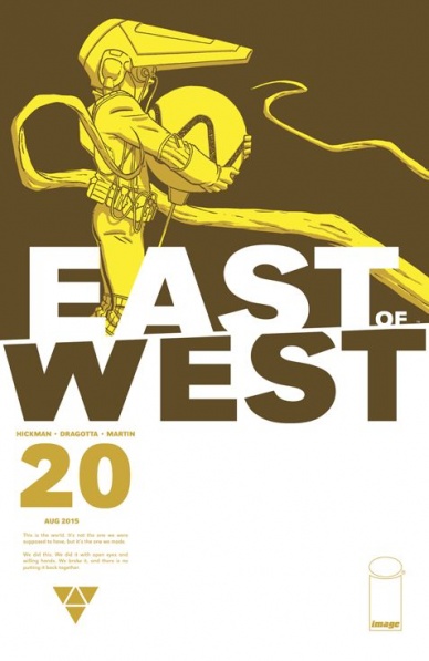
East of West #20
Written by Jonathan Hickman
Illustrated by Nick Dragotta
Review by Ken Godberson III
I know everyone is currently associating Jonathan Hickman with “Secret Wars” and rightly so, but “East of West” is still his best book and a great deal of that is owed to Nick Dragotta and colorist Frank Martin. To be blunt: there is no book on the market that looks like this book. There is an angular nature to Dragotta’s work. Lots of points on people and clothing and architecture. But the art never feels like it is stiff. It can almost be cartoonish, especially with Doma Lux’s “oh crap” face in this issue.
And speaking of Doma Lux, this is very much her character origin issue, also serving as a setup issue to introduce some new world building for several factions on this Road to the Apocalypse, including one that I believe very few of us expected. This is something of a continuing pattern with the book. After the absolute insanity that was issue #19 shuffling the board around, this issue is a quieter, more politics-focused aspects taking center stage. As such, it would be easy to write the issue off as “unexciting”, but the character work done here will no doubt play bigger parts in the issues to come.
Final Verdict: 7.7- A set up issue for greater things to come, but Dragotta and Martin are on magnificent point as usual.

Grayson #11
Written by Tom King and Tim Seeley
Illustrated by Mikal Janin
Reviewed by Brian Salvatore
This issue, more than any other in the series, is really banking on the title of the book. This isn’t a Nightwing book, or a Robin book, or even an Agent 37 book – this is a book about Dick Grayson, the man. This issue asks the question, exactly who is that? King and Seeley approach the question from a few angles, but they only really present the answer in the form of a negative, in terms of what Dick isn’t. Now, I know that this is a storytelling device, and they’re not really bagging on one of my favorite characters in all of media, but it is hard to read the pages where Dick is, seemingly, arguing with himself, and not come out a little blue for the character.
But that’s the point, and it is a point that Janin perfectly illustrates. Tasked with drawing Dick fighting ‘himself’ for most of the issue, Janin tries to both trick you into forgetting which Dick is which, and giving you enough clues that you can keep them straight most of the time. Janin manages to take a script that is very dialogue/exposition heavy and craft it into an issue that reads as smoothly, and action packed, as can be, despite the layers of dialogue.
Janin also borrows a trick from Greg Capulllo in his first “Batman” arc, where Batman is trapped in the Court of Owls’ labyrinth, and you must turn the comic to get the full reading experience. Here, there is a moment where Dick’s implant is getting messed with, and you must do a similar trick with the book – and while it lacks the impact and total confusion that “Batman” issue had, it still works nicely to drive home the point.
The issue ends with a twist, one that will work for each reader a little differently – personally, it works well for me, as this is an espionage thriller, and there needs to be backstabbing and twists and turns and unexpected reveals, and characters being dead/not being dead to make it really work. But I could also see some people having a problem with the reveal, and that’s fair, too. Personally, I’m just happy to see this juggernaut of a team (including colorist Jeremy Cox and letterer Carlos Mangual, who also deserve credit for doing some incredible work) continue to tell unexpected, and thoroughly satisfying, stories for the near future.
Continued belowFinal Verdict: 8.1 – Perhaps a few too many swerves, but overall, this issue rights the ship from last month’s #10, which was the weakest thus far.
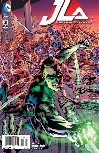
JLA #3
Written by Bryan Hitch
Illustrated by Bryan Hitch
Reviewed by Keith Dooley
Rao, the Kryptonian god, continues to enthrall the citizens of the world in “JLA” #3. Writer Bryan Hitch is building a story with intriguing potential, yet makes a few missteps that he made in the first two issues. Humans’ reactions to Rao is explored yet again in this issue, giving us a sense of déjà vu. The pace of the series, so far, is slow and drawn out. There are also some rare, slightly cringe-worthy, moments of dialogue. However, the scene between Batman and Superman has some insightful and very character-appropriate dialogue. If Hitch continues to write future issues packed with pages like these, then this series can grow into something more than just a showcase for his distinctive artistic style. Characterization is missing while the plot is being drawn out and simply filling space.
Although that recognizable Hitch art is on display in this issue, it lacks any urgency and dynamism. This is understandable because of the story’s pace. Widescreen fight shots and a Wonder Woman lost in a desolate Olympus may look pretty, yet we never become enthralled by or invested in the art. The most exciting scene in “JLA” #3 is the rooftop conversation between Batman and Superman. The reason for that being the focus on character and a scene that doesn’t feel like unneeded filler. Daniel Henriques’ inks are one of the issue’s highlights. He adds a richness and lushness to Hitch’s pencils that cause the art to burst from the page.
Another highlight of “JLA” #3 is Alex Sinclair’s colors. The lush greenery and waterfalls in one scene appear photorealistic, with a character’s reaction to the moment exactly what the reader will experience as well. Sinclair also contributes to how we react to characters. The red glow that surrounds Rao feels both radiant and ominous. We get an uneasy feeling as we bask in the glow of a god.
“JLA” #3 is proof that Hitch needs to find a much tighter focus and a smoother pace for his story. If he continues to draw out this tale endlessly and doesn’t discard the familiarity inherent in his script, then readers are going to become frustrated and stop reading. With characters like the JLA members, there is a lot of new territory for Hitch to explore.
Final Verdict: 6.0 – This latest issue of “JLA” doesn’t compare to Hitch’s best work and his story is only slightly engaging so far. If you’re looking for a popcorn comic with little substance, this issue might be an attractive buy.

Lumberjanes #17
Written by Noelle Stevenson & Shannon Watters
Illustrated by Brooke Allen & Maart Laiho
Reviewed by Matthew Garcia
Since Boom! decided to expand “Lumberjanes” into an ongoing series, the entire creative force behind this book has done well with expanding on the world, developing more of the characters, and establishing the mythology of Miss Quinzella Thiskwin Penniquiqul Thistle Crumpet’s Camp for Hardcore Lady Types without ever falling victim to an overwhelming sense of continuity. There’s this thrill of discovery and exploration throughout all these pages, and even if Stevenson and Watters and Allen and the rest of the creative team behind this series weren’t as invested in the project, it would still be one of the most enduring and engaging monthly books. But Team Lumberjanes obvious joy and desire to make this one of the best books on the stands.
This month’s issue concludes the arc dealing with Rosie and former Lumberjane Abigail as she goes to confront the mighty Grootslang, the current Lumberjanes hot on their trail, and the very fate of the forest dangling by a tusk. The action is kinetic, the jokes fly fast, and even if some of the girls aren’t getting much screen time, everyone has a part of play and the book goes out of its way to establish their importance in the grand scheme of things. In true “Lumberjanes” fashion, there’s also plenty of subversive elements about inclusion/exclusion, identity, and trust.
Continued below“Lumberjanes” #17 also marks Noelle Stevenson’s last issue as lead writer for this series, and I actually appreciated that there wasn’t some grand swan song as she bowed out. No sentimental reflections on the past 17 issues or quiet farewells. The issue wraps up its narrative, sets up the next arc, and sort of allows the characters to all speak for themselves. Not only is Miss Quinzella Thiskwin Penniquiqul Thistle’s Crumpet’s Camp an institution for hardcore lady types, but it also seems to be becoming an institution for Boom!
Final Verdict: 8.8 – Joyful and exciting and full of life, “Lumberjanes” continues to impress month after month.
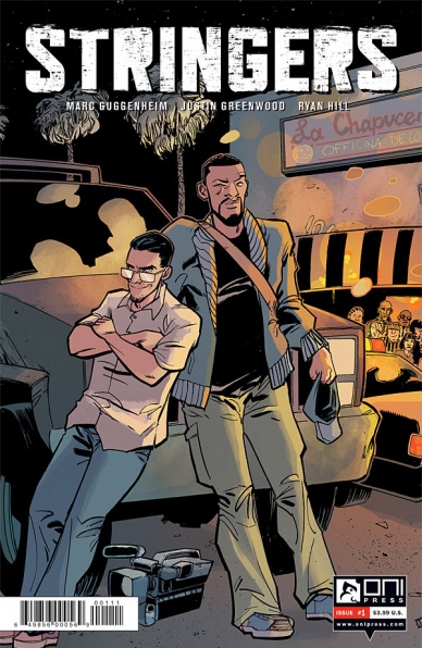
Stringers #1
Written by Marc Guggenheim
Illustrated by Justin Greenwood
Reviewed by Brian Salvatore
Justin Greenwood is back with, what seems like, his 10th project of recent memory – a collaboration with Marc Guggenheim, called “Stringers.” This book is about two men who chase down news events in Los Angeles, like car chases, shoot outs, etc – and sell them to various news organizations. The book, really, is about the two main characters, their different approaches to their job, and the profitability of telling ‘the truth.’
I’m a sucker for news-based narratives, and Guggenheim does a great job of setting the stage in a way that the characters feel both compelled to help, and rebel against, the news agencies in question. Paul and Nick bicker like only old friends can, and their relationship is set up as being both extremely close and growing apart – they want different things out of life, and those goals are somewhat reflected in their attitude towards the job itself. Guggenheim really does a fantastic job of creating a fully formed relationship out of these two men over the course of a few pages.
Greenwood is saddled with the task of adding visuals to the early part of the story, which is really just an excuse to get to know the two main characters. His opening page, which is a faux-collage of various elements of the story, gets almost completely covered by text boxes, but the abundance of information doesn’t slow Greenwood down. This is some of his most kinetic work, with the action packed scenes drawn in a way that suggests quickness and looseness, while the quieter scenes are more gently finished. There is a healthy dose of Ryan Browne-esque onomatopoeia used in the sound effects, and that adds a bit of levity to the story, which already is pretty light in tone, despite capturing a police shootout/chase through Compton.
There are a few standard tropes in play here – the ‘my life is changing but my partner’s isn’t’ conversation that keeps getting delayed, for instance – but the story is so well executed that you don’t really mind if parts seem a little cliche. This is an extremely fun, quick read, that has me eagerly anticipating the next issue.
Final Verdict: 8.5 – A strong debut for this fun Oni miniseries

The Tomorrows #2
Written by Curt Pires
Illustrated by Alexis Ziritt
Reviewed by Jess Camacho
After the death of one of The Tomorrows, Pires shifts his attention to Claudius as he tries to figure out who killed his friend. “The Tomorrows” #2 ends up becoming both a look at the past and a story about friendship and revenge. The first issue of “The Tomorrows” had a hefty amount of world building so with that groundwork done, this issue serves as a more focused and almost standalone story. Pires does a great job at developing the relationship between Claudius and his dear, departed friend but he also does some important work in regards to establishing groups that exist outside of The Tomorrows. With all that said, I do wish we got a bit more about the illegality of art because that was arguably the most interesting part of the premise.
“The Tomorrows” will have different artists on each issue and for this month’s issue, Alexis Ziritt steps in. Ziritt is probably best known for his work on “Space Riders” but in this issue he channels something else entirely. This is sort of a grafitti inspired take on Blade Runner. The character designs are futuristic but still fashionable. The grid panel layouts are excellent and through them Ziritt is able to go crazy in the fight scenes. Metcalfe’s colors are almost all neon and it creates this gorgeous but surreal mood that fits perfectly with the script.
Continued belowWith a changing crew of artists and a writer who has proven himself as someone willing to go against the grain, “The Tomorrows” has the potential to be one of the best miniseries of the year.
Final Verdict: 7.5 – Another solid issue but I’d like to see more of the team.

We Can Never Go Home #4
Written by Matthew Rosenberg & Patrick Kindlon
Illustrated by Josh Hood
Reviewed by Kevin McConnell
Growing up in New Jersey “punk rock” was something that was a rite of passage. I am from the Gen-X crowd being born in the early 1980’s and the Ramones were a soundtrack to my mislead youth. Connecting with punk was easy given the raucous sounds and take no prisoner attitude. However not everything can be “punk rock” otherwise it would defeat the purpose of call it that.
“We Can Never Go Home” exemplifies everything that the counter culture is all about. This issue picks up after a cliffhanger from issue #3 and does not exactly give all the answers up front. In fact it is told from numerous points of view that collide to a great revelation. Duncan and Madison continue their journey on the run only to find that they are not the only ones with their gifts. They are at a crossroads on what to do next, do they turn themselves in or do they attempt to find the people behind their gifts?
Matthew Rosenberg & Patrick Kindlon capture the essence of youth supreme precision. During an argument about midway through the book that sets the stage. I felt as if my wife-to-be and I were discuss one of the many things we argue about. Duncan & Madison are true teens with no direction. Everything is ideal and the world is their oyster in a way. Rosenberg & Kindlon use this angst and confusion to give the two main characters depth and make them feel human. Both leads are coming to terms with their choices and they grow (and recede) with every new challenge.
Josh Hood’s art is reminiscent of the album covers of yore. His line work is perfectly straight with perfectly defined characteristics. There are a lot of vehicles in this issue too that gives Hood a chance to flex his muscles for these details. During the super power moments everything fits perfectly in this world. It never feels like it is out of place or too fantastic, it feel ordinary. IF anything Hood’s artwork bring the spirit of normal kids with abnormal powers in a boring world.
My favorite part about this book is the feeling that I have been in this situation before. It is a coming of age story that reminded me so much of moments in my youth. There is a certain nostalgia that adds to the DIY charm of this book. Without a doubt it is one of my favorites series of 2015.
Final Verdict: 7.7 – Barreling towards a conclusion with a sequel on the way, We Can Never Go Home is everything I love about comics. A great story, solid art and I middle finger in the air attitude.


