
Long gestating and frequently delayed, Lee Bermejo’s “street level, sci-fi” post-apocalyptic romp finally makes its way to comic shelves. Originally announced way back in 2013 with the Vertigo Defy line (which also included “Sandman: Overture”, “The Wake”, “Coffin Hill”, and “FBP” when it was “Collider”), it never appeared in any solicits and continued getting teased but never released.
Now, like two years later, the first issue is here. But with a project that’s sat for so long in development, the question comes up: is it worth it? Did it all pay off?

Written and Illustrated by Lee Bermejo
Colored by Matt HollingsworthIn the post-apocalyptic city of New Angeles, killing isn’t just a crime – it’s entertainment. When the “big one” finally hit the West Coast, Los Angeles was left in ruins. And when the U.S. government decided to cut the city loose, things went from bad to worse. To survive, L.A. did what it does best: It turned survival into entertainment.
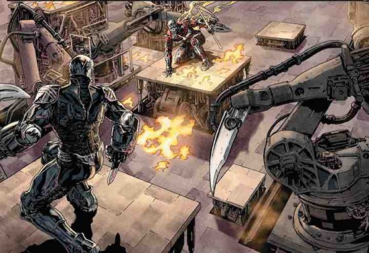
Now, thirty years later, the city of New Angeles is thriving once more thanks to the blood sport known as SUICIDERS – a TV series that combines the spectacle of hand-to-hand combat with elaborate, high-tech obstacles that test each competitor’s ability to survive. But these competitors have an edge: They’ve been freakishly enhanced by drugs and technology. The results are both marvelous and monstrous, as the man called The Saint begins to rise above his fellow Suiciders.
“Suiciders” #1 is a crescendo of a book, starting off at a low hum and ending in explosive chaos. It’s set 30 years after a catastrophe that basically killed all of L.A. and focuses on one of the most celebrated and spectacular competitors in this deadly gladiatoresque sport. Bermejo is creating a comic that emulates those action/sci-fi movies from the ’80s that Stallone always used to appear in, where the men were powerful and terrifying, never showed any emotion, and always spoke in thinly disguised, incredibly insulting innuendos, and where even the most confident and assured women became bumbling messes when they see the shirtless hero. It’s firmly and proudly in that genre and doesn’t do much to stray away from that.
For the most part, “Suiciders” #1 is concerned with setup. Bermejo gives us some gives us some quick glances at his cast of characters, just enough for us to understand who they are and their place in the bigger narrative. He gives us New Angeles and Lost Angeles and the hidden connecting tunnel in-between. He shows us this massive gladiatorial event known as the Suicides and drops hints that it might be a commodified version of some event way out in the boonies. He tells us about a major cataclysmic event (probably an earthquake) from 30 years ago that threw L.A. into disarray. He gives us a sense that this will be about religious fundamentalism, class warfare, self impression and identity, and spectator sport. These are teased, but I’m sure they’ll be explored as the book continues to be released.
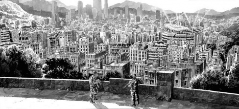
Bermejo throws in more than a fair amount of religious references and imagery throughout the book. Not only does the whole thing open with a character named The Saint, out of costume, kneeling at this massive, gory crucifix that looks like it came out of Mel Gibson’s atrium, but there’s also these three distinct environments the story takes place in: New Angeles, which is surrounded by this huge wall that blocks the city off from the rest of the world, Lost Angeles, which we only see a passing glimpse of, just enough for us to know that this is a place we do not want to deal with, and finally, an in-between zone, this underground corridor filled with all manner of debris and destruction. It’s Heaven, Hell, and Purgatory.
The characters also frequently speak about “salvation” and every action they take seems to be a way for them to get to salvation. Circles and halos constantly appear for the central cast to walk toward. There’s a lot of walking in “Suiciders”, whether it’s our protagonist, The Saint, heading into the arena; a highly notorious journalist looking to get an exclusive interview; a pair of refugees trying to make their way into a walled off city; and a couple guards on standard patrol along this barrier. Bermejo seems to stress that these people are all searching for a salvation as they can best understand it.
Continued belowThe first part of the story is definitely the strongest. The casual buildup to the main event, the slowly developing hum of the crowd in the background, the small scenes set backstage as The Saint prepares himself for battle. It was effective and interesting and definitely the only time I felt any investment into the story.
However, Bermejo’s script is more awkward than assured. He tends to repeat information a lot. I think pretty much every single character mentions that it’s a.) a Suicide night and b.) that the world changed 30 years ago at at least one point. I get that Bermejo may have wanted us to know that this information constantly hangs over this world, that it permeates the peoples’ minds and is the only fucking thing anyone can think about, but it comes off more like he’s shoving us through the narrative, like he doesn’t trust us from the first six dozen time he mentioned it to understand what’s going on. He tries out a bunch of ambitious narrative ticks that I’ve seen a lot in Brian Azzarello’s work in particular (no surprise, since Bermejo arguably made a name for himself on their “Luthor” and “Joker” collaborations), some interesting match transitions, some cool juxtaposed images and texts, but I didn’t think many of them really landed too well. He introduces so many characters and so many different things going on that the jumping back and forth between them never gave me enough time to feel my way through any of them.
What I’m especially conflicted about, though, is Bermejo’s art.
I think it’s atrocious.
Sure, it’s technically competent, and features some superb draftsmanship and perspective work. But the hyper-realism, the pristine grotesqueness and perfect control of grit make it a.) difficult to read, especially when a lot of people are talking at the same time and b.) just gross to look at. I found the artwork to be muddy, incomprehensible, frequently static, and filled with moments where you can feel there’s supposed to be a lot of action, but it never much comes alive. It’s striving to be so lifelike that it has no life. This was especially evident in the actual Suicide event, where the characters were constantly in cool, impossible poses, and there were obviously lots of mechanisms at work, but it never came across as dangerous or violent or exciting as the event should have been to me. He throws all these complicated layouts — characters bursting out of the frame, panels stacked on top of one another, rectangles splattered across the page; it has this ’90s vibe to it where everything has to be cool and awesome, but it falls flat because there’s nothing else behind it.
At the same time I cannot think of another art style that would have been able to capture the story Bermejo’s trying to tell here. It embodies the mood and atmosphere of the narrative: it fits the book, and it’s difficult for me to find fault with that. Matt Hollingsworth’s (definitely the strongest part of the book) dulled, gritty color palette helps sell the atmosphere, from the grime and filth that make up most of the book. I don’t think I’ve ever seen pink come across so grungy. But I still cannot look at it without thinking, “This is not something I dig.”
Obviously, since this a first issue, there’s a lot of elements being set up and established and Bermejo leaves himself a lot of room to explore his themes and his world and characters. He’s promised a human element to the series, but I did see a few hints of that within this first issue. I think a lot of the awkward script moments will disappear the longer this book goes on and the more chances Bermejo has to try out different plots and whatnot. It’s just his art, his stiff ultra-realistic images that make it feel like it’s not nearly as profound as Bermejo wants this book to be or as goofy as this book ought to be.
Final Verdict: 5.8 – Some cool concepts and developing storytelling aren’t enough to overcome some stiff visuals and forgettable action.


