

We have a special Artist Alley this week, as we welcome MC fave Declan Shalvey, artist of the upcoming “Moon Knight” with Warren Ellis and Jordie Bellaire, to talk about the art of the comic cover. While Artist Alley primarily focuses on interiors and storytelling aspects of art, the comic cover is certainly one of my personal favorite aspects of comics, and Shalvey is one of the best in the business. We get in-depth with Shalvey about what makes a cover work, what a cover says about a comic, and more, while looking at a wide variety of pieces he’s crafted with him to get insight into the decisions an artist makes in bringing a cover to life.
Thanks to Declan for talking covers with us, and for those interested in his upcoming “Moon Knight” work, come back on the day that book is released – March 5th – as we’ll be going over the interiors of that issue in another edition of Artist Alley.
When we first chatted, way back in the first iteration of Artist August, you had only really just started getting into covers, and you said then that you’d like to get more heavily into that line of work. Since then, you’ve definitely done that, becoming a frequent contributor in the covers game. What appeals to you about working on covers in specific, versus working on interiors?
Shalvey: Heh, yeah I definitely wanted to get more cover work in 2013, and that happened in spades!
Well, covers are immediate. There’s a lot of elements that need to be considered when composing a sequential page, but with a cover; your objective is to catch someone’s eye. It’s also challenging to integrate story elements into a piece if possible; it certainly helps the piece be more original, instead of looking like stock imagery. It’s a way of telling a story in ONE image, as opposed to 20 pages. It’s a great muscle to flex. Also, if I’m being more pragmatic, it means that if any press happens for your book, it’s not advertised with someone else’s art. When publicity was happening for my arc on Deadpool, it was far more gratifying to have my own art showcased. I feel it better reflects the book.
Mainly though, you need to grab a readers eye. It’s a challenge to come up with something creative, illustrative, but also something that demands your attention.
I really love covers, and to me, a good cover is one that hits on three levels: brilliant piece of art, fits the story it is the cover for, and the piece stands out when a person is walking around checking out comics at the shop. To you, what makes a good comic cover, and what titles and artists stand out in today’s comics?
Shalvey: Firstly, I think you’re dead right about a cover working on those 3 levels. Even on 2 of those levels and you’ll have a decent cover.
I think there’s a lot to be said for simplicity in covers. If I can, I try and find a graphic element; a shape or icon that represents the cover (I had great fun with the star on Winter Soldier, or the spider design on Venom, etc). If you can find something from the story, even better as it works with the narrative. Generally though, a bold/interesting composition with accomplished illustration leads to a great cover. I see graphic design being employed in more covers these days and it’s lead to some really interesting and inventive results.
As for contemporary artists going great covers? Well, Dave Johnson is still one of the best. He’s great at balancing wonderful technique and illustration with bold graphic design. JP Leon’s The Massive covers are CRIMINALLY under-rated; every month he does absolutely mind-blowing covers. Massimo Carnevale’s Conan work in the last year or so was amazing. Mike Del Mundo’s X-Men Legacy covers were wonderfully inventive, Kris Anka’s X-covers have been great too. Chris Samnees Daredevil has had amazing covers that nearly always relate to the story within. I quite liked Emma Rios’ wraparound illustrations for Pretty Deadly; they were very distinctive. Really enjoyed Joe Quinones’ Captain Marvel covers, Jenny Frisson’s Revival covers and Ryan Kelly’s Three covers too. Those Chip Zarsky covers have been wonderfully designy, as well as the Tom Muller Zero collaborations; great work. There’s a lot of interesting cover design out there right now.
Continued belowYou had mentioned before that you really like it when cover artists are the same as the book’s interior artist, and that’s something you’re getting to do on Moon Knight. What do you think that adds to a title when you’re able to do that? Is it all about creating a unified look for a title?
Shalvey: Well, yes, I do think it creates a unified look, but it also represents the interior better. Saying that, not every comic artist makes a good cover artist, which is why we see SO many covers with 6 characters just standing/running. For that reason, I’m not actually completely against the idea of a ‘cover artist’ on a book; as long as the covers themselves create a unifying look/continuity. There’s noting worse than a random cover artist. When Massimo Carnevale did covers for my issues of Conan/Northlanders, I did NOT complain. The man’s a master for one, but also he had already established an aesthetic on those covers and a different artist would have ruined it. Otherwise, I do prefer to do my own covers as I think I can do a decent job.
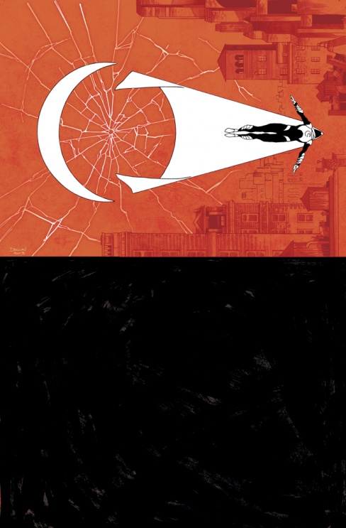
Let’s start with a recently revealed cover for Moon Knight #2. I think the design on this is incredible, with the crescent moon creating a circle element in combination with the cape, which almost creates a target like look when you factor in what might be a bullet hole causing the glass to fracture on the page. There’s a lot going on here past being a pretty picture. Can you walk me through what you were going for on this cover?
Shalvey: Well, we’d established a trade dress for the series where half the image is taken up by the title, leaving the top part free for the illustration. With the first cover, we did a really bold, black-and-white close up of the eyes; really minimalistic, and I liked it a lot. With the second cover, I knew I had to do something different and get some story points into it, since the first cover was quite ambiguous. Without giving away too much story, issue 2 features a sniper, and Moon Knight is in his new superhero gear (which I also wanted to feature in the cover).
Initially, I tried some various poses (examples attached), with the city in the background (again, wanted a lot more information in this cover) and thought cracked sniper glass would be a cool way of drawing the eye to MK. I was getting happy with Fig 3 (Editor’s Note: the figures he is referencing are in the roughs image below this answer), but then I though about a scene in the issue when MK drops down from his glider. As mentioned before, i try and use icons in covers where possible, so incorporating that moment was a way of having a story point, but also incorporating the MK crescent moon icon into the piece. The format of the cover design dictated that he fall across the image rather than down it, but I thought it still worked. I reckoned if I could position the moon shape and the cape in sync with each other it would echo the shape of a sniper sight; pushing that aspect more. I was originally thinking I’d have an actual target, but then instead used the shattered glass idea from before and it all came together. I felt it all clicked in Fig 6, but Warren and suggested I replace the MK pose from Fig 4 and Jordie agreed. They were right; it’s a lot more direct.
I had a rough idea for what the covers would look like in colour, but Jordie felt it worked against the strong design of the drawing. She felt it needed to be coloured in a more stylized way, especially considering how bold and minimal the first cover was, so she decided she wanted to colour the covers in primary colours, and really play off the white in MK’s costume in each issue. I thought it was a great idea; I’d never have thought of that.

The half illustration, half titling space for the cover is something I really like to see on comics, and something that has been noticeably done well by Nathan Edmondson and Mitch Gerads’ The Activity, for example. Why was this the right fit for Moon Knight, and what appeals to you about this setup as a cover artist?
Shalvey: I’ve seen a similar format before for sure; The Activity, Civil War, East Of West, Marvel Knights, etc. For this book, the look mainly spun out of Warren not wanting it to look like a ‘comic book cover’ instead looking at pulp sci-fi and crime novel covers as inspiration. Using Warren’s example, I came up with the rough trade dress and logo placement. Warren had a specific font in mind for the text, and Jordie had the idea of making one of the ‘O’s a moon. All of that helped make the overall cover look less traditional and more interesting. It just plays with the format in a different way, and that’s always refreshing.
Well these covers are kind of appealing as because the format is different to a regular cover, the approach to designing it is different. It’s a lot more challenging; less about show-off drawing and more about using an interesting composition. For me, it’s a challenge unique to this book.

Now, this kind of blows my mind, but the first cover I saw from you was only four years ago, in this cover to 28 Days Later #9 (that series feels like a lifetime ago). I thought it’d be interesting in this exercise to look back, back, back in your time as a cover artist, and this cover hits a lot of the things you’ve mentioned you’d like to do with your covers – repeated graphic elements, space for the art to breathe, bold composition that leads to accomplished illustration – but I have to wonder, what would 2014’s Declan Shalvey do differently on this piece, and how do you think your approach has changed since this time, if at all?
Shalvey: Oh wow, that takes me back! Was that my first 28 Days Later cover? Wow; surprised I got another after this. It does feel like a lifetime ago.
I think this does have all the elements that I said I like to have in my covers, but I have to say… this doesn’t work. I do like panels in covers, so I think I wanted to use multiple panels to show the range and amount of threats in the series while having a cool shot of the main character. I see that I was trying to zig-zag the reader’s eye through the image too, so I was definitely trying something, and definitely trying to do a moody piece I just don’t think it was fully successful. It kinda looks Selena is just walking around a gallery of framed Infected photos, and the drawing of Selena is very stiff; gets awkward from the waist down. I think the composition is a little awkward too.
2014 me would definitely do something different. I still like the colour scheme and the technique; would keep that, however composition-wise I’d totally change it. It would have been better to have a more action-y pose on Selena; have her floating in the middle of the page, maybe then use way, way, WAY more panels at different angles and have them overwhelm the page. Keeping her in grey/white would have kept her as the focus. If anything, there’s too much white in this cover and it kills the intensity. This was my failed attempt at doing a Hellboy/BPRD cover and it shows.
Man, that THAT Dec.

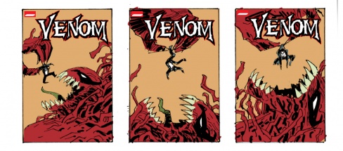
Let’s talk about Venom #33, which was another slightly older cover, but one that I thought really played very well within the environment Marvel’s title dress creates for cover artists. For this piece, and in a general sense, how many different versions did you create roughs of before going this direction, and what made this the direction you wanted to go in? Personally, this piece really resonates with me because of the muted background that makes the illustration pop all the more, and I love the incredible scale created between the two characters. Sharp piece.
Continued belowShalvey: This one is only a year or so old. . After my short cover run on Winter Soldier I pushed to do covers on Venom and was delighted to be able to cover my own issue. I wanted it to be good. I think I did 12 different layouts trying to do an impressive illustration. I whittled it down to 3 or so and handed it in to Marvel (generally I’ll do a few different ideas and callously axe the ones I’m not crazy about; that way I won’t end up spending a day or so on a cover I’m not mad about). I was told Axel Alonso liked one of my ideas but got an idea of his own based on it… “How about a King Kong-sized Toxin dangling a tiny Venom over his mouth? Like he’s about to eat him. Put the focus on Toxin.”
I handed in revised layouts based on the above (attached) and I think they picked the best one; Toxin is totally overwhelming, but yet Venom is still defiant. In the end, it ended up being a fairly basic composition, but still bold. Simple, yet clear and direct, as a good cover should be. The simplicity allowed a lot of negative space which accommodated the new trade dress, which can be tricky, and the logo placement worked well too. I think it really came together when Jordie coloured it though. She REALLY made the cover pop.
This is the second cover you’ve had little, rough thumbnails you created for a cover you’re working on. What’s your general approach when it comes to covers? Do you always rough them out first in smaller form and start working through concepts, or is that a situational thing?
Shalvey: Oh yeah, I always rough them out smaller first. Anyone who follows my work on Twitter or Tumblr have probably seen that I do the same for every sequential page I do too; it’s where I do all my thinking, solve problems, try different things out to see if they work or not. With covers, you need to show editors a rough first anyway. Sometimes they want to have more input, sometimes they just want to pick their favourite. It’s a good exercise to weed out the good ideas from the bad. You might have an idea that might have worked in your head, but not necessarily on the page. It’s easier to evaluate them once you’ve fleshed them out a little.. Now and then I might only hand in one idea; that happened recently actually. I only had one idea but I honestly thought it was really good, thankfully he editor liked it too. Actually, I should say I’ve had a great experience with Marvel on covers; they’ve let me be a lot bolder and experimental than I thought they’d be.
Sometimes I have colour thoughts too, so I’ll rough them in on Photoshop for Jordie, just so she can see what I was going for. Generally, she does something different, which I always embrace as she always has better ideas than I do, but at least with the roughs she has an idea of what I was trying to achieve.
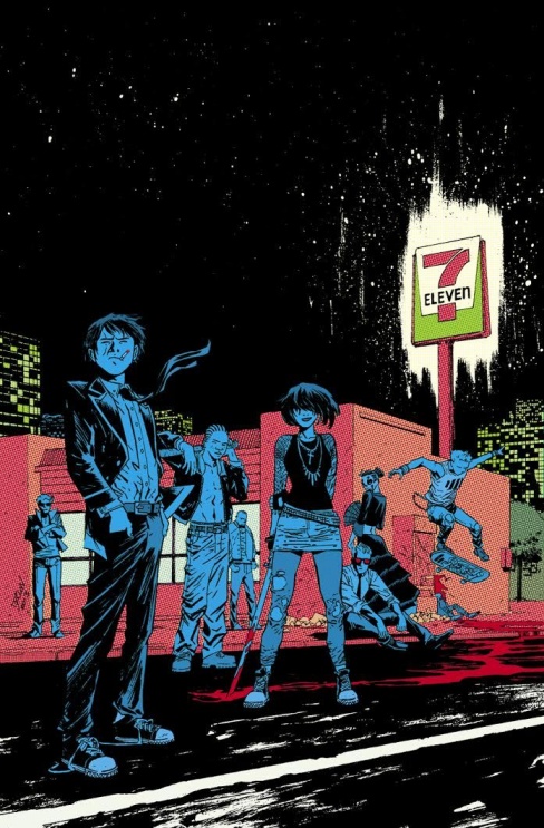
This cover, which is a variant for Rick Remender and Wesley Craig’s Deadly Class, is a serious favorite of mine on a book that is just loaded with awesome covers. This book has a bit of a rough, street vibe at least to the first issue, and I think you did a phenomenal job capturing that. Now, I apologize if they are more Jordie notes, but for this piece, two things really stand out: the Ben-Day dot like effect on the 7 Eleven and the super rough white paint shock around the store’s sign with the almost dripped white paint look that trails off it to the upper left. How did those elements come to get added to this piece – were they planned, or did they get worked in as the piece evolved – and what do you think they do to elevate it in your mind?
Continued belowShalvey: Oh thanks man! Yeah, I’d already seen a few variant covers by some AMAZING artists…. no pressure there! It was very flattered to be asked though; I’m a big fan of Rick’s and have been telling everyone how great Wes is for the last couple of years (!). Plus, to be included in a group of so many great artists was a treat.
I had a few ideas, one I liked was kind of a yearbook type thing, but as it turned out, Wes was doing something similar with the inside cover dress, so that nipped that one in the bud. We ended up doing one that was a specific suggestion of Rick’s . It worked out as this cover managed to create a tone that the others hadn’t. That’s important with a variant cover; you want it to fit in with the aesthetic of the series, but you want it to stand out from the rest also.
The dot-effect is all Jordie. I didn’t suggest it, though she knows I do like that effect. She wanted to push the dated/nostalgia tone we were going for, and try establish an 80s-ish tone. You can see the difference in my colour rough to what Jordie is, and there’s no comparison as to which is more insired. The white paint look is white ink I sprayed on top of the original page before scanning. I felt I needed to add a little spectacle to the piece; the rest is very restrained, very slice-of-life, so I wanted to balance it out a little. I wanted a big black sky, but you can great scope by breaking up some of that black and I think it worked out. I think the overall composition, illustration, and use of more concentrated, stylized colours combined and really nailed the tone we were going for.

Shalvey: There’s some great cover experimentation in creator owned stuff alright. I really like how ambitious Emma Rios is with her wraparound covers on Pretty Deadly; it’s a hell of a lot of work, but I’d love to try that someday. I really like the collaborations that the Zero artists have done with Tom Muller too. Really stand-out stuff.
I’ve done a couple of Image covers and I didn’t feel the need to do something too mad as Marvel have let me be pretty experimental for the most part. The cover for Venom 38 and Deadpool #18 specifically come to mind. So as a result, it’s not like I’ve felt like I need to be off the chain on the Image covers I’ve done. However, the Moon Knight covers have been interesting; having the trade design be such an integral part of the look of the covers has made them very identifiable and forced me to be a little more innovative. So whenever did a book of my own, that might be something worth exploring further.

Shalvey: Depends on the project really. I did a Motormouth variant cover and knew nothing about her. I did a cover for a new series and I had to use a promotional image as reference. Sometimes you’ll get a full issue, like with Deadly Class, Rick sent me the whole issue. That made it a lot easier to really study the book, but with most jobs the covers are needed before the issue is even written never mind drawn, so you’re working off an email from the editor or writer, or solicitation copy.
Continued below
We’ve talked about one of the regular covers for Moon Knight, but when it comes to the variants, what were you going for in terms of design? If your goal for the regular cover was to have the clearly delineated half trade dress, half illustration look, what were your goals for the variant covers?
Shalvey: Well, they started off as me just doing a promotional piece for the series, as the covers would be very design-based, so I thought it’d be good to actually SHOW what he’ll look like, since it’s such a different take. I handed in an idea, wanted a nice and moody shot of Moon Knight in his new suit-y duds. Wacker then suggested we make it a variant cover, and for each cover for the first 3 issues, do the same image but showcase a different costume (Moon Knight will feature a different look in each of the first three issues). So, the variants themselves are also variants of each other.
I really liked this idea (especially getting to do a variant cover when I’m already doing the regular cover; pretty rare), but I was concerned that while the image I came up with I was happy with, I didn’t think it would work well with a caped character (and I knew one of the costumes would be a superhero costume of my design); there would just be too much cape coming up from the ground blocking out the rest of the drawing. So I suggested I change the image to allow more space and would work with the different/more dynamic looks.
I like that it works as a good introduction to the look of the series. The regular cover for #1 gives nothing away; this image actually shows how I draw Moon knight, how I draw backgrounds, and the colour approach we have for the series.

Shalvey: Oh thanks man; I really appreciate that. No one has said that to me before. I love drawing cityscapes, but I hate using rulers so I have to find a way to make them interesting. It can be tough to come up with a strong visual for a city that doesn’t look like a grid or a lesson in one-point perspective. A lot of people are using digital tools to draw cityscapes these days, and I just feel like it saps the life out of the drawing; there’s very little character to them, so I try and add as much character and atmosphere. Been trying to do it a lot more on Moon Knight, but it can be tough. I think I could be doing a lot better really. I’m also surprised you think that as I actually really like drawing natural, organic stuff, like the landscapes in Northlanders were a real treat for me. Maybe the cityscapes are more challenging to me; I gotta work harder on them and the work shows. I think the inkwash I’ve been utilizing on this series has allowed me to add a lot more texture to buildings; there’s and extra value added that really seems to flesh out all the buildings.
And hey; I get the Hawksmoor reference man! I’m working with Warren Ellis after all!
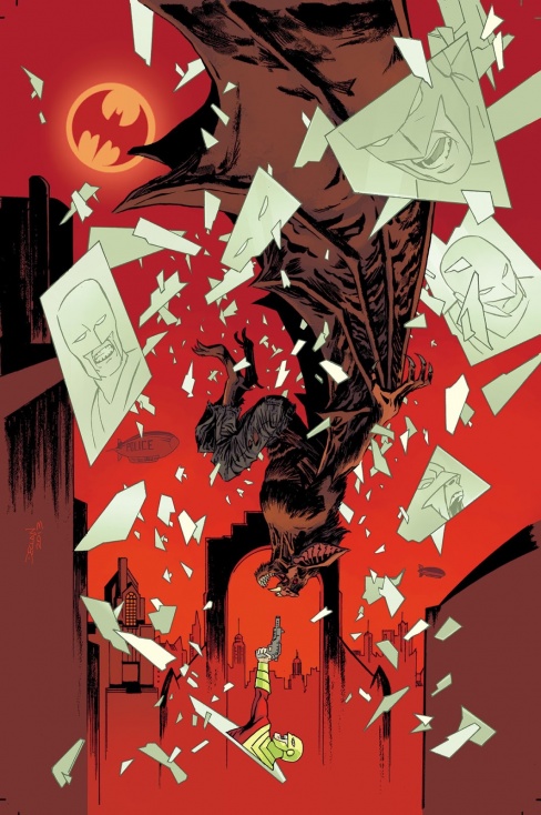
You and Jordie recently covered the whole six issue mini of Forever Evil: Rogues Rebellion, and if I’m correct about this, it’s your first DC proper work (outside of DC Digital and Vertigo). Now, not to cast aspersions on them as comic makers, but generally speaking, I find DC’s covers to be a little…uninspired. Yet this piece for Rogue Rebellion #3 is a very bold and effective cover that works within what they generally go for. I really love the usage of Mirror Master’s powers here, and Jordie’s colors really make the piece pop. Can you talk to me about the experience covering this mini, and in particular, how this piece came together?
Continued belowShalvey: Yeah, our run of covers on this series was my first DCU-proper work; it was great to do; I got to play around the DCU a little, which I’d never gotten a chance to do before. Before we wrapped our run, we also did a couple of pages for the Batman Inc. Special and a short story for American Vampire, so that was a few fun months at DC.
It’s been my opinion that DC covers in general are slightly more conservative than at Marvel. Working on these cover certainly took more time than usual as we were planning on doing covers that were a lot more graphic design-y, but that didn’t work out. We ended up with covers that were a lot more ‘safe’ than we were planning for, but I do like a lot of them, and think we ended up doing some illustrative and impressive pieces. Actually, this one is probably my favourite of the covers. There’s less characters featured, so with less elements to include you can play more with big chunks of space. Out of the lot, it’s definitely the boldest. Probably why I like it so much.
For the series, despite doing more traditional covers, I wanted to introduce a design element to them. I decided to integrate a circle in a specific location; this meant no matter what happened in the cover (there would be a lot of location hopping) that there would still be an element that united all the covers as a series. In the first cover, it was an eclipse, in the second cover it was the Daily Planet building sphere, and in this cover where the story took place in Gotham… I mean, it was a no-brainer; Bat-signal. I’m sure no one noticed the circle in each cover, it was just something subtle I wanted to tie it all together. I love the red Jordie used in this cover; and I’m really happy that Man Bat got to take up so much space in the image; I really wanted him to be REALLY imposing. The fact that I could use mirror Master’s powers to show only his head and arm at the bottom meant also that I could make him seem smaller than he was. Using the shattered mirrors meant that I could still feature him properly, despite how much space Man-Bat occupied.


