
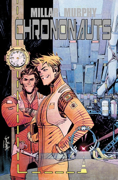
Everyone has their personal favorite artists, and for me, there are few names that consistently impress me more than Sean Gordon Murphy. Whether its a project that springs entirely from his mind like “Punk Rock Jesus” or a collaborative effort like “Joe the Barbarian” with Grant Morrison or “The Wake” with Scott Snyder, this is an artist that both beautifully tells stories and delivers big moments in ways like few others can. He’s a hellacious talent, and this week, he has a new book dropping in the very fun “Chrononauts” #1 with writer Mark Millar (a personal favorite writer for me as well). It features some of his best work yet, and I was eager to chat with Murphy about it.
For today’s Artist Alley, Murphy shares what it’s like working with Millar, how colorist Matt Hollingsworth brings the best out in his work, how he develops a story, the appeal of fast cars and faster planes, and much more. Take a look below, and on Wednesday, check out Murphy’s work in the first issue of “Chrononauts”. You won’t regret it.
Frank Quitely. John Romita, Jr. Steve McNiven. Goran Parlov. Duncan Fegredo. You name a top artist, Mark Millar’s worked with them seemingly. I’m curious, what was it that appealed to you about working with Mark, and what made Chrononauts a particularly good fit for you specifically?
SM: Those guys are some of the “greats” in comics—the chance to work with Mark was a challenge to see if I could keep up with them. One of the things that keeps me going are the email chains that Mark has with all his artists: with Parlov and Fegredo looking over my shoulders, it forces me to try and give Mark more than what he’s asking for.
I’ve never had a writer customize a script to fit my abilities to the degree that Mark has. Early on, I asked him to include a car chase, and no only did he write me an amazing car chase for issue 3, he worked in as many cars, planes and motorcycles as possible. When my wife started seeing the pages, she said, “It looks like something you’d write for yourself!”
Chrononauts is motivating me to draw the best pages of my career. I’m having so much fun that it’s not feeling like work.
Even though you’ve released your own creator-owned projects before and Tokyo Ghost with Rick Remender was announced before it, this is actually your first Image project to see the light of day. As an artist, what appeals to you about working with Image to release a book like this? Do you find it to be noticeably different than previous experiences at all, or is it pretty much the same besides the business model?
SM: I’ve always felt more comfortable working on projects with a smaller team, which is what we’re doing at Image. As much as I respect the history and business models of the major publishers, I don’t think the smaller books I’ve been involved with required the major resources those publishers provide, things like a PR person, two assistant editors, an intern, etc. There are only a handful of people making Chrononauts happen, and I love seeing this trimmed-down model compete with the big guys.
One thing I’m always curious about is what they use to bring their art to life. I know some are entirely digital. Some stick almost entirely to traditional mediums. Some are a mix of both. What do you use when you’re working on Chrononauts, and what’s your process for bringing a page from script to finals on your end?
SM: I’m a stickler for traditional techniques — the only thing do digitally is add halftone effects.
So when I lay out a script, it’s all on paper with baseball card sized thumbnails. Then I move on to 11×17 bristol board where I’ll redraw my layouts over the top with light colored pencil. I’ll lay in my perspective lines with a different colored pencil, then I’ll tighten with a 4H pencil. Then I’ll ink mainly with a Japanese nib and a Raphael brush. Other tools I’ll sometimes use are Microns, calligraphy nibs, corrective white, razor blades, and bleach.
Continued belowA large chunk of my income is made by art sales, so I couldn’t afford to go digital at this point.

One of the first things that stands out about this page is the work of Matt Hollingsworth. You’ve worked with him recently on The Wake and your other Image project Tokyo Ghost will also feature his colors. In your mind, what is it about his colors that pairs so well with your own work, and what makes him stand out as a storyteller in his own right?
SM: Matt’s “woodblock technique” on my work really helps set my art apart from other comics. The use of hyper-filtered coloring effects is pretty ubiquitous in comics right now, and Matt’s organic approach really helps set us apart from that. The technique comes from old Japanese printmaking using watercolor, rice paper and a wooden press. It was really time consuming, but the organic effect is like nothing else. Matt manages to somehow do it with computers, which I find very impressive. I’m a very traditional artist when it comes to tools, so I think Matt’s “old school” woodblock textures really compliment them.

You talked about this in an earlier answer, but when I saw this page, I had the same reaction as your wife: it looks like something you’d write for yourself. I mean, you have an ancient ruin with a badass fighter jet hidden within it. It’s a perfect tease of things to come. One thing I’ve always wondered about is where does your affinity for drawing things like fast cars and faster planes come from?
SM: I get this question a lot.
Cars (and planes and other tech) are hard to draw because it involves measuring and math, whereas drawing Batman’s suit is mostly organic. Most comic artists don’t like drawing cars because they don’t yet have the mathematical solutions to problem solve the challenge of putting that car in perspective, capturing the right angles and curves, and then drawing the correct ellipses for the wheels.
I love perspective challenges, so once I understood the math, drawing tech became fun for me. And because so few artists can pull it off, I like showing off. And showing off with a sports car is even better!
One thing I’ve always appreciated about your work is the level of detail. A lot of artists get credit for being detailed, but your work really earns that distinction for elements you put into a page like this one. For example, I really like the fighter pilot symbol engraved into base of where the plane is placed. Is something like that from the script, or is building the details of the world you’re drawing just something you can’t resist as an artist?
SM: To be honest, I don’t really have that much detailed compared to other artists I know. Geof Darrow is a good example–he’ll draw every shell casing that falls out of a gun, and each engine part of an exploding car. I don’t have the attention capabilities of someone like Geof. So I try to make my smaller efforts matter when I can. For example, the splash of the fighter jet: Most of that picture is make of shadowy, inky blacks. The hieroglyphics on the stone are mostly meaningless doodles. And the floor and stone textures is an organic grid. The only thing that’s really detailed is the plane, the characters in the background, and that ONE clear carving of the stone airplane. Geof Darrow might have rendered every shadow with historically accurate detail–I only drew those details a handful of times, but by using black to focus the readers attention, it makes it seem like there’s more detail than there really is.

Looking at both this book and others you’ve worked on, you keep things pretty straightforward when it comes to layouts. That’s not to say you don’t utilize panel progression well – I really enjoy the zoom in on Rachel between panels 2 and 3 on this page – but it seems that you focus on page layout from a storytelling standpoint rather than in a flashy way. When it comes to layouts, would you say you have a specific view on how they should be utilized in telling the story of a comic? Has that changed the longer you’ve worked in comics?
Continued belowSM: Millar wrote Chrononauts to have less panels per page than I used to–an average of 4 per page, when on PRJ and The Wake I dealt with 6-7 per page. And because I know Mark likes things to be really cinematic, I’ve layed Chrononauts out differently that most other books. It’s very reserved and plain, but I feel that it better captures what’s happening within the panels without being distracting.
You spoke about your process and how you lay out the whole book on baseball card sized thumbnails before you get to drawing. What advantages does that give you to the process of bringing a book to life, and how much do you find that improves the efficiency of your work? Do you pretty invariably keep to those layouts when you get to working on the bristol board, or is that more of a guide to how you think the page will work out from the script but you’re open to change?
SM: Layout out an entire issue before starting interiors is helpful because I can pick my moments better. For example–let’s say I REALLY want to do a drawing of a cowboy riding into the sunset on page 1, but on page 6 I notice there’s a similar opportunity to draw the same thing. I make the “cool” panel on page 1 something else, and then make page 6’s “cool” panel the sunset panel. If I just laid out page 1 and started drawing it, I’d eventually get to page 6 and realize that I was about to repeat my sunset panel. In other words, layouts help me think about the whole book at once, rather than focus on the page of the day.
I’ll often change them each day if I see better opportunities, of course. You make a hundred decisions per page, usually going with your gut and moving onto the next decision, and you hope to get 90% of them right.

Chrononauts is a comic that has a lot of pretty bombastic settings, with perhaps none greater than when Corbin first uses his creation to travel through time. With so much going on, how do you balance portraying the insanity of the situation without losing clarity in the story?
SM: If you think issue 1 has a lot of settings, wait until issue 3–there’s a car chase through time! It’s one of the biggest challenges I’ve ever drawn–I feel like I’m doing the research for a period book 22 different times within the SAME book, if that makes sense.
I find that the way to keep the storytelling clear is by keeping the panel layouts simple, the action moving consistently from left to right, and not doing anything too crazy with the camera angles. When camera angles because too extreme, the camera itself becomes the focus of the shot, and not necessarily what’s inside the panel.
One thing I really liked about this issue was the varying reactions to this immense achievement. They really run the gamut, from Rachel’s trained apathy to the nuns stunned faces. My favorite, naturally, is Danny Reilly’s here, though. He’s pretty hard not to like given how casual he treats every situation. When it comes to your character work, are you the type who uses reference to create more realistic feeling poses and characters, or are you a more feel oriented artist that just gets in there and sorts it out on the page?
SM: I use photo refs when I can, but I don’t allow myself to be a slave to them. Usually I’ll fit a photo to my sketch, rather than the other way around. This will usually mean my models have to bend in unnatural ways in order to pose their arms and legs to fit my drawings, at which point I’ll change my drawing to fit more with real anatomy. But the animated feel to the characters is always there. And I never photo traces because I feel that’s cheating.


