This week, Artist Alley returns with an inside look at “Five Ghosts” #9 with artist Chris Mooneyham. This title has been a consistently entertaining romp, as Mooneyham and writer Frank Barbiere take us on some classic styled pulp adventures with Fabian Gray, a man who channels the talents of Sherlock Holmes, Dracula, Robin Hood, Merlin and Miyamoto Musashi through his Dreamstone. While this book is undoubtedly a well-rounded one, with Barbiere delivering an original concept in consistently engaging fashion, it’s hard to argue that Mooneyham’s throwback style and sensibilities in his work, paired with exceptional storytelling, isn’t the highlight.
We talk to Mooneyham about their success on the book so far, how he and Frank work together, his Kubert School experience, the book’s colorist Lauren Affe, and we break down five choice pages from the issue as well. Take a look, and by god, read this book. It’s a hell of a thing and well deserving of your time.
Also, take a look at the bottom for some bonus art, including roughs and inks from many of the pages we look at in this edition.
Clearly you were on a lucky streak when Five Ghosts was first launched at NYCC 2012 and you won Multiversity’s prize pack at our party with Image, but even with that in mind, the first year of Five Ghosts was undoubtedly a monumental success. After year one, how are you feeling about the fan/critical/retailer response? It seems like this is one book that has been met with damn near universal acclaim, and your work is a huge part of that.
Chris Mooneyham: Haha yeah, that Prize Pack was a shock to me… but to be honest, I didn’t even want to go that party, but Frank did. I just wanted to go home and sleep. I’m glad Frank talked me out of it, because that was a nice prize.
Frank and I were thrilled when Image picked up Five Ghosts, but the fans and the retailers were a huge part of the success of the series, and we’ll be forever thankful to them for that. The critical response is really nice, too. Maybe I’m not wasting my time drawing for a living, eh?
Both you and Frank were pretty new to the comic game when you rolled out Five Ghosts, but you wouldn’t be able to tell that when reading your book. What was the development process like for the book before launch, and how do you feel your working relationship has evolved as you’ve moved along?
CM: The development of this series almost never happened (with me on board, that is). The way Frank likes to tell it; when he first brought the idea to me, apparently I said “no”. I have no recollection of this, of course, and I assume he just wants to paint me as a grumpy old codger. But, we were working on a sci-fi western at the time, and maybe I just wanted to see that through… so maybe he is right in his recollection of events.
We started it as a 6 page pitch (which ended up being the first 6 pages of the first issue), so all the development went into the character design (on my end). The first drawing of Fabian was pretty much spot on to how he looked in the finished product, but the ghosts themselves took a little while. I was a fan of all of those characters to begin with, and I wanted to take the best (or, at least, my favorite aspects) of previous incarnations to create our version of them. Frank was pretty much on board with everything I showed him from the get go.
But that’s Frank and I’s relationship. We’re collaborators. It’s as much his as it is mine, and vice versa. These days, he pretty much just asks me what I want to draw, and forms story around it. I love it. It’s a great way to work. For example, when he was coming up with the story for Lost Coastlines, I told him I wanted to draw sharks and pirates. You get both of those in the first issue of that arc alone!
Continued belowLet’s talk about your art in general, and what’s helped you find your voice as an artist. Growing up, who and what were some of your biggest influences, and how did your experience at the Kubert School help cultivate your work?
CM: I grew up with the same stuff everybody my age did: The X-Books by Jim Lee, Adam and Andy Kubert, and John Romita Jr.. I remember some kid bringing in the first issue of The Death of Superman for show and tell in 2nd Grade, and being amazed that they were killing Superman. That issue, as I found out many years later, was drawn by the amazing Jon Bogdanove. Then came Knightfall, which I also loved. That was my first exposure to several great artists, like Jim Aparo, Graham Nolan, and Norm Breyfogle (who is one of my favorite Batman artists, to date).
But, ultimately, if wasn’t until I attended the Kubert School that my knowledge and taste in comics/comic artists really expanded. I knew about the “greats” like Frank Frazetta, Joe Kubert, Jack Kirby, Alex Toth, John Buscema, Gene Colan, and Klaus Janson (to name a very small handful), but I never really appreciated how great they truly were. What was once ugly and plain to me as a kid, was now the most beautiful work I’d ever seen. Now I love their work more than any contemporary artist. I still love JRJr, and Mike Mignola, and those other guys I mentioned, but you really can’t get any better than the guys who made comics what they are today. I think there’s a certain quality they all had that’s missing from comics today, and I’m trying to bring that to Five Ghosts.
On this second arc, “Lost Coastlines”, it seems like you guys are really going big, which is amazing considering how epic the first storyline was. Now that you’re an ongoing and have a passionate fanbase, do you find yourself trying anything new or taking your art in any different directions in this second arc?
CM: Lost Coastlines is a nerve-wracking next step for me, but a fun one. On one hand, I want it to better than The Haunting Of Fabian Gray, but on the other hand, I don’t want it to look out of place, in comparison with Vol 1. Plus, it has the unfortunate task of being a sequel of sorts, and we all know how good sequels are haha.
But yeah, the first few issues of Lost Coastlines really took me out of my comfort zone, in a good way. I really love drawing organic backgrounds, so all of the interiors and ships and whatnot were pretty time consuming. But so far, the whole series has been really fun, and super gratifying. Hopefully, we’ll get the opportunity to keep doing it for a while.

Your covers for Five Ghosts have a very classic feel to them in terms of both look and design. When it comes to covers, what’s your approach and what are your goals for it as a piece of art? Does your approach on a Five Ghosts cover differ at all from how you might tackle one for RoboCop?
CM: This series is an homage to classic comics, from the Golden Age through the Bronze Age (but leaning more towards the Bronze Age, in my opinion), and the covers are no exception. I’ve always been a fan of covers that incorporated what was going on in the issue itself, as opposed to the vague “pin-up style” cover. Not to say that those are bad, just not what I prefer doing, when I have control.
The RoboCop cover I recently did for Boom’s movie tie-in(s) was definitely a case of the pin-up. I didn’t know what the issue entailed, really, so I just treated it like a movie poster, in getting as much info from the movie necessary surrounding a cool (albiet generic) pose of RoboCop. And who could say “no” to doing a RoboCop cover? RoboCop kicks ass.
With Five Ghosts, on the other hand, I pretty much have carte blanche when it comes to design and content. So when Frank gives me a basic idea that the cover should convey, I start pulling out old comics that told a good chunk of plot in just the cover. Marvel’s Conan did a great job of that, along with almost any Kirby or Kubert book. They take a moment of peril from the issue, and sum it up in one image, either literally, or in allegory. I love that shit. I don’t think enough of today’s comics do that, unfortunately. So, I’m glad that I get to.
Continued belowRegardless of the type of cover you’re doing (storytelling or pin-up), composition and clarity are key. Those are my biggest concerns when tackling a cover… and interiors, for that matter. “What is the best way to get this idea across? How do I make it perfectly clear to the reader, without having to spell everything out to them?”, are the questions I continuously ask myself as I work.
When it comes to the actual logo design and everything for the book, was that something that you originally designed yourself?
CM: Hahaha, well… the logo was actually designed by the very talented Dylan Todd, so I can’t take credit for that; even though I’d love to.
Frank and I both tried coming up with a logo… but we just weren’t “clicking”. I remember my first ones being too horror inspired, then I moved on to mimicking the Doc Savage logo… to no avail. Frank didn’t like them, and I didn’t like the ones he was coming up with. They were all just awful, on both our ends. And I love doing that sort of thing!! So when Frank told me he had Dylan come up with a logo, my first reaction was that I had been cheated on haha. Like, “HOW DARE YOU USE ANOTHER ARTIST!! I’M THE ARTIST!!!” But then he sent me what Dylan had come up with, and it was perfect, so I had to get over my jealousy and rage. Now, though, I can’t imagine the logo looking any other way. It really sums up the the feel of the book. So, thanks, Dylan!

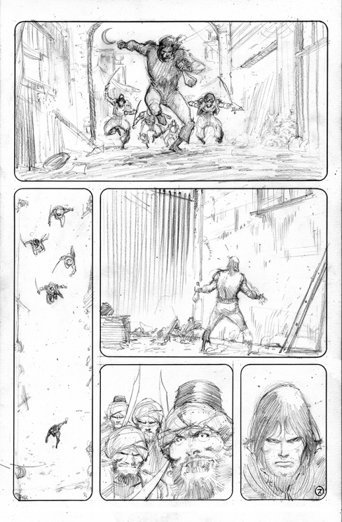
Even though this is one full page image, there are still panel breaks in the page. Why is that? Is it a way of focusing the reader’s eyes on the shackles and the Dreamstone as they read through the page?
CM: Yeah, you pretty much got it. It is one image, but the goal is to slow the reader down, a little bit. As loathe as I am to compare comics to movies, I have to admit that they do overlap when it comes to certain aspects of storytelling.
Had this just been a regular opening splash page, there wouldn’t be any real drama to it, I think. By splitting it up into panels, we build up mystery for a reveal. We start with shackled hands that could belong to anybody, but as you descend the page, you find out that the man chained up is Fabian Gray. Then we continue down to see that not only is Fabian chained up, but he’s a prisoner of his nemesis, Asif Quintano. It’s all about pacing, really. Like I said, it could have been a regular splash page, but that would have been a “BAM!” moment, instead of an “ooohh shit. How did this happen?” moment. It slows things down for dramatic effect.
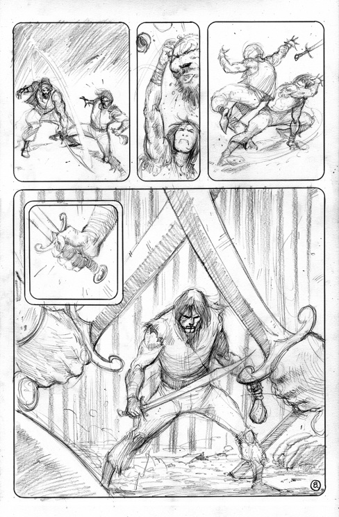
When it comes to laying out a page, how much comes from Frank’s scripts and how much is you discerning the proper pacing you’re trying to tell the story at? A page like this is very interesting because its layout serves a very specific purpose, but as readers, we don’t really know how that comes to be. Enlighten us, Chris!
CM: Looking at Frank’s script, Page 1 still called for 4 panels. However, each panel called for a different shot. When I saw it, I thought, all of this information can be conveyed in one image, so why not just make it a splash, and deep the same beats by fractioning it off into 4?
Frank and I look at this series as a collaboration. We split the chores relatively evenly, I think, but ultimately, the script I get is a “loose” interpretation of what the story actually is. He’ll break down pages into panels, but if I think a panel would work better as a 4 panel sequence, I go for it. He’s really not picky about stuff like that. He let’s me go nuts, because he trusts my skills, like I trust his. Every once in a while he’ll have something really specific in mind, as far as layout, so I won’t mess with that, because I know he’s put a lot of thought into how he wants it to look. I think I’ve already said this, but it really is a great way to work. It keeps things fresh and fun, and that’s how you keep creative energy up. It’s synergy at it’s finest!
Continued below
Now I’m worried I’m going to walk myself into another situation like the titling question, but what’s the origin of the splash title page? Obviously it’s a pirate map reference, but how did that come together, how much of this was you, and is something like this maddening to an artist, or really fun?
CM: Haha, well, you’re right. Just like the logo, I had nothing to do with the map. That’s the product of Frank and frequent collaborator Shane Vidaurri. I love it, and it saved me a lot of time and energy. Plus, Shane really shines with stuff like this, so it really was a no brainer to have him do it. For me it would be kind of maddening, I think, because it’s so precise. I don’t have the patience to do something like that. Just look at my work. It looks quick, because it is quick. I can’t stand spending more time than necessary on something, but I seriously applaud those that do.

In the flashback sequence, you adopt a seemingly sketchier style with a more muted palette from colorist Lauren Affe. Now, I have two questions from here. How did you decide on your approach for this flashback, and when it comes to working with Lauren, what is your process? Do you work closely together on achieving the look you’re going for, or is this more of a hands-off type deal where she knows what you guys are going for and delivers from there?
CM: Originally, I had only intended on portraying the flashback with the rounded off panel borders, but as the deadline started creeping closer and closer, I thought, “what if we just kept it in pencil?” I already had the first few pages of it penciled (with the intent of going to inks), and being the lazy person I am, I brought the idea to Frank, and explained that not only would it be cool to change it up a bit, but it would lighten Lauren’s load, too. So really, it’s me passing laziness off as creativity, haha.
Working with Lauren is great, though. This book wouldn’t have the look it does without her. I think I may have given her a few notes when she first came on the book, but when I saw the pages she sent back, I realized there was absolutely no need for that. She knows exactly what she’s doing, and doesn’t need me or Frank standing over her shoulder, telling her to “change this”, or “fix that” She really is fantastic, and I hate that we have to share her with other books. She reminds me of Dave Stewart, in the sense that she doesn’t color any two artists the same way.

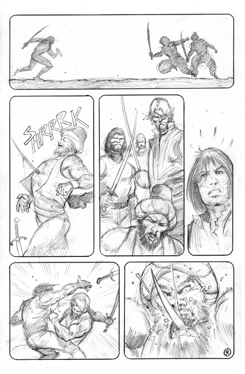
This is a great page, but in particular I wanted to talk about the lower panel where Asif stabs Fabian. One of the things that mystifies me most as a reader who loves comic art is the decisions an artist makes to accentuate moments, and I love the usage of lines pouring out of spot where the stabbing is taking place, drawing our eyes to that point and making it all the more powerful. Can you talk about your approach as an artist with elements like that? When it comes to something like that, do you go in knowing you want to accentuate it in such a way, or is it more that you knew that it needed a little something extra to draw readers eyes to the action?
CM: You pretty much hit the nail on the head. It draws focus to the action. There are so many different ways to attack an action shot like this. I guess the rest of the page has a lot to do with what’s eventually decided upon, though.
In panel 1, we have a relatively extreme close up, focusing purely on the action of Asif spitting on Fabian, and not really showing much else. Panel 2 is a medium close up. Almost a “calm before the storm” moment. Here we see the characters enough to establish where they are in relation to each other while having a sense of what may transpire next. Neither of these first two panels are full figure shots, so the logical choice is to zoom out and show enough of these guys and put them in the most dynamic position possible, in the biggest panel on the page, no less. The last thing I’d want to do is put such a pivotal scene in a small panel, as that would diminish the impact of the action.
Continued belowThat’s the logical explanation. However, a lot of it is instinct, and a basic desire to just draw something cool. For me, the last panel had to be a shot like that, so that I could get a cool “Holy Mother!” moment in an otherwise static page. And without those zap lines, the focus could have easily been either of the characters expressions, instead of the knife going into Fabian.
Basically, I had to get the stabbing, the body language and the reaction all in one panel, and try and make it as different from Batman being stabbed by the Talon in “The Court Of Owls” as possible. That awesome splash page by Greg Capullo was all I could think about when I was doing the roughs for this page. It sucked, because I knew there was no way I would be able to match it, haha. But this came out okay, I guess.
If you enjoyed that look into Mooneyham’s process, take a look at some bonus coverage of his work, as Chris shared roughs and inks for some of issue #9 below.