
It’s safe to say that Warren Ellis and Jason Howard’s “TREES” is a comic completely unlike any others on the stand. It’s a slow burn, but the deliberate, almost clinical pace they’re taking to building the world and its denizens is intoxicating in the same way that something like Steven Soderbergh’s “Contagion” was. It doesn’t tell a story so much as it studies it, dissecting the situation and making it all the more fascinating. Yet, it’s strangely human, and a huge part of that is Howard’s art. Having previously collaborated with Ellis on “Scatterlands”, he knows how to best deliver a story like this, and the way he pencils, inks AND colors this book delivers the mood and feel that makes it such a fascinating read.
With the arrival of its fourth issue last week, I reached out to Howard to talk about the book, his process, building its world, working with Warren, what he goes for with his colors, and much more. For me, Howard’s insight into his work helps enrich the reading experience, and it certainly makes me appreciate his work all the more. Take a look below, and thanks to Jason for chatting with me about this book and its fourth issue.
I can say for sure that TREES is a comic that reads completely unlike anything else I am reading right now, and maybe ever, in terms of comics. There’s almost a clinical way it studies the situation of the Trees and the world as a whole. When you were first developing the book, how did you and Warren discuss approaching it visually? Were you trying for a different feel at all, or the best way you interpret the story visually?
Jason Howard: We didn’t have a lot of discussion on the visual approach. I spent a lot of time considering the approach I wanted to take and I would show development sketches to Warren to get his feedback, and he would have some notes but overall he’s been very much “you’re the artist” about it, which gives me a lot of room to explore. The line work and surface style really grew out of the Scatterlands comic we had done before. In reading the first couple Trees scripts, there was grittiness there that I wanted to capture and that looser broken line approach seemed to fit. Warren mentioned that he wanted to approach the story more like a novel, and I think that shows in the pacing so far and the way the characters are being developed. From a storytelling place I am trying to compliment this and find a different feel than my previous work. I joked with a friend recently that I have to be careful when I’m doing layouts not to layout Trees pages like Super Dinosaur pages. Super Dinosaur is all about big awesome things and I want it to read quickly and focus on the visually cool stuff. Trees is more quiet and there is a focus on the world and mood, I still want the story to read clearly but I want those other elements to play a big part too.
You’ve worked with Warren before on “Scatterlands”, so clearly you knew what to expect from the experience. For you as an artist, what appeals to you so much about collaborating with Warren, and how do you think that helps you get the most out of your art?
JH: It really comes down to wanting to work on good stuff. For me as a comic fan Warren has written a lot of books that I really enjoyed. He brings a unique perspective to the stories he writes and I often find myself reading older work of his and wishing I had drawn it. So its been pretty great to have that opportunity.
With so many tools available to artists, the entirely traditional artist is becoming an increasingly rare breed. Are you a traditional or a digital guy, and what do you use in bringing Trees to life?
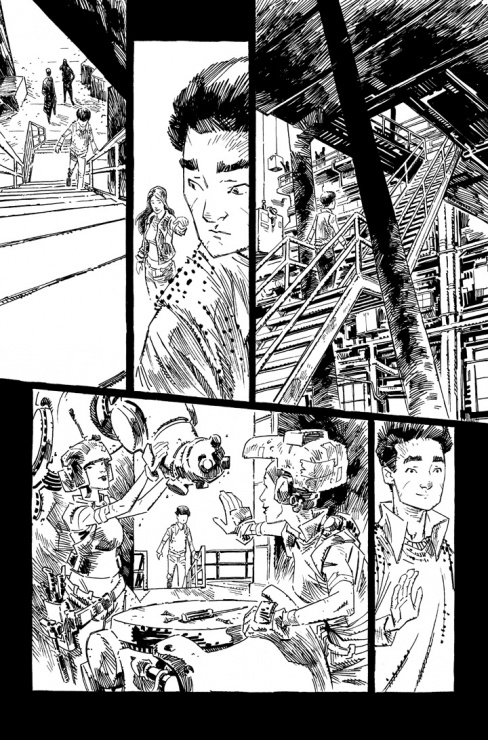
JH: Both! I love trying new things and am always on the lookout for that one magic tool that will make all the difference, I haven’t found it yet but someday I will! In the meantime, digital pencils and traditional inks has really been working for me. Drawing a page digitally lets me take advantage of all the editing and speed benefits of the computer. Then by inking it traditionally I can make sure it still has that good old fashioned hand drawn goodness. I use a Cintiq to draw with and it feels very natural. I have played around inking digitally, I even inked a couple Super Dinosaur issues that way, but it just doesn’t feel right yet. Maybe its a practice thing and I’ll get the hang of it eventually, but on Trees I’m firmly in the traditional ink zone. Once the inks are done its back into the computer for colors.
Continued below
I’ve really loved the covers so far on the series, and this one in particular. They’re very graphic and simple, yet with powerful central images. I know Fonografiks is the letterer on the book, and on other books like “Saga” and “Nowhere Men” he did a lot of the cover design around single images. Is that how these covers work as well, or are these all you?
JH: Thanks. Yeah, Fonografiks is great. In addition to the lettering on the book he designed our logo, which I think is pretty perfect for the book. However, the actual artwork and concept of the cover design I figure out on my own. Fonografiks will come in after and determine the placement of the logo and credits info.
Everyone has a different idea as to what makes a comic cover work really well, and I’m curious, what do you think makes for a successful comic cover? What do you look for as a comic artist?
JH: I think there are a lot of approaches that can make an effective cover. The artist side of me will buy a book just because of a cool drawing on the cover. But ultimately I think you want a cover to stand out, to pop and get noticed amongst all the other books coming out that week. With Trees specifically, I am really trying to use contrast and simpler bold elements to stand out. I am also approaching them more conceptually. Rather than drawing literal scenes from the issue, I try to find some idea or emotion that relates to the issue and develop a cover off that. In this issue, a main part of the story takes place in the Chinese city of Shu where a character is sort of being pushed outside his comfort zone and having some of his ideas about the world challenged. This led me to use a rice bowl to show China and it being upside down and spilling to show the characters ideas/life being turned upside down. Then blood spilling out of the bowl hints that maybe there is something darker going on. But if people interpret it differently thats fine too 🙂
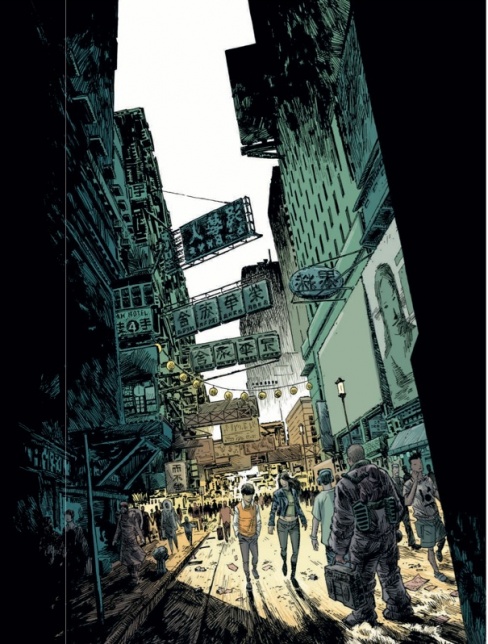
I love the differing communities the book focuses on, and this page opening on Shu gives us a great look at the chaos of the city. When you were developing each of the settings, how much was you just going nuts creating, and how much was building from existing elements of the real world?
JH: Despite the sci-fi set up, the story in Trees is pretty grounded. So when I’m drawing the environments in the book I want them to feel grounded. I will use reference to give me ideas and help certain things like cars or in this case buildings look fairly accurate. I try not to be a slave to that stuff, I want everything to look filtered through my own drawing. But I think having a little more real approach helps give a sense of normalcy to things that can then contrast against the more fantastic elements of the story.
With your coloring, do you have specific palettes per location? I’ve noticed Shu – at least externally – is predominantly colored in pale yellows and a sort of teal, while once we went inside 818 there were more reds and blues to it. Of course, the pale yellow comes back later in Svalbard, so my theory may be shot, but there does seem to be a certain rhyme and reason to the color palettes.
JH: Yes, I tend to use a color palette for each location or scene and switch it up when the story moves somewhere else. I feel like this helps create a sense of place and distinguish from one scene to the next. So the Shu outside pages in this issue are mostly the teal greens and yellows. But when we move inside the art factory, I wanted it to feel very bold and a little weird so I used a pink/salmon color against a strong blue with some bits of orange and green. If we come back to a location and time has passed I will usually switch up the palette, but sometimes I give specific locations their own color scheme and stick with it every time the story comes back there.
Continued below
I really love the top two panels on this page, as Tian does his best to shut out the world before getting slammed back into it. I’m always interested in the choices an artist makes, and obviously you could have went a lot of different directions in conveying what he was going through. For you, how does a story beat like that come together? In the same vein, how loose of scripts are you working from in terms of bringing something like that to life?
JH: Thanks. Warren’s script was pretty specific on this page, so I can’t take too much credit. I think on panel 2 he asked for the inks to drop out and just have a pencil background, but I couldn’t find a way to make that feel right with the rest of the page for me. I tried a couple different things to get a similar effect and finally decided on what you see here.

This page is just fantastic. It’s an endearing bit of character work that is almost strictly visual, and it makes us realize how bright Tian might just be, even as he’s assuring us he isn’t stupid. This is not a dialogue heavy book, so much of our connections to the characters are built off your art, and delivering it in the wrong way could impact how we relate to someone like Tian. How do you approach a page like this in nailing down the proper sequence of expressions, and does working on a page that where dialogue is mostly absent change your approach at all?
JH: The script broke down what Tian is sort of thinking reacting to in each panel, so for me its a matter of finding the right expression to convey that. Not having any dialog makes it more important because there is nothing else there to convey the idea if the drawing doesn’t get it quite right.
Color is important in conveying mood, and it’s hard not to take that last panel as the light literally flicking on in Tian’s head as he finds the right thing to say. Going back to color, what do you use it for? I mean, what is it that you like to use your colors to convey? It seems to me that coloring for reality is less important to you than using it for mood and feel, but as I said previously, I could easily be wrong!
No you pretty much have it right! For me the purpose of color in comics to convey mood and help tell the story in some way. Coloring something “realistic” is pretty much the bottom of my list of things to do with color. In fact I think that it tends to be ineffective and boring in comics. I think that the best comics manipulate everything to make the best reading experience. Panels are composed to clearly show what the reader should see, sometimes this means leaving out real things or faking the perspective. Faces or anatomy may be exaggerated to better show action or emotion. Shadows might be added based on what makes a character stand out or draws the readers eye, not based on how the light would actually fall. The same with color. I am the boss of the color, I tell it what to be in order to serve the story and art, I don’t let reality tell me what colors things have to be. For me, having that attitude is what makes coloring fun and creative.
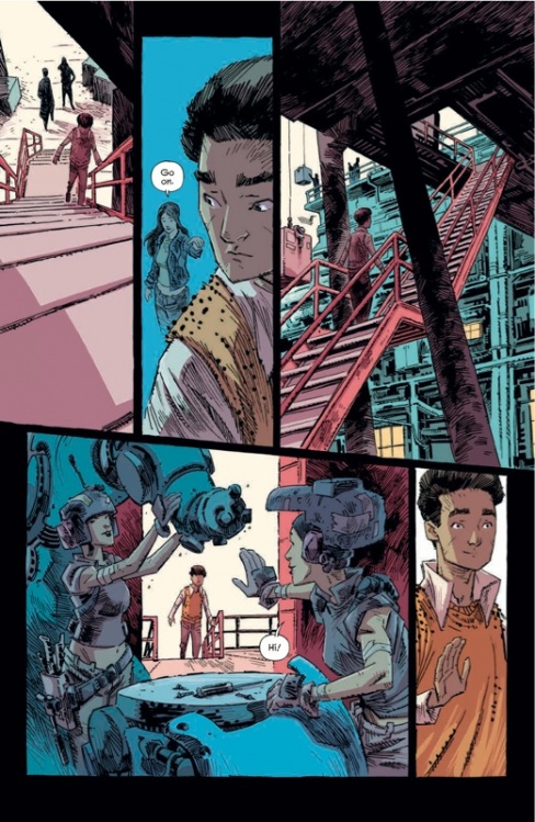
A lot of artists have some layouts they prefer to stick to when it comes to telling a story, but one thing I see in your work is you don’t really stick to a form in this book at all when it comes to panels. I thought the pages when Tian was in 818 were particularly great, as they kind of fit the likely overwhelming feeling he’s going through in there. I also love how the panels cut downwards on this page as Tian moves up. It gives a great feel of motion to the page. Do you layout the entire issue first? What’s your process as you go from setting up an issue to finalizing it?
Continued belowJH: With Trees, I made a style choice at the beginning to not be locked into a specific panel layout. My previous book was Super Dinosaur, and because it was all ages I was pretty strict about keeping a very simple easy to read grid with my layouts. So with this I really wanted to give myself the freedom to experiment and just do whatever I think with best work for the story.
My normal process for drawing an issue is like this. I start with rough pen thumbnails. Really small scribbles basically, just my initial instincts from reading the script. Im not worried about drawing at this stage, the focus is on the storytelling and simple staging of the elements. If these are done well the rest of the process is much eaiser. Once those are finished I move to the Cintiq (I use Sketch Book Pro software for drawing) and do fairly rough layouts at the correct proportion for the comic page. There is some actual drawing on the layouts, but its not the focus, more about working out storytelling and making sure I have interesting/clear shots. Making sure the pen thumbnail works. I like to layout a whole issue at once.
After the layouts are done I lighten up the layout and over top I work out a tighter drawing. These are my “pencils”. Because I’m doing the inks they are not super tight, but structurally everything is there. Sometimes when pencilling I’ll have a better idea for a panel, this is a reason why I like to to layout out the whole issue before I start pencilling. It gives my brain time to think about solutions. I don’t have all my good ideas on the same day, so coming back to pencil a page a couple days after the layout lets me see it fresh and hopefully improve it. You can see on panel 4 I changed the layout when pencilling it. Having the girls stand felt more interesting to me and making them bigger in the panel helped me make sure that they were recognizable as the same girls Tian saw on the stairs in issue 1. When the pencils are done I print them out in light blue and start inking.


When it comes to panel layouts like the one on this page, why lay it out like that? For you as a storyteller, how do you use the way you structure layouts to aid the flow of the story, and would you say you’re a layout boss like you’re a color boss?
JH: A lot of it is instinctual. But I knew that because Tian was moving I wanted the angled gutter across the center, to sort of show that things aren’t square or settled. I would like to be a layout boss, haha. Sometimes they have their own opinions. When laying out a page there is a push and pull balancing the needs of all the panels. For example, on this page I would have loved to make panel 3 really tall, just have it extend the entire height of the page. I think it would have been cool to show this crazy tall flight of stairs that he was climbing. But if I do that then all the other panels are going to get quite a bit smaller or have to be a different shape to make them fit. So for the sake of the page as a whole this was my compromise. I think its still effective, and am very happy with the finished page but thats usually the kind of thing that might make me dissatisfied with a page. Sometimes you know there is a perfect layout solution, one that just nails the needs of each panel perfectly but due to time restraints you never find it and have to settle. The pages I love are usually the ones where I feel I captured the intent of the script perfectly and added some clarity or nuance to the story through my layout choice.


