

Today brings the first issue of the newest project from Kieron Gillen and Jamie McKelvie, “The Wicked + The Divine”. Their collaboration as writer and artist has been one of the most creatively fertile and consistently great of any we’ve seen in the last decade, and their latest from Image Comics is nothing short of magnificent. James will elaborate on that in our Pick of the Week review, but Gillen, McKelvie, Wilson and Cowles have created something truly special here, something that feels like what they’ve done before, but with all of the experience they’ve had in recent years pushing the project to an even greater level.
We’ve talked to Kieron about the book, but for our Artist Alley column, I was eager to talk with Jamie even though he doesn’t often do interviews. Thankfully, he agreed for this one, and we talked about his ongoing creative partnership with Kieron, why Matt Wilson is such a good collaborator for him, style and identity in his characters and more, all the while walking you all through a few pages and the first two covers of the first issue. There aren’t any spoilers here, so read with confidence, but I hope you’ve picked this up already. This is going to be an all-timer, folks.
This is a question you likely get asked all the time, but something magical happens when you and Kieron work together. What is it about working together that you feel brings out the best in you, and you him?
JM: We always say that the best comics made by a team feel like they are made by one person, and that’s what we try to do. We try to make it feel like it’s the product of one mind. So we spend a lot of time talking back and forth, discussing ideas, and so on. Kieron knows he can write a panel for me that is reliant on, say, a character’s expression to work, and that I can pull that off.
The other but also hugely important members of the band are Matt Wilson, colorist supreme, and letterer Clayton Cowles, with Hannah Donovan doing design work on the book as well. This is a book that really has a fierce and highly assured visual identity from cover to cover, and it feels like every aspect of the look of the book works completely in lockstep. How closely did you work with Matt, Clayton and Hannah to create the visual identity of the book? Was it very much a situation where you simply know they’ll do their jobs well and they do it, or did you powwow together to create a really unified like and feel?
JM: We work extremely closely. Matt joked the other day that he had to go back 3 pages in his inbox until he found an email that wasn’t between us. We have a shared dropbox where we put all our work, so we can all see what each other is doing, and discuss ideas.
That said, I know that everyone involved is fantastic at their jobs, so I don’t have to oversee every little thing. And we’re all involved in the creative process, bringing our own ideas of how to approach this. There are bits all the way through I can point to and say “That was Matt’s idea, that was Hannah’s idea, that was Clayton’s.”
Now, I didn’t want to show this in our look at the pages, but I had to mention it: but this issue does something I’d never seen from your art, as it gets pretty damn gory. Obviously this isn’t your first time depicting violence, but it’s jarring in both a natural and…strangely beautiful way. For you, was that something that took any more time and thought process than usual, or is that every bit as natural for you as an artist as depicting a god/pop star at the height of her power?
JM: I think we wanted to do something a little different with the violence in the book, so we went s little pop art with it. I’m always trying to think of ways to tackle different elements of a book, and as those moments are supposed to be deliberately jarring, we went in a little different direction. Matt’s solution to the colouring is brilliant.
Continued belowThe Google image searches for those bits were really unpleasant.
Some artists are still traditional, some are wholly digital in their art, some are a mix of both, but for you, what’s your process, and what are your key tools for bringing an issue like this to life?
JM: I haven’t drawn on paper for about 4 years now, beyond sketching layouts directly on to the script. Then it’s into Manga Studio. The process gets more blurred than traditional methods – layout stage merges into pencils into inks. It allows for a lot more flexibility along the way. I’ll often build rough sets in Sketchup if I know the environment will be used several times – it helps to keep it consistent.

Before we talk about the covers to #1, you’re obviously someone who has seen a lot of success as a cover artist, with your work on Ms. Marvel being amongst some of my favorites right now for one. When you’re approaching a cover – not just for “The Wicked + The Divine”, but in other projects, what are you looking to convey? What do you think are the keys to a successful comic cover in your mind?
JM: I think primarily a) they should attempt to convey the attitude or general feel of a book and b) they should try to stand out on the shelves. It’s very easy to get lost on the racks when so many comics come out every month.
I usually have some idea of the contents of the story for any given issue I’m working on – not always, but usually! From there, rather than try to recreate a specific moment, I think about the core of the issue and how to design around that. Sometimes it might be something as simple as “in this issue Wolverine shows up!” If it’s right for the tone of the book, I like to put a little humour in there too – that tends to stick in readers’ minds, which is helpful for a cover.
These covers fit the gods as pop stars aesthetic very well, as to me, they really remind me of a variety of iconic pop album covers. This look is carrying forward, depicting different characters on each issue we’ve seen so far. Can you walk us through what you were going for on these covers in specific, from the singular character shot and Matt Wilson’s vibrant colors to the reversed lower text and the flares of the colors emanating from the characters? Is it the plan to keep this layout for the book’s covers beyond issue #3 as well?
JM: The book is about both celebrity and mythology, so I wanted to convey a little of both. I wanted to keep it modern, so I looked to design and music magazines for inspiration, with striking images and big bold text. The portraits seemed like a good choice – again, they stand out on the shelves. Aside from our human lead, Laura, we used the lighting and other effect to convey the exceptional nature of our characters. Lucifer’s eyes glow red, Amaterasu’s are like eclipses, while the light around her gives the impression of fire, and so on. I was inspired by the cover to a Katy B single and wanted to try to do something like that with the cover colours. Of course I can rely on Matt to achieve the effects I want.
The text is designed by Hannah Donovan, a designer I’ve worked with a lot. My initial concept sketch had the big, slightly translucent text across the face, but she flipped “The Divine” when she realised how it balances out and conveys the opposite natures of the two words in the title. Then she put together the rest of the trade dress, and designed the back covers, too. She also put together the icons I designed in the title pages that you see in the book. Basically what I do is surround myself with very talented people to make me look good.
The first ten issues will each be of a different character. After that, I suspect I’ll want to do something different again.
Continued below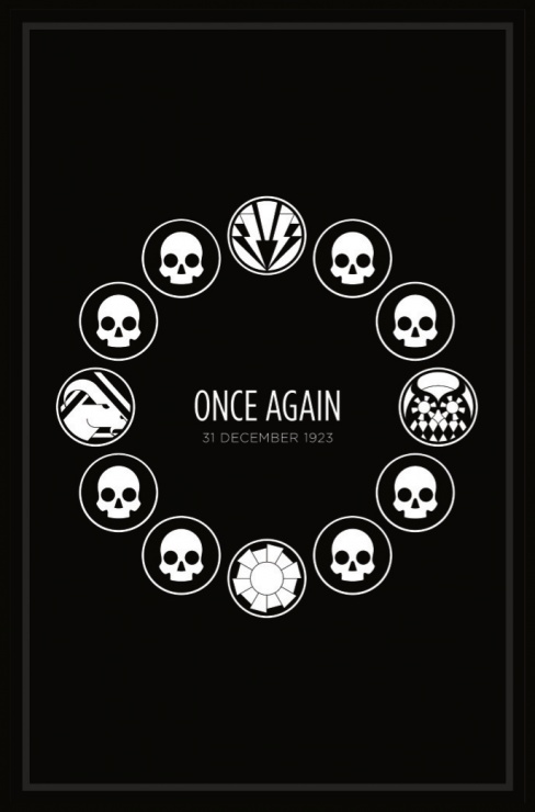
This is the page that greets us as we first open the book, and while we’ve seen some elements like this from your work before, these Hickman-esque graphic transition pages are really excellent mood setters for the book. For you as an artist, what do these elements add to the overall look and storytelling of the book, and how did the idea come together? Was that something you or Kieron in specific wanted for the book, or was it something that naturally developed as the team was putting the book together?
JM: The idea to have an icon for each god was Kieron’s, though the design and concept of each one is mine, based on his character descriptions and of course the mythological basis for each. I then decided it would be cool to adapt the icons for each era – so these 1920s icons have an art deco feel to them. I like the idea that if we go back into pre-Christian eras, I could design icons that look like runes or signs carved into stone, or wood.
They also allow us to impart story information. As you can see here, all but four icons are identical skulls. What does that tell the reader? Combined with the following pages, you can figure it out.

As the first page of art in this issue, it’s a continuation of the highly foreboding feeling that comes with that first transition page. The thing that stood out to me as a reader was its deep blacks and close zoom didn’t feel like what I had come to expect from your work, but it worked tremendously well. Would you say that with this series you’re finding yourself trying anything different, or was this image more of a situation where a scene called for something specific, and you did what best fit it?
JM: I’m always trying to do new things with my work, but in this case we wanted a strong, focused image, so spending time rendering the skull to give it weight and physicality helps that. It really sets the tone of the following scene.
Obviously a first image is hugely important for a book, as it is a tone setter for the rest of the issue and even the series. There are all kinds of different ways you could have approached this, but you did in this very specific way. What was it about this that made the deep, highly resonant blacks and the close zoom the right choices to make, and when it comes to how you and Kieron work, how loose are his scripts in terms of visuals? Is it really a case where you decide all of the key things like that, visually, or is he highly specific in what he wants in a scene like this?
JM: Kieron is often very specific in his descriptions, but with the proviso that if I can think of a better way of approaching something, I should go for it. We’ve worked together for over ten years now so we trust each other when it comes to storytelling. In this case, the page is very close to what he asked for. The script was written before I came up with my cover concept, so I like that you go from a close-up of a head on the cover, to a near identical close-up of a skull. I don’t think the opening scene is what you might expect from the book, so this sets up a nice sense of mystery and foreboding.
I should also add that Matt Wilson’s colours add a great deal to this image – the rendering he’s done lends an extra air of realism.

First off, this is an unbelievable page. It floored me when I first came to it, and I love the way it delivers a perspective of a musical performance almost as a religious experience (which it’s probably similar to but I never thought of that before now). A big choice for an artist is in the perspective they deliver the image from, and for you, what made this the best way to deliver this story beat, and what do you think placing the camera on the stage did for bringing out the power of the experience for the reader?
Continued belowThe script actually called for a shot of the crowd from behind Amaterasu – we get to see her close up next page. Here, we want to show the effect it’s having on the crowd (and Laura, specifically). Through the use of the lighting on Amaterasu’s dress, we wanted to give her that kind of otherwordly, magical presence from the get go – I had in mind that kind of back-lighting-with-white-dress effect from early Kate Bush videos.
But while it’s Ama’s gig, this is Laura’s experience, so it was important to focus on Laura here.
Two things I love about this spread are the textures in the lights and the colors throughout. Both aspects simultaneously ground the image firmly into reality, while also giving the page an almost ethereal, otherworldly feel. For the former element, how were those textures added to the art, and what was the intent with them? With the colors, what do you feel Matt brings to the page that accentuates your work so well, especially on a page like this?
I use a lot of texture brushes and textures I’ve made myself in Manga Studio, basically. Here, I was attempting to draw that kind of lighting effect you get as stage lights shine through smoke or dry ice, for two reasons. One, we’re at a gig. But two, it’s to guide the eye of the viewer. You can see the crowd through the light and the smoke, but the only person who is really clear is Laura, the person we want you to focus on in the crowd. Matt cleverly, and subtly, uses a darker line colour for her than the rest of the crowd, too, so she’s in really sharp focus.
I’m very lucky to work with Matt – he understands what I want from any given page, but will always turn in work is 20 times better than what I could do. His use of lighting, for mood and storytelling purposes, is second to none. On this book, especially, we are as a team very collaborative. We all throw ideas into the mix, and that includes Matt and Clayton. I’ve done comics where I’ve barely communicated with the colorist or letterer, but here we constantly talk and discuss approaches.
Everyone brings this up, but it’s only because it’s true: the style and personality you bring to the world and the people who live in it is remarkable. From the hair to the fashion to just how someone holds themselves, it’s a unique gift that makes your work stand out all the more. For you as an artist, where does that come from? How important to you is it to ensure that the world you’re depicting is filled with unique individuals, at least visually speaking?
I say this a lot, but comics are pop culture, and as such should feed from all the other forms of pop culture around it. We should bring in fashion, music, TV, movies, magazines, anything that can be used to further the story or make it look right. In terms of the look of the characters, well, I just pay attention to the world around me. It helps that I like in a place like London, full of music and art and fashion, but there’s also so much stuff online. I never understand when an artist doesn’t try to follow styles for young characters – there are literally blogs dedicated to how people dress, so there’s no real excuse not to try.
Every character has to have their own style that is a reflection of their attitude and personality. It’s all part of the same package. Luci wouldn’t wear what Amatersau wears, and she wouldn’t dream of dressing like Cassandra. Each style says something about the character before they open their mouths, and that’s all in aid of telling the story.


