If you follow our Valiant (Re)visions features, you’ll know something that is the case pretty much always: Archer & Armstrong is my favorite and the most entertaining of all Valiant titles. Much of it is because of writer Fred Van Lente’s inventive, tremendously entertaining scripts and plots, but the art team on the book of Clayton Henry, Emanuela Lupacchino, Pere Perez and more add so much to each and every issue that Van Lente’s ideas and bits couldn’t work without them.
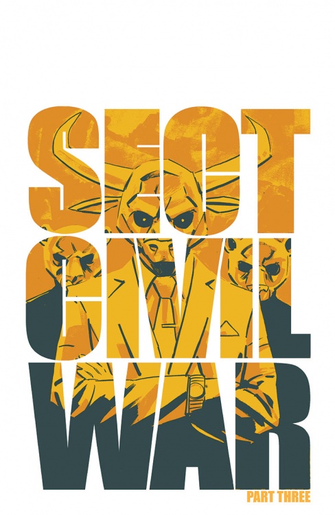
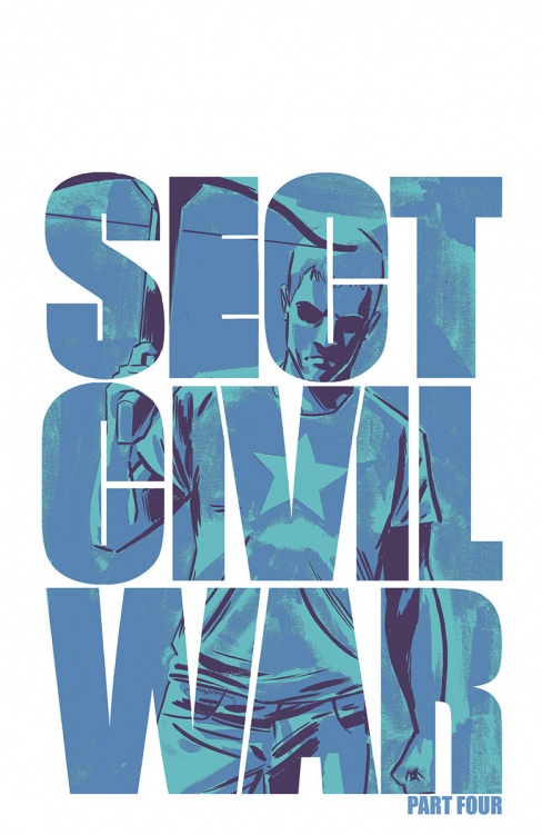
With the upcoming “Sect Civil War” mini-event, things are going to get escalated in the book, so that means Valiant brought in the big gun for it: Michael Walsh. Walsh is the artist of the very well received “Comeback” over at Image as well as “Zero” #1 from this past week, and he’s a man whose storytelling in art is only matched by his brilliant design. For “Sect Civil War,” Valiant brought Walsh in to design some of the new sects that would be featured in the arc, that way interior artist Khari Evans would have something magical to go off of.
To get you all as excited for “Sect Civil War” as I am, we have an exclusive look at Walsh’s process in developing these groups, as well as some first looks at covers and interiors for the series. Check it out, and by the way, the series is on-sale for $0.99 per issue on ComiXology right now. I highly recommend catching up if you haven’t.
You’ve pretty much stuck to creator-owned work so far, so I’m curious: what appealed to you the most about designing characters for Sect Civil War, and do you think a book like Archer & Armstrong and a writer like Fred Van Lente is a good fit for your design talents?
Walsh: As was the case with my creator-owned work , I was pretty much able to design these characters from the ground up. I love being able to put my stamp on a universe, especially one that I am already a huge fan of. Contributing to the Valiant world has been a huge pleasure for me.
One of the reasons that Archer and Armstrong is so successful is that Fred is able to mix a fantastic sense of humour with super-hero action that has some real consequences. I tried to invoke a little bit of that sense of humour into these characters while still keeping them dangerous and mysterious.

Do you generally think designing characters and looks is a strength for you as an artist, or at the very least, something that appeals to you more as an artist?
Walsh: Yes, I’ve always thought that design oriented work played to my strengths. Keeping things bold and simple yet still eye-catching is something I’ve always been a fan of and tried to incorporate into my art. It is really the essence of character design, stripping down the visual components to the bare minimum to get across personality and theme.
Take us through your general process for designing a character or a group like in Sect Civil War. Did you take the ideas from Fred and run with them, or was it more of a case where the two of you worked together to find that final look?
Walsh: In this case I had a general concept for each group of the Sect and ran with it. Usually I start with the key visual components, i.e. the block head or the tie-dyed cloak, and work my way up from there. Only adding what is absolutely essential.

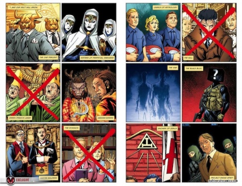
For the Black Block, talk to us about their look. They’re very utilitarian, supreme badasses with a 90’s comic amount of pouches on their vests, and they convey their emotions via emoticons on their faces. How did that look come together, and what makes it a good fit for who they are?
Walsh: I think originally we were going to have them in a black body suit but I figured that with the amount of weaponry these guys would be carrying, a military vest would be a great way to lug it around. It was a good way to ground them. And to add a bit of flavour.
Continued belowAs for the emoticons, I was trying to add some levity to the design. Also, visually I didn’t want Khari to have to be drawing flat black blocks everywhere, I thought this would be a good way to convey emotion while still maintaining the anonymity of the separate Black Bloc soldiers.

The Hashish Eaters are basically the best thing I have ever heard of as far as a secret society of villains, especially because they’re based off a real group in history. With this one, talk to us about their look. How much of it was just you going nuts with the idea, and was there anything you didn’t get to do with them that you wanted to?
Walsh: With the Hashish Eaters I just went crazy: crocs, dreads and tribal masks. These guys are a drug-induced mish-mash of influences. You know when you were in high school and you had that one friend who used to smoke all the time? I wanted them to resemble the bedroom of that friend. The wall with Bob Marley, Lord of the Rings and Led Zeppelin posters… They are way too gone to worry about any kind of respectable footwear, so they stick with crocs. They wear some tribal masks to try and be intimidating but they get one too many eye tokes and the masks end up doing more harm than good.

With the Master Builders, I have to say the finest touch to their hipster personas are their epic staches that you’ve given them. Were there any other touches you’ve factored into that hipster aspect of their look, and how heavily did you have to stick to the traditional Freemason look?
Walsh: These guys were the most straightforward of the bunch as I don’t think the Freemason get-up has changed much, just the people wearing it. I added some modernizing features like the Moccasins, the striped socks and the moustaches, oh the wonderful moustaches you will see!
Out of those three, which was the most fun to work on? It has to the the Hashish Eaters, right?
Walsh: Probably! Hard to say as I had a blast with all of them. I really do like the general aesthetic of the Black Block.

When it comes to the other Sects in the Valiant universe, did you get to touch on any of them and give any updates to their looks, or was your focus mostly on these three?
Walsh: These three were the only characters I developed but I look forward to working more in the Valiant Universe. It’s a great place to be.