
Welcome, Earthlets, to Multiver-City One, returning today for a special edition focused on the “Sci-Fi Special 2018.” In the spirit of this all-female issue, we reached out to our female staffers and six of them were game to review a strip for today’s edition! So, enjoy this special edition, and let us know your favorite strip from the issue in the comments!
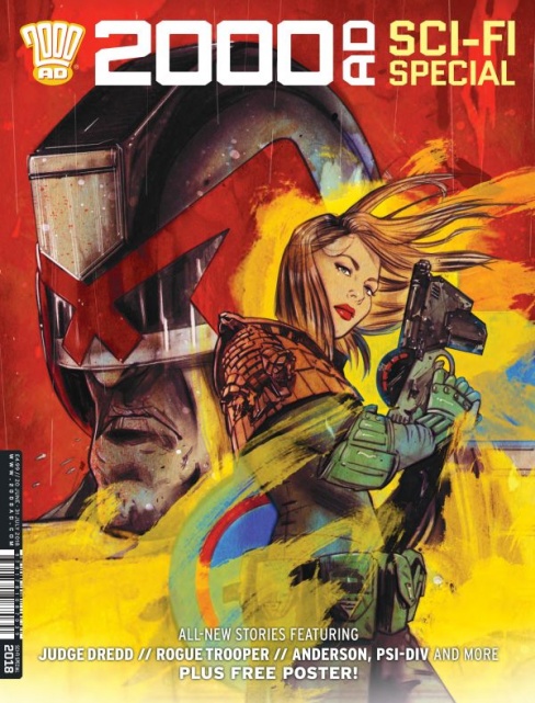
THIS YEAR IN THE SCI-FI SPECIAL
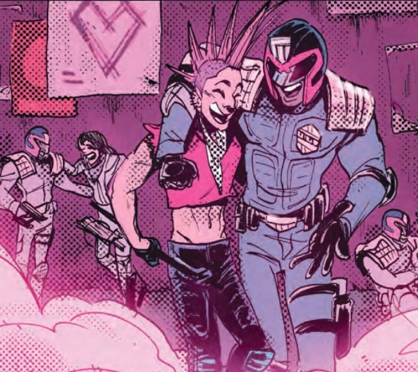
Judge Dredd: The Feels
Credits: Emma Beeby (script), Babs Tarr (art), Annie Parkhouse (letters)
Frida Keranen: Emma Beeby has scripted a story which explores the coldness and harshness of Judge Dredd and his world, but doesn’t take itself too seriously. The comic references the 60’s hippie movement but also includes a wink towards contemporary culture in the form of Kardashian Towers.
Babs Tarr’s artwork here is far from her snazziest but still works quite well, incorporating a wide variety of angles. There aren’t really any panels that catch your eye, but understandably a 6-page action story has to concentrate on moving the events forward. The scenery has traces of the brightly pink futuristic setting of Tarr’s “Motor Crush” comic, the city of Nova Honda. The pink colour scheme is very different from the majority of Dredd comics, but Tarr balances it out by sticking to only cold hues and adding a lot of steely blue. The choice works well for Mega-City One’s cold and unwelcoming streets. Some of Annie Parkhouse’s lettering breaks the colour scheme of the comic, but it isn’t too distracting.
Beeby and Tarr work well as a team and the creators’ own touch is very evident in their take on Judge Dredd. All in all, ‘The Feels’ is a fun little story that doesn’t explore its central theme very deeply, but feels almost refreshingly different in its execution.

Tyranny Rex: Don’t Forget to Blast My Cache
Credits: Katy Rex (script), Liana Kangas (art), Liana Kargas and Gab Contreras (colors), Ellie De Ville (letters)
Brian Salvatore: Sometimes the most effective sci-fi just goes a couple inches further down the ‘realism’ chart, creating something that doesn’t seem all that out of the ordinary, before taking a sharp turn into the fictional realm. That’s what happens in “Don’t Forget to Blast My Cache,” where we see Tyranny using her 3-D printer (I’m with you so far), printing a design she torrented (sure) to print a car (a little past most current printer’s capabilities, but I’m following), but the file is compromised, so it turns into a monster with arms and mounds of brainy-goo. Now, we’re firmly into the sci-fi realm.
Katy Rex pens a simple script that doesn’t waste time with exposition or unneeded dialogue; this is a lean, tight script that accomplishes an awful lot in its five pages. Liana Kangas uses an almost minimalist approach to her work, not focusing on the technology, or even the monster, all that much, but rather using the space to explore Tyranny and Lem’s reactions and their internal processing of what they see in front of them.
Kangas’s style allows Tyranny – a green humnoid with a tail – to appear totally normal in her surroundings, with a sort of casual confidence that really works for the story. The colors, by Kargas and Contreras, double down on the simplicity, going for simple, primary colors for most of the backgrounds. It all allows the reader to focus on the story, and get across a lot of information in a short span of time.

Rogue Trooper: The Thousand Days
Credits: Alex De Campi (script), Sam Beck (art), Eva de la Cruz (colors), Annie Parkhosue (letters)
Emily Myers: For the most part, “Rogue Trooper: The Thousand Days” is fairly straightforward sci-fi story. Norts and Southers, warring factions on Nu Earth, have managed to turn their world into a poisonous hellscape through the use of chemical weapons. This issue follows a day in the life of a Souther platoon preparing to advance against Nort troops. Before they engage, however, they run into the titular Rogue Trooper, the last surviving member of a group of genetically modified super soldiers specifically engineered to withstand the hazardous climate.
Continued belowIn a short amount of time, “The Thousand Days” does quite a good job of establishing the Rogue Trooper world, central conflict, and character dynamics. One gets the sense that winning ground in this war is a painstakingly slow process, as Souther commanding forces are shown bribing their own troops with fresh food as a reward for advancing. Despite the grim reality of the situation, however, there is just enough light dialogue between soldiers to show that genuine camaraderie, at least, still exists.
Beck’s art has an understated feel to it, and is considerably less gritty than I would have expected for such a premise. This fits the nature of the comic, though, with its plethora of generic infantrymen facing off against each other. Action flows smoothly between panels, but I did feel that the Southers’ climactic confrontation with the Norts could have been framed in a more exciting way.
While it may not be the most original take on the war story, “The Thousand Days” manages to present a compact sci-fi tale with a few interesting quirks, and it’s worth checking out if the concept intrigues you.
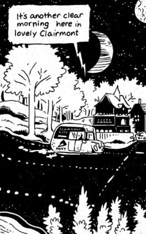
Future Shocks: Delivery
Credits: Tillie Walden (script and art)
Alea Perez: In this offering of ‘Future Shocks,’ Tillie Walden, of “Spinning” fame, delivers a disturbing 6 page, black and white, understated thriller that tells the tale of a disgruntled, humanoid postal worker on an extraterrestrial planet. The first two pages offer quick, loose drawings within firm, uncompromisingly straight-bordered panels that neatly contain the story. By page three, as news of an escaped (presumably malicious) creature is shared with the reader and the fear of Clairmont’s residents becomes apparent via newly erected cautionary signs, the uncertainty and subdued disarray that comes with that fear is depicted by way of Walden’s considerably loosened borders.
In places where routine has been challenged, once straight and rectangular panels seem to mirror that loss of fidelity by taking on a misshapen appearance, coming to a crescendo in a panel that depicts the comic’s first visible death. It’s only at this point, halfway through, that it is made clear there is indeed danger. But the postal worker’s reaction to this revelation is ambiguous at best, with Walden only giving readers a quarter view of the postal worker’s face before plunging it into almost complete darkness.
The standard rectangular panel makes a return when, at the end of her day, the postal worker finds a moment’s respite from the continual untrusting gaze of a customer through their window, from the aggressiveness of a dog-like creature, and from the coarseness overheard at a house on her route. But this return to order doesn’t last long. Panels begin to fray at the edges and a reveal on the last page encourages further uncertainties. Is the postal worker metaphorically marking victims? Is she to be feared or is she harboring something bigger and more fearsome than herself?
Walden cleverly depicts the passage of time and a change in atmosphere through her ink-black, shadow-laden drawings, and the black and white art of the comic is masterfully juxtaposed with the grayness of the story. Although a second passing will allow more meaning to be imparted on the postal worker’s expressions, it is never entirely clear what it is we as the reader are seeing and therein lies its power to chill and to inspire speculation.
The ambiguity of this piece is haunting in its use of sophisticated devices, simplistic art, and complex possibilities.
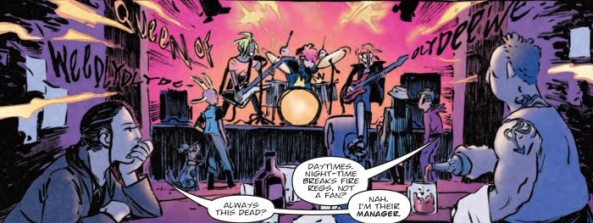
Judge Death: Darkness Descends
Credits: Leah Moore (script), Xulia Vicente (art), Pippa Mather (colors), Annie Parkhouse (letters)
Jess Camacho: I don’t have the most experience with the “2000 AD” series or the world that these characters inhabit. I’ve read a handful, if that, of “Judge Dredd” collections and I’ve seen the Karl Urban movie but that’s about it. The fact that this issue was put together with all female talent really appeals to me because so often large publishers can’t find all the women working in comics. Shocking, given how many women actively draw and write books and are all over Twitter and Tumblr with their work. Anyway, “Judge Death” is a heavy metal story that’s all about heavy riffs and actual death. A band, not doing so great at the time, finds an old album from years ago, from a band that people have created crazy myths about. Once they find this album, it takes over their lead singer with disastrous effects.
Continued belowOne of the things that stood out the most to me about this story is that it felt very accessible. I had some worries that going into this blind would cause me to miss too much context and feel like I couldn’t fully enjoy the story but the complete opposite happened. Moore’s writing is very easy to get into as her story is really something doesn’t need much context. It does use a character that’s very known by longtime fans (I did a quick Google search to answer my own questions) but that’s not something that stops you from enjoying the story. “Judge Death” goes by quick but it’s got a complete beginning, middle and end, which is something that anthology stories can suffer from. “Judge Death” also is extremely metal but that vibe completely comes from the art team.
Xulia Vicente and Pippa Mather absolutely were the selling point for me on this story. While the plot is very good, this kind of story lives and dies by how it looks and “Judge Death” is a story that delivers. There’s a sort of grittiness in Vicente’s work that feels right for a story centered around a heavy metal band. It’s grimy and slightly messy and that really, really works for this story. The character designs, the crowd scenes and the way the music itself is shown to us works so well. Music is incredibly tough to show in comics without audio and she does a great job here. Mather’s colors are absolutely my favorite thing in this story because it’s not exactly the kind of color work you’d expect from a story like this. Mather’s work is full of energy with lots of bursts of bright colors and neons and it feels like music. It makes the story feel like a stage show and that’s the perfect tone.
DeMarco, PI: Love Remains
Credits: Laura Bailey (script), DaNi (art), Ellie De Ville (letters)
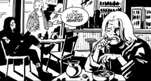
Liz Farrell: Black and White. There is no color within the world of “DeMarco, P.I.” It gives this world an almost noir feel, with its stark dark and light contrasts, its dramatic shadowing, its elements of crime, and its own detective, in this case, a P.I., Galen DeMarco. The artistry of DaNi reflects an element of easy simplicity, while proving a complex companion to the story. Side note: I’d like to adopt Galen’s hair style.
We hear from four characters, three of whom are female, and these three drive the entire plot of the story. DeMarco is on the case; she’s been hired to figure out a mystery, some sort of body-part disposal, people disappearing situation that sounds as if it can only end poorly. We see some tension between her and the other characters. One source of conflict is over station in life. DeMarco has grown up with money; those she is helping have not. A second source of conflict is over what seems to be a breaking societal norms in terms of personal behavior, or marriage.
There are some nice single character panels by DaNi within this comic; each reveals intimate details about their characters, maybe even details that are left up to the audience to interpret. For example, DeMarco standing with her gun and Mrs. Tippins revealing her innermost thoughts. The reflection of motion and movement is also tackled effectively here, with DeMarco dropping a bag of snacks, running to catch a perp, or Mrs. Tippins violently hugging her Judge husband. Panels with no script always intrigue me, as I find myself looking for clues where things are left unsaid. Sometimes what is left out is more important than what is included.
Humans want to be safe, in more ways than one, and there is a thread of safety running through this script. Physical safety is a must, particularly in a world where that does not seem to be the norm. Also, Laura Bailey touches upon the idea of emotional safety here. Mrs. Tippins finds a way to satisfy both her physical and emotional safety in a way that leaves us with a sour stomach at the end of the script.
This mystery has almost a “Twilight Zone” ending, which I am here for. It’s unexpected. I get the idea that things aren’t always as they seem in this script, just as the title implies, “Love Remains.” The love that remains, most likely, has a different meaning for Mrs. Tippins than it does for Galen DeMarco. One will be left in the dark, or the black, the other still has a chance, in the light.
Continued belowAnyone else think DeMarco’s gun looks a lot like Han Solo’s blaster? Just asking.

Terror Tales: The Hockey Sticks of Hell
Credits: Olivia Hicks (script) Abigail Bulmer (art) Annie Parkhouse (letters)
Michael Mazzacane: After reading Check Please, I felt more than prepared to take on a story of horrifying hockey sticks. But, no, the British play on a grass field and run around. Imagine the grass stains, truly terrifying. Olivia Hicks and Abigail Bulmer’s ‘Terror Tales’ strip tells a story of demonic pacts and why they never work out. I wish there was an extra page in this strip, making it a more standard 5 pager as opposed to 4. Just so we could get more of Abigail Bulmer horror-comedy beats, but the moments that do exist work well enough.
Bulmer’s art in this strip is in the vein of Archie comics, representational but still cartooned in style. Like the opening narration it harkens back to supposed simpler and better time. These expectation setters are the key for when things get horrifying and funny. Of course that nostalgia is all a lie, the veil is dropped by the third panel as the snobbery and ruthlessness of the girls hockey team comes through behind closed doors. Bulmer does a good job with expressions, showing the subtle differences between happy smiles, devilish smiles, and the sheer look of terror.
The shocking moments of horror comedy are well executed. The initial beats of shock and excess work because of how plainly the paneling is executed. It’s a call, response, and taken one step further. Bulmer also nestles some gruesome bits into the background of a couple panels that gives everything a bit more depth for a four page story.

Anderson, Psi Division: Spa Day
Credits: Maura McHugh (script), Emma Vieceli (art), Barbara Nosenzo (Colours), Ellie Deville (letters)
Kate Kosturski: After a hard workout, most people would look forward to a spa day, right? Not Judge Cass Anderson of the Psi Division. “Spa Day” is actually “Scrub Personality Artefacts” Day, a time for Judge Anderson to go under to get rid of the manifestations of past enemies from her brain. Unfortunately, there’s too many of them hanging out in there, leaving her life in critical balance. It will take some help from Cass’s friend and sparring partner Judge Shatka to save her.
The photorealism of Emma Vieceli’s art is astounding, making this one of the most richly detailed and realistic strips in the prog. She knows how to draw a tough woman who still manages to look feminine – – think Starbuck of the most recent Battlestar Galactica. (I’m also pretty impressed with her hair – – I’d give an arm for volume like that.) Maura McHugh keeps her script tight and economical, with the exposition at only the key points when needed and nothing more. There’s still just a bit too much assumption here – – how did all those enemies get in her head? A panel or two of further background would have added context and heightened the drama of the danger of her brain cleansing. Barbara Nosenzo chooses her colors wisely for her apparitions, preferring light blue for those on the side of good and light, leaving the malcontents looking more like their real selves and less like phantasms.
“Spa Day” is a fun introduction to the Judge Anderson character with just a few small missing elements here and there. While I’ll stick with my spa days consisting of mud baths and seaweed wraps, I’ll be sure to check in with another of Cass’s adventures and maybe treat her to a well deserved facial afterwards.


