

It’s that time of year! The Multiversity Year in Review is here, and from now until Friday, December 22, we will be talking about favorites in a variety of categories. Let us know what we missed in the comments!
Best Artist
Without the artists, we wouldn’t have comics; it’s just that simple. All of these folks – some young, some not so young – are doing the best work of their careers right now, and continue to push the medium forward.
10. Andrew MacLean
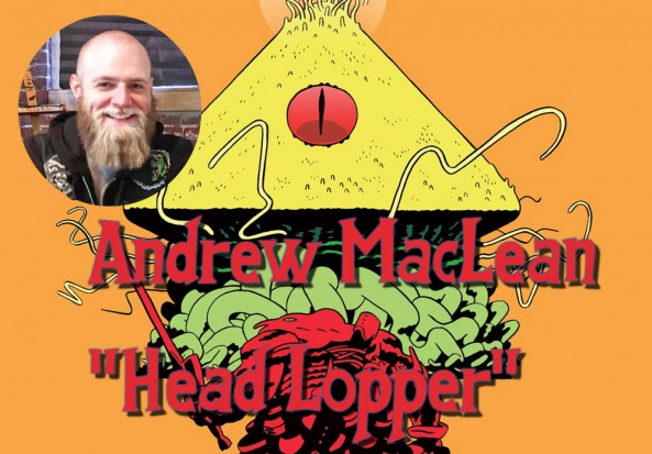
Our 2015 Breakout Artist finally makes his way into our top 10 artists list. He is someone I have been championing as one of, or maybe the best, artist since 2012. Since then, he has continued to refine and develop his art style into something like no one elses. He has one of the most recognizable styles in comics.
I have loved with “Head Lopper” he has continued to push what he puts on the page. While he could probably pump out an issue a month of Norgal just cutting losers heads off, he puts it out quarterly and puts in amazing work on his visual storytelling, bonkers character designs, and evolving environments. Issue 7 of “Head Lopper,” with Jordie Bellaire’s colors, was some of this years most visually charming pieces.
He also had his first work at Marvel this year with “The Mighty Thor” #700. While seeing Andrew on a New Gods book or an ongoing Thor title would be cool it was great to see his art permeating further into the mainstream landscape. Hopefully with the consistent work on “Head Lopper” and appearances in books like “Thor,” he will be number one on our list next year. – Kyle Welch
9. Cliff Chiang

We could talk about Cliff Chiang’s ability to draw practically anything for hours. We could talk about his precise pacing, his distinct designs, and characters you can actually tell apart from each other. We could talk about his style, his ability to direct your focus across the page, his instinct at knowing when to overwhelm us with detail or when to pull back. But all that’s been said at length, so the best thing we can do is is simply sit back and admire his artwork.
With “Paper Girls,” the book he’s been working on with Brian K. Vaughan over the last couple years, Chiang has finally found a canvas large enough to showcase the full extent of his talents and imagination. Here, he’s had the opportunity to draw dinosaurs and monsters, the far flung future and weird psychedelic pasts. He approaches all of these with a steady hand and grounded sensibility, a desire to do nothing more than immerse you in the issue for as long as it lats. This might be one of his hidden talents, his ability to matter-of-factly deliver the story. He rarely, if ever, has his characters burst out of the panel borders or thrust them into odd forced perspectives. While “Paper Girls” is littered with splash pages, but I think that’s in part because Brian K. Vaughan loves splash pages. Chiang isn’t a showy artist and he prefers keeping on the gridded layouts, but he’s so confident, so sure about what he’s doing, it doesn’t take much for him to sweep you into this universe. His compositions are always effective, he keeps the geography of all the characters in mind, so you’re never given a chance to get hung up on small details when there’s much bigger problems at hand. You buy the cavewoman and the space lady are able to exist at the same time. You’re able to empathize with any of the paper girls themselves because their reactions are relatable and true to the situation. “Paper Girls” has been Chiang’s primary outlet, made all the better because it seems like he, with the rest of the book’s team, are going to see this crazy ride through to the end.
And this is only his sequential work. Cliff Chiang has also provided dozens of covers, illustrations, and pinups, all of them perfectly capturing this energy, this mood, this spirit of the subjects. There’s a retro atmosphere to this work but it never feels old. It harkens back to the time when illustration art favored open lines and idealized presentation, yet it never feels like it’s longing for that time. His work is modern without being overwhelming and classic without being conservative.
Continued belowCliff Chiang’s work is full of life and energy. It jazzes you up; it can frighten you, pull off bad jokes, or keep you at the edge of your seat. Above all else, however, it’s immersive and captivating. Year after year, Cliff Chiang has turned in some of the most exciting work on the spinner rack. – Matt Garcia
8. Daniel Warren Johnson

Every book Daniel Warren Johnson has drawn has looked great, but his work this year on “Extremity” has cemented him as one of the best artists out there. As with all his previous books, the action sequences are some of the best out there, expertly conveying speed and power in the movements of characters. The technology he draws continues to be both detailed and extremely practical, showing a great eye for detail and design. The area where Dan has really shone this year, more so than other years, is the little moments. The way he’s conveyed looks of hope or sadness or anger through his characters, small changes in body language, little things that may go unnoticed, but really bring a page together and when you do notice them. In a book that’s about the struggle the comes with losing something that makes you you, it’s these little moments that take it from an interesting idea to a great comic. – Leo Johnson
7. Joelle Jones

Comic fans got the best of both worlds from Joëlle Jones this year, getting to enjoy her stunning linework in both her creator-owned passion project “Lady Killer 2” and on perhaps the biggest stage in corporate comics right now, “Supergirl: Being Super.” “Lady Killer” sees Jones applying her typical clean style to a story that gets, in a manner of speaking, pretty messy. It’s a disorienting comic that can lure you into a false sense of security before Jones punches you in the gut with the gruesome. She also did a miniseries stint with Mariko Tamaki on DC’s “Supergirl: Being Super” that was mostly realistically portrayed high school drama, including some surprising (but innocent) gross-out material. You’ve never seen a zit portrayed like this before, is what I’m saying. While she’s been an industry mainstay, and personally my favorite comics artist for a few years now, it felt like Jones really upped the visibility of her work this year, culminating in her working on arguably the most recognizable name in comics: “Batman”
A little while ago on Twitter, comics writer Christopher Sebela shared a marvelous (paraphrased) Jones quote about writing for artists: “Give me a physical beat and an emotional beat and get out of my hair.” I’m not sure what Tom King’s scripts look like or how his collaborations generally go, but it sure seems like that’s what Jones was able to do on their “Batman” arc. Issue #35, specifically, finds Jones putting on a clinic for staging a swashbuckling sword fight full of traded barbs and a variety of shifting emotions. Selina Kyle and Talia al Ghul do battle over their connection to Bruce Wayne in a sprawling, cinematic clash wherein Jones’s clean cartooning does the lions share of the work. It’s one of the most thrilling, muscular action sequences of the year, and Batman has a ringside seat for it the entire time. There are some words exchanged here and there, but you mostly don’t need them. Joëlle Jones is that good. – Vince Ostrowski
6. Russell Dauterman
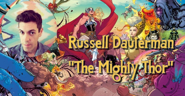
Russell Dauterman is one of the greatest and most under-appreciated artists working in comics today. “The Mighty Thor” is arguably one of the best ongoing series currently published by Marvel and, with the vividly detailed art of Dauterman, the comic wouldn’t be nearly as fantastic. “Thor” #700 was a visual feast. Dauterman’s splash page in the issue was one of the high points of the year for me. The page was drawn so fantastically and was loaded with secrets teasing the next year of stories for the book. Meanwhile, the cover for “The Mighty Thor” #702 is a greatly inspirational image that shows the inherent strength a hero usually seen sitting on the outskirts of the Odinson’s life. If you haven’t seen the wonderful art of Dauterman in the past year I would ask you to kindly reacquaint yourself with one of Marvel’s best. – Alexander Jones
Continued below4 (tie). Fiona Staples

Since “Saga” burst onto shelves and into our hearts five years ago, Fiona Staples has been an staple of lists like this. And rightly so, she is brilliant. In “Saga,” her art creates such a vibrant and alive world. She builds loads of fantastic and original imagery for this huge and varied universe “Saga” takes place in. But it isn’t just big sci-fi stuff that makes Staples so great, it’s the life all her characters are given on the page. At its heart “Saga” is a family story, the point is the characters and relationships. Staples can do both big sci-fi moments and quiet family moments, and make them beautiful. Her work manages to be very pretty in a way that never distracts from the story she and Vaughan are telling. Sometimes an artist may make something that is visually beautiful but doesn’t progress the story, that is never the case with Staples, she is always doing comics in the most beautiful of ways. – Edward Haynes
4 (tie). Jorge Jimenez

For a medium that was originally intended for children, there are few things that comic artists have trouble with more than realistically drawing kids. They are either too muscular, just shrunken adults, or a weird homunuclus that looks out of place on every page.
Jorge Jimenez has no such problem.
The youthful exuberance he brings to the titular “Super Sons” allows the characters to appear truly young, not just small. Jimenez is unencumbered by trying to make the boys look like anything other than what they are: a scowling misanthrope and a wide-eyed smile on two gangly legs. The way Jimenez differentiates the movements of the kids to the rest of the characters in the book is masterful; they are perpetually taking the steps two at a time or leaping when a walk would do just fine. These are kids who are trying to prove themselves, and Jimenez’s layouts and panel composition reflect that as well. When the adults are around, there tend to be larger, more static imagery – they have nothing to prove. When the boys are on the move, the panels reflect the kinetic energic and manic excitement that comes from being young.
But Jimenez also excels in the quieter moments of the book, where the boys have to figure something out, or pause in contemplation. Jimenez practically shows you the synapses firing and inspiration striking with his masterful facial expressions. There is nothing about his work that leaves you guessing, either the intent/thoughts of the characters or what is supposed to be happening on the page. His frantic, manga-influenced style never gets sloppy or unfocused. Rather, there is such an energy that runs through it that you’re both barely keeping up, as well as marveling at the craft of each panel. – Brian Salvatore
2 (tie). Mitch Gerads

Mitch Gerads, to the best of my knowledge, will have illustrated only eight issues by then end of 2017. That consists of three issues of “Batman” and five issues of “Mister Miracle,” all in collaboration with his “Sheriff of Babylon” partner, Tom King. While his output may be lower than some of the other artists on this list, his accomplishment is certainly no less impressive. Aside from reaching entirely new levels in his craft, Gerads inked and colored all of his work. The resulting product is one that feels quite unique, mostly due to Gerad’s impeccable ability to blend the mundane with the extraordinary.
We first see signs of this in his work on “Batman” in issues #14 and #15. The epilogue to the “I Am Suicide” arc, this two-parter plays with the history of Bruce and Selina. Gerads playfully clashes multiple eras of Batman history, from the Golden Age to Mazzucchelli’s ‘Year One’ to King’s own flavor of Batman. This story also highlighted the team’s commitment to the use of nine-panel grids, a format the duo would use throughout the year to great effect. In “Mister Miracle,” Gerads would go on to contrast the mundane and the surreal further, blending the every day monotony of civilian live and human co-habitation with the wild antics of Kirby cosmology and daredevil escapades. Sometimes this contrast exists within the same page, as in the spectacular sequence in issue #3, where Scott converses with Bug. Gerads’s use of the nine-panel grid calls Scott’s unreliability as a POV character into further question, as the technicolor Bug never appears in the same panel as Scott until the end of the exchange. This small design choice elevates the already engaging and challenging story.
Continued belowHowever, some of Gerads’s best work eschews the nine-panel grid, and panels in general for that matter. Gerads delivers two of my favorite pieces of comics work this year in a duo of splash pages. The first, in “Batman” #14, is a minimalist piece that casts an embracing Bruce and Selina on a rooftop, against to starlit backdrop of the Gotham night’s sky. This minimalist approach is later explored in Scott Free’s escape acts in “Mister Miracle.”
The second, and in my opinion greater of the two, is in “Batman,” a one-off team-up between Swamp Thing and Batman. The page, which as an almost Norman Rockwell quality to its composition, again contrasts the normalcy of Bruce’s manorial life against the fantastical profile of Swamp Thing. It’s a terrific scene upon which the rest of the issue finds its ground. Gerads’s pairing with King has certainly been a bountiful one in 2017, and I look forward to seeing more of their work in years to come. However, it’ll be equally exciting to see Gerads take what he’s learned this year and apply it in other collaborations as well. – Zach Wilkerson
2 (tie). Nick Derington
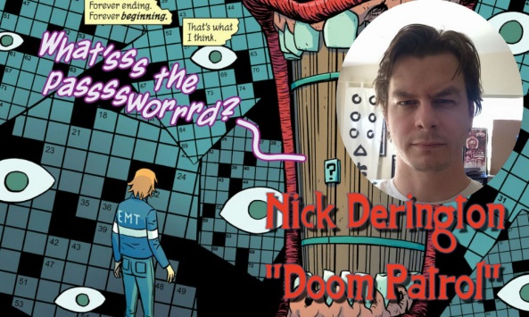
Drawing Gerard Way’s “Doom Patrol” can’t be easy.
For starters, you’ve got fan favorite characters to update but still stay consistent with for longtime fans. The series also introduces a whole host of new characters to design, some of them outlandish and superpowered, some of them just roommates and co-workers.
On top of that, you’ve got a story that spans from an American city to the farthest reaches of the galaxy. In short, you have to be ready to draw anything and everything.
That alone is a considerable challenge. But what if you had to find a balance between cartoonish flexibility and a sense of dimensionality and weight? That all of these crazy things could actually exist in the world? Nick Derington, joined in later issues by the legendary Tom Fowler on inks, delivers on all counts. The final page of the latest issue of “Doom Patrol” is the perfect example. In a page drenched in classic Gerard Way symbolism, a character has left his parents a message written in the junk in his bedroom. This means Derington needs to draw laundry, broken records, a skateboard, all manner of every day objects and them legible, visually interesting, and believable as those objects, all while allowing the heartbreak of the message itself to shine through.
And Derington does this sort of thing multiple times in every issue. The core of Way’s work has always been transmitting heartbreak through the most elaborately bizarre means possible, and you need an artist as versatile as Derington to pull it off, and one whose work is subtle and beautiful enough to convey real emotion.
Also, even if Derington wasn’t delivering some of the best sequential art on the planet, he’d surely rate high on this list for the sketch work he shares on social media. Working almost exclusively in colored pencil and on characters from every corner of the medium, his work there is just as imaginative and alive as his print material, and well worth a follow. – Benjamin Birdie
1. Stjepan Šejić
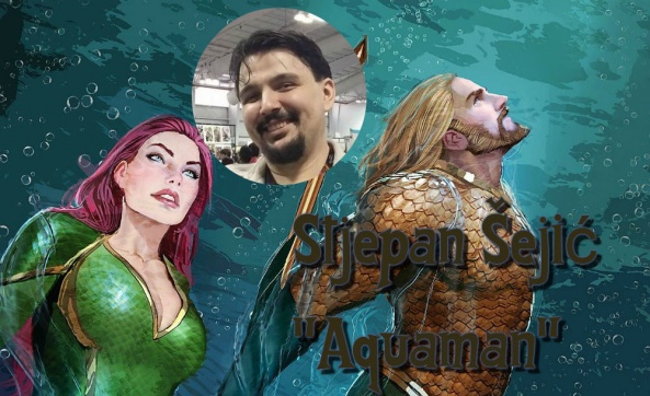
Before this year, I was somewhat familiar with Šejić’s art from his work for Top Cow, particularly in “Artifacts,” as well as a few issues of “Rat Queens.” It was when he took over the illustration duties for “Aquaman,” though, where we really got to see what he can do, and by all accounts, it is fantastic.
The amount of detail that goes into each and every panel Šejić draws is praiseworthy enough, but every image is overflowing with dynamic fluid action and raw emotion. There’s a perfect amount of shading and color on each of the characters to make them feel alive and the little details on each of them really make the characters pop. The way he draws each of them in any given scene conveys a huge amount of emotion and intention behind every pose, glance, and smile. Even the individual scales on Aquaman’s outfit glisten and shine with an amazing amount of care and attention, and the effort it must take pays off immensely in the end results.
Continued belowOf course, when you’re drawing a comic set almost entirely underwater, as “Aquaman” is, “fluid” takes on more than one meaning. The underwater action Šejić illustrates has added a certain level of flow and power to the scenes, properly employing sprays of bubbles and flowing water around the characters to illustrate the intensity of everything they do. The way the characters float, their hair flows in the water, and how they hold themselves as they move all evoke the sensation of them really being underwater, rather than just characters standing around with an aquatic background.
Speaking of backgrounds, yes, those are excellent too. From the glistening throne room of Atlantis to the murky depths of its slums, Šejić’s work with the scenery is a sight to behold. Each location feels real and alive, filled with brilliant detailing and shading/lighting work that enhances the scenes. Where else would characters drawn with such detail and care live than an equally impressive world?
What else can I say? Stjepan Šejić’s work has blown me away this year, and he absolutely deserves three cheers (at the very least) for the amount of care and detail he puts into it. – Robbie Pleasant
Editorial Commentary:
Brian: It is sort of insane that we only have one artist, Fiona Staples, carry over from last year’s list. I don’t think it is possible to squabble with any of these picks, in either year, but this year’s list is really impressive to me, due to the sheer variety of styles represented. From MacLean and Johnson’s manic energy to Jimenez’s burst of exuberance to Šejić’s smooth detail work, this list represents some of the best of comics, not just this year, but this decade. Take both years together, and that claim only intensifies.
Matt: I do like the variety of styles our staff selected for this one. Part of the reason these people caught our staff’s attention is that their styles are so malleable and able to fit all kinds of genres and aesthetics. But, echoing you, Brian, I like we have everything from simple designs to overly intricate linework represented here.
Alice: Ditto on what both of you guys said. I’m much more proud of the representation of artists here than on our writers list. I do wish Joelle Jones was higher on the list, but I’m glad she’s on it at all.


