

Welcome to the Multiversity Year in Review for 2021! To call this a weird year is a Hulk-sized understatement, but one thing that was a pleasant surprise was the sheer number of interesting and excellent comics that came out this year. We’ve got over 25 categories to get through, so make sure you’re checking out all of the articles by using our 2021 Year in Review tag.
Color artists are responsible for color (obviously), but also so much more than that. They add texture to a comic, and visual effects. Color can direct the eye, helping guide the reader to the most important parts of the story, while also setting the pace. Our colorist award is named after Dave Stewart, because he was the best for so long. He’s not the only great in comic book coloring though, so here are our favorite groovy colorists who helped make 2021 comics fabulous. Dave Stewart is not eligible for his own award.

3. Matt Wilson
Matt Wilson is a hell of a colorist. You don’t make get namechecked in the same lists as Jordie Bellaire, Tamra Bonvillain, Nathan Fairbairn, Dave Stewart, and Laura Allred unless you have chops. You certainly don’t do it year after year after year if you aren’t incredibly good at applying the equivalent of sound and motion to a medium that is silent and static. And when the artists as good as the ones Matt works with make sure he’s the one touching the work they spend all those hours slaving over, then you know Matt is, in fact, a hell of a cartoonist.
What artists, you ask? What books put Matt on this 2021 list? How about Nic Klein on Thor, Esad Ribic on Eternals, Mahmud Asrar on King Conan, Guiseppi Cammuncoli on Undiscovered Country, and Chris Samnee twice (Fire Power and Jonna and the Unpossible Monsters). God-sized action in the Nu-Marvel Mighty Manner, pulp fantasy sharp as a barbarian’s sword, near-future dystopia, martial arts action with a domestic twist, and an all-ages children’s fantasy kaiju-infested comic. If you can find a throughline for that whole list other than Matt’s involvement, I’d like to see it.
But that diversity speaks to a good colorist’s ability to mesh with and accentuate what the story and their artist’s work requires to make that final product work. And as previously established, Matt (like Jordie & Tamra) is a hell of a good colorist. – Greg Matiasevich
2. Tamra Bonvillain
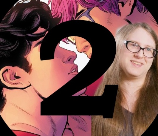
Color artist Tamra Bonvillain has had an incredibly important 2021. Bonvillain’s 2021 work is perfectly captured by the colors for the “Superman: Son of Kal-El #5” variant cover by Travis Moore and Bonvillain. This image depicts an iconic kiss between Jon and Jay. Bonvillain’s masterful colors give the image a sense of intimacy that defines the current era of DC. Bonvillain’s “Wonder Woman” colors add so much to the flagship DC property. In issue #779, she uses a lot of negative space in the background to show that Diana is in a place like no other. The hues of Deadman are a great juxtaposition for Wonder Woman’s ghostly white outfit here. One of my favorite outlets for Bonvillain’s work this year has to be the colors for “Crush and Lobo.” The series has so much ambition and she lends an incredible amount of details to the colors alone here. “Crush and Lobo” contains numerous space bars where every drink is a different color and every alien is wearing something interesting. The attention to detail that a colorist like Bonvillain can bring to a project is the difference that can make a comic book truly great. I can’t leave here without giving a special shoutout to “Proctor Valley Road” as she lends wonderful colorwork to the legendary BOOM! Studios comic that features writing contributions from Grant Morrison! Here’s to the promise of a great 2021 with titles like “Wonder Woman” continuing into the next year! – Alexander Jones

1. Jordie Bellaire
In a year brimming with talented colorists doing phenomenal work, Jordie Bellaire has emerged yet again as our number one pick for Multiversity Comics’ 2021 Dave Stewart Colorist of The Year. Her work on “Black Widow” is always a pleasure to behold. The dominance of the color red is handled exceptionally well. In my opinion, no one colors Natasha Romanoff’s hair better than Bellaire. She utilizes a very distinct style that’s bold, yet complements the pencils and inks. This is a tricky balancing act that she handles better than most — drawing attention to the character without overwhelming the work of her collaborators.
Continued belowWhat she does with the various settings is also worth noting. The backgrounds in dialogue-heavy scenes are often rendered in muted tones that, coupled with the inventive panel layouts, enhance the pleasing sense of depth in the panels. A simple conversation between characters is frequently made to seem vivid and engaging.
Her approach to action scenes is well thought out. Her splash pages are often jaw-dropping. The coloring on things like blood spurts and sound effects make the images vastly more dynamic. Additionally, she sometimes uses a single color to dominate the panels during heightened moments. In “Black Widow,” whenever she saturates her scenes in bright red, this creates an exhilarating sense of danger and suspense.
The attention to detail shown in character costumes is also interesting. The saturated purple of Hawkeye or the whiteness of the White Widow make these individuals distinct thus creating a smooth reading experience whenever multiple characters are engaged in combat.
Additionally, her adaptability to genre is remarkable. Ms. Bellaire’s DC work has a different flavour and matches the tone of the book she’s working on. Her work on “Hellblazer” is perfect for the horror genre. She favors a seemingly drab color palette mostly consisting of greys, blues and greens to depict John Constantine’s England. In contrast, she selects a more saturated, warm-colored aesthetic whenever supernatural entities are showcased.
After only one issue, “The Thing” already looks like another feather in her cap. In the opening, New York has a look reminiscent of the grittier, street level Marvel heroes like Daredevil and Iron Fist. When the titular character is revealed, she switches color palettes to a more vibrant, silver age look suitable for a member of The Fantastic Four. This book has lots of potential and we can’t wait to see what she does with it in the new year.
It is a testament to Jordie Bellaire’s superb output that we haven’t even talked about some of her other work such as her contributions to the Image series, “Head Lopper”. One thing is for certain; she is a rare talent whose color work greatly improves her partners’ illustrations. We look forward to more outstanding work from her in the new year. – Jim Malakwen


