

1. The Bizzaro World of “Superman”
The Bizarro world of opposites is a long standing tradition in the DC Universe, and has seen all kinds of interpretations, but in their last big storyline for their “Superman” run, Peter Tomasi, Patrick Gleason, and Doug Mahnke (with letterer Rob Leigh and a bunch of inkers and colorists over the course of the arc) really pulled out all the stops.
They expanded the conceit to the entire universe, like Robin here. Who, I think, is a slick “man” wonder? I’m not sure. It’s not quite one to one, but it is delightful.

See? Like, a Ladies Man? I think?
And, instead of rescuing a cat from a tree…
A deeply sad Joker…

Even the sound effects are opposite!

I guess you could say…I hate it! ;D
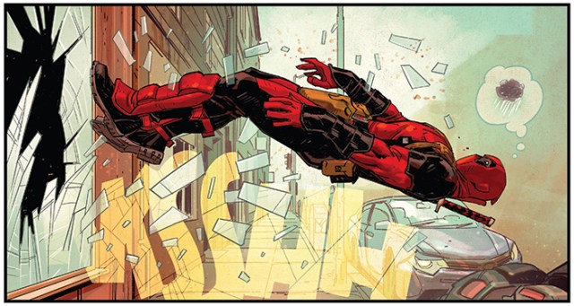
2. Nic Klein and the Perfect “Deadpool” Panel
It takes little bit for the first issue of Skottie Young and Nic Klein’s “Fresh Start” of “Deadpool” to really kick into its zaniest gear but Klein wastes no time in putting on his usual clinic. In the panel below, Deadpool is getting chucked through a window, probably not for the first or last time. Klein (who colors his own work) captures the moment perfectly, simultaneously active and frozen, even giving Deadpool some character, in a mask and without a word of dialogue. The composition, the body language, and both the bold and subdued color choices, all come together for this here:
3. A . . . Powerful . . . Moment in “Man Of Steel.
There have been a lot of great moments in Bendis’s “Man Of Steel” that draw from the rich seam of the writer’s talent for verisimilitude and humanistic dialogue, but one of the most striking moments so far was incredibly simple.
Superman is examining the aftermath of a building fire, and after a look around, he switches to X-Ray Vision:
 The art by Ivan Reis and Joe Prado conveys the stillness of the moment, but it’s colorist Alex Sinclair who makes the boldest choice. Having even the most basic familiarity with the character and noting the context tells the reader that the simple flat of blue means, Superman has switched to X-Ray Vision. There’s no dotted lines, or circled cutaways, just one CMYK choice (the pure color isn’t altered or gradated in anyway). It’s a remarkable moment of restraint that makes Superman and this story seem all the more powerful.
4. The Incredible “Isola”.
Writer Brenden Fletcher, artistsKarl Kerschl and MSASSYK, and letterer extraordinaire Aditya Bidikar have created a truly new experience in their new book “Isola.” Like, check this out:

One of the coolest aspects of the book is Bidikar’s creation of an entirely new language for sound effects. They have a vaguely Japanese feel, but are completely new creations.

They do a phenomenal job giving them impression of volume and the nature of the sound without using a single readable letter.
The character action and the backgrounds, while without as pronounced a difference as we saw on “Gotham Academy,” still work together in a strikingly unique way.
And check out this sequence that bridges two pages.

This book is special in pretty much every way.
5. The New Status Quo of Cosmic DC
“Justice League: No Justice” did a lot of ground-setting for plenty of characters and the DCU at large, but my favorite development has to be this crazy bit where to save Coluans from being eaten, they had to release thousands of planets that Brainiac had captured and shrunk down into power sources.
This meant that out in space, there are now thousands of planets that had been sequestered for like a super-long time are now free and clumped together in outer space. But don’t take my word for it:

Oh yeah, there’s also a planet’s worth of Coluan refugees in ships in the same area.
It’s just an incredibly interesting stage to set the next few years of cosmic DC stories, and a development with a ton of potential. I can’t wait to see where it goes.


