

Welcome, Earthlets, to Multiver-City One, our “2000 AD” weekly review column! Every Wednesday we examine the latest offerings from Tharg and the droids over at Rebellion/2000 AD, the galaxy’s leading producers of Thrill-Power entertainment. Let’s get right to it!

THIS WEEK IN 2000AD

Judge Dredd: Chimpsky’s Law Part 4
Credits Kenneth Niemand (script) PJ Holden(art) Quinton Winter(colours) Annie Parkhouse(letters)
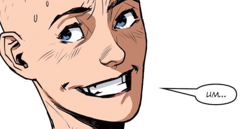
Michael Mazzacane: After all the build up last week it’s time for the terrorist cell to finally act and bring about the revolution! If Noam doesn’t get in their way, well, if they don’t get in their own way. It’s interesting to consider their portrayal against early ‘Democracy’ style storylines and the present context about the terrorist figure. These terrorists are a bunch of dolts, who are dangerous to themselves and others. This allows the team to work in some solid physical humor and sight gags as Noam manipulates the situation. It also creates a more humorous option to the futility of their position that was explored in the last strip. Here their actions are futile because they’re plainly not good at this sort of thing instead of being overwhelmed by the Justice system.
Niemand continues to use Noam’s narration to tie everything together, but due to running the numbers last week, there is a certain unreliability to what is written and the corresponding images. How do you trust this is what’s going on and not a flight of fancy, or dying memory, by Noam. The terrorist operation is not tense in the slightest, the creative team go to great lengths to show their ineptitude. What makes it tense is both the sense of potential unreliability and the readers own interest in seeing Noam succeed against Dredd.
Quinton Winter’s coloring in this episode is delightful. They give Mega City One both a bright overall palette, but one that still reads as dystopian and decrypt. Pages are primarily understood as a mixture of oranges and yellows, which makes the short term gas pop even bigger with all of its purple and maroon tones. It just feels like a hot sunny day, like Dog Day Afternoon, but with a comedic edge. The terrorist seem like they’re interrupting a normal day of mindless consumerism than staging the opening strike in the revolution. Winter’s coloring hasn’t come to the fore in this way before, it’s been solid from the start, but here it is a good example of how the creative team are able to visually reference the texture of a sequence and still skewer it.

Aquila: The Burning Fields Part Eight
Credits: Gordon Rennie (Script), Patrick Goddard (Art), Pippa Bowland (Colours), Jim Campbell (Letters)
Christopher Egan: The destruction from Vesuvius’s wrath opens this chapter. Horrific deaths are on full display and with Rennie’s script we feel the full pain and heartache of the loss of these innocent lives in the wake of an apocalyptic nightmare. Knowing this is based on the real tragedy of Pompeii makes these opening pages all the more powerful. It is at this moment that we fully understand the subtitle of this Aquila story, we are at the burning fields.
We then move forward to Hades where Aquila and his companion have arrived, reborn in the underworld. The gates have opened and our heroes are ready to move to the next part of their journey. With being reborn, Aquila has regained his eyes, his health, and has dispatched the severed head of Scarabatus that was stitched to his shoulder. His companion is healthy as well and both men have gained new armor and weapons. Aside from being in Hades, things are looking up for them, cosmetically anyway.
A young man is sitting alone a few steps away, which is soon revealed to be a much younger, and a bit more flashy Scarabatus. Looking himself over, he reveals some interesting traits about himself and the way he sees himself. As the three men discuss their best way of finding the soul of Nero they know there will be many enemies and many obstacles in their way. Scarabatus isn’t even sure where in Hades the soul of a previous Emperor would even be. This unlikely trio sets out for the Rivers of Hades!
Continued belowHorror and excitement are fully fleshed out in each panel. A very solid entry to this saga and it will definitely keep fans intrigued on where the story goes next.
“Aquila: The Burning Fields” Part 8 has some great moments that open our eyes a bit more to the true nature of these characters, but at only 5 pages long, it is over before it really gets going. However, it more than does its job of getting us to come back for more.
Thank you… and just in time. Here’s Survival Geeks
Survival Geeks, Crisis of Infinite Nerds, Part 7
Credits: Gordon Rennie & Emma Beeby (script), Neil Googe (art), Gary Caldwell (colors), Annie Parkhouse (letters)
Gustavo S. Lodi: Like clockwork, “Survival Geeks” alternates between the bad-good issue dynamic this column has been referring to since the series and arc started. In an inventive, cleverly plotted, and very amusingly scripted and dialogued entry, this chapter of ‘Crisis of Infinite Nerds’ was a blast.
The underlying constant of “Survival Geeks” has been its art. Chapter in and chapter out, Neil Googe crafts dynamic panel layout, fluid action, clever character designs, and some truly outlandish, Kirby-esque creature and environmental designs. There is never a dull moment on these pages, even when characters are mostly socialising and discussing their absurd altercations.
On a still positive note, the script and plot for chapter seven actually pushes onward. Readers will better understand the nature of this world (multi-world?) and of the challenge at hand, and experience what is nearly the endgame for the entire story. The cliffhanger alone is worth the price of admission, with a bit of a fourth-wall break leading directly to the next issue’s blurb.
All in all, “Survival Geeks” continues to surprise, and not always on the right way. Happily, this entry is filled with absurd situations done right, sharply written dialogue, and a satire undertone to the habits of comic book, and general nerd tropes, that the vast majority of its audience will find entertaining.
Future Shocks: Scavengers
Credits: Rory McConville (script), Andrea Mutti (art), Simon Bowland (letters)
Brian Salvatore: ‘Scavengers’ is a clever little one-shot, which subverts expectations a few times over the course of its four pages. It’s a masterclass in keeping the reader on their toes, and in delivering a surprising story in a very familiar milieu.
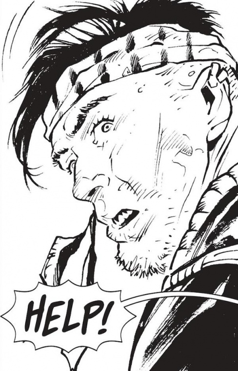
The strip begins like countless dystopian sci-fi stories, with a scavenger/hunter out among the burnt out ruins of a city, attempting to locate a lost comrade. He’s on the radio with someone back at home base, who is communicating just how little time he has left to complete his mission. When our scavenger, Charles, spots Ray, the missing one, McConville’s script does its first twist, which is to reveal that Charles and Ray are lovers, behind the back of Marvin, who is also in a relationship with Ray. That makes it sound more soap opera-y than it reads, but we are quickly given a love triangle that adds drama to an already very tense situation.
Perhaps the reveal of the love triangle felt a little more surprising because we are still living in a very heteronormative world, but the sexuality of the three characters really doesn’t matter. Its main purpose is to give the strip an added element of tension, and it works, because just as the relief washes over the reader that they made it back, McConville’s second twist is revealed: Marvin knows about their tryst, and is going to let them die as he watches. This is an especially cruel ending to the strip, which is underscored by Mutti’s phenomenal art, which places so much fear on the faces of Ray and Charles, while leaving Marvin looking cool as a cucumber as he is about to watch his friends die.
Mutti’s work on the creatures that populate this world is also really fun, as they are vaguely reptilian in nature, but when bathed in his heavy ink, they take on demonic qualities. It’s also fitting that the creatures look different in every shot, as if you were on the run from these beings and confronted them only during quick movements and battles, you wouldn’t necessarily have the best view of them either.
Continued belowAll told, this “Future Shocks” has the requisite twist that most installments feature, but with an added dose of drama due to the romantic entanglements present. It’s a fun, quick read that leaves the reader totally satisfied with its amuse bouche of a story.
Hershey: Part 7
Credits: Rob Williams (script), Simon Fraser (art), Simon Bowland (letters)
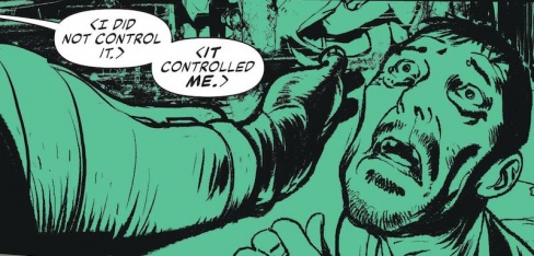
Greg Lincoln: “Hershey Part 7” gives us a few moments with Falcoa the man and it seems that Rob Williams wants us to see him as a bit of a person before the end. The opening page with this glorious neon green tones shows him a bit, and only a bit, remorseful, contemplative, and just a bit human before returning us to the man changed by the gift of Smiley and by the city that is now his. Then Williams returns us to our regularly scheduled despot as he seeks to expand his reach. Part seven also takes a shift in narrative gears and though Williams lets the dialogue carry the plot we rush forward into a showdown between the “Judges” of Comuna 13 and Hershey’s band of two. He also reminds us that Hershey is not here for justice she’s here to wipe out the net built by Judge Smiley.
Simon Fraser kills it on the art this week as much as Hershey and her army of two killed up a whole squad of “Judges.” From his opening images that cast Falcoa as a hit more human, through the flashback to Hershey working up to the attack on him, to the reveal of the monster that Falcoa is the image are all marvelous, clean and moving. The color choices bring them alive, particularly the cold neon opening to the hot neons that close the chapter. “Hershey” has been a gorgeous treat to have with this bad ass character we thought was sadly gone. Thought it’s a bit too much an American comics trope I’d not be sad to see her stick around for a while after this arc.


