
There is a lot to cover on Wednesdays. We should know, as collectively, we read an insane amount of comics. Even with a large review staff, it’s hard to get to everything. With that in mind, we’re back with Wrapping Wednesday, where we look at some of the books we missed in what was another great week of comics.
Let’s get this party started.

Avengers #675
Written by Mark Waid, Al Ewing, and Jim Zub
Illustrated by Pepe Larraz
Colored by David Curiel
Lettered by VC’s Cory Petit
Reviewed by Gustavo S. Lodi
As the beginning of the 16-issue weekly event ‘No Surrender’, “Avengers” #675 needs to prove it can deliver on an epic scale, juggle multiple characters and be a coordinated effort among its three writers. But does it succeed?
Like most event books, there is a lot to establish on this first outing. The script is successful on determining who the main characters will be, the scope of the danger the heroes will face and even includes a plot twist or two. Curiously, where it is at its strongest is right at the start on a more subdued moment, where it re-introduces the hero Lightning (Miguel Santos), his current whereabouts and even supporting cast. It seems that Miguel will be used as the reader’s point of view into the story, which is a wise creative choice, considering the large overall cast and fast-paced action.
Having said that, the script is at its weakest in determining how unique the book will be. Given all the recent events published by Marvel, there is little here to illustrate why the sense of danger should be at an all-times-high. Sure, it seems like a cosmic-level threat, but how many times have readers seen the Avengers (at much smaller rosters) prevail on similar scenarios?
The art by Pepe Larraz is truly outstanding. Every page packs a great level of detail, but without sacrificing pacing or character expressions. Pepe also makes a point on making everything look beautiful: from sport cars in an auto-shop, to massive tidal waves hitting the shoreline. The mostly empty half page in space with Captain Marvel works particularly well, as it reflects the hero’s desperation at the same time it shifts readers from a dense page into a much lighter one. The colors by David Curiel complement the art beautifully and is very effective in supporting the distinctions among the large groups of heroes – costumes and energy signatures all look distinct.
Final Verdict: 7.1. “Avengers” #675 is a good start for this weekly event with a good script and great art, but it still needs to show why it will stand out among the crowd. Hopefully the next instalment will offer more answers to that.

The Damned #7
Written by Cullen Bunn
Illustrated & Lettered by Brian Hurtt
Colored by Bill Crabtree
Reviewed by Matt Sadowski
Eddie’s corpse makes a screwball escape while his soul journeys deeper into the netherworld—now in color! Bunn and Hurtt have settled nicely into their infernal noir series by now. With the introduction of new characters, glimpses into the past, and “The Damned” universe’s mythological expansion, the second part of ‘Prodigal Sons’ is the most fun and fresh of the series.
Morgan and Darcy escaping Bruno Roarke’s hit squad with Eddie’s corpse is the action comedy through-line of the issue. Slapstick action and quick-fire repartee hearken back to the screwball comedies of the day. The complete disregard in which Morgan and the demons play hot potato with Eddie’s lifeless body is hilarious as he’s dropped from a building, used as a knife-deflecting shield, and wielded as a blunt instrument. Hurtt’s cartooning is reminiscent of old comic strips, a perfect fit for the prohibition era setting. Most pages follow a nine-panel grid (with some combined panels), providing the necessary space for the action to unfold clearly.
Eddie’s suicidal venture to the afterlife does nothing to temper his cracking wise like the literary gumshoes he’s modeled after. While the netherworld has largely remained on the periphery of the series, ‘Prodigal Sons’ is delving deeper into it than ever before. Ancient Greek architecture of broken columns and coliseums populate its foggy ruins. The colors are so muted that it verges on black and white, a nice balance with the color palette between this issue’s two prominent scenes.
Continued belowSide note: this latest three-part arc of “The Damned” isn’t entirely “new.” Originally black and white, Oni Press is rereleasing “The Damned” in color upon its launch as a regular series last year. But, considering the monochromatic media era that this series lovingly references, did this demon noir series ever need color? Admittedly, Crabtree’s coloring work is effective so it might be worth a reread for original fans.
Final Verdict: 7.5 – Revitalized with color a decade after its initial release, ‘Prodigal Sons’ part 2 ups the ante by delivering the action, humor, and stakes that make this demon noir great.
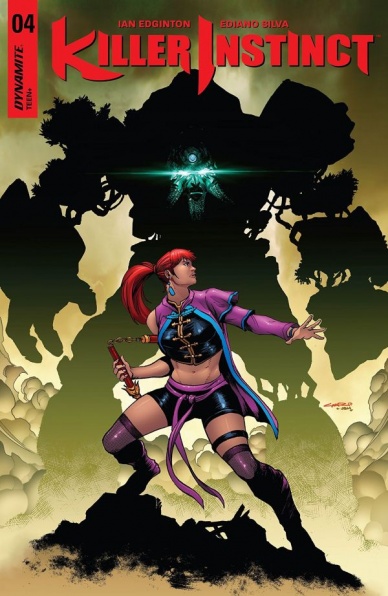
Killer Instinct #4
Written by Ian Edginton
Illustrated by Ediano Silva
Colored by Jorge Sutil
Lettered by Troy Peteri
Reviewed by Gregory Ellner
In terms of writing, Ian Edginton does not fall into the trap of lesser fighting game comics, and rather than just make a full issue all about a fight without much plot otherwise, he limits the one real battle. Instead, Edginton focuses in on plot. A large portion of the story in “Killer Instinct” #4 concentrates on the relationship between the five characters on the island of Akeso, and even the villainous Kan-Ra is given a chance to show himself useful (though perhaps not entirely trustworthy). The writing does not require prior knowledge of the series, but rather incorporates the necessary elements into the dialogue without feeling too much like an info dump except where that is the explicit point within the story itself.
Ediano Silva’s artistry is very dynamic, befitting the genre of the story, at least in terms of physical action. Unfortunately, this does not extend to facial expressions. With the exception of the positively hammy Kan-Ra and a few rare moments with Kim Wu, there is next to no change in anyone’s facial expressions, and they appear to be virtually the same regardless of their emotions, from anger to surprise to worry or sadness. This problem is particularly noticeable when, while discussing her recent depowering, Wu’s face is not in focus, making any ability to actually see what she is thinking be impossible.
Jorge Sutil’s coloring helps to save the art somewhat. The island of Akeso is given a vibrant green color that contrast with the different shade of green in the stones making up Aganos, each of these contrasting against other attention-grabbing colors, in particular the violet and blue outfit on Kim Wu. All of this bright coloration works in contrast against the flashback told by Kan-Ra, where browns and oranges take the focus in order to give a distinct impression of a past surrounded by desert as is a common interpretation of Mycenaean Greece. Each of these work well when pitted against the dark shadows of the Coven’s lair, which, for good reason, is covered in very dark hues to draw attention to their vampiric nature.
While the comic is pretty good, it doesn’t do much to really stand out from other action comics in this particular issue.
Final Verdict: 6.5- A pretty well put-together story and interesting color palette that are both sadly hampered by somewhat lackluster facial artwork.
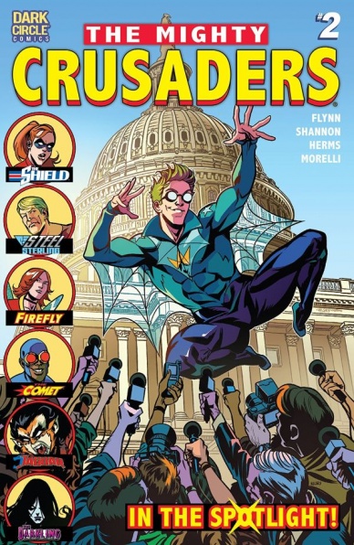
The Mighty Crusaders #2
Written by Ian Flynn
Illustrated by Kelsey Shannon
Colored by Matt Herms
Lettered by Jack Morelli
Reviewed by Michael Mazzacane
“Might Crusaders” is in a bit of an odd place. On one hand it is a book with a fairly long and recent history. At the same time, it’s hard not see how these characters, despite bearing multi-generational monikers, as being clear analogs to various other characters and reading them as such. Now that could be my own lack of familiarity with these characters and the series in general, but those assumptions are what inform the larger question of: why/how do you do a cape book outside of the Big Two? The second issue of this series does a better job of making a case for itself and answering those overriding question.
As a cape book there is a certain throwback charm to it, however being about super people doing super things hasn’t been popular since the turn of the millennium. Where “Crusaders” shines is when it skips the heroics and focuses on the personal dynamics of these characters and how that history informs them, and other modern considerations like public relations. From that angle it makes “Crusaders” a bright and poppy riff on some of the more interesting elements of “The Ultimates.” When focusing on the personal dynamics Kelsey Shannon’s clean designs shine. Firefly is shown with great emotion and articulation as she gossips about Shield over several glasses of wine. If there is one section Shannon falls a little short in is environments, there are several panels that conspicuously drop them and replace them with solid bright colors that don’t exactly extenuate the emotion of the panel.
Continued belowWhile the super heroics maybe a tad boring, Flynn and Shannon use the nostalgic qualities of the book to their advantage in crafting an effective horror sequence. Shannon, colorist Matt Herms, and letter Jack Morelli do a good job of giving this segment of the book its own distinct feel by playing to the classic, core, strengths of horror. Those strengths being, strong imagery and panel by panel pacing, with a dash of cheesy distressing dialog. Having the mad sorcerer ask you to “hold nothing back. Scream as you die” because it adds a nice effect to the ritual is surprisingly hardcore. Like most cape books, it is at its most interesting when it isn’t really about the capes.
Final Verdict: 7.0 – “Might Crusaders” is still early on, but it seems to be finding a niche and using its nostalgic aesthetic to mask more contemporary takes on cape comics.

Millennium: The Girl Who Kicked the Hornet’s Nest #2
Written by Sylvain Runberg
Illustrated and Colored by Manolo Carot
Lettered by Phillipe Glowgowski
Based on the Novel Trilogy by Stieg Larsson
Reviewed By Kate Kosturski
(Warning: This review will contain spoilers for the novel The Girl Who Kicked The Hornet’s Nest)
As Frank Sinatra once said, “and now the end is near” – – for we have reached the final curtain of the story of Lisbeth Salander. This final issue of the latest comic adaptation of the Stieg Larsson novel series hits all the high points of its source material: Lisbeth’s trial, the investigation and capture of Erika Berger’s “poison pen” who sent the sexy snaps to her (now former) bosses at the Svenska Morgon-Posten, the various courtroom revelations from her sister and from a disturbing videotape that lead to Lisbeth’s vindication, her own moment of reckoning with her half-giant half-brother, and a somewhat warm reunion for Mikael and Lisbeth. For those that never read the book, it will provide fulfillment. For those that have, it will probably come across as disjointed and with several gaping plot holes (like the previous issue), though less so here than the first installment.
Once again, Manolo Carot returns to illustrate and color this final issue, and while he does fine work, it’s quite different than that of the man who did the art for previous issues (Jose Homs). His Blomkvist is more chiseled and angry in facial features, which doesn’t always match the tone of the story – – Mikael and company know the Sapo is closing in on them, but rather than be fearful and angry, they are resolved to beat them at their own game. Carot pulls out every possible stop with the punk Lisbeth in her first courtroom appearance. It’s well done, but does feel a bit much. As I said my previous review, praise is due to Carot for making his own mark on these characters when numerous film adaptations provide many an inspiration for him.
While there is a fourth novel in the series (The Girl in the Spider’s Web), it’s not authored by Mr. Larsson, and reviews for it have been mixed. Thus, it feels right to end our comic adaptation here, as was our author’s original intent in his novels. The adaptations of The Girl Who Kicked The Hornet’s Nest were weaker than their two predecessors, but the comic brings Mr. Larsson’s work to a whole new set of fans. If they pick up his books as a result of these comics, they can be considered on some level a successful endeavor.
Final Verdict: 5.9 – The weaknesses in narrative from the first issue carried on into the second, but aren’t as bad as before. I’m not thrilled that we have another change in artist either, but it does behoove you to read this second half to finish out the story.

Titans #19
Written by Dan Abnett
Pencilled by Paul Pelletier
Inked by Andrew Hennessy
Colored by Adriano Lucas
Lettered by Josh Reed
Reviewed by Alexander Jones
The newest issue of “Titans” shifts the focus of the title ever-so-slightly with the introduction of DC artist Paul Pelletier. Pelletier has a great handle on the Legacy of the CD Universe and is a perfect person to be drawing one of the comics so essential to the publisher’s current initiative even with the “Rebirth” being over and the books switching back to the DC Universe logo. Pelletier is especially vital in the context of this comic as this story, in particular, bears a strange, overbearing script with two groups/generations of brightly colored costumed heroes.
Continued belowWhile writer Dan Abnett certainly seems to carry a strong set of voices for the “Titans,” this story sets up seasoned Justice League heroes like Batman to come off as really harsh against the team without the proper dose of explanation or motivation to ground any of these activities in any sort of reality. Aside from a flashback subplot, the script consists of one long conversation between the Justice League and Titans. From what I can gather from future solicitations, this story does seem to be one of the most important arcs of “Titans” containing some larger implications for the forseable future. Still, Abnett should have found a better way to shuffle between the story being a lecture indicating a shift in direction versus a living, breathing comic book.
When comics like these feature heroes in broad daylight bearing their costumes, they can seem silly and out of place. Thankfully, Pelletier does his best to make the feel cast look confident, making the newly redesigned “Titans” costumes look like a good idea. Roy Harper’s Arsenal outfit seems to be a particularly challenging outfit for most creators to draw as the complicated hues coalesce into a simplified, mess of an outfit, yet Pelletier can get most of the details in the costume right each time he draws the character.
Due to the story being a conversation piece between the different heroes, Pelletier has a lot of heavy lifting to do and succeeds in bringing intense facial expression and variation in a couple page layouts. He makes sure to change up the backgrounds when characters are bringing lots of emotion to a scene. Due to the intense detail in the costumes, readers will likely never get the two casts mixed up. The scenery in the story does have some familiar elements, but these characters are arguing in the same large, amorphous space.
“Titans” #19 has a point to make but rapidly devolves into a lecture from the Superfriends. To really cement the status quo change I understand Abnett would want to stress these changes to prove the new concept is (kind) of here to stay (for a little while) but that doesn’t make for good comics despite how great Pelletier’s pencils can be.
Final Verdict: 5.5 – “Titans” #19 features DC’s premiere heroes giving a heavy-handed…lecture?

The Wild Storm: Michael Cray #4
Plotted by Warren Ellis
Scripted by Bryan Hill
Penciled by N. Steven Harris
Inked by Dexter Vines
Colored by Steve Buccellato
Lettered by Simon Bowland
Reviewed by Reed Hinckley-Barnes
“The Wild Storm: Michael Cray” has so far operated as a kind of “Michael Cray Kills the DC Universe,” with the titular character taking on twisted versions of different DC super heroes. In the first two issues, Michael Cray killed a version of Oliver Queen that was hunting people for sport. In this second arc, he is taking on a schizophrenic version of Barry Allen, who has been murdering scientists to prevent a terrible future involving artificial intelligence.
It is always disappointing when instead of a creative team coming together, the things that seemed to be working slowly start to fall apart. Since the first issue, quality of art in this series has slowly been decreasing. In “The Wild Storm: Michael Cray” #4, there are a number of moments where it is just ridiculously low. Characters have faces that are strangely formed, many of them viewed from odd perspectives and built out of strange angles. Similarly, the body language of the issue feels stiff and unnatural in many cases. There is a sequence in the issue where a character runs into a wall, and the shape his body takes is just so unnatural it pulled me straight out of the issue.
The art does not do the story any favors, though there are some highlights. Some of the moments where Michael Cray is focusing on what is going on with him, and his interactions with the team that he has been forced to create are good. And yet, many of these are still hampered by the art. It is hard for these small moments to hit when the body language and facial work is so lacking. On top of that, for a series that seems to be about one person taking down these Wildstorm versions of the Justice League, the action to is underwhelming in both idea and execution. Only three of the issues pages are used in the taking down of this version of the Flash, and the way they take him down is just boring.
Final Verdict: 4.9 – The art work is too large an issue for “The Wild Storm: Michael Cray” #4 to overcome. Overall, nothing in the issue is able to click quite the way it is supposed to.


