
A song of darkness and sun begins with a unique Elseworld as kingdoms rise amongst various heroes in “Dark Knights of Steel” #1!
Written by Tom TaylorCover by Yasmine Putri
Illustrated and Colored by Yasmine Putri
Lettered by Wes AbbotAn entire medieval world will be forever changed when a spaceship crash-lands from a doomed planet. Monarchs will die, kingdoms will rise, and what seemed the end of the world for many…was only the beginning! An epic high-fantasy story set in a DC Universe where nothing is what it seems…
From worldwide bestselling writer Tom Taylor (DCeased, Superman: Son of Kal-El) and acclaimed artist Yasmine Putri comes a generational tale of good and evil within a brand-new DCU!
Creating an Elseworld story – that is to say a story in an alternate universe to the current DC canon) can be daunting. There are many moving pieces to take into account, many characters who must be seen differently. If done poorly, nothing will make sense, or it will be overly reliant on one character or one mythos even if it may claim to be a wider, vaster timeline. With “Dark Knights of Steel” #1, while concentration does seem to be, to some degree, rooted in the famous dark knight detective often called Batman and the Man of Steel primarily known as Superman, Tom Taylor elects to use that focus to cast his gaze wider.
In large part, Taylor’s efforts are a rousing success. That said, it is hard not to trust him with alternative takes on established universes, after his writing in DC Elseworlds such as the multi-part, “DCeased” saga and the majority of “Injustice” comics, as well as the continuing “Dark Ages” miniseries for Marvel Comics. Taylor knows the worlds in which he operates, understands how the characters he uses function and work together (or do not), and can find humor or seriousness, depending upon the situation and the character.
Rather than rely on generalities, let us look into the writing presented in this debut. The various characters of “Dark Knights of Steel” #1 are definitely familiar, but Taylor gives just enough of a difference to make them appear very fresh. Some people who may be friends in most comics are turned to enemies. Lines are drawn across kingdoms. But at the core, it all feels natural, intriguing, and to some degree very fun. Yes, there are elements not dissimilar from the A Song of Ice and Fire book series, particularly when it comes to the patriarch of the apparent protagonist faction, but rather than be overbearing or too far into doom and gloom, the use of darker elements helps the story to become all the more enriched and enthralling.
If there is one negative to the writing, it is Taylor’s use of needless repetition at one point early on. Some narration is used in the form of a prophecy, but it is being written down while it is being spoken. Most of the words are identical, but are still written twice: once in the form of dialogue, once in the form of showing them being written down. Instead of doing so, there could have been more focus given to one of the other, barring the beginning (to establish what was happening) and the ending (which has a joke in it due to differences between the written and spoken word).
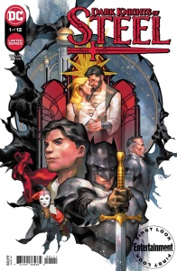
Yasmine Putri’s artwork is perfect for “Dark Knights of Steel” #1. She does an excellent job of using highly realistic imagery mixed with magic, making elements of supernatural or fantastical elements feel all the more otherworldly and strange. From the outset, Putri’s linework and inks establish the anguish and fear of those who come to a strange land only to be met with hostility, as well as the ways in which that negativity may cause them to instinctively lash out with powers they never knew they had. That level of pain also is present in the faces of those who are experiencing it in other times, along with a plethora of other emotions ranging from pride to joy to annoyance and more beyond. Even setting aside the close-ups of people, Putri does an excellent job setting various scenes. From sprawling castles to dark dungeons, from outer space to a simple field, from carnage to peace, all feel natural and in a way beautiful through her illustrations.
Further proving how well Putri fits to this story, she also provides the colors for “Dark Knights of Steel” #1. From bright to dark, from mundane to mystical, everything in this dark fantasy story is given to its emotional impact, and the colors are no different. Brilliant greens make for a supernatural angle in much the same way as violent reds, while other reds on a certain harlequin are much less shocking or surprising. The use of light and dark further helps the mood of any given scene, and makes it all feel akin to a live action television series or feature film. From levity to wonder to fear, among other emotional reactions, there is much to be gained and learned from the way in which Putri uses her colors to emphasize different elements of a wide variety of scenarios. Even in the depths of despair, the story still feels like it has an element of fun hidden, the colors working in seemingly effortless concert with the illustrations snd the script to truly show the ways in which those who operate in the darkness can function alongside those of the light and make a better story for both halves in the process even as myriad colors from abroad seem to be infiltrating the story, literally as much as figuratively.
Final Verdict: 8.5– Masterful as ever, Tom Taylor’s work alongside Yasmine Putri is definitely worth checking out for fans of dark fantasy as much as fans of the DC Universe!


