
Back in 2012, an event ripped through the Marvel Universe. It tore apart the space-time continuum, relaunching the line with all new #1s and a streamlined universe. It was called Marvel NOW and it mirrored the Direct Competition’s then-year old relaunch in size, scale and br — What’s that? It was just a re-branding and a bunch of new titles and new #1s? “AvX” didn’t even change up the universe itself, unlike “Secret Wars” in 2015? Well, now I feel silly.
Regardless, we’re here to cover the first third of the initiative that’s had, perhaps, the most outsized impact on the company, spawning multiple waves, a 2.0 version, and the start to a few fan-favorite, and fan-reviled, runs. This is Marvel NOW A-F, let’s see what Marvel thought was important enough to be their flagship titles in 2012.

A+X #1
Written by Dan Slott and Jeph Loeb
Penciled by Ron Garney and Dale Keown
Inked by Danny Miki, Cam Smith, & Mark Morales
Colored by Will Quintana and Frank D’Armata
Lettered by VC’s Clayton Cowles and Comicraft’s Albert Deschesne
Reviewed by Elias Rosner
The concept of “A+X” #1 is simple. Take an Avenger, take an X-Men member, team them up and then do the same a second time for two stories for the price of one. It’s pure superhero storytelling at its finest, in the grand Marvel tradition. . . it just kinda sucks that the best part of the comic is the Q&A at the top of the credits page. I know. Harsh. But “A+X” #1 just isn’t that interesting a comic.
It’s fine, it’s a good way to kill some time, and were it back in the days of comics being far cheaper than they are now, that would be enough. But now? Comics need more substance to them if they’re going to sustain a concept like this and there has to be something that makes one come back month to month. The return of “Marvel Now Presents” in the wake of their Legacy initiative was a good example of this done well. But back to this comic.
The Captain America meets Cable story is fun, with 2099 Trask coming back to the 1940s and planting a Nazi sentinel to wipe out mutants, so Cable and Cap and Bucky gotta stop him. It’s goofy in all the right ways, has some heart, and Slott clearly gets the characters, making for a fun mash-up. Garney, the inkers three, and Quintana capture the dreary, rainy battlefields at night without letting things get murky and the way they render the action is dynamic. The dialog can get a bit dry and overwhelming at times but that seems to be the point.
As for the Red Hulk story, it feels far more undercooked. Again, the art is fine, though a bit too slick for my tastes, but the story is lackluster and is mostly a punch-fest that ends on a cliffhanger. It’s not a satisfying done in one but I also don’t care to continue with it. There’s nothing egregiously wrong but a boring story is a boring story and it closes “A+X” #1 out with a whimper.
Final Verdict: 5.4 – Could be worse but it’s not all that engaging a first issue. The anthology format, though, means giving the series a second chance is far easier than it may have otherwise been.

All-New X-Men #1
Written by Brian Michael Bendis
Penciled by Stuart Immonen
Inked by Wade Von Grawbadger
Colored by Marte Gracia
Lettered by VC’s Cory Petit
Reviewed by James Dowling
“All-New X-Men” #1 is probably the best chapter in Bendis’s run. Where the rest of the series flounders through plot-starvation, the first issue is dense, promising and artistically engaging. The issue’s first half doesn’t break much new ground, instead rehashing tried and true X-Men tropes at their most well paced. The second half is where things get interesting, providing a stark contrast between the past and present protagonists, illustrating how fundamentally they have changed and largely justifying the series premise in the process.
Continued belowStuart Immonen’s art captures costumes and spectacle skillfully, placing each scene in a delicately constructed setting with cinematic blocking throughout. Albeit, a couple of the characters end up seeming a little flat-faced when they aren’t a frame’s main focus. That being said, key panels like young and old Hank McCoy’s first interaction are some of the best, most emotionally ripe portraits of the character ever put to page.
Bendis’s penmanship is at its most recognizable here, which is probably the biggest deciding factor in how readers respond to the issue. Characters either speak with Whedon-ish skittishness or in action hero platitudes seemingly rehearsed a hundred times over. However the actual plot under the dialogue feels modern and suspenseful, with every faction teetering on a political knives’ edge.
Marte Garcia’s colors are the issue’s highlight. The bold color palette pops while remaining contrasted with layers of dark shadow that can make characters seem larger than life or reservedly subdued. Pages shift dynamically towards neon primary colors as the level of surrealism in a scene amps up, it’s superheroic and endlessly endearing.
Final Verdict: 7.0 – Overall, “All-New X-Men” #1 feels familiar in the most contemporary way possible, with layers of moral quandary wrapped in great art. So even if the story isn’t to your liking, you can always just switch your brain off and look at all the pretty colors.

Avengers #1
Written by Jonathan Hickman
Illustrated by Jerome Opeña
Colored by Dean White
Lettered by Cory Petit
Reviewed by Kevin Gregory
“We have to get bigger.” And with that line the clearly articulated goal of Jonathan Hickman’s “Avengers” and “New Avengers” run is spelled out. The Avengers need to get bigger, and that comes with bigger problems, bigger solutions, bigger betrayals, wars, conflicts, secret cabals, and just plain secrets. It’s an Avengers World and we’re just living in it.
This issue kicks off the next two years of Hickman’s larger story which culminates in “Secret Wars.” This issue teases and gives a clear map of what is to come from the get go, with those early pages acting almost like a fairy tale or myth, but they give us the course of this run. “New Avengers” wouldn’t launch until the month following, but there are even hints of that darker Cabal-filled story here as well.
Tony and Steve have decided to make the Avengers bigger, because for some reason the team currently consists of the team every kid saw in theaters in May 2012 when this debuted. Tony knows it’s because of *something* big, and Steve just thinks it’s a really good idea. Those six have to run off to Mars to fight new foe Ex Nihilo, and they lose, with Steve sent back needing to form a new team. And just like that the game is changed perfectly.
All of this is accomplished in a storybook fashion which is completely sold by Jerome Opeña and Dean White. That mythic grandeur is given to us in the flashbacks as the panels walls change and the figures look like they could be in a children’s book or painting. None of that is bad, as it adds to the sense of gravitas this book is going for. We’re telling a grand big story and there’s a grand big plan. The art suffers a little bit as we move into the action sequences and moves from myth into reality. But, while this run would shuffle through artists like one wears socks, here at the beginning the art is perfect for the tone and vibe.
And of course there is the Hickman penchant for fonts and graphics. That Avengers tree or web graphic that appears empty and then fleshed out at the end is just the kind of stylized extra piece you’d expect. The font choices on the graphics carry over from Hickman’s work on “Fantastic Four,” and it adds to the very sci-fi feel of both runs. It’s an Avengers World, and how would you know if there wasn’t some sick circles and lines on white?
Final Verdict: 9.2 – This issue offers a stunning and gorgeous debut clear with a thesis and a promise. Things are gonna get bigger, and that’s very exciting.
Continued below
Avengers A.I. #1
Written by Sam Humphries
Illustrated by André Lima Arajúo
Colored by Frank D’Armata
Lettered by Clayton Cowles
Reviewed by Brian Salvatore
Six years ago, Jonathan Hickman kicked off an “Avengers” run that, in many ways, was similar to the current ‘Dawn of X’ initiative in the X-books. Like then, Hickman was writing the main series, with other writers taking on side books that add to the overall tone and tenor of the line. “Avengers A.I.” was one such title, with Sam Humphries and André Lima Arajúo bringing Hank Pym to the forefront and giving him a team to deal with an artificial intelligence threat that he, more or less, created.
The team is a family affair, with Pym’s ‘grandchildren’ the Vision and Victor Mancha, along with Doombot (an AI with the mind of Victor Von Doom) and S.H.I.E.L.D.’s Monica Changa. The idea of a team dedicated to the technological foes of humanity is an inspired one, and somewhat surprising that it is an idea that Marvel has never really committed to minus this one, year long series.
Arajúo doesn’t get too much to do in this issue. You’d think that a series like this would have lots of opportunities for visual scientific exploration, but there is a lot more talking about tech than actual tech in this issue. That said, what Arajúo does get to play with looks great, with his Frank Quitely inspired work looking great when he gets the chance to let loose a little bit.
Overall, the book is a lot of fun, and signaled what should have been a near permanent status quo in the 616 that, sadly, didn’t stick.
Final Verdict: 7.8 – A fun idea, executed well.

Avengers Arena #1
Written by Dennis “Hopeless” Hallum
Illustrated by Kevin Walker
Colored by Frank Martin
Lettered by VC’s Joe Caramagna
Reviewed by Jake Hill
Comics have a long history of jumping on trendy fads for story ideas. When kung fu and blaxsploitation movies were popular in the 70s, we got Power Man and Iron Fist. And in the early 2010s, amid a deluge of YA dystopia fiction, we got “Avengers Arena.” It’s a premise that will forever be a product of its era: the villainous Arcade has kidnapped a dozen or so superpowered teens to force them to battle to the death on an island full of deathtraps. Remind you of anything? The cover to issue #1 parodied the movie Battle Royale down to the font and color choices. Issue #2 looks just like the cover of the Lord of Flies paperback I read in high school. Issue #3 does The Hunger Games. The inspiration isn’t subtle.
But the first issue is really good. Right away, it acknowledges everything you were thinking. Arcade comes out and admits that he read The Hunger Games last time he was in jail. So if the premise seems hacky don’t worry, it’s the fault of the uninspired villain. By the last page of issue #1, Ken Mack aka Mettle, is dead. It’s genuinely heartbreaking, establishes the high stakes, and the overwhelming power of the villain. The issue quickly captures everything that draws people to these sorts of stories. But when it came out, people hated it.
Not everyone, but enough. This premise was genuinely a controversy. This was the first ongoing series written by Dennis Hallum (then called Dennis Hopeless) and the dude received death threats over it! Once Mettle was killed, readers really bought into the idea that no one was truly safe. They feared for Hazmat and Reptil, who had become recent favorites in the pages of “Avengers Academy,” and they really feared for Nico and Chase, beloved members of the Runaways. At the time, the controversy felt like a big deal, a reminder of how online comics had become.
But looking back, it’s insane that such a good comic was the target of so much anger. I’m sure Mettle had fans, but this series was more additive than destructive. It established Hazmat as a powerful character in her own right, and also introduced us to Cullen Bloodstone and Death Locket. More than anything else though, “Avengers Arena” #1 is a strong mission statement for a strong series. Hallum and series artist Kev Walker draw you right in, and by the time you’ve finished 22 pages, you notice that you’ve forgotten to breathe. Maybe it’s not classy literature, but “Avengers Arena” is a fantastically effecting pulp adventure, and one worth returning to. If nothing else, it will remind you what made people feel passionate in 2013.
Continued belowFinal Verdict: 8.2 – An obvious gimmick, executed to emotional perfection.

Cable + X-Force #1
Written by Dennis “Hopeless” Hallum
Illustrated by Salvador Larroca
Colored by Frank D’Armata
Lettered by VC’s Joe Sabino
Reviewed by Jake Hill
I spoke to Dennis “Hopeless” Hallum about “Cable and X-Force” at a con once. He was still fairly new to Marvel, and was choosing characters as any of us would, based on how much interest they held. That’s when editor Nick Lowe asked him a weird question: which characters do you have no interest in writing. Hallum admitted that he had never really cared for Cable. Lower encouraged him to develop a pitch, and that’s where the premise of this series came from- Hallum’s disinterest in the characters.
That could have gone really poorly. The fact that it doesn’t is a testament to Hallum’s great skill. He forces himself to be interested, by coming up with new conflicts for the central cast, which includes Cable, Domino, Colossus, Doctor Nemesis, Forge, and Hope. It is the last character, coming off of the events of “Avengers Vs X-Men” who makes the story pitch so interesting. Hope was sort of a living MacGuffin who had served her purpose, a chosen one who had restored the balance. Hallum shrugs and says, “Wow, that must have messed her up good. I wonder how she’s feeling about no longer being relevant to the story.” That choice ends up creating a superhero comic quite unlike any other.
“X-Force” is always the black ops book; the characters are always living on the fringes. But Hallum realizes that it’s not the cool grizzled badasses who would end up in this life- it’s the people who have served their story function. So “Cable and X-Force” becomes a heavily armed island of misfit toys, characters driven to violence because they don’t know who they are when they are at peace. It’s a theme later comics would try to explore, but not nearly so well.
On art, you’ve got Salvador Larroca, a fella who has been drawing “X-Men” since the 90s. Larroca’s “Star Wars” artwork came under a critical eye due to his highly photo-referenced (and traced) style, which was a bad fit for that book. This is much more in his wheelhouse, though the figures all look like they weren’t ready for the picture- they’re all caught making dumb faces. Combine that with Frank D’Armata’s colors and you have art that looks unfortunately a little goofy. And wet. And maybe a bit sticky? It’s not a perfect fit for the story being told, but Larroca more than acquits himself in conjuring up the over the top images demanded by the tongue-in-cheek script.
In hindsight, it’s clear that Hallum was hot stuff from the beginning. From his earliest projects with Marvel, he drew attention for being thoughtful, funny, and challenging. But it’s here, with “Cable and X-Force” #1 that he proves himself to be a guy you can’t ignore. The first issue sits a bit uncomfortably, but that’s the point. Hallum is trying to learn to love these characters and if you go on the journey with him, you’ll learn to love them too.
Final Verdict: 8.4 – One of the hidden gems of Marvel Now. If you don’t think you’re into Cable or X-Force, that’s all the more reason to read it!

Captain America #1
Written by Rick Remender
Penciled by John Romita Jr.
Inked by Klaus Janson
Colored by Dean White
Lettered by VC’s Joe Caramagna
Reviewed by Elias Rosner
Rick Remender is a polarizing creator, at least when it comes to his Marvel works, and I can think of no better run that exemplifies it than this one. “Captain America” #1 starts with a retcon to Cap’s home life, throws our good Steve Rodgers into a dimension where nothing makes sense, Zola is ruler, and we go full “Lone Wolf & Cub” with everyone’s favorite star-spangled G.I. Structured like a cold open to a film, it’s a baffling first issue, beginning with a proposal and a mystery train, and ending with the title ‘Castaway in Dimension Z’. . .but I absolutely love it.
Continued belowThe comic takes itself so seriously while presenting these ludicrous sci-fi scenarios that you have to appreciate just how bonkers it is. Romita Jr. and Janson do a heck of a job rendering it all and it’s interesting to see how much has changed and how much remains the same for these two. I mean, just compare this issue to “Action Comics” right now. There is looser inking and a more mailable nature to Romita Jr.’s art at this time, which at times is a determinant to the product, with faces that can’t quite seem to stay consistent, but on the whole keeps the solid, square-jawed characters firmly within reason in terms of proportions. Plus, the panel to panel transitions are handled with the same eye for action as always.
Maybe there is more irony to my enjoyment of this first issue’s story but I genuinely found myself engaged in the narrative thanks to the earnest nature of the pulp on display. Captain America is war pulp, WWII and spies with a dash of mad science. This? This is “Weird Science,” Fantastic Four territory. The clash, in this case, providing the novelty and much of the friction.
That said, the issue does leave any new reader absolutely baffled as to what had just happened and there is a reliance on a lot of back-knowledge for the opening three-quarters.The first time I read this, I knew little about Cap of this era. Even now, knowing far more, I was lost, but in the end, it doesn’t really matter. Cap is off playing interdimensional dad in the wastes and that’s the new status quo. It’s goofy and 100% serious and somehow it all just kinda works.
Final Verdict: 6.9 – Divisive and strange, this first issue is not without its flaws but on the whole, it’s an energetic start to a new era that’s brimming with ideas.

Deadpool #1
Written by Gerry Duggan and Brian Posehn
Illustrated by Tony Moore
Colored by Val Staples
Lettered by VC’s Joe Sabino
Reviewed by James Dowling
“Deadpool” #1 kicked off a surprising six-year run penned by Gerry Duggan, this humble introduction organically introduces the groundwork for Duggan’s saga but is strangely lacking in the thematic trappings that made his run so engaging and distinctive.
Writers Gerry Duggan and Brian Posehn write a pitch perfect script that plays straight to its target audience by throwing readers straight into the action; Deadpool doesn’t have any sort of prolonged reintroduction and his new supporting cast fall quickly into place. Both writers also deserve some credit for what could be the most pun-heavy headline in comic book history. The possessed presidents plaguing ‘Pool have little to no motive for their rampage, which makes the narrative feel a tad bit contrived, but this is fairly easy to forgive in a “Deadpool” comic. The sense of contrivance only deepens due to the issue’s over reliance on guest stars. Thor and Captain America’s appearances aren’t necessarily egregious, but they don’t do much to prop up Deadpool as his own character and a cynic would say they aren’t there to do much more than give the Merc with a Mouth some second-hand post-Avengers popularity.
Tony Moore comes to the rescue here by drawing some near-perfect “Deadpool” art. His linework feels appropriately messy and weirdly Where’s Waldo-ish; only with explosive gore that comes oozing to life thanks to Val Staples’s colors. The issue marches with a frenetic tempo that wouldn’t be possible without Moore’s pencils, masterfully leading the reader’s eye through perfect page-turns and eye-catching action. S.H.I.E.L.D agents Sitwell and Preston both have immediately memorable and endearing character designs that keep them from becoming lost to the issue’s breakneck pace.
However, here’s where this review hits a sticking point. I don’t know if “Deadpool” #1 is actually funny. It’s peppered with one-liners and scenes are unquestionably absurd, but the story never really leads to any sort of punchline; it feels like Duggan and Posehn have tried to replace thematic and comedic structure with random zaniness and Ghostbusters references. It works well enough and the issue isn’t a boring read, but the whole story feels empty by the issue’s end.
Continued belowI should say that I’m actually a fan of Duggan’s run, I’d argue that “Deadpool” (2015) #30 is one of the best Deadpool stories out there, and it’s just as contrived as this issue, only it has an emotional through-line that gives a purpose to the mayhem.
Final Verdict: 6.5 – “Deadpool” #1 is a hollow but enjoyable return to the surprising life of Wade Wilson. The story may be flimsy upon inspection but its generous serve of quips and action keep it entertaining none-the-less.

Fantastic Four #1
Written by Matt Fraction
Penciled by Mark Bagley
Inked by Mark Farmer
Colored by Paul Mounts
Lettered by VC’s Clayton Cowles
Reviewed by Nicholas Palmieri
In these twenty pages, Fraction and Bagley do everything a first issue should do, and it all stems from a desire for clarity.
There’s a clear hierarchy of characters: Reed is first, the rest of the Four are next, and the Future Foundation bring up the rear. We clearly understand the tone of the book, one of adventure and heart and a bit of humor. Each character has a clear personality and their own solidly defined niche in this world: Reed is the genius explorer who gets caught up in his own brain, Johnny is the goofy-yet-heroic stud, Ben is the soft-hearted brute, and Sue is the compassionate mother figure. The world’s fantastic (for lack of a better word) attributes are clearly defined, too. By the end of the issue, I know exactly where the story is going — the Four and the kids are going exploring in space for educational and personal reasons — and I understand Reed’s motivations. We also don’t know the exact details of how it will play out, keeping things both clear yet exciting. Bagley’s art style is equally clearly defined, never confusing and always with just enough impressionistic flourishes to keep things interesting.
As far as I’m concerned, good storytelling often stems from clarity. This is a good first issue.
Final Verdict: 8.0 – A model first issue.
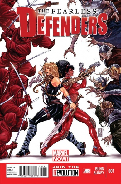
Fearless Defenders #1
Written by Cullen Bunn
Illustrated by Will Sliney
Coloured by Veronica Gandini
Lettered by Clayton Cowles
Reviewed by Rowan Grover
Bunn brings a lot of pizzazz and polish to the opening of this series, possibly due to the fact that this is early in his career when not spread across ten different Marvel books at once. Misty Knight is a conduit for campy, 70s detective fun, and provides shiny superhero action too with the use of her bionic arms, which Bunn never forgets to include narratively. From here, we move to a different setting in White Mountain National Forest, which accentuates the idea that this is an adventure comic as well as a superhero slugfest. There’s intrigue created through the statue Misty finds, and suspense as its powers are revealed. Bunn also brings a new character, Annabelle Riggs, to the table. She’s the real highlight of this issue as she acts as an avatar for anyone obsessed with Marvel mythology: she wants to find information by herself without resorting to asking the literal gods around her (that would be cheating), and she even briefly hooks up with fan-favorite character Valkyrie, who then promptly finishes stabbing skeletons in the head. It’s a super fun issue and Bunn provides a great hook character for newer readers, making it a worthy Marvel Now debut.
The art is something of a mixed bag. Sliney does some good superheroics for the most part, but there’s an undercurrent of uneasiness throughout the whole thing due to the fact that superhero art was still very male gaze-y at this point in time. Misty Knight wielding the Satan Claw 2.0 (maybe the best name for a weapon?) against sailors is great high-octane kung-fu action, but we definitely don’t need to see how gravity-defying her breasts are and how visible her nipples are in her too-tight bodysuit. Valkyrie also suffers from this, partly due to the fact that her rather dated costume design gives Sliney an excuse to draw body parts that are even more physics-bending than Misty’s. The skeleton fight is exciting, however, and there are some great full-page splashes that emphasize the arcane nature of the battle and the seemingly infinite number of undead the Defenders are facing. Sliney’s depiction of Annabelle Riggs is appropriate, at least, feeling like the only normal person there amidst a group of veritable gods. Gandini brings a shiny, dawn-like quality to the whole book too, which makes it feel nicely Asgardian-themed. Even the undead fight, with its swirling, hazy blue smoke, has an ethereal quality to it thanks to Gandini.
Continued below“Fearless Defenders” #1 feels like one of the most unique Marvel Now debuts that had the most potential to explore the nooks and crannies of the Marvel universe for newer readers. Unfortunately, the art feels dated in a lot of aspects, but it doesn’t take away from how much heart each character has.
Final Score: 6.8 – A fun Asgardian romp if you can look past the hyperreal art style.

FF #1
Written by Matt Fraction
Illustrated by Mike Allred
Colored by Laura Allred
Lettered by VC’s Clayton Cowles
Review by Vince J Ostrowski
Whenever someone brings up the ‘Marvel Now’ initiative in retrospective fashion, Matt Fraction and Mike Allred’s “FF” #1 is always the first comic book cover that enters my mind’s eye. I guess that’s because not only was this run uniquely tailored to me as a Mike Allred die-hard, but in an external context, it is quite possibly the book that best represented what ‘Marvel Now’ was trying to do – at least the way I understand it. It’s a mash-up of a writer and artist that both have strong, unmistakable creative voices, doing a decidedly non-traditional superhero comic premise. Fraction inherited the “Fantastic Four” books from Jonathan Hickman after his career defining arc came to an end and he commandeered the “Avengers” titles. Fraction decided to follow up Hickman’s run (which began with the premise of the FF fixing every problem in the universe) by doing something a little more quirky and irreverent. The “Fantastic Four” are dying and they need to leave our universe to find the cure. While they’re gone (which should only be 4 minutes our time, a Chekov’s gun that is joked about time and again), a new team will take their place. Enter Mike Allred and a cast of a dozen colorful characters: Scott Lang, Medusa, She-Hulk, Ms. Thing, and a bunch of precocious kids and aliens thrown in for comic relief.
Comic relief that comes in the form of some Christopher Guest-style interview pages that are almost all played for laughs (some more successfully funny than others – my only real criticism of the issue). But that’s not to say that the whole thing is a big joke, and issue #1 wants you to realize that right away. Ben Grimm nervously asking She-Hulk to take his place on the team, and Susan Storm sitting down for a glass of wine to have a motherly heart-to-heart with Medusa are highlights. But it’s Reed Richards’ reason for picking Scott Lang as leader of the Future Foundation, while somewhat clumsily handled by the typically aloof patriarch, that is most acutely born out of considerable warmth and empathy. Scott just lost a daughter and is struggling to cope, so maybe acting as a father figure for a group of super-intelligent children is the pick-me-up he needs. The best part is that he won’t have to do it alone, thanks to Allred and the colorful cast he playfully splashes across the page.
Final Verdict: 9.0 – “FF” #1 represents the best that ‘Marvel Now’ has to offer from a conceptual and artistic standpoint. It’s a funny, funky issue at first glance, but carries a deeper, more soulful read between its covers.


