
The summer journey through the Amalgam Universe continues today with a review of “Super Soldier”, the best written Amalgam yet. Plus, I’m noticing some differences between the DC-made Amalgams and the Marvel-made ones.
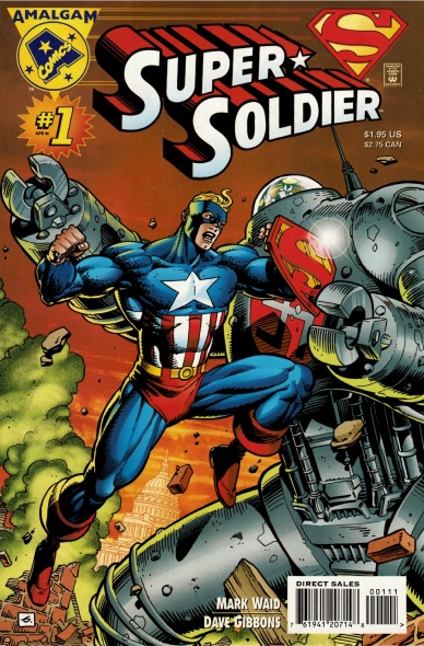
Captain America, by way of Superman. This was co-plotted by script writer Mark Waid and artist Dave Gibbons. Colors were done by Angus McKie. DC published it.
When this started I thought I’d have to check the fine print at the bottom of the title page to determine the publisher, but I’ve noticed some other ways to tell. For one thing, DC printed the names of the writer, penciller, and inker on the cover. For another, the publishers had different advertisers – DC’s has three ads for new music CDs, a collectible card game, a ballot for the 1996 CBG Fan Awards, and an promo for “DC vs Marvel” #4. Marvel has more ads with a wider variety – Black Sheep, M&Ms and other candy, TV shows, and mail order comic businesses.
All the DC books also feature the same “Amalgam-nation” newsletter at the end. Styled as a bullpen bulletin/DC Nation hype piece, it gives readers a look at all 12 Amalgam books for the week. It also features a Stan Lee-like soapbox from Amalgam editor MM Carwald, the Amalgamation of DC editor Mike Carlin and Marvel editor Mark Gruenwald.
The Plot
A baby was rocketed to Earth from a doomed planet, crashing in Kansas in 1938. There were no survivors.
Scientists experimented on the corpse, incorporating some of its cellular structure into their new super soldier serum. Put into a 4F volunteer during World War II, it gave him powers beyond mortal men. Locked in battle with a fierce Nazi robot, both fell into the cold Atlantic Ocean and were presumed dead.
Forty years later, the Justice League Avengers recovered Super-Soldier’s frozen body and revived him. Now he spends his days as the mild mannered reporter, Kent. When the evil leader of Hydra, Lex Luthor the Green Skull, recovers the Nazi war machine, Kent must leap into action once again to save America. During the battle, Super-Soldier learns about his weakness to a green rock and how to protect himself. In the end, he saves Washington DC and Luthor is revealed to the world as a villain.
What “Wizard” thought then
“Wizard” pushed this one as the perfect summation of what Amalgam was going to be in their advance coverage (issue 56). Mark Waid, who wrote three Amalgam titles, said this one was the most fun to do and felt it set the bar for quality. Retailers disagreed and “Super Soldier” was the eighth best-selling Amalgam title, which was still a respectable 15th place overall for the month.
Post release, “Wizard” gave this title no special attention.
What I think now
I don’t know where to start, so let me say this: This comic is near perfect. It feels like a number one because of the opening three-page origin recap, which is well told and well framed. The other Amalgams I’ve read work hard to imply a history, usually by starting mid-story or with editorial comments directed readers to prior issues. This feels more genuine.
The story we’re told is straightforward and clear. Gibbons uses lots of establishing and full body shots, which keeps a reader aware of what’s happening. Close ups are only used to focus on a single action or emotion, not to avoid drawing more anatomy or background. I’d go so far as to say that Gibbons’ work here is frustratingly flawless. Here I am, short on my word count, and I can’t find much more to say about the art because all it does is tell the story. There’s no stand-out splash page where he obviously tried to impress us. There’s no bad layouts, just functional variations on a basic grid. There’s not even any poorly-drawn background characters. Every panel, and every element of every panel, is drawn with equal skill. Really, it’s remarkable just how unremarkable it is. And I love it.
In addition to pencils and inks, Gibbons also provided the lettering for this issue. Once again, the elegant simplicity of his work enhances the story without drawing attention to itself. The use of legible fonts and selective use of sentence case letters seem like obvious choices, but it stands in contrast to the showy work from Comicraft on Marvel’s Amalgams.
Continued below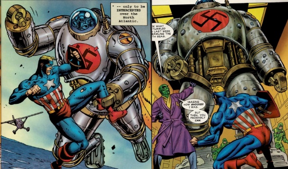
McKie uses some slick coloring in “Super-Soldier”. In the example above, you can see how every muscle group on the hero’s body gets its own color gradient. I normally prefer flatter colors, but the effect works well here because it’s used equally on every thing – look at the plane and hydra soldiers in the background. Of course, what I really want you to see in these samples is the robot.
The panel on the left is from a 1940s flashback when the robot was new. The panel on the right is a “present day” scene in 1996 after the robot was recovered from the sea. Before discussing the color, look at the blacks to see what Gibbons did to make it look different: smooth shadow vs hatching, plus the 1996 robot has a few featureless spots (there’s a small one near the center of the swastika). That’s not much.
Now, do I even have draw attention to how important the color is to these two scenes? I think it speaks for itself, so I’ll point out something that’s not obvious: this color change is actually pretty subtle when you’re reading the comic. These scenes are eight pages apart, and none of the characters mention the tarnished metal. This is just another example of the artists doing their best work without trying to steal the spotlight from the story.
Sometimes the subtlety is overplayed to the comic’s detriment. We’re never told what Super-Soldier’s powers are, just shown a few. I know that “show, don’t tell” is good advice for a comic, but here it’s overplayed because of the nature of Amalgam. Near as I can tell, the serum gave Kent all of Superman’s abilities. The only unique physical skill Captain America has is throwing his shield, which Super-Soldier never does. That leaves this comic feeling less like an Amalgam and more like an Elseworld Superman.
There’s also the small matter of the main character’s name. The only thing he’s ever called in the comic is “Kent”. Whether this is his first or last name is never clear, and I guess that’s Waid’s choice. Still, given how little of Captain America shines through in this one-shot, I think it would have been better to call him “Steve” or “Rogers”.
In the end, Our aOur lStanding on it’s own, it’s near perfect. I’d definitely buy a second issue, and I highly recommend you track down a copy of this one.


