
![]()
Another visually stunning issue of “Rise of the Black Flame” is out.
Written by Mike Mignola and Chris RobersonCover by Laurence Campbell
Illustrated by Christopher Mitten
Colored by Dave Stewart
Lettered by Clem RobinsIn an ancient temple lost deep in the jungle, the heroes find proof of the rumored human sacrifices and answers about the Cult of the Black Flame.

Mark Tweedale: This series continues to go from strength to strength. Three issues in, and I find myself liking the miniseries more with each installment. Christopher Mitten never ceases to surprise me—there are pages in here where I simply had to stop reading to admire the artistry. I love the way Mitten draws rock formations.
Mike Romeo: For sure, especially when those rock formations have been carved into giant heads! Mitten’s work is absolutely outstanding, especially when it comes to all of the action we see this week. Maybe it’s my own perception, but I never really would have thought of Mitten as a sustained action sort of artist. I mean, we’ve seen plenty of bombast from him in the past, but reading page after page of a fight sequence felt new to me. It was absolutely fantastic to see him render out a sword/gun/torch battle like this, and it only seemed to get better the longer it went. A little later on I’ll argue that the structure and pace fell apart during this sequence, but that doesn’t mean it wasn’t gorgeous to look at.
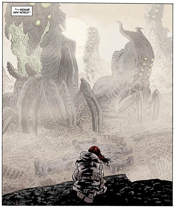
Of course, Dave Stewart does a lot of the heavy lifting. When I got to the panel of the expedition crew standing on the ridge, with the temple in the distance and mountains beyond it, I was floored.
Mark: As was I.

Mike: If you look at Mitten’s linework you’ll see that he varies his line to convey depth, though he doesn’t push it as far as other line artists may. Here, it’s really Stewart’s work that pushes the temple and mountains away from the reader. For objects in the distance, he actually changes the color of Mitten’s line to a deep-greenish color, which reads as softer than the black line work in the foreground and created the illusion that there’s a haze between the crew and what they’re looking at. The the mountains, even further away than the temple, have no line to them at all. They’re simply pastel shapes that seem miles and miles from the reader. I’d love to see what this page looked like before it went to Stewart. Did Mitten draw in those mountain shapes, and Stewart cut the linework completely? Were they left as pencils for Stewart to follow? Or was it empty sky that was populated during coloring? These questions are what makes this duo feel like a great team, it’s difficult to clearly say where one left of and the other began.
Mark: I’m glad there’s more with this artistic team on the horizon. Yeah, it’s only a short story in the “Hellboy Winter Special 2017,” but I’m hoping this is just the beginning of many more Mitten–Stewart projects to come. Throughout, though especially in the earlier pages, I was reminded of Stewart’s work with Guy Davis in Liz’s visions with Memnan Saa—his colors gave those sequences such sense of scale. The mood here is very different, obviously, but there was a similar approach at times in the way distance and depth was portrayed.
I’m going to delve into spoiler territory now.
I think the series also has Chris Roberson at his best. Last month’s “Hellboy and the B.P.R.D.: 1954—Black Sun” was weakened by some filibuster-ish exposition, so I couldn’t help but being hyper-aware of how exposition was handled here… and it was handled elegantly and naturally. In particular, there was a panel with Sarah Jewell that hinted at more of her past adventures, and all she says is, ‘…Things that were buried and gone long ago. And more than a few of them deserved to be left in the dark.’ The rest is carried by the art, which depicts the Cthulhu-like statue that’s shown up in “Witchfinder,” “Lobster Johnson,” and “1954”; the Nimung-Gulla skull from “B.P.R.D.: The Black Goddess”; the Aztec depiction of the Ogdru Jahad from “Hellboy: The Island”; and a frog statue from… somewhere. Man, she’s really seen some stuff! (Seriously, I need a Sarah Jewell series.) And even you don’t pick up on these references, you still get a sense of weight here without the scene being weighed down. The moment was both economical and effective.
Continued belowNot to mention the dialog in this issue has such character to it—no character sounds alike. It’s something that works almost invisibly that makes the characters feel real to me.
Mike: I agree completely with every point on the dialog. It was tight and gestural, everything it needed to be. But there was a moment in the issue where I felt like things came undone, and it’s the fight scene I mentioned earlier. It felt really uneven and jerky, like being in the car with someone who’s learning to drive stick. The action would pause and the characters would have a round of banter, only to then start shooting again. Like when Jewell makes the crack about who’ll be picking up her bar tab, or when McAllister says they need to leave, I just didn’t have a sense of how many people they were fighting or how they were handling it overall. We were shown a few guys ambushing them, and then a whole mess of exploding heads, so that combined with the dialog breaks left me unclear on what the situation really was.
While it’s partly Roberson’s insertion of banter that leaves me feeling this way, I can’t say that Mitten isn’t a part of the fumble. Almost all of his action panels are tightly framed, while the dialog panels are wider and feature more characters not fighting. And now that I think about it, I can pin a bit of this on Stewart, too. His coloring of those tight action panels are all reds and oranges, while the wider, calmer panels are blues and greens. This (wrongly) confirms that the action has passed and that things have cooled down.
Mark: Yeah, this was my only problem with this issue. That action sequence kind of jerked a lot. I didn’t mind the color flashes, mainly because the cooler panels in between reconnected me to the location, but there was definitely a problem with establishing the stakes of the conflict, and there was definitely a moment in the middle when I thought the battle was over when it wasn’t. I think in part it was because the characters seemed to be able to give each other their undivided attention during the banter.
The biggest problem area was when McAllister is firing off shots urgently, while Sarah bandages her wounds. They’re exchanging dialog, and yet they almost seem to be in different scenes.
That said, while the pacing was an issue, I had no trouble tracking each character throughout the sequence.
Mike: The named characters, at least. If you’re wearing a mask in this scene things seem to get a little more fluid.
I really liked the conclusion to this scene, though. I thought that was an expert bit of pacing, to say the least. When there’s a scene that the reader is shown the events around a killing strike, but not the strike itself, it can be really powerful. The way Mitten pulled in tight on McAllister’s face and showed the torch drop before we even knew what had happened was impactful, as was the extraction of the sword from his chest. The way it was rendered almost had an underwater feel to it, the way the blood seemed pillowy and voluminous, almost suspended in the air. Flipping through the issue again, it’s clear that this is just how Mitten draws this type of thing, but it feels like he even pushed his own style a little further for the sake of selling that last panel. And it really worked well.
In terms of narrative, I think that sequence did a lot for this issue, too. Up until this point there’s been a real sense that this story was made possible by Western imperialism, and the characters have carried themselves as such. The series harkens back to Indiana Jones and “Tintin,” which can often depict Eastern parts of the world as almost playgrounds for Westerners. The jerky fight scene can, in a way, be illustrative of that, given that you don’t mind me undermining my own narrative critique from earlier. Maybe the character’s attention to one another over their attackers was indicative of a sense of invincibility that comes from their cultural perspectives? The illusion of dignified people in a savage land, so to speak. McAllister thinks that he can take his anger over what he’s seen out on these masked men, only to meet an obvious fate. Maybe this is a turning point in the book, in terms of the way these characters view themselves and the world around them?
Continued belowMark: McAllister was certainly the most naïve of the group. I think it’ll be interesting to see how the characters handle the fallout from this. ‘Farang’ and, to a lesser extent, Sandhu were the only characters that didn’t seem to carry that invincibility with them. For Farang, this event wasn’t surprising—it was exactly what he expected when he started on this journey. For Sandhu, he’s more vulnerable than before.
I’m not so sure about Sarah thought. This isn’t exactly her first rodeo, and I’m sure in her long career as a paranormal adventurer, she’s seen worse. If anything, I think she wears a bit of overconfidence like a shield. I don’t see that changing, but perhaps as we as readers get to know her, we’ll start to see the cracks a little more, especially since she’s going to hobble a bit now. I don’t think she’d like being a burden on the group.
Marie-Thérèse LaFleur is the one that strikes me as the most clear-eyed though. There’s a moment when they’re all retreating out of the cave where she shoots a look at Sandhu, and her expression makes me think she’d already realized by that point that McAllister was going to die. This combined with her conversation with Sandhu from issue #2 makes her the character I watch the most.
Mike: Yeah, I agree on Jewell. She’s played as the brash American, almost as a contrast to McAllister’s proper Englishness. This’ll be a turning point, for sure, though I won’t be surprised when McAllister resurfaces.
Mark: Yeah, Sarah certainly has that brash streak to her. Do you want to put a score on this one?
Mike: While the art is a near ten, the narrative hiccups really hurt this one for me. It’s a 7 from me, still good, but with its flaws.
Mark: Despite the pacing issues in the fight, overall I enjoyed this more than any issue so far—I was grinning ear to ear when I finished it—so I’d feel weird giving it a score less than the previous issues. And yet those pacing issues must be acknowledged, especially since they did seem to stem from the writing, the art, and even the color.
So, while I am inclined to give this issue an 8, which would be reflective of my ultimate experience, I’m deducting a half point for its flaws (the bare minimum I can reasonably deduct). This is a 7.5 from me.
Final verdict: 7.25. A highly enjoyable issue, despite a rough patch.


