
There is a lot to cover on Wednesdays. We should know, as collectively, we read an insane amount of comics. Even with a large review staff, it’s hard to get to everything. With that in mind, we’re back with Wrapping Wednesday, where we look at some of the books we missed in what was another great week of comics.
Let’s get this party started.
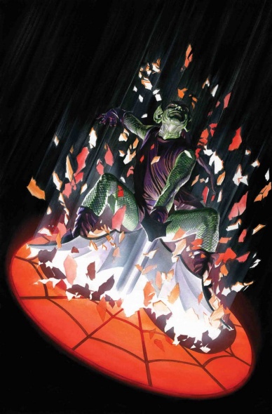
The Amazing Spider-Man #797
Written by Dan Slott
Penciled By Stuart Immonen
Inked by Wade von Grawbadger
Colored by Marte Gracia
Lettered by VC’s Joe Caramagna
Reviewed by Alex Curtis
Despite the hype for this first installment of Dan Slott’s last “Spider-Man” arc, there’s not a whole lot going on here. Most of the issue feels like Slott is trying to catch up Spider-Man fans of all different walks on Peter’s quintessential dorkiness and hectic life—which isn’t necessarily a bad thing—but this is far from an exciting opening issue. It’s more setup than anything else.
Norman Osborn’s over-the-top, insane dialog doesn’t fit with the character. Historically, even at his most maniacal, he’s had an air of sinister gravitas and control—which set him apart from many generic, crazy rogues. Unfortunately, now Slott pens arguably Spider-Man’s greatest foe as just another goofy, scene-chewing nut. Granted, you could make the argument that the Carnage symbiote is driving him to be more openly deranged, but that’s not made explicitly clear nor impacted.
Stuart Immonen delivers the goods here as best he can; but he’s not given a lot to do and the pages are so cramped with panels, it’s hard for him to really express himself. Most of the issue is talking heads even though Immonen is best when he’s given high-octane, kinetic action set pieces. Many of these pages lack appropriate detail and come across as a rush job. However, Immonen is so talented, even his lesser efforts are above average. Marte Gracia’s colors help liven things up, and his smoky color palette fits like a glove with Immonen’s breezy dynamics.
Another problem is Phil Urich’s sudden death, which is a waste of a good character. It would have been fascinating to see Phil as King Goblin trying to battle with Norman across this arc. Throw Phil’s concerned uncle into the mix, and you’d have a really interesting, emotional plot thread. But no, they have to kill him off. Unless of course, he’s still alive—but that would be even worse story-wise.
The ending is immensely frustrating. It turns out Osborn has been questioning J. Jonah Jameson about Spidey’s identity the whole issue. JJJ refuses to squeal, but he slips up by indirectly mentioning Gwen Stacy’s death, which tips off Osborn. You can practically hear a cartoon-comedy sound effect in the background. This is the cheapest of plot devices and undercuts Osborn’s intellect. With all his resources and brains, the way he discovers Pete’s identity is by an impassioned slip of the tongue? Organic plotting this is not.
Final Verdict: 5.5 –The first chapter of Slott’s “Spider-Man” finale doesn’t accomplish much and stumbles numerous times. If this is setting the tone for the rest of the arc, then I’m afraid this could be a disappointing swan song for Slott.
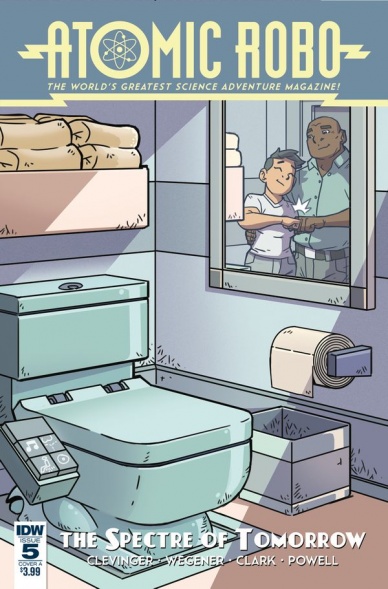
Atomic Robo: The Spectre of Tomorrow #5
Written by Brian Clevinger
Illustrated by Scott Wegener
Colored by Anthony Clark
Lettered by Jeff Powell
Reviewed by Gregory Ellner
Brian Clevinger’s writing on “Atomic Robo” has always been full on pulp action, coupled with weird science that has just enough realism to be plausible. In a story with cyborgs, artificial intelligences, and more, this focus is all the more fun and entirely on display. Clevinger’s writing does not require readers to know everything about the series before this storyline, as the plot basically explains itself (occasionally with intentionally heavy-handed dialogue to explain things between characters). However, there are a lot of bonuses for those who do know the story so far, from mentions of ALAN to other conspiracies.
Scott Wegener’s pencils are very rough and thick in the conclusion to ‘The Spectre of Tomorrow,’ rather jarringly so on characters. The thick nature is so blatant that some of the characters don’t even seem to fit into their situations, such as the very awkwardly handled cyborgs with their extremely indistinct faces. In contrast, the thinner work on the scenery, such as buildings falling apart, is much thinner and cleaner, more attuned to what the series more commonly utilizes.
Continued belowAnthony Clark’s coloring helps to alleviate the weirdness. The glowing holograms of ALAN help to showcase his alien nature, despite being a terrestrially based artificial intelligence. The colors on individual people help to separate them out and identify who they are, but backgrounds could use some work, given they tend to be rather blank on the whole.
Jeff Powell’s letters do deserve some note, especially on ALAN. The artificial intelligence’s ability to focus is shown to deteriorate as the writing itself becomes incomprehensibly mangled, the red text on orange backing bizarre yet familiar for him.
In general, this conclusion is very well done, but the art could maybe use a little more work compared to earlier installments of this series.
Final Verdict: 7.0- A satisfactory conclusion, but with some weird linework.
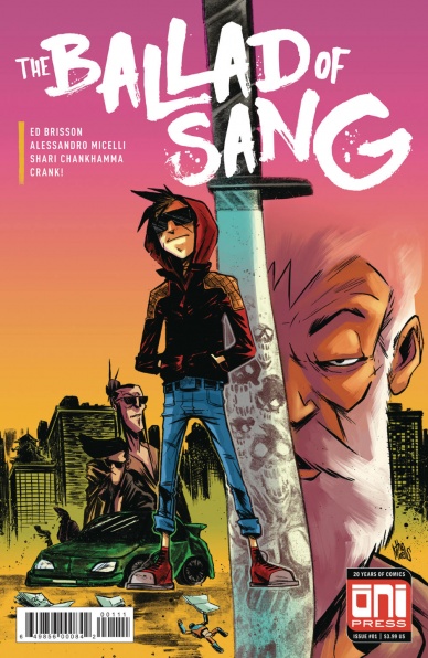
The Ballad of Sang #1
Written by Ed Brisson
Illustrated by Allessandro Micelli
Colored by Shari Chankhamma
Lettered by Crank!
Reviewed by Jonathan O’Neal
“The Ballad of Sang” is as breezy as it is bloody. While reading, it is difficult not to draw parallels to “Deadly Class,” another story about preternaturally gifted assassins, but where “Deadly Class” has spiraled off to follow a large roster of characters in several narrative directions, the first installment in Ed Brisson’s book economically sets up the world of the mute Sang and seemingly establishes a simpler conceit that will drive the narrative of subsequent issues, meeting the gold standard for all good first issues.
Brisson’s scripting eschews narration in favor of economical dialogue, mirroring his young protagonist’s inability to speak, and while the book’s solicitation gives us more than the script about Sang (in fact, it gives the entire story—skip it if you can), this first issue works with Sang as a mystery. We don’t need his back story. In six pages, we see all we need to know about Sang and his father figure/handler, and the balance of the book so efficiently establishes Sang’s forthcoming central conflict that the only complaint is that the issue is over before you know it.
Alessandro Micelli, making his American comic debut, lays down kinetic and brushy lines over Chankhamma’s mix of solids and watercolor effects that have a viscerally crude yet sophisticated animation quality that matches well with this action heavy issue and contributes to the stories gritty aesthetic. As for character design, the contrarian brilliance of an assassin wearing a red hoodie, red sneakers, and a jacket emblazoned with a giant red eagle can’t be understated in a story so soaked in blood. This coupled with Sang’s facial scar and pupil-less left eye makes for a killer who isn’t designed to disappear into a crowd. By the end of this issue, he certainly wishes he could.
While the influences of Brisson’s beloved cult cinema and trashy VHS treasures are apparent, “Sang” #1 succeeds without those callbacks and works on its own steam in the a way that only comics can, by giving a satisfying story that’s also a setup for more carnage to come in minutes flat.
Final Verdict: 8.0 – Economically and thrillingly does what every good first issue should do, make you want to come back for more.

Bloodshot Salvation #7
Written, illustrated, colored, and lettered by Jeff Lemire
Reviewed by Alan Buxbaum
“Bloodshot Salvation” #7 tries its best to make the reader feel as if they are blind, lost, and dependent on their trusty dog and other four senses. This is all happening while Bloodshot is trying to keep his infant daughter safe in what feels like a nightmare of a dream. While Jeff Lemire does an incredible job of communicating this through his artwork, his writing takes away from the aesthetic at key points of the story.
Lemire’s minimalistic representation of being blind starts off effectively and as one might guess: pitch-black with sporadically placed words representing Bloodshot’s thoughts as he attempts to figure out what is going on. A few pages later and Lemire subtly places three different sized rectangles that collectively take up the entire page. At first this feels arbitrary, but as you continue to read, it becomes apparent that these hollow panels are representative of how Bloodshot is perceiving time. This is because of the way that Lemire spaces out text/speech bubbles in a given rectangle; it does an amazing job of making the reader feel like they’re thinking these thoughts in a given moment. Once they have moved onto the next rectangle, it feels like a switch in Bloodshot’s train of thoughts, thus creating the illusion of different lengths of times. I was really impressed with this and went back several times to examine it further.
Continued belowAnother aspect of Lemire’s illustration comes in the form of describing his environment with lines that loosely correspond to what he thinks it may be. For instance when Bloodshot accidentally falls into what feels like water, there are outlines of an abstract image of liquid. This same device occurs later on when our protagonist isn’t sure if he’s feeling gigantic, leathery wings. Our pitch-black page is once again littered with lines that correspond to what this might look like with our eyes closed. It’s a wonderful way to emote these images in a blind, confusing setting.
Conversely, Lemire’s writing is somewhat overdone at times, as if he’s trying to be too obvious about his intent. For example, an excerpt like, “I feel something move across my feet and legs. It’s sharp and wet,” would be much more effective if he used language that insinuated this rather than presenting it on a silver platter. Another part that seems less than characteristic of Bloodshot is when his infant daughter finally cries for the first time after he thought she was dead. His reaction: “Damn. We woke her up.” This is not what I would except from someone who was scared beyond belief one page earlier that his daughter was dead in his arms. These examples are indicative of the main issues with Lemire’s writing-style in this particular issue.
Final Verdict: 6.2 – While Lemire’s drawing is more than enough to keep one interested throughout the issue, “Bloodshot Salvation” #7 would benefit greatly from his writing meeting this level of craft.

Exit Stage Left: The Snagglepuss Chronicles #3
Written by Mark Russell & Brandee Stilwell
Penciled by Mike Feehan & Gus Vazquez
Inked by Mark Morales & Gus Vazquez
Colored by Paul Mounts & Ross Campbell
Lettered by Dave Sharpe
Reviewed by Elias Rosner
We’re halfway through our Snagglepuss mini-series and so far, Snaggle has yet to encounter any fallout from HUAC, as shown at the end of issue 1 and teased throughout issue 2. It’s still there, as evidenced by a small conversation in the middle of the issue, but it goes mostly unnoticed by Snagglepuss himself. This decision, however, is for the best as Mark Russel’s sharp writing shines best in this series when he’s doesn’t have a clear villain to write. By giving us just Snaggle and his daily tribulations, we get an idea of who he is and why he sees the world as he does. Instead of having the pacing and plot structure of a movie, as many comics tend to do, this one is structed as a play.
As such, the project of this issue, that of the actionable difference between actor and star, is made clear. We see all the broken people in Snaggle’s life and how he interacts with them. How he attempts to repair them and how his art, and his views of art, are shaped by the fact that who he is, is not accepted or shown on TV or in the movies. Only on the stage can he put the people he sees and the person he is.
All this wouldn’t be possible without Feehan and Morales’ artwork. It balances on the fine line between cartoony and realistic so that neither the humans nor the Hanna Barbara characters feel out of place. However, they do have trouble with conveying subtle emotions with the human characters. Pablo Picasso especially. His face stretches and elongates like Ralph Dibny’s and it feels out of place. For such a slow, low energy issue, these small bouts of intensities are jarring and often times end up breaking the flow of the issue.
Additionally, the “Sasquatch Detective” backup is once again charming and brings some levity to the issue. Combine that with Vazquez’s energetic and Stilwell’s snappy writing and you have a backup that is a fantastic addition to the comic, even if that energy does leave me feeling winded by the end.
Final Verdict: 7.8. Actors take the stage this month in this slow but important issue with some art qualms.

Extremity #12
Written and Illustrated By Daniel Warren Johnson
Colored by Mike Spicer
Continued below
Lettered by Rus Wooton
Reviewed by Matt Sadowski
“Extremity” comes to a brutal end as the Roto and Paznina clans finish their fight. The action begins immediately after the end of #11 as Rollo winds up his mech suit for a powerhouse punch to Shiloh. From here on out, it’s a bombardment of action scenes and bombastic SFX accompaniment. At an extended 30 pages, Johnson has ample space for lengthier action scenes and satisfying closure. Action is nicely balanced with drama, allowing appropriate weight to the tragedies that transpire. Large panels and a couple splash pages are scarcely populated with word balloons that make for a breakneck dash toward the end.
Throughout its run, “Extremity” has explored the uphill battle of peace against war. The final issue shows that the line between the two isn’t as clean as we’d like to believe—and a legacy of hatred may linger well after it consumes its cost. War may usually beget more war, but peace doesn’t necessarily beget more peace. “There is no peace. Only kill. And be killed,” says one character in the issue’s climactic moments. Thea fulfills her role as the peacemaker, as “a light in dark places,” but not without consequences that may profoundly change her worldview going forward.
The parallels between Thea and Annora come into stark focus for the endgame. Both have visible mutilations and parents on the warpath. The way their fates intertwine and contrast in relation to their respective tribes is genuinely surprising. Rollo, Jerome, Meshiba, and others mostly get their time in the spotlight, but not everyone makes it to the finish line. One character death is emotionally impactful while another produces a curiously nonchalant reaction. The ending isn’t as clean or pleasant as some would like, and “Extremity” is better for it.
Final Verdict: 8.2 – “Extremity” ends not only with tragedy and hope, but with a profound uncertainty for the future. Daniel Warren Johnson wraps up his hard-hitting maxiseries with a cataclysmic battle and enough pathos for a satisfying conclusion.

Giant Days #36
Written by John Allison
Illustrated by Max Sarin
Colored by Whitney Cogar
Lettered by Jim Campbell
Reviewed by Matt Lune
And so we reach the end of the second year of university for Susan, Esther and Daisy. Before they all pack up and go their separate ways for the summer, there’s still one thing left that Daisy has to do: break up with Ingrid.
Ingrid has been a fantastic new addition to the roster throughout the girls’ second year, but it’s been clear for a while that her and Daisy live two completely different lives. Rather than turn this into a slapstick sitcom trope – “they’re the classic odd couple!” – Allison’s nuanced, grounded approach has allowed us to naturally reach the same conclusion as Daisy: that sometimes a relationship based on lust cannot move into something more substantial.
Thankfully, this has been a slow burning plot point for a number of issues now, and rightfully so. This isn’t a decision that Daisy has taken lightly, nor has she wanted to accept that decision in her own mind, but rather than rush through it, Allison devotes this issue to Daisy and the conversation she’s been dreading.
Sarin’s expressive characters and only-slightly exaggerated forms add, as always, rich emotional dimensions that the script couldn’t manage alone. The looks of concern on Susan and Esther’s faces, the determination, heartbreak and relief on Daisy’s, and even a rare moment of manly bonding between McGraw and Susan’s dad later in the issue (a fun, minor subplot) are handled beautifully.
“Giant Days” #36 is an issue about heartbreak, but it’s not a heartbreaking issue. We see a massive turning point in Daisy’s life handled in a very real, human way, and through a smartly plotted montage across a nine-panel grid, the aftermath of a break-up is allowed the room to play itself out in ways that other books may have just breezed past.
As is always the case with “Giant Days,” there are moments of comedy throughout the issue too, a particular highlight being a moment between Susan and Esther, the former mocking the latter for her choice of degree, which could come across in any number of ways, but thanks to Sarin’s characterisations and facial expressions, it’s clear that it’s a harmless moment of fun between friends.
Continued belowWhile “Giant Days” #36 is very much Daisy’s time to shine, this issue as a whole serves as an excellent wrap up for the second year of the girls’ uni experience. We get a rewarding scene that shows real growth for Esther, and even the bonding of McGraw and Mr. Ptolemy is an indication of just how serious Susan’s relationship with McGraw is. While the issue concludes their second year in a satisfying way, there’s also a final page that’s as shocking as it is potentially devastating for a certain someone as they return home for the summer.
Final Verdict:8.6 – A realistic, emotional and even funny exploration of heartbreak and healing.
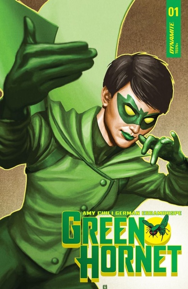
Green Hornet #1
Written by Amy Chu
Illustrated by German Erramouspe
Colored by Brittany Pezzilo
Lettered by Tom Napolitano
Reviewed by Gustavo S. Lodi
The latest volume of “Green Hornet” attempts to reintroduce the hero’s mythology to a modern audience by presenting some core components in a traditional light, but flipping some elements, prominently that of the main lead to a female character, with ties to the Hornet’s expanded family. But does this first issue succeeds on both fronts? The answer, unfortunately, is a bland ‘maybe.’
First of all, Erramouspe illustrations are solid: they convey the narrative effectively, with panels flowing in a dynamic manner, especially around fighting moments. It is clear that the artist is keen on using movement lines to keep the story dynamic and it certainly adds to the sense of urgency the script wanted to present on some sequences. For an issue that is about reintroducing a mythology, Erramouspe also manages to design compelling visuals to the Hornet’s base, weaponry and cars.
The art does suffer a bit in two aspects. Facial expressions and traits sometimes fail to tell characters apart, especially around the older men in the book: they all look like the same elderly gentleman, from the receding hairline to the sharp suit. More problematic are the color choices by Pezzilo. Other than blacks and greens, there isn’t much to be seen here. And while the choice might make sense for a character clad in emerald operating mostly at night, that limited palette makes the book look stale and it hurts how readers can tell one scene from the next.
Chu’s script is competent on delivering that first goal of “Green Hornet” (reintroducing the mythology), but only comes half as close on the second one (making readers care about the new protagonist). On the positive side, past elements of the character are quickly brought up to speed, his absence being felt in multiple layers of urban life in Century City. However, readers only get glimpses of Mulan: beyond a solid conversation with her father, getting to know her was clearly left for future issues of the book.
Final Verdict: 5.9 – While “Green Hornet” #1 offers an interesting story proposition with fluid art, it’s pacing choices on how to introduce key new characters and situations leave readers with a question mark about what the series will be about.

Meg, Jo, Beth and Amy: Little Women – All I Want For Christmas
Written by Rey Terciero
Illustrated by Bre Indigo
Inked by Gabrielle Rose Camacho
Colored by Ryan Thompson
Reviewed by Michael Mazzacane
The first entry in “Meg, Jo, Beth and Amy: Little Women,” a contemporary webcomic update to Louisa May Alcott’s book does everything one should hope for and expect from serialized fiction. Writer Rey Terciero gives the four titular women enough room to give readers vaguely-specific indicators of their personalities and what the plot of this first chunk of entries will be about. Terciero’s dialog straddles that YA line of earnest speaking theme while still sounding human. With this being “Little Women,” developing and effectively dramatizing the rapport between these sisters is imperative. Terciero creates the rhythm of how families talk to one another.
The art team effectively dramatizes that rapport, which, like Terciero’s writing, hits that cartoon aesthetic you find in young adult series like “Backstagers” or the work of Raina Telgemeier. Bre Indigo’s figures are expressive, in particular some very nice work done with the eyes. One bit between Meg and Jo is entirely sold via the difference in their eyes. Gabrielle Rose Camacho’s pallet is bright and saturated but not over done.
Continued belowThis book is first being syndicated as a webcomic on the Tapas platform, which employs the infinite scroll technique; it is here that the comic falters a bit. The infinite scroll employs the heavy use of gutters for things like scene demarcation or the passage of time. In this entry it felt like the gutters were too big. While undoubtedly sequential art, the heavy gutters mixed with paneling that often only featured a single character created a feeling of isolation between the sisters. Which is the antithesis to the core motif of a series and an odd choice because these four women are all in the same room. The macro sense of isolation is effectively shattered when the space between panels and characters converge and interact with one another, all effective moments in showing the rapport between them.
I’m glad to see how effectively this series has been transformed into serialized fiction. This episode hits the satisfying chunk threshold as the plot has been effectively setup and characters all feel well realized given the circumstances. That mixed with the earnest tone has me curious to follow the development of these sisters going forward.
Final Verdict: 7.5 – Small miss steps included, this first entry in “Little Women” is a structurally sound first entry and the kind of thing you should want out of serialized fiction in general.
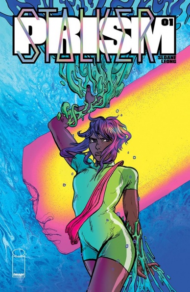
Prism Stalker #1
Written, Illustrated, and Colored by Sloane Leong
Lettered by Ariana Maher
Reviewed By Kate Kosturski
Biopunk meets Sailor Moon meets Easter eggs – that’s “Prism Stalker” in less than ten words. Our protagonist is Vep, raised away from home as an indentured servant on another planet, collecting eggs for her insectoid hosts. Not much is known about her original home except that it is destroyed. But her destiny is not to be a collector – – she’s called in by one of the “Chorus” (presumed to be the leadership of this unnamed planet) to colonize a new world based on her “species history.” This isn’t an assignment that Vep can turn down. As she’s injected with some sort of scentmarker as part of her new job, she’s cautioned to leave her old life – – even her name – – behind.
The dialogue in this debut issue is sparse, with just enough to introduce you to characters, scene, and backstory. While I wouldn’t have minded a little more dialogue to set the scene, what we have for now is okay for two reasons. The first is that this is solicited to be an ongoing series, so all the questions in my head that I want answered now should hopefully come in time. The second is because the words are not the star of this show – – that is Leong’s glorious, vibrant art. Never has a biopunk dystopia looked so good. From the front cover you see Leong takes the word “prism” in the title literally, as the rest of the book is filled with vivid, striking pinks, blues, golds, and purples. Add to this her detailed, manga-influenced pencil and ink work that makes movement leap off of the page and every scale and tentacle reach out to you with wild abandon, and you have an exquisitely built world where your eyes linger on every panel, looking at every detail, hoping to find some answers to those questions that dialogue cannot answer right now.
If you haven’t had a chance to read our interview with Sloane last month on the book, do read (or re-read it) after you digest this first issue. You’ll appreciate her boundless creativity even further. This is not your grandmother’s biopunk, and that makes it a groundbreaking exemplar of the genre.
Final Verdict: 7.9 – Have patience with all your unanswered questions about Vep and her world and linger over the artwork. It’s the star of this show and may provide some clues into her world and future.
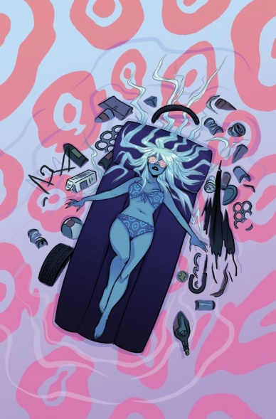
Shade, the Changing Woman #1
Written by Cecil Castellucci
Illustrated by Marley Zarcone
Colored by Kelly Fitzpatrick
Lettered by Saida Temofonte
Reviewed by Alexander Jones
Shade is back but not in the manner you would have expected. Continuing on in the Young Animal fashion, the character has slightly changed while still retaining the solid foundation and personality the previous title was built upon. The issue takes a moment to stop and smell the roses while re-examining its own purpose towards the beginning of the issue which also takes a wildly experimental diversion into a character DC fans have been waiting to see in this book for quite some time. From a scripting standpoint, writer Cecil Castellucci is giving artist Marley Zarcone lots of freedom to explore with the medium as the creator pushes comics to the limit. One such scene where Shade is laying inside of a tree is a particularly imaginative look into the characters’ background offering additional characterization and personality to the story.
Continued belowWhile the new name and premise is hardly something worth changing the title over, Castellucci’s script and engaging work on the character means the new #1 barely interrupts the story. In addition, readers don’t need to know much about the character before diving into the series right here. This is a #1 in superhero comics which actually feels like a #1. The only core problem this chapter has as a whole is how there isn’t quite one force or conflict driving Shade towards the next scene. The issue meanders, taking its time exploring Shade’s life but not delivering a guiding force to really drive fans to want to see what happens in the book next month.
Zarcone’s sobering work on the title gives each character interaction a distinctive feel while the artist is also able to really explore the more heady side of Young Animal. With Zarcone’s almost unsettling pencils, “Shade, the Changing Girl,” and Woman feels like nothing else currently on the stands. With the unconventional language set generally used by Castellucci, the title bears a vision held by each creator. The visual motifs and oddities such as a casino interspersed with Shade visiting her friend is a fantastic flourish that offers something the typical superhero comic outside of Young Animal wouldn’t bring to a narrative like this.
Not all that much has changed going into “Shade, the Changing Woman” #1 from the last series. The visual oddities, unique language, and dark, interpersonal drama is still on display in the issue. While a more firm plot could benefit the comic going forward, “Shade, the Changing Woman” #1 is a triumph.
Final Verdict: 7.9 – “Shade, the Changing Woman” #1 doesn’t change all that much different from the previous series and continues to be one of Young Animal’s brightest stars!
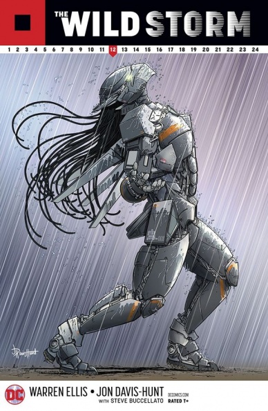
The Wild Storm #12
Written by Warren Ellis
Illustrated by Jon Davis-Hunt
Colored by Steve Buccellato
Lettered by Simon Bowland
Reviewed by Reed Hinckley-Barnes
There are a number of positives things one can say about Warren Ellis and Jon Davis-Hunt’s “The Wild Storm,” but calling it action packed generally isn’t one of them. However, with “The Wild Storm” #12, the series comes pretty close. If the numbering on the cover of the book is to be believed, then this is the halfway point of the series, which feels right, as there are a number of things the book has been building to that are finally coming to fruition.
For its opening few issue, “The Wild Storm” was a book that seemed to be riding the line between deliberate, and just being boring. But, as the seeds that were laid early on in this run start to come together, it’s clear that Ellis needed to take the time to get the reader reacquainted with this world, allowing us to know the ins and outs of its different factions and the roles they have been playing. All that is to say, “The Wild Storm” #12 is a book that has three different secret societies, all performing various different operations on each other all at the same time, and is somehow not only not a convoluted mess, but succeeds on being an extremely entertaining book.
And I haven’t even mentioned Davis-Hunt’s art yet, which is such a vital part of why this book succeeds. The characters are all so expressive, each moving and carrying themselves in an entirely unique way. The action scene that takes place in the middle of the book is propulsive, gun shots and punches all having a real weight to them when they connect. All of this is then tied together by Davis-Hunt’s very structured panels, which gives the book a sense of order even when the world in side of it is descending into chaos.
Both the art and writing are firing on all cylinders here. All of this to say, if this is the half way point of “The Wild Storm,” I can’t wait to see what the back half is going to look like.
Final Verdict: 8.5 – Halfway through it’s series, “The Wild Storm” #12 has a number of its plot lines come to an exciting and explosive head.


