
There’s a lot to cover on Wednesdays. We should know, as collectively, we read an insane amount of comics. Even with a large review staff, it’s hard to get to everything. With that in mind, we’re back with Wrapping Wednesday, where we look at some of the books we missed in what was another great week of comics.
Let’s get this party started.

Written by Dan O’Bannon and Christiano Seixas
Illustrated by Guilherme Balbi
Colored by Candice Han
Lettered by Michael Heisler
Reviewed by Ryan Fitzmartin
“Alien: The Original Screenplay”, is a competent, but ultimately somewhat futile re-interpretation of the screen classic. Dark Horse has essentially re-adapted the screenplay without H.R. Giger’s iconic Xenomorph designs, and the result is somewhat lackluster. Alien without its iconic alien is a good sci-fi story, but it isn’t anything special. Artist Guilherme Balbi has created new designs based on the script descriptions, and while I find the fleshy, tentacled beasts creepy, they can’t match up to the visage of the horrifying Xenomorph.
The story of “Alien: The Original Screenplay” is still exciting to read, as the crew of the spaceship Snark descends to an alien surface. Balbi’s pyramids and temples evoke a more classical space opera image, as contrasted with the film’s aesthetic. Balbi’s fantastical desert surface reminded me almost of Frank Frazetta drawing Barsoom. The more exotic, outlandish designs may have indeed been what O’Bannon envisioned before Ridley Scott. This is where the comic provides the most interesting alternative to the film, with its architecture and landscapes.
For the characters, there isn’t much to say. They’re recognizably similar to those from the film, but with more diversity, modern hairstyles, and different names. Yet they don’t feel as well sketched out as the characters in the film. The dialogue is largely quite bland. The characters all talk the same and don’t have many defining traits. There’s no character in “Alien: The Original Screenplay” who pops out in the way Ellen Ripley does. The likability and depth of the characters in the movie is a testament to the strength of Sigourney Weaver and the rest of the cast.
It is unlikely this comic will hold much interest for anyone except Alien die-hards. Even those fans won’t be too moved or excited by the comic. If the purpose of this project was to reimagine Alien, it’s only served so far to prove the enduring strength of the original. The story and action are still indeed fun sci-fi, proving Dan O’Bannon’s script to be a solid base for the film. Divorced from Ridley’s Scott and H.R. Giger’s style and designs, “Alien: The Original Screenplay” loses the edge and vision that made the film a classic.
Final Verdict: 6.2 – An unnecessary and weaker re-imaging of a classic movie, likely of interest only to truly devoted fans.

Story by Matt Kindt
Art by Wilfredo Torres
Color by Nayoung Kim
Lettering by Nate Piekos of Blambot®
Reviewed by Jamie Yost
Matt Kindt and Wilfredo Torres’ James Bond homage suffers from a lack of motion, the kind of frenetic energy its very name implies, which is ironic considering “BANG!” #3 earns its title as the protagonist is repeatedly referred to as not only a hired gun, but a bullet, aimed at ne’er do wells.
Having explored pastiches of 007 and a supersoldier John McClaine in past issues, “BANG!” #3 dabbles in action film gadgetry. Paralyzed from the waist down, Michele Queen’s super-suit grants her enhanced mobility and a telepathic bond with BOI, a bioengineered smart car. Not only does Queen command the BOI through this telepathic link, but she also confides in, and dare I say, flirts with “him” all while suspended in a VR prison. It’s great character building for sure, but to quote Kindt’s own exposition, “a little less chit-chat and little more action if you don’t mind.”
That “BANG!” #3 falls short on the action is certainly no fault of the art team as Queen spends several pages suspended in a VR prison. While the big bad monologues and Queen mind-chats with BOI, Wilfredo, and colorist Nayoung Kim find the opportunity to draw inspiration from the fine art world. A pair of enhanced VR glasses project Queen’s captor as a deconstructed 3-D nightmare right out of a Nychos painting. Think Dr. Manhattan reconstructing himself, skeletal system after nervous system, and so on. Torres and Kim’s pop art stylings draw a strong comparison to Laura and Mike Allred, especially as Dr. Queen makes her heroic escape. You won’t be faulted for flipping the cover over to make sure you’re not reading Mike and Laura’s fantastic “FF” run.
Continued belowAny shortcomings are quickly forgotten as “BANG!” #3’s gorgeous art and brisk pacing come to its thrilling conclusion as Kindt and company deliver another exciting entry into the pantheon of Bond homages.
Final Verdict: 6.5 – “BANG!” #3 is a fun pulpy action romp with strong art and engaging characters but could offer a little more *ahem* bang for its buck.

Written by Gerry Duggan
Illustrated by Phil Noto
Lettered by VC’s Joe Sabino
Reviewed by Luke Cornelius
With ‘X of Swords’ looming, it’s up to Duggan, Noto, and Sabino to reach a suitable endpoint for the early threads that have featured in “Cable” so far. The result of their collaborative efforts proves successful in this respect, with Cable’s conflict with the group of Spaceknights over the Light of Galador coming to a fun conclusion in “Cable” #4.
Opening with an expository sequence about the Spaceknights’ origins, we get an instant sense that this is the beginning of the end of their story; we’re getting the relevant missing details to the villains before their demise. Here, as throughout the issue, Noto’s artwork smoothly shifts styles to communicate when events aren’t taking place in the present by removing outlines from the panel themselves and the objects inside them. It’s a subtle shift, but it makes “Cable” #4 easy to follow without the need for time and location captions.
Cable’s misleading of the Spaceknights is enjoyable, as is the additional timeline manipulation between Kid Cable and Old Cable, but the issue really shines through the exchanges between Cable, Esme, and Emma afterward. They may be brief, but there’s a great injection of humor in them, delivered superbly through Noto’s artwork, with the highlight being Emma Frost’s three-panel “I’m watching you” gesture. With the Spaceknights conflict over, we get back-to-back information pages to set up stories for later in the series, before Cable is brought back to reality when he has to stay home for dinner. This halting of another adventure, although it is primarily to leave the solo stories paused before the X-Men event, is disguised neatly, furthering the youthfulness of this iteration of Cable that has built up over the series so far.
Noto’s artwork throughout the issue is fluid and lively, with his facial expressions excelling. Due to Cable and Esme being limited to telepathic communications, there’re very subtle changes in their expression to show their emotions, changes that are minute enough for the Spaceknights not to notice.
Overall, “Cable” #4 does a great job of being a fun and entertaining comic thanks to its youthful characters and great artwork, whilst bringing the solo outings to a pause before ‘X of Swords.’
Final Verdict: 7.2 – A fun comic which primes “Cable” for its ‘X of Swords’ involvement.

Written by Dan Watters
Illustrated by Dani
Colored by Brad Simpson
Lettered by Aditya Bidikar
Reviewed by Christa Harader
“Coffin Bound” #6 plunges us back into the action – Taqa’s determined to meet the Vulture in whatever way she can, we meditate on fighting and reflections, and someone gets chucked out a window. All in a day’s work. Watters attempts to blend concept and grit, and as usual, it’s a bit of a mixed bag. The lofty speech still doesn’t track well, despite the irony being intentional, and it tends to slow down the reading in ways that don’t serve in moments of quick action. Still, there’s something compelling here, especially in Taqa as a character. It’s mostly in her potential, in the drawn breath of her quest. How that plays out in the climax and fallout will be interesting.
Dani’s art is organized chaos, and the disintegration issues that occurred in earlier installments aren’t present here. Simpson’s color palette is a night-soaked sea of blues, pinks, and purples that adds depth and structure to Dani’s loose line, and Bidikar’s work is a testament to lettering imagination and talent. Line tails break balloon borders and often the reality of the work, but Bidikar plays with this with a stroke on the bottom of the ballon and just a touch of white around the tail itself. This softens the effect, and while they’re still not completely seamless, those tweaks go a long way toward making them so.
Continued belowOverall, “Coffin Bound” #6 does some basic scaffolding for the arc to follow and entertains. It’s a book that tries to bridge the tower and the gutter, and its ultimate success relies on a tightrope walk through the next several issues.
Final Verdict: 7.5 – “Coffin Bound” #6 goes hard for narrative flavor but continues winding a self-conscious conceptual path.
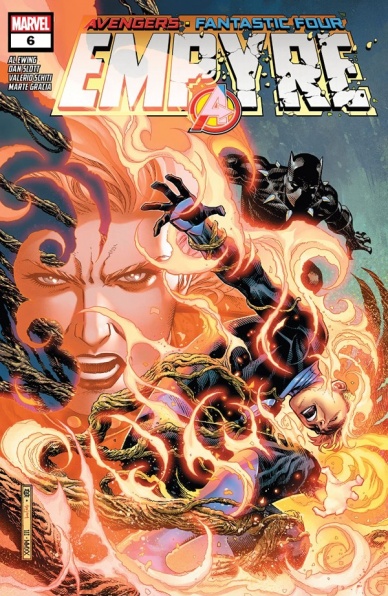
Story by Al Ewing & Dan Slott
Script by Al Ewing
Illustrated by Valerio Schiti
Lettered by VC’s Joe Caramagna
Colored by Marte Gracia
Reviewed by Michael Govan
Here we are at the final issue of the “Empyre” mini-series. Well…final-ish. There are still three or four tie-in issues but still close enough! How is the grand finale of the latest event from the House of Ideas?
Off the top of my head, the word I would have to go with is ‘busy’. Throughout the issue, that was all I could keep thinking. ‘This is a lot’. “Empyre” is kind of sprinting to the finish line and it feels like it’s rushing to tie up a dozen or so loose ends.
For example, tie-ins that were mentioned in passing are suddenly significant plot points here. I haven’t read everything on the “Empyre” checklist so I don’t know how the Skrull and Kree kid ended up in their mess. Nor do I know how Thor now has this Gaea-son earth power. Just my opinion, but I think this mini could have used a bit more room to breathe, maybe seven issues instead of six.
While there are definitely a lot of disjointed pieces, those disjointed pieces aren’t bad in and of themselves. For one thing, the book looks great. Schiti’s artwork is great for a superhero comic, the panels epic, kinetic, and thanks to colorist Gracia, vibrant as well. I particularly enjoyed Mr. Fantastic’s Iron Man armor and the page with Captain Marvel, Human Torch, and Wiccan right in front of the sun really sells the scope of the event.
On top of that Ewing delivers some great character moments. It’s a great touch that Tony Stark is at his most ingenuitive under pressure, coming through with a genius plan. We also have Invisible Woman pushing her powers to the max and the ever-loving, blue-eyed Thing putting his big heart on his sleeve to reach She-Hulk. As a “Young Avengers” fan since the start, it’s really special to see Hulkling take his rightful place as King of Space.
This mini might not have perfectly stuck the landing but it does open up some new possibilities for the cosmic side of Marvel that should be exciting to see. A fun ride worth reading.
Final Verdict: 7.0 – Long live the King!
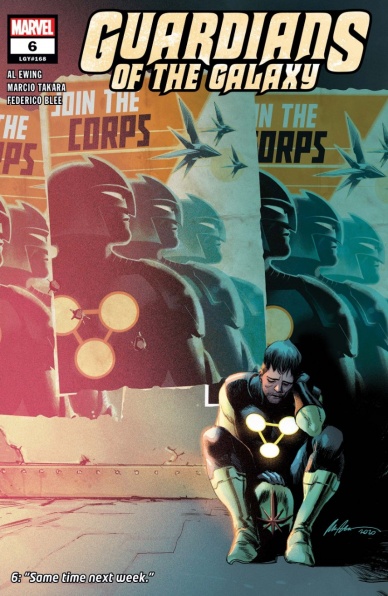
Written by Al Ewing
Pencils by Marcio Takara
Colored by Federico Blee
Lettered by Cory Petit
Reviewed by Quinn Tassin
One of the best things about Al Ewing is that as well as he’s able to write big, crazy stories, he’s just as capable of pivoting into more grounded, smaller narratives. After a few issues dealing with gods and rival Guardians teams and alternate universe doppelgängers, in “Guardians of the Galaxy #6,” Ewing takes our favorite Nova, Richard Rider, to therapy. Better yet, the issue is a pretty clear play on the format of DC’s controversial miniseries “Heroes in Crisis” and uses all of its tricks to produce much stronger results.
“Guardians of the Galaxy #6” is probably the closest thing to a slice of life cosmic comic book that we could possibly hope for and Ewing really delivers. He couches the whole issue in Richard Rider’s need to be a hero and take the weight of this universe onto his shoulders and his shoulders only. The result is a quiet and powerful issue about what it’s like to be a superhero and also a person. Evocative of Kurt Busiek’s “Astro City,” the issue delivers a number of small moments that really make a difference.
There’s almost zero action in this issue but thanks to Marcio Takara’s art and Federico Blee’s colors, it doesn’t feel that way at all. Every nine-panel discussion and every fleeting flashback feels full and engaging. There’s a particular moment as Richard and Gamora chat at the space bar (not an official name but a funny one that they could and should have used), where there are two panels of Nova speaking to Peter Quill in the Cancerverse and they’re truly tiny, but feel representative of what works so well about the issue. Another great moment- Richard putting his Nova helmet back on. On that page, he stands up differently, exuding different energy than he has for the entire issue. He’s a superhero and he clearly feels like one. Takara deserves heaps of praise for that.
Continued below“Guardians of the Galaxy #6” is a very very good comic book. It communicates the impact of the cosmic hero lifestyle on a human being incredibly well. It helps ground an already very strong series. It gives us Noh-Varr and Hercules as a couple. What more could a comic fan ask for?
Final Verdict: 8.9 – “Guardians of the Galaxy #6” sends Nova to therapy and takes us to church.

Created by Emma Kubert and Rusty Gladd
Reviewed by Matthew Blair
Creators Emma Kubert and Rusty Gladd would like to invite you to a sprawling fantasy world of mystery and magic and ruled by a powerful and ambitious, yet seemingly dysfunctional, family. “Inkblot” #1 follows the adventures of a nameless archivist who stumbles into a world of adventure with the most terrifying and demonic of creatures: an adorable and magical black cat.
It’s clear that a lot of passion and heart went into creating “Inkblot” #1 and that Emma Kubert and Rusty Gladd are eager to show off their hard work. The book is taken up by a massive exposition dump detailing the rise of the main character’s family and how they came to rule over seven fantasy realms with a Yggdrasil-like tree castle in the middle that supposedly connects them. Unfortunately, there isn’t a whole lot of urgency in the book, no war that threatens to break out or massive, universe ending threat that threatens to destroy everything unless something is done about it. It’s an interesting storytelling choice, and kind of nice to have a simple exploration and discovery narrative, but if the stakes aren’t made clearer the entire series runs the risk of losing steam very quickly.
The artwork is the strongest part of “Inkblot” #1, which makes sense since both the creators were graduates of the famous Kubert school. The environments are richly detailed and the magic and action is gorgeously drawn on the page in a cartoon style that evokes old school comic strips like “Prince Valiant” or other fantasy comics like “Elfquest”. But the real highlight of the book is the titular cat character, who is adorable and drips with mystery and personality.
“Inkblot” #1 is a pretty comic to look at with a new creative team that is pouring their heart and soul into its creation. However, while the artwork is gorgeous and the cat is adorable, the comic will have to start developing a more concrete story with clearly defined stakes if it wants to capture and maintain audience interest.
Final Verdict: 7.4 – There are a beautiful and interesting fantasy world and an adorable creature companion that will probably sell lots of plushies, but there’s no real sense of urgency or reason for the story to be happening.

Written by Zac Thompson
Art by Jen Hickman
Lettered by Simon Bowland
Reviewed by Kobi Bordoley
When we first read the press release for “Lonely Receiver” back in February, co-creator Jen Hickman described the story as “sexy and weird,” and we are here to tell you that after reading “Lonely Receiver” #1, it is, in fact, very sexy and very weird. It’s the kind of issue we’d recommend rereading immediately after you finish it the first time. Zac Thompson throws us in the deep end head first, and in the first few pages, it’s unclear who exactly is narrating, what timeline we’re in, or who’s feeling what. Hickman’s deft art pushes and pulls, her images’ true meaning and subject often unclear. Sometimes, Bowland’s evocative lettering, which makes clear delineations as to what’s going on, is the only guiding light the reader has. Things get sorted out by the end (the post-story documents are especially illuminating and well crafted), but for readers used to a more railroaded story, “Lonely Receiver” #1 will prove challenging.
That’s not to say that challenge isn’t rewarded. Digging through the intended obfuscation has its rewards, and a close reading of “Lonely Receiver” #1 will have you reflecting on your own relationships and their emotional fallouts. “Lonely Receiver” #1 has a lot to say, and says it to our face: maybe your utmost desires should not be manifested as reality. Maybe your sense of control is worth questioning. Maybe we should, for the 100th time, rethink dating robots.
Continued belowOf course, it’s not that simple. Thompson and Hickman’s world is much more than a reskinned Her. It’s darker than that, more subtly deceitful and heartbreaking. “Lonely Receiver” #1 feels like the kind of story that emanates outward from its center. What we mean is that this issue feels like a beating heart, a concentrated nugget of ideas that will serve as the series’ ideological and emotional center. For this reason, “Lonely Receiver” is heavy on ideas and weighty questions. While this style of storytelling may be the holy grail for some readers, it’s not for everyone. Perhaps this story will be polarizing for that reason — regardless, we’d suggest giving “Lonely Receiver” #1 a try. Sometimes you don’t know if you’re in the mood to swim until you dive in headfirst.
Final Verdict: 8.0 – Weird, sexy, and provocative, “Lonely Receiver” #1 brings up powerful questions of intimacy and autonomy.
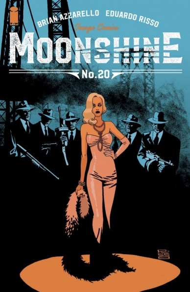
Written by Brian Azzarello
Illustrated by Eduardo Risso
Lettered by Jared K. Fletcher
Reviewed by Derek Uibelhoer
Brian Azzarello and Eduardo Risso have done a fantastic job at setting up their latest arc of the prohibition era crime-fantasy series, “Moonshine”. The new arc, ‘Angels Share’, shifts between the perspectives of the once handsome Lou Pirlo as he comes to grips with a guilty conscience heavily weighed by the high cost of killing; and the heartbreaking Tempest as she cunningly uses her prowess as a performer to get closer, and closer, to her new prey.
Moonshine #20 starts off with a flashback into Lou Pirlo’s past that serves to show the mounting pressures that all but forced him into a life of organized crime. Back in Lou’s present, a killer has been ravaging the city of Cleveland at night; and for some nights now, Lou can’t for the life of him remember what he did. Azzarello does a great job in this issue bouncing back and forth between the characters whose worlds he is slowly pressing up against one another to show what little control they each have over their own decisions. While Lou’s actions are aided by a supernatural curse, Tempest’s dirty game is driven by an unshakeable need for revenge against the man who hurt her family. Azzarello takes it one step further to show us that even the big Boss Joe Masseria doesn’t really have a choice in killing off his enemies, he needs to send a message if he wants to keep his power. By showing us just how connected all these characters are, Azzarello draws similarities to the control the mafia has over its made men, and the moon has over some monsters, as well as comparing the poor morals of bought cops with those of hired guns. He wants to force us to question who is really more of a monster; the senseless beast who kills a man, the conscious criminal who ordered the killing, or the crooked cops who did nothing to stop it?
Eduardo Risso steadily brings some of his best work to the table in Moonshine #20. He uses careful attention to detail; from the high waisted pin-striped three-piece suits equipped with suspenders, hats, and pocket watches, down to the old school automobiles and rotary dial telephones, to help ground this unreal tale in a fully realized 1920’s Cleveland, Ohio. Risso shows off his versatility when rendering the flashback in this issue with muddy watercolor washes that starkly contrast the sharp flat colors and black silhouettes of the present-day plot. His heavy reliance on the black inks creates the perfect tone for this blend of horror and crime and the soft colors he chooses to set a serene unity throughout the pages that feels effortless. The way Risso lets positive and negative space play off each other to give each page a unique layout is something that is unmatched in most comics today and each page is paneled with such precision that anyone might stand alone as a piece of graphic art. His style is uniquely his own and in this story, it certainly serves to showcase both the suspense of horror and the thrill of crime.
While Moonshine #20 is a welcome addition to the ever momentous plot of the series, the issue does little to stand out from any of the other issues in this series. If you are already a fan of the series, this is certainly an issue you won’t want to miss, but if you haven’t jumped on board yet, this is not the place to start. While there is a large reveal at the end of this issue, Moonshine #20 is still setting up a larger plot that we have yet to see wrapped up.
Continued belowFinal Verdict: 7.8 – Though the issue relies on a past understanding of the series, Moonshine #20 is a beautiful addition to this extraordinary mashup of werewolves and organized crime told by two of the industry’s veterans.

Written by Chelsea Cain
Illustrated by Elise McCall, Lia Miternique, and Stella Greenvoss
Colored by Rachelle Rosenberg
Lettered by Joe Caramagna
Reviewed by Joe Skonce
It seems like everyone in comics is getting their own island these days, ronin, billionaires, even mutants.! Now, Dark Horse is giving another tropical oasis, this time for spies living on a mysterious island paradise located in the Bermuda Triangle. It’s a contemporary story, or at the very least in a post-Netflix age, but in “Spy Island” #1 Lia Miternique and Chelsea Cain create a spy story that feels like a 60s thriller that features witty dialogue and art that gives the issue a healthy dose of groovy fun.
Like many first issues, “Spy Island” #1 has to do a lot of heavy lifting, but Nora’s narration makes the worldbuilding and exposition light and fun. Nora is largely jaded about her life, living in a world that is surrounded by alien artifacts, impromptu conga lines, and lots of spies, but everything just seems to bore her. Nora has a quick wit, which helps make the issue more punchy. She knows mysterious things are happening, but she’s in no way curious about learning more. Unlike other comics that focus too much on mystery but provide no hook to come back, it’s fun to think about how Nora is going to handle being part of a conspiracy she’s largely over.
The real star of the show is the psychedelic art from Elise McCall, Lia Miternique, and Stella Greenvoss. “Spy Island” #1 features outfits while feels like they came straight out of a 60s Bond flick, but what takes it to the next level is Rachelle Rosenberg’s coloring. There’s pink wallpaper with leaping zebras, tie-dyed maxi skirts, and fern bedspreads. There are also interesting composition decisions, including photographs of real fish and placing a (quite scary) mermaid into a collage of coral. There were even a few moments where the art was inspired by psychedelic 60s films like Blow-Up with minimalist backgrounds and quickly changing colors. Overall the art creates a fun backdrop to Nora’s boredom of living in a vibrant and wild place. The Bermuda Triangle certainly has mysteries, but the fun comes from our protagonist’s disinterest in following them.
Final Verdict: 7.5 – Featuring a psychedelic 60s inspired art style, “Spy Island” #1 creates a mystery worth revisiting.


