
Today on Artist August, we’re featuring the tremendously gifted Esad Ribic. Penciler, inker and just a little bit of a colorist on “Thor: God of Thunder” from Marvel with writer Jason Aaron, Ribic is one of the best artists in the business, and his run on the book finished with yesterday’s eleventh issue – for now, at least, as he’ll be returning after Ron Garney finishes his run on the book.
I talk to Ribic about his work, working with other inkers, colorists and painters, designing a good villain, making it in the industry coming from another country, and much more. Thanks to Esad for the very candid conversation, and I hope you enjoy the interview.
What made you first appreciate comics, and how did you first decide that you wanted to pursue it as a career?
Ribic: I don’t think I ever made that decision. I knew that I wanted to draw for a living, pretty early as a kid. But I wasn’t very specific about that. I was interested in painting and animation, but drawing…I was interested in that kind of stuff. I never really realized until probably high school. Especially since in the early 90’s in Croatia we had this war and basically when ex-Yugoslavia disbanded, I was starting to get more interest towards doing comics because…my first big job I ever did was animation. I saw that as my career. Pretty soon what happened was the studio went bankrupt because it was one of those state financed things and they just slashed everything. Basically I was left with what was up to that point a hobby.
I didn’t really start to think of it as a possible career up until that point, because I hadn’t done anything besides underground, dark humor, very short stuff. Like one or two pages. This was occasionally painted over…I was always painting, I never really thought of doing anything in black-and-white. So naturally when I started doing comics, that’s how I approached it. I developed this style from necessity because I couldn’t get any of my painted stuff published because all of the magazines were black and white. They were more of ‘zines than magazines.
That’s what the situation was, so I was thinking of it as a hobby until it became my first career (laughs).

How did you first break in coming from Croatia?
Ribic: Here’s the thing: a couple of years before me my good friends Eddie (Biuković) and Darko (Macan) started doing some work with Dark Horse, doing some Grendel and Star Trek stuff. It was proof that it was actually possible, because for us here, you couldn’t make comics a career. You couldn’t make comics a living. It was too small to support professionals. Basically, the thing was if you are good enough, you need to go and try something abroad because you’re not going to get enough back home.
I already felt the urge to specialize. I was still doing magazine illustration, commercial illustration, all kinds of stuff. I couldn’t say no to a job. Comics were really only like 1/5 of what I was doing. I realized that was actually what I wanted to do. I would rather do that than illustration stuff. I love to do illustrations, but I couldn’t only do that.
So basically, my friends got work in the States, but I was aiming more towards France because I thought my type of artwork would be easier to sell to French editors than to Marvel. We were declined by Dark Horse. They just never answered us. There was no “no.” For me and my writers portfolio.
So we started sending to some other companies. We didn’t send anything to Marvel or DC, because we figured they wouldn’t just get someone from the streets, they’d say, well, you don’t have any fucking track record.” (laughs) We tried some smaller houses in the states, and at the same time, I was sending stuff to France, but they weren’t responding either. I was getting silence on all continents (laughs).
Basically the first job that got offered to us was this small company Antarctic Press. That was kind of strange to me. I don’t know why my writer sent our portfolio to them, because they’re a manga company and I don’t see any manga in my work. But they liked it, and we saw it, “well, they’re mostly doing manga, so we’re going to be noticed because it will be different in their portfolio.”
Continued belowWe did that, did a couple mini-series with them, and then I met Axel Alonso. Right at the same time, the same friend of mine who was working at Dark Horse, landed a job at DC, and he introduced me to Axel who was his editor. He loved Eddie’s stuff, and he loved my stuff, so he said he has to work with us and we were all happy.
Literally, since Antarctic is a small company, there’s not a lot of money to be made on those deals, so it required me to do a lot of work at home and on the comic for them. So working with DC was great, because big companies means a good steady paycheck and stuff like that, so you can relax finally. I did a couple of minis and some covers, and one mini five page comic for some anthology with Vertigo. I did one mini-series called “Four Horseman” with Robert Rodi, and then I moved to Marvel.
Did you move to Marvel because Axel went over there?
Ribic: No, no, I moved over there before him. I kind of didn’t really have a good rapport with Karen Berger, you know. So I generally just…some people liked my stuff, and they were pretty aggressively looking for new artists. It was after their bankruptcy, late ’99, 2000. After the “Four Horseman” thing, I said, well, you know what, I’ll just take this offer I got from marvel and moved on.
That’s how I ended up at Marvel, really. I’ve been there for 13 years now.
One of the interesting things about your art is…a lot of artists have went purely digital, but your work seems heavily based in traditional still. Do you still work primarily in digital?
Ribic: Well, there are two different things. If I paint, I still paint completely traditional. When I do black and white stuff, like currently in Thor or Ultimates, the way it was done is I will do pencils, and then I will scan it to my computer. I realize that basically it’s much faster for me if I do that stuff if I do elaborate backgrounds on separate papers so I can reuse them. That’s how I do those things. If it was up to me, I would paint all of that stuff, but you can’t have a Marvel book every 6 months.
I find this process a good medium between what I want and what I would get if I penciled, someone inked and someone colored it. I don’t like that stuff. It just doesn’t…it feels wrong to me. I started inking my own faces because I always had a problem with people inking my faces. Then I realized after I fought with inkers doing my stuff, a guy told me, “you should just not have an inker.” So I said, “you know, you’re right.” So I started doing pencils and gray scaling on the computer, so that’s what I am doing now. I do pencil stuff and then bump it up on photoshop to make it look more like ink.
Then I would add to photoshop a gray scale layer, where I set up lighting and basically render stuff. It’s a pretty easy job for a colorist because literally when he picks the colors from that layer, most of the stuff is already rendered for him. I get critics who say, “you don’t really do a lot of backgrounds, the colorist fills them in.” I do all of that stuff, I just don’t do it in pencils. I do it in grayscale. It’s not done by colorists, it’s by me.
It’s done on purpose because one thing I don’t like when you see scenes where somebody stopped and somebody else started. I’m kind of irritating with that kind of stuff. I want it to look like nobody can be sure what my colorist did and what I did. It’s more organic that way. To some people, most people think colorists are doing it, but I did it.
It gives it a more cohesive look. Like one person looked on it.
Ribic: Exactly. That’s what I’m going for it.
Another thing is, I was never really happy with…if you work in Marvel, it’s expected that colors will be rendered colors. There’s going to be a lot a lot of light and shade that colorists add. To tell you the truth, I never really saw a colorist adding a proper layer of light and shade. If they could do it, they wouldn’t be colorists, they would be artists. So why the fuck would you let somebody who is not very adept at it do those renderings. Let the fucking artists do their renderings. That’s what I’m doing.
Continued belowI started doing that when I was doing Uncanny X-Force. I did like three issues. I was busy, so that was still an inked book, but I would do guides for colorists, and then I realized it the best way for me to do it would be to do them as layers in photoshop. I started doing this grayscale, and it’s a thing that’s kind of worked for me. I’ve continued to develop it through Thor.

It makes sense to me. I hear stories about inkers who apply their own style to other people’s works, and same for colorists, and for me I’m looking for storytelling that works together. When you start getting off that, that’s when the art suffers.
Ribic: Yeah, but don’t get me wrong: the traditional way of penciling, inking and coloring can work magically. But it only works magically if the artist has a style that is conducive to that kind of treatment. So if you have an artist with that kind of style, it almost doesn’t matter what inker does it if it’s a skilled inker. When it’s well-inked and everything is done well, it almost doesn’t matter what colorist does it, if they do where the art tells them to do.
It rarely happens. 90% of the time, it kind of all looks awkward to me. And don’t forget, I’m a painter basically. Most of the stuff I did was painting covers, painting those Marvel Knights books. That’s how I think in that regard, and I just never saw…there are some great colorists and there are some really bad ones. Generally, always the problem is, if I put enough information for the colorist to always be sure what I want, it’s actually much better for me to do it myself and let them fill in the colors. If I want them to render certain stuff in a certain way, it’s much easier for me to do it in photoshop.
Some will tinker with it because they want to put more of their own slant to it, like Dean White would always be like (in an impersonation) “Oh man, I always feel so unneeded.” I’m like, no! What the fuck?! But you know, really it’s all about this thing in the end looking like you can’t really be sure who did what. I know it’s working because I will look at some of the pages and I’m not even sure who did it.
I just returned from a convention in France, and this guy brought out Ultimates, the trades, and I was looking through it because he wanted to ask me about a page, and I wasn’t really sure if it was me who did this certain thing or was it Dean. I had to look at my grayscale art to see, yeah it was me in this case. Even to me after a while, it wasn’t clear who it was. It kind of really works organically.
I know you’re a really big painter, and Silver Surfer: Requiem is one of my favorite things you’ve ever done, but could you ever see someone painting over your work? Would that be something you would do?
Ribic: I had someone paint over my work. I did this pencil sketch of John Carter that Richard Isanove painted over, and I didn’t like it. The problem with that stuff is it’s really hard to like that stuff, because it’s not from the same page. What he likes, the colors he likes…he’s more chromatic. He thinks more in a chromatic sense. He’s basically like early 20th century French painters. It’s all about color. I’m more about light and shade and depth of feel. I don’t give a shit about colors, really. Colors are here to add sense to space. It’s kind of a different look at the same thing.
To me, when I’m doing pencil, I’m doing it with my rendering and my colors on top of it. I can’t not do it. So basically I do it up to a point. To finish it myself, and then someone else does it in a different way, of course I’m not going to like it.
Continued belowIt has some merit. I’m not saying Richard isn’t good at what he’s doing.
It’s just not a good fit.
Ribic: Yeah. I don’t see it like that. Some people like it. For me, it just doesn’t work.
Your big project right now is Thor: God of Thunder with writer Jason Aaron. For you as an artist, what appeals to you about a project like this, and how is it collaborating with Jason?
Ribic: I worked with Jason for a while on one-shots some time ago. We liked working with each other, so we decided we wanted to work together in the future. Thor was a good opportunity because I was still doing the second arc of Ultimates and we already understood that there was going to be a change in approach because it wasn’t selling enough. They were expecting it to sell, I don’t know how much. The numbers were better than before, but still not good enough. So they wanted to bump it up. I decided I didn’t want to do it, and Jonathan Hickman decided that too, so we left the book.
Before we finished that thing, Jason and I pitched the Thor thing to Axel and Axel immediately said “well, you know what, you want to work with Jason again because he’s going to be free.” He liked the idea. To me, it was like “fuck yeah, great! That’s it.” Especially since the appeal was from a start, it wasn’t going to be infused with standard Marvel continuity. To me, that’s just an impediment. Anything interesting you want to do, you can’t do it because of some continuity reason.
So I saw it as, if I’m going to enter the Marvel continuity thing, why not do it in the book that’s removed as much as possible from it. Jason’s story is fucking great, and there’s a lot of stuff in it that I like to do. I’d like to do more Viking ships and stuff like that. I’m one of those guys who when I have the time, I’d do wooden ship models. I’m into that shit.
It really was just a fucking great project. I think it turned out better than I expected. What’s it like, issue #9 is out?
Yeah, issue #9 is out.
Ribic: I’m not sure what you’ve read, but to me, it kind of works…I just love what we’re doing. A lot of the stuff is very untypical for Marvel continuity. A lot of that stuff is not that exotic because it’s done in European comics and the stuff I liked as a kid. In this continuity, it’s kind of like getting some new quality, and it feels original. I love it.
I have to say, it’s my favorite Marvel book right now. Traditionally, I’ve never been a Thor guy. The thing that stands out about is the scope and the scale of the story. It’s godlike. It’s what you want for the book. How important for you two was it to create a story that was befitting a god?
Ribic: It goes really unsaid…I don’t really read comics. The more time I spend drawing comics, the less time I spend reading them. I didn’t really read a comic book in a year or something. I have a pretty fresh memory and opinions on the stuff I read before that. To me, when I was growing up, I was never really a fan of Marvel’s stuff. I was a fan of John Buscema. I would read everything that guy drew. I’m still a huge fan. So basically, one thing I noticed was I started reading some stuff from Marvel I didn’t really like. Frank Miller’s Daredevil…I never really saw it as anything special. I heard so many things about it, and I kind of expected it would be even grander and more awesome than what Buscema did with Conan and the Surfer and stuff like that.
And it feels like a fucking TV thing. Buscema’s stuff feels like movies. Big budget movies. But this thing felt like a TV show. It’s indelicate and fun TV.
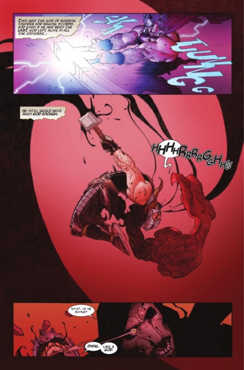
So when I came in, I thought, “no matter what we do, it has to feel huge. Because it’s gods. Because it’s millions of gods killed. You have to do something big.” I deliberately pull the camera away from the action so it lets the reader subconsciously remind this thing we’re observing now is this huge fucking event. When we look through a telescope, we think, “wow! What the fuck was that?”
Continued belowIn that regard, some other aspects suffered, but it’s a give and take, and I decided to go in that certain direction that will kind of add to the epicness, and maybe not rob too much of the intimacy.
On the other hand, I tried to make them act as much as I can to fill the gap in the middle. There are all of these big objects smashing, and then there’s a close up of someone’s face. There’s something missing in-between. You have to compensate for those midshots somehow. Or put as many of them where you can.
There’s a very subjective chemistry you have to do so you don’t have holes.
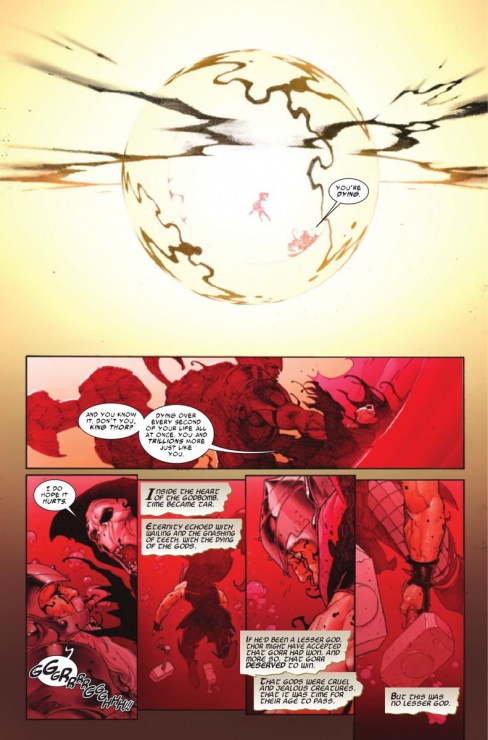
When you’re talking about pulling the camera out…some of those last pages blow me away. When the God Bomb was revealed, that was operating on a scope you rarely see in comics. It blew me away.
Ribic: I had a problem with that thing because I think the colorist kind of fucked it up on that thing. He put on some very little lights on the God Bomb. I think those details kind of diminish the size of it a bit. What I said to him was basically treat it like a mountain that is 100 miles away from you, so you see it basically as just a little darker than the sky. There’s no detail on it anymore. Treat it like that. It’s just a huge mass.
I’m a big fan of this British illustrator called John Harris, and he did a lot of those huge meteorite and spaceship shots, with them colliding and flying next to each other. All of those are about the mass and size. I always try to go…I stole a lot from that guy when I did Requiem. Check him out if you haven’t. Awesome stuff. Not exactly known in the field as much as he should be I think.
So this is the thing: the more you put in, the less size you get. He just didn’t…he didn’t have the balls to leave it like that. “I have to put details otherwise it will look unfinished” and I was like “noooo!!!”
I’d love to see how you envisioned it. Even in the book, it still stood out, but I see your point.
Ribic: I’m nitpicking here. Let’s make it clear. It all works. I’m happy with how it turned out, but it could have been a little more.
When you were developing this book, how did you and Jason work together to create the look of Gorr, the brand new villain for the book? What do you think makes him stand out visually as a villain, in particular?
Ribic: Jason basically wanted a creepy guy. I don’t really remember anymore, but there wasn’t much more than that in the concept. But from what we already had from his pith, it was understandable to me what kind of creepiness that would be. Creepy could be an old guy with a creepy laugh, which is an interesting idea for a Marvel villain.
He’s a god killer, so there is a connotation to that. The thing is, I didn’t want to go for some huge cosmic sized character. Actually, the way I envisioned it was why should an enormously powerful villain look enormously powerful? He can be just like an average fucking dude, and then you discover that he’s this monster with enormous power. There’s Galactus, a guy the size of a mountain. So what do we do? Do a guy the size of two mountains? (laughs) It kind of loses the scale.
But let me tell you something: I wanted Gorr to be bigger than Thor. I wanted him to be more like muscular in a marathon runner since, not like a wrestler or body builder, but I wanted to draw him bigger. But then Jason said; make him like exactly the same size as Thor. I think that was actually a good decision because the reason I wanted him to be bigger was because I was unsure of the design I did.
The thing is, the basic design is an amalgam of some of my favorite villains. There’s a lot of Emperor Palpatine, some villains from old 50’s illustrations…we were always going to add a bit of campiness to that, so I took some stuff from you know…old illustrations. But we wanted to do it in a way that wouldn’t be straight camp.
Continued belowOne thing I really wanted to do because I thought it was a great idea was there was an old Balkan folk tale about the Devil who tried to pass as a human. Basically, he could remove all of the signs from his body that he was the Devil except one thing: he couldn’t change both of his legs into human legs. He still had one goat leg. I loved it. They even made a movie based on some of that folklore. I saw it as a kid and I thought it was fucking terrifying. Everyone saw him as a guy who was limping, so we’re back to the thing where everyone treats his power as unobvious.
I wanted to do the same thing here. It’s hard to see Gorr limping, but you can’t not limp with one human leg and one goat leg. That’s the idea.
Besides your interior work, you’ve been a pretty prolific cover artist. What do you think makes a great comic cover, and how is your approach different on a cover than it is on interiors?
Ribic: I don’t know what makes a great comic cover.
You don’t? What makes something stand out to you?
Ribic: Let’s put it this way: I know what makes a good comic cover of a certain type. Better than other covers of that same type. That’s just one type. That’s not necessarily a great comic cover.
I guess it’s pretty subjective and dependent on genre.
Ribic: The thing is, the things that I’ve seen that I thought was great…I have this problem if someone does a technically great painting; it gets stuck in my mind because I know how hard it is to do something like that. Not necessarily for anybody else who isn’t a painter.
So there’s subjectivity on my part too.
Literally anything that stands out from the fucking comic shop that doesn’t look like run of the mill shit looks great. I’m pretty conservative with that stuff. Basically, I approach covers that I do as movie posters from the 70’s or 80’s. For me, there is formality to covers. There are a lot of great covers that are basically blown up panels. I like some of that stuff, but I’d never do it. I think I need to do it my way. It’s very subjective. I don’t think there’s a recipe for that.
I know you’re off on the next arc and Ron Garney is handling it. Are you coming back after that?
Ribic: Yeah, yeah. I’m not sure when it’s starting. I’m finishing issue #11 now. After that, I’m going to do some one-shot thing, and basically right after that…depends on when Jason manages to finish writing the Garney thing. So I don’t know if I’m going to do some more one-shots after that or if it will be ready for me to go to right away. I’d rather it be right away, because I don’t want to be out of the groove I’ve gotten into.
I’m hoping by the end of the summer I’ll have the first script. I want to use that time to…I haven’t had a lot of free time in the last couple of years, and I’ll have some in the next couple months. I just want to develop this style some more, so I’ll probably spend a lot of time creating some new textures and stuff like that. Just looking at the way it works with my pencil, and then have a big upgraded look on the next story arc.


