
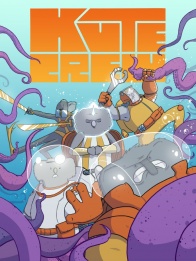
What do you get when you combine grumpy Koalas, 80s Saturday Morning Cartoon team antics, and a webcomic team that love puns? Well, you’ve got yourself a recipe for the “KUTE Crew.” We got the chance to talk to the “KUTE Crew” crew, Nick Marino and Nils-Petter Norlin, before their launch today. Before you read that, let’s take a step behind the curtain for some shop talk and to see just how the Chief Beef gets made. Oh yeah, it’s that kind of comic.
What’s been your process for the lettering of “KUTE Crew” and did you have to reconsider what would look fine in a traditional page and what it would look like on the Webtoons version?
Nick Marino: My lettering process is best summed up in one word… tedious! But even though it’s tough to reach the finish line with a result that I love, it’s fantastic to be able to tweak my dialogue as I’m putting it onto the page so I can best complement Nils-Petter Norlin’s amazing art. We did everything in a traditional comic book layout first, and so I’m continually tweaking things as I’m cutting out panels and seeing how they’ll work in Webtoon’s vertical scroll.
In the past, one of the longest steps in my lettering process has been making dialogue fit nicely into an oval word balloon, but I said “NO!” to that this time around. I’m using rectangular word balloons here which means I’m focusing on the layout of the dialogue in a different way. I was a little worried that the rectangular balloons might look weird in the Webtoon layout, but I’ve been pleasantly surprised so far. These word balloons hang really well over the edge of panels and cut into the large Webtoon gutters in a way that I think looks great and I hope readers agree.
Speaking of that, how are you approaching making sure the comic reads well vertically if it’s built for the page originally? Do you worry it’ll look too chopped up instead of taking full advantage of the scroll?
NM: I worry about everything in the process of telling this story, so yeah I’m definitely worried about that! But as our chapters progress I think you’ll find that I’m really considering how we can take advantage of cropping our original panels to flow best for the scroll.
I did tons of research before deciding on the layout KUTE Crew would have on Webtoon, and I’ve tried to find that happy medium between reading well on the browser and great in the mobile app, especially finding the right mix of white space and panel size. My goal is that you’ll read the story without even having to consider how things are laid out because you’ll be so hooked on the narrative. I just want it to feel seamless.
How is publishing in multiple formats, between mini comics and vertical scroll style webcomics changed how you write, and artist Nils-Petter Norlin composes, “KUTE Crew?” I’ve seen Webtoons like “Cyber Force: Rebirth” and “Red Hook” go from vertical to a more standard printed but rarely the other way around.
NM: When I write, I’m always considering other formats that my comic might take. We didn’t know that KUTE Crew was gonna end up on Webtoon when we started work in 2016, but I had Comixology’s Guided View in mind when I began writing it, so I’ve always anticipated that readers might interact with our story panel-by-panel and not page-by-page.
I started as a comics creator in the late ’00s with webcomics that I knew I would eventually get collected into minicomics, so I’ve been working to evolve my process along the way and make it better every time. I’ve found that it normally works smoother when you design for print and then chop things up for the web. Doing it in that order gives you a lot more flexibility than the alternative. Also, Nils draws at a really high resolution so I have lots of options when it comes to resizing things for our Webtoon layout!
Did you have to workshop a lot of the alliteration and puns? If so, what were some rejected names?
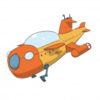
Continued belowNM: YES! So, so many names. Nils is a master of punny character ideas, so I was laughing my ass off every time I’d get another email of his concept drawings. Most of the puns and alliteration happen at the moment of creation, but some stuff like the name of our ship–the Tangerine Marine–popped up down the line when I realized it needed a new one.
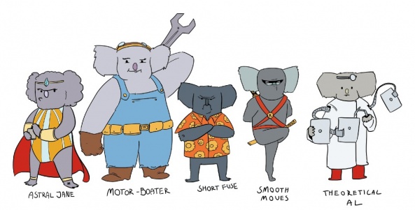
We narrowed down the monikers for our core team members based on the qualities we wanted them to have–magician, scientist, engineer, fighter, etc–and decided to save any other punny characters for different moments scattered throughout our story. For example, the KUTE Crew has a leadership problem in that its leaders keep dying, and that’s a great place to put in funny characters who didn’t make the cut for the recurring cast.
Just the other day I rediscovered a great punny idea that we’d discarded: a three-headed dolphin named Multi Porpoise! I wish we’d used that one!! We’re too far along in the process for it now as our first 160 pages are nearly complete, but maybe down the line if we do more.
Nils-Petter Norlin: Nick covered most of what I have to say about our creative process. Our core set of characters had a fairly traditional type of processes behind them where we went from initial character descriptions turned into concept art which were then tweaked into finished characters.
Coming to a Toys-R-Us near you.
In regards to general world building we had a different approach though. Knowing from the start that we wanted a fleshed out world with plenty of characters in it meant that there really was no limit to how many peripheral characters we could create. From my end of the creative process I would from time to time just illustrate different characters that I found visually interesting, every once in a while with a punny name attached to it. Eventually we had a pretty sizable roster of characters to choose from whenever we needed an extra character somewhere.
While this roster may have started off as me just goofing around with some designs Nick took many of these designs to heart and they have since been written into the story in ways that I could not have foreseen.
NM: Hahaha yeah that’s very true! We were inspired by our own non-existent toy line.
You’re putting the comic up on Gumroad after each chapter, which is not common with comics that go on Webtoons. What’s the ethos behind the decision and do you think you’ll build a different audience with the sold comics vs the free comic on Webtoons?
NM: Our story is made out of 10-page chapters and I really want people to have the chance to experience it in that serialized format too. Since Gumroad is the most widely used spot for digital downloads at the moment, we’re gonna offer our digital releases on there and give readers an opportunity to pay what they want for a hi-res version of every chapter.
When I love a story, I enjoy revisiting it, especially if I can revisit it in a different way. I hope the Webtoon format will get readers hooked with punchy episodes and little cliffhangers, and then the Gumroad downloads will let them spend more time with Nils’ fantastic art and see some stuff they might’ve missed the first time.
What were some of the influences on “KUTE Crew?” Lemme see if I can guess: Captain Planet, “Brute Force” and G.I. Joe?
NM: I’m a sci-fi guy at heart, so my two big influences for “KUTE Crew” were Bucky O’Hare and Star Trek. Bucky O’Hare is an old childhood love of mine with a great comic, fun cartoon, incredible toys, and wickedly tough NES game. I’d love to see “KUTE Crew” have a crack at those other mediums too! Star Trek is a passion of mine because the writing has been so strong over the decades, and even though we’re more focused on humor than Trek, I try to work in lots of sci-fi goodness.
There are lots of other fun influences in there too, mostly stuff rooted in comics and cartoons. TMNT because it’s just the best; a shining beacon of charming characters who cut through eras and mediums. Barnyard Commandos, this largely forgotten cartoon and toy line of pigs and sheep with tricked out weapons locked in a never ending farm war. And, yeah, you nailed it… the other biggie was GI Joe! In particular, when it came to naming our characters. (I mean, who has better character names than GI Joe?) So between Bucky and Joe, I gotta give a huge shout out to the inspiring genius of Larry Hama.
Continued belowNPN: Again, I second pretty much everything Nick said. Saturday morning cartoons from the 80’s and 90’s largely influenced many of our narrative and visual choices. In much broader strokes than talking about specific shows this meant that we wanted a story with anthropomorphic animals and that we wanted to color code our heroes and villains, the former in yellow and orange and the latter in purple and green. We also looked at how toy manufacturers influenced many of the shows back then. This meant that we thought of various vehicles as being potential play sets from that era. For that reason you seldom see a return of some of the mini subs and other small vehicles in the book since they’re only there to add to the “toy lineup” behind the “show”.
When designing the characters and vehicles, what was the average process? Could you walk us through one of the concept art pieces?
NPN: The average process was for us, to put it simply, quick. Having worked with Nick for years prior to this comic, I think we’re at a place where Nick‘s writing speaks to me in such a way that I pretty much instantly know what I want to draw based on his descriptions and he is almost always on board with my interpretations.
With “KUTE Crew” we ended up using something pretty close to the very first concept picture of the crew. But since that, at first, felt too easy we went back and experimented with the look of the crew, but eventually went back to the original versions of our characters. Take Astral Jane for example.
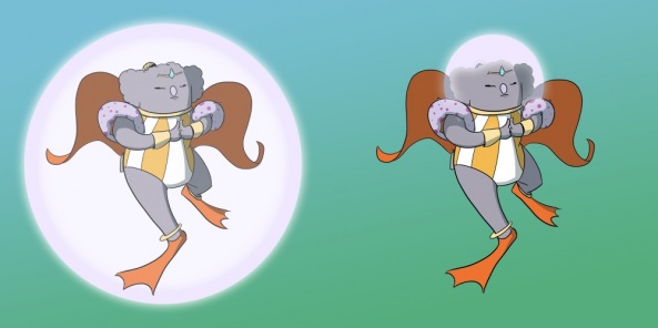
We tried giving her different cloaks and robes. But in the end we only changed her color scheme to give her the same gold and orange to match the rest of the team; I think Nick’s only note for me on that one.

So in short, our process was: Nick sending me descriptions, me getting it “right” on the first try followed by us making changes for the sake of making changes but really just making slightly worse versions of the original concepts.


