

As Lettering Week comes to a close, we’re squeezing in one last interview. This time, it’s Rus Wooten in the hot seat, whose work you may recognize from a myriad of popular titles like “Invincible,” “Walking Dead,” “Manhattan Projects” and recently, “Black Science” and “Deadly Class.”. Let’s get to it.
I know you’ve been a comic fan from a young age. Can you remember a particular moment or two when you knew you wanted to be involved with them as a career?
Rus Wooten: Probably sitting at the drawing table with my friend Kevin at age 13 as we both drew a “secret origin” comic about our own heroes.
Was there anything in particular that drove you toward lettering specifically?
RW: I’ve always been interested in typography and design, starting as a kid when I’d go to work with my Dad sometimes. He was an Art Director and Creative Director at ad agencies, and I learned a lot from him; I still seek his opinion on my work. But I kind of fell into lettering by way of helping Chris Eliopoulos out after I’d left Wizard to freelance.
Any time I’ve asked a writer or artist if they wish they could go back and redo some of their old work, and the answer is always yes. Is it the same for you when you look at old lettering jobs?
RW: Absolutely. I cringe looking at some of my earliest lettering work and kind of wish I could fix it or tweak it here and there.
You’ve had a wide ranging career that’s included, among other things, stints for Wizard Magazine and Virtual Calligraphy. Starting with your education, can you give us the Cliff Notes version of how you got to where you are today?
RW: I got degrees in both Fine Arts, specializing in drawing, and in Art Education from the University of South Florida in 1996, and while I enjoyed teaching during my my internship, it didn’t feel like that’s what I wanted to jump into full-time. I did some substitute teaching while trying to freelance with art and design, and I did some work for Wizard and their Online Editor, Buddy Scalera, as he was getting their website redesigned for the transition of their online presence away from AOL and onto the Web. I then got hired as Online Assistant Editor (and web designer) in 1998 and moved up to New York. I met Chris Eliopoulos through Buddy while I was working at Wizard, and I started helping him with some setup work for his lettering in 2002. He then asked me to be a part of his new lettering studio Virtual Calligraphy. My solo lettering work started in 2004 or 2005 with Robert Kirkman, taking over lettering for him on ‘Invincible’ and ‘The Walking Dead’, and I left Virtual Calligraphy to go completely solo in 2011.
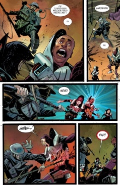
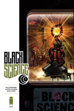
Two of the books you’re currently doing, “Deadly Class” and “Black Science”, have very different styles to their lettering. Did you get suggestions on how Remender, Craig, and/or Scalera wanted the book to look, or did you have freedom to find the right look yourself? Which elements (writing, theme, genre, art) influence your lettering and design decisions the most?
RW: It depends on the book, sometimes the style’s all up to me, or sometimes the creative team has ideas for the lettering style already that I implement as best I can. With those two books, we all discussed the look of the books from art to lettering to design, so each book was very much a team effort, and it really paid off in both cases, I think. I really try to let each book’s genre, tone, and art style inform my choices on lettering style, because no one style fits all, and I’m there to help tell the story and compliment the art.
One aspect of the lettering in “Deadly Class” that really stands out to me is the way you handle the balloon tales. Instead of the standard scallop shape, they’re a uniformly thin line that just ends without coming to a point. It’s a minor touch, but it fits with Craig’s aestetic and maintains the book’s visual appeal. Was it your idea to do this?
Continued belowRW: That was actually Wes’s idea, who’s a great designer in his own right. I’d already had the font chosen and decided on the elliptical balloons, based on our discussions and test pages, but Wes wanted me to try tails like that and mentioned some examples as inspiration. I think it was a great choice and works perfectly with the overall look of the book.

You also designed the logos for both books. Did you go through many different ideas for them, or did they mostly spring fully formed?
RW: Again, it depends on the project, but in these cases, the final logos originally sprung from ideas Rick had, and in the case of ‘Black Science’, Rick also had the idea to have the sidebar on the cover design. The ‘Deadly Class’ logo came easily while we went through several different variations of the ‘Black Science’ logo. Once I had one that everyone dug, we played with different placements on the cover, and I think it was Matteo who suggested that we have the logo break into the art area, while I think Dean suggested that we add the “onion” insignia (the circular patch design on the Dimensionaut suits) to the ‘Black Science’ logo, which fit perfectly.
What other books are you currently lettering?
RW: The Walking Dead, Invincible, Tech Jacket, Super Dinosaur, Sex, The Bounce, East of West, The Manhattan Projects, Thief of Thieves, Ghosted, Burn the Orphanage, Clone, and the upcoming books Howtoons, Low, Outcast, and The Pantheon Project… I feel like I’m forgetting something.
You recently did writing and art chores as part of the “Fearless Future” anthology with Chris Robinson. Is that something you’d like to do more of in the future?
RW: Definitely. I have several projects I’m working on that should be out later this year, both writing and illustrating, and of course lettering my own stuff. I’ve got my own stories to tell, and comicbooks are my first choice in which to tell them.
How important is it, do you think, for individuals to have good handwriting?
RW: I think it helps if you’re going to be lettering with pen & ink or designing your own fonts, but not totally necessary. Like Nate Peikos said the other day (I’m paraphrasing), handwriting can be sloppy and just jotting something down while lettering with pen & ink is much more deliberate, so one could have bad handwriting but be a good letterer.
After working with letters and design all day, are you able to “turn off” your eye for it? Or are you constantly critiquing every billboard you see?
RW: I’m always seeing stuff I’d tweak, or stuff I get inspired by, or just cringe looking at. It’s been that way since I was a kid learning from my Dad. It can be good and bad, depending on the instance, but overall, it’s a good trait for me and my work.
If you could give only one piece of advice to an aspiring letterer, what would it be?
RW: Study the best letterers, study graphic design and typography, try to not cover up too much art with your lettering, and never, ever use the uppercase “crossbar” I in comic lettering unless it’s for the personal pronoun… ever.


