

It’s that time of year! The Multiversity Year in Review is here, and from now until Friday, December 22, we will be talking about favorites in a variety of categories. Let us know what we missed in the comments!
The first comic image most of us ever saw was a cover and, for good and for bad, it is still what often times draws us to pick a book up off the shelves. The three artists below have an uncanny talent for finding that one image that perfectly conveys the tone and content of their book.
3. Dave Johnson

This year marks Dave Johnson’s third appearance in this category in the last five years. At this rate, the only reason we aren’t calling this the Dave Johnson award is because our Best Colorist award is named after Dave Stewart and we’re trying to avoid Dave confusion. But there is no confusion as to WHY “Reverend Dave” keeps making this list: he’s one of the best cover artists in the business. The only argument putting him here can start is over which aspect of successful cover work he excels at the most. Because it’s not just drawing a pretty picture. Drawing a pretty picture is (relatively) easy. But drawing a picture that grabs your attention from across a shop, that cuts through the noise surrounding it, that makes you take notice of a character like you’re seeing it for the first time even though he’s Deadpool and you are most certainly NOT seeing him for the first time? That’s hard. Really hard. Almost as hard as trying to break down what I love about Johnson’s approach and technique in a different way than I did last year, when he made our list for a second time. In 2016 I went for color, which incidentally is another way the Dave’s could be confused with each other. For example, Dave Stewart colors “B.P.R.D.” comics that Dave Johnson covers, but Dave Johnson colors his “B.P.R.D.” covers on those Dave Stewart-colored comics. See what I mean? But this year, I’m going for Dave (Johnson)’s flexibility with story tone, more than color tone.
It’s hard to be funny, but the covers Johnson does for books like “Deadpool” and “Foolkiller” always make me chuckle. His string of “Deadpool The Duck” variant covers makes me yearn for a Steve Gerber/Johnson team-up series that, since Gerber passed away in 2008, can only exist in my dreams. Maybe instead of reprinting comics in trade collections, Marvel can go back to doing books like “Marvel Tales” that just flat-out reprinted old issues of “Amazing Spider-Man” with new covers. Put Dave Johnson on some Howard the Duck reprint issues and I would buy them in a heartbeat. Other artists have a top they can go too far over. Dave Johnson? I don’t think so. His sense of how far to push things without going QUITE over the edge shows a discipline gag-friendly artists like Frank Cho wish they had. But “Reverend Dave” isn’t just a comedian. Want straight-ahead sci-fi? Check out Johnson’s variant cover for “The Jetsons” #1. Fired up from watching some Marvel Netflix shows? Fire up some of Johnson’s covers for Jason Aaron & Steve Dillion’s “PunisherMAX” series or the recent “Elektra” or “Kingpin” books and see some truly distinctive takes on Frank Castle, Wilson Fisk, and Elektra Natchios. From laughs to oooh’s to chills, Johnson does it all.
The year Dave Johnson’s covers do nothing for me is the year I stop putting him on my Best Cover Artist list. Since I’m betting 2018 isn’t going to be that year, I’m gonna do myself a favor and start planning for next year’s write-up today. Right after I finish this Google Image search on Dave Johnson covers. – Greg Matiasevich
2. Christian Ward
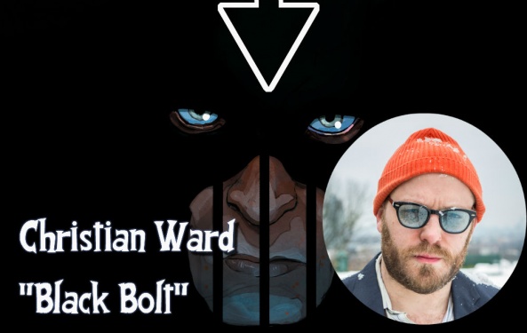
Christian Ward doesn’t craft covers, he crafts paintings. Now, while this might seem like a loaded statement, hear me out. Imagine, for a second, that instead of being on the front of a comic, his art is removed from context, stripped of the text and credits, with only silence to comment upon it. What do you see?
Continued belowFor “Black Bolt” #1, you see a man, surrounded by darkness, his face muzzled, only his eyes and his mouth are visible, the rest of him invisible. It evokes the image of a prison, of a disobedient, violent dog, of silence. He looks at us, contempt in his brilliant blue eyes and dares us to read on, to find out why he is held back, to find out who his jailer is.
Or, take “The Ultimates 2” #6, where his psychedelic influences shine through. He’s trapped the cast of the book within the outline of a horned figure, whose starry face is recessed into the center, and, upon closer inspection, is seen to be chained up as well. The characters are all circling in towards the face, distorting and repeating, as they are dragged in by a cosmic whirlpool, the fading afterimages of their symbols the only bits of them that remain outside of the starry, blue-black creature.
These are just two examples of Ward’s unique style and just one look at them tells you why he’s got a spot on this list. What makes his covers so striking is his use of color and how he uses this to create negative space. On both covers I spotlighted, he frames the main subject of the cover by positioning it in relation to the empty space around it but not just to the white space. He uses blues and blacks and literal space to create this effect as well and gives the covers a depth of feel that doesn’t appear in other, simpler, figure covers.
This year, Ward spent most of his cover work on “The Ultimates 2” and “Black Bolt” as well as the first cover for “Dan Dare” and, while he does not have as many as, say, Alex Ross (how many Marvel covers did he do this year?) the work he produced is strong enough to grab this spot. – Elias Rosner
1. Nick Derington

The philistine who thinks cover art is easy (“You only have to draw one picture!”) fails to appreciate the endless abyss that fussing over every element of an image can become. Tilt the perspective this way or that, nudge a limb to the fore or aft, light the image just this way. Arresting simplicity is why Nick Derington’s art takes this year’s crown, as a fresh mix of a few aesthetic triumphs in current popular comics art.
“Good pictorial composition is an arrangement of shapes that convey the subject with visually appealing clarity,” declare Bret Blevins and Mike Manley in Draw #13 (TwoMorrows). In an age of image bombardment, clarity is winning when it comes to design, illustration, and visual appeal. Glance at recent Cover Artist winners like Jamie McKelvie, Becky Cloonan, and David Aja, and then peep the striking compositions of Derington’s “Doom Patrol” and “Mister Miracle” shelfstoppers. They linger in the mind’s eye long after you’ve drifted to other, more convoluted, brazen, or trendy covers. Knock out the details, and you’re captivated by the striking shapes that own the gravitational center (ie Barda’s staff, Cliff’s robot head) or elements that cross harmoniously to unify disparate elements (ie Casey’s arms spanning the wacky Doom Patrol lot). Or fixate on the details, and observe the Kirbyan curves melded purposefully with the subtly Quitelyan stippled masses, or the animator’s eyes coupled with the portraitist’s hands and the illustrator’s sense for body surfaces as negative space. Stand amazed.
To readers, Derington’s ascent has been breakneck fast, since the removable Warholian gyro sticker embossing last October “Doom Patrol” #1 to the ironic dramaturgical crowning of every “Mister Miracle” cover. But also in those covers, the signs of a wise-beyond-years modesty. Perfect for Tom King’s melancholic, world-weary superherotude. Perfect for Gerard Way’s carnival of absurdities. From fast food French Fries to Apokolips in flames, Derington knows how to stage the theatrical snapshots that lure you into the diegesis. Again, Blevins and Manley: “In our endeavor of creating narrative storytelling artwork, most effective compositions emerge from a personal ‘sense of drama’–an instinctive identification with the heights and shallows of the subject, story, characters and situations we’re visualizing.”
But my personal favorite element of the Derington craft? The return of beautiful cartooning, represented by the artistry of large eyes, goofy creatures in funny poses, and a simple mood of quiet, reflective honesty in facial nuances of curiosity, regret, force, wonderment. For all his striking compositions and narrative drama, what I like most about Nick Derington’s covers is that Casey looks content, Scott Free stares longingly, and Flex Mentallo is hilariously hairy and hammy as he always and ever should be. Derington is pure comics as high art, and we will always celebrate that. – Paul Lai
Continued below
Editors’ Commentary:
Brian: I’m a sucker for all three of these guys, but Johnson – especially with his variants this year for DC – really appeals to the nostalgic part of me, when covers were used to sell the book in a different way than they are now. It seems like Johnson takes the salesman part of the job more seriously than almost anyone else in the business, and that help give his covers something a little different in 2017.
That said, Ward and Derington are both absolute beasts who are just getting better and better. This is a strong category this year.
Matt: All three of these guys tend to do a lot more superhero work, yet all three have a different and fun take on the genre. Frankly, I wish more interior art for mainstream cape comics did more varied and interesting things like this, instead of continuing to hire people like David Finch or something.
Alice: These three are an interesting cross-section of what goes into the art of making comic book covers. Nick Derington seems, at least to me, to have popped up as if from nowhere with an incredible sense of striking design matched with beautiful linework. Christian Ward, meanwhile, brings a very painterly style to covers, truly making them works of art. And, finally, Dave Johnson (who’s been at this gig for years) almost brings a blend of the two. He has the tight designwork of Derington with a little less character and he has the looseness of Ward’s style with a little less grace.


