
Comics are a visual medium. Despite the industry’s focus on writing, without the art, we’re just reading novels (no disrespect was intended to novels, novelists, or those that enjoy them). Our list is chock full of illustrators who are doing innovative, exciting work, and we are thrilled to highlight them today.
10. Andrea Sorrentino
Another year, another banner example on how incredible artists can still reinvent the comic book medium, with innovative, inspiring covers, pages, and panel design. Case in point, Andrea Sorrentino. During 2019, the Italian artist has been mostly focused on his creator-owned series with Jeff Lemire, “Gideon Falls.” There, Sorrentino could display what may be his trump card, an ability to constantly innovate on pages that seem to pull readers into the frame. Be it through spirals that suck the paint inwards, mosaics of different realities creating a patchwork design on the pages, or even more quieter, introspective moments where characters are conversing. Even then, Sorrentino pays close attention to detailed backgrounds and facial expressions, adding to his sense of realism, but never sacrificing narrative flow or movement.
Beyond “Gideon Falls,” Sorrentino also collaborated with Marvel on a couple of issues for the “Avengers” book with writer Jason Aaron. Lending his brushes to stories set in the past, detailing the life and origins to the 1,000,000 BC Avengers, Sorretino’s distinct style was useful to contrast those tales from the more high-octane stories of the present.
Regardless where he is working, Sorrentino is a master crafter of new ways to tell a story. There is rarely a conventional page, one without even a tidbit of an experiment, of a visual component that pushes the art medium forward. – Gustavo Sarraff Lodi

9. Sana Takeda
There are a thousand qualities that make Sana Takeda a great artist, and 90% of them are invisible. The visible ones are easy, it’s her vibrant and ethereal color palettes, the well integrated computer effects, and strong character designs. But holding those features up are hundreds of small, smart, perfect choices.
It’s the way every character and scene in her comics have their own palette, allowing each one to stand out from a distance as strongly as a cartoon silhouette while still being integrated as a whole. It’s how how much thought goes into the clothing, how it builds on their culture and history while being realistic and practical. It’s the way she inks and colors her own drawings, so instead of everything being outlined in India ink she uses whites and yellows and whatever is appropriate for the lighting. It’s the subtle computer gradients she uses in the backgrounds to draw your eye across the page.
On top of all that, Sana Takeda is one half of the team responsible for “Monstress.” “Monstress” is a book so good that is has been on the top of my recommendation short list for everyone, old fans and new, since it came out.
Sana Takeda is a treasure, and a master of the art form.- Justin McGuire

8. Erica Henderson
I spent a good bit of 2019 reading trades of “The Unbeatable Squirrel Girl” by Ryan North and Erica Henderson. While Henderson left as the main artist in 2018, her work on “The Unbeatable Squirrel Girl” was the perfect showcase of what the book was capable of. Her work on the series perfectly captured the tone of the comic. It is an example of those collaborations that you hope to see in comics, showcasing and enhancing the talents of the writer and artist both. But this is the past. In 2019, Erica Henderson decided to push the limits of what an Erica Henderson comic could be and proved that having a unique style doesn’t have to be limiting.
Henderson has an instantly recognizable design, one that feels like classic cartoons. While other artists might choose to focus on elaborate musculature and physical prowess, Henderson focuses instead on faces and emotions. It’s very effective. In fact, if you were to remove the text from a Henderson comic, you would still get a basic idea of what every character was thinking or feeling based on their faces. They’re similar, sure, but they do a lot of work in telling a story.
Continued belowHer cartoonish style could be seen as a hindrance to some. “The Unbeatable Squirrel Girl” is lighthearted and fun, the art working in tandem with the script, but you might question the art with a script that isn’t as light. In 2019, Henderson applied her style to “Assassin Nation,” a book that while not exactly serious was incredibly violent. There was an initial disconnect as I started reading the comic but after a few pages, it just worked. Once again, her facework was spectacular. Henderson clearly had a good time with backgrounds, including sight gags and interesting set designs. “Assassin Nation” also featured dynamic action and hilarious onomatopoeia, which enhanced the absurdity of the comic. While you might not think of Henderson as you read the back blurb, her art proved to be an excellent fit.
I’m excited to see where Erica Henderson goes from here. If 2019 is any indication, she has a lot of fun and unique stories to tell. -Joe Skonce
7. R.B. Silva
R.B. Silva has been a solid artist for Marvel for years now. Working on books like “Amazing Spider-Man” and “Invincible Iron Man,” it’s unlikely that you’ve not seen some of his work before, but even if that’s true, 2019 made him unavoidable.
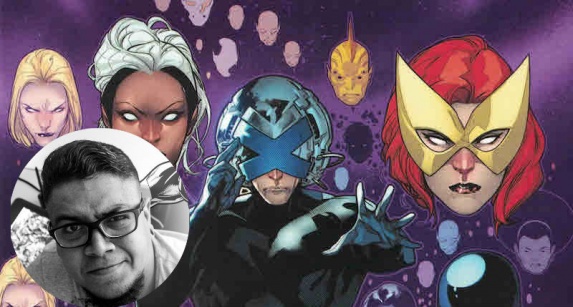
Starting off the year on projects like “Domino: Hotshots,” Silva ended the year by being launched into the stratosphere on a little hidden gem of a book called “Powers of X.” It’s not just that this was one of the highest-profile books of the year, although that alone would have garnered appropriate attention on Silva and his work. The truth is that Silva’s work on “Powers” was stunning. Hickman’s script transported us across thousands of years of X-Men past, present and far-flung future, and R.B. Silva was there throughout, guiding us with a skill that is unfathomable. With a style that can capture exaggerated action and powerful emotional beats, Silva portrayed brand new characters with the same effortless nuance as fan-favorites and managed to elevate the science-fiction and give space to the moments of genuine humor and heart.
2020 already looks like a big year for R.B. Silva. Not only is he returning to Hickman’s mutant masterplan with “X-Men” #5 and #6 but he’ll be doing the covers for the upcoming relaunch of one of Marvel’s biggest books, “Star Wars.” – Matt Lune

6. Tradd Moore
If you needed a reason for Tradd Moore to be on any list of top artists, you only need to look at “Silver Surfer Black.” To call the artwork there beautiful would be an understatement, with its stunning view of planets, space, and twisted dimensions beyond description.
At one point, Silver Surfer has to reassemble himself, atom by atom. Tradd Moore portrays this with surrealist visuals and designs that does things with shapes and perspectives that I can scarcely begin to describe with words alone. It blends symbolism, surrealism, and I’m fairly certain at least one panel is a Picasso. And that’s just one instance.
Throughout the entire comic, Moore’s free-flowing artwork brings beauty and color to the depths of space that boggles the mind. The cosmic conflicts defy the very pages they’re on with the sheer intensity of the designs. Fluid motion, powerful impacts, and intense visual stylings that one could only find in drawn form.
Tradd Moore has given us a young Ego the Living Planet, the Surfer’s battle with Knull, a trip through a black hole, and so much more, all with a visual flare that few others could come close to comparing. It’s a perfect style for cosmic stories, where all of space is his playground.
Everything in Moore’s art is either filled with beauty or energy, often times both. Nowhere is this better represented than in “Silver Surfer Black,” where often times the sheer quality of the designs and the artistry that goes into each image must be seen to be believed, but if you’ll turn to any page you’ll quickly see why he’s deserving of a spot on this list. – Robbie Pleasant

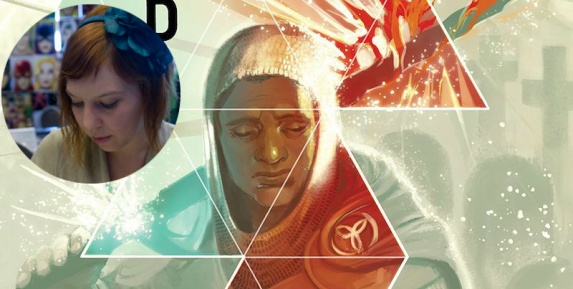
5 (tie). Jamal Campbell
Jamal Campbell has had arguably the biggest glow up of 2019. Not only has his style evolved into something truly distinguishable, iconic even, he has been able to apply his craft toward the creation of two of the most exciting new characters of the year.
Continued belowComparing Campbell’s work on “Naomi” and “Far Sector” is difficult due to the latter’s relative newness. However, the two series highlight Campbell’s strong design since and diversity as a creator. “Naomi” began as a small coming of age story, something Campbell depicted effortlessly on the page. In some ways he is the perfect match for Bendis’s verbosity, crafting lavish spreads for the copious word balloons to hang without disrupting or obstructing the visual medium. One scene that stands out in particular during the first issue involves Naomi in the park with her friends. Depicted over five horizontally stacked panels, stretching across the page, Campbell is able to capture the youthful dynamism of Naomi’s group. While his linework is impressive, it’s his glossy colors that arguably stick with the reader longest.
While Naomi starts small, it soon balloons into a cosmic epic spanning multiple worlds, and Campbell matches the shift in lockstep. His imagination runs wild on the page as Naomi lets loose for the first time, delivering a stunning conclusion to the young heroes story. Cambell seems set to carry this flair for the extraordinary into “Far Sector,” the first issue of which manages to rival even Liam Sharp’s exceptional work on “The Green Lantern.”
Between Naomi and Jo Mullein, it’s clear Campbell is a master of crafting striking and memorable characters. Here’s hoping that Campbell star continues to rise in the manner of fellow Bendis collaborator, Sara Pichelli, following her creation of Miles Morales at the start of the decade. – Zach Wilkerson

5 (tie). Joelle Jones
Lots of artists come and go from our year end lists here at Multiversity, but Joëlle Jones seems to be a perennial favorite – this is her third year in a row making the cut. This year, Jones had a less varied resume than she’s had in past years, but the work was no less impressive, and perhaps even pined for more because of that fact. She continues to write on “Catwoman”, providing gorgeous covers every month that hint at the story that will unfold within. The most impressive of these was the cover to issue 16, which finds Selina caught between her life in Villa Hermosa (the setting for pretty much the entirety of Jones’ run so far) and her past back home in Gotham with the specter of the ‘Year of the Villain’ hanging over her. Jones’ stunning depictions of the denizens of Gotham draw a stark contrast to the more understated cast of Villa Hermosa, who play equally for her time at this point in her life. This image gives the suggestion of a story that many superhero comics no longer attempt in the age of the pin-up style cover.
And while “Catwoman” has been a good read throughout, it is simply a showstopper when Jones happens to be drawing interiors. As far as I’m concerned, Joëlle Jones interiors are akin to “appointment television” – the idea that when her art is on the menu, you drop everything to look at it. Jones has been adept at redefining Selina Kyle visually, blending her sleek, cat-burglar physique with a daunting physicality and confidence. There have been a lot of great visual variations on Selina over the years, but Jones’ is easily my favorite interpretation. That’s high praise when you consider that Darwyn Cooke did a defining turn with her back in the early aughts. Jones’ comic book action chops are nearly unmatched, clearly relishing the opportunity to let the imagery dominate over the dialogue. She deftly avoids the pitfall of telling more than showing that some writer/artist dual threats run into, making sure to write-in plenty of action-focused scenes for herself.
One thing that probably flew a little under the radar in 2019 was her short stint doing the art on a Tim Seeley story for the Wal-Mart “100-page Swamp Thing Giant.” I’m happy to report that the results were appropriately creepy, flexing a different muscle than her “Catwoman” work. With versatility like this, it’s not hard to see why she consistently rates with us. It seems like no matter the subject matter, whether something as fantastical as the world of Swamp Thing or street level as in Villa Hermosa, Jones consistently captures my imagination and leaves me wanting more. Here’s to more in 2020. – Vince Ostrowski
Continued below
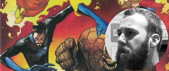
4. Joe Quinones
Joe Quinones did not win this spot because he did some homages in “Dial H for Hero,” his only interior work this year. He won this spot because he took the idea of homages — callbacks to previous works — and created something wholly new out of it.
His homage work in each issue of “Dial H for Hero” was spot-on: the “Sin City” scenes were undeniably 90s era Frank Miller, focusing on the noir use of light and shadow, just as the Toriyama “Dragonball”-inspired scenes took on the red-toned, decompressed panel layouts common in that era of shonen manga. The “Shade the Changing Man” homage was even specific enough to utilize Chris Bachalo’s wallpaper-like designs down the spine of each page. Beyond that, though, he took each homage and made it his own: he fully adopted the stylistic quirks of each of the cartoonists he was homaging and used them in a way that fully made sense for the “Dial H for Hero” characters. He also used them in a way that made sense alongside his own normal, non-homage art style. That fluency in all styles, combined with the sheer amount of homages over the course of the series, is something only an incredibly skilled and versatile artist could accomplish.
Arguably, his best moment this year was in “Dial H for Hero” #6, when dozens of homages were thrown at us in a single sequence which itself was a riff on Alex Ross’s “Astro City” work. A Mike Allred Madman character would get kicked by an Erica Henderson Squirrel Girl riff as a character reminiscent of Leiji Matsumoto’s Captain Harlock cocked his gun behind her. Beyond just the character designs, his page layouts got even wilder to represent multiple artists at once: the “Astro City” pages took up full-page spreads, while other pages would superimpose a smaller Charles Burns-like story over a Bruce Timm-like series of panels, as if you had two open comic issues in front of you, layered on top of one another.
Even with all that chaos, Quinones’s storytelling remained clear and fluid. As I said above, it’s one thing to be able to imitate another’s style, but it’s another entirely to make a foreign style your own. I’d say his “Dial H for Hero” work looks effortless, but he clearly put a ton of effort into it, and he deserves to be recognized for every ounce.- Nick Palmieri
3. Stephanie Hans
“I just knew that the world clearly needed a fantasy universe drawn by Stephanie Hans, and would do anything to enable it.” – Kieron Gillen
You’ll have to forgive “Die” writer Kieron Gillen for having a self-interest to put over his artistic collaborator Stephanie Hans like that, but he is right. Hans painterly application of color conjures images that read distinctly, as if contained by traditional lines, and have the flowing impressionistic spirit old school fantasy cover art evoked. It is this strange mixture of grandeur and immediacy that allows for the feeling awe and despair simultaneously exist within the Party on the splash page as they fall back into the world of “Die.” Matt stares down at the mocking sword now returned to his hand. Angela gazes in wonderment and horror at the new cybernetic hand that appears to be part of her person. Chuck lovingly displays his new found virility as a Fool would. At the center, Dominick, now Lady Ashe, stares down at their new body, hair glistening and black gown flowing through the air. The majesty of a splash page and promise of a fantasy world with the existential horror of “Die” nostalgia in a single image.
As the Party works their way back through the world of “Die” the more common understanding of nostalgia comes through in the highlights and glistening quality of the world around them. Glass Town and Gondol shine like Bree or Rivendell. The pastiche of a high fantasy world created by a teenager as the birthday gift for another. But as they get closer to wherever they go in a given issue the highlights fade and the horror comes through as the Party begins to interact with the people they’ve left behind. They can survive anything but their past. Hans ability to balance these aspects in the dense sprawling world of “Die” is an achievement, at once a world of splendor and threatening.
Continued belowBuilding this beautiful nightmare of a setting is one thing, but transforming them into coherent pages of a comic is another. For the most part Hans page design isn’t overtly stylized sticking to the most part to a standard number of panels. Her pages are balanced by her command of color, working with letterer Claytown Cowles, to guide the reader through the page. It is an excellent example of how basics can underpin even the most stylish of images.
Through her character acting and design work, Stephanie Hans creates a familiar yet freighting world of fantasy and adventure. – Mike Mazzacane
2. Pepe Larraz
No one can speak about superhero comics in 2019 and not mention the triumph of “House of X” and “Powers of X.” While Hickman may get the credit as the “architect” of the event, no one served as a visual architect more than “House of X”’s Pepe Larraz.
Larraz cites greats such as Olivier Coipel and Stuart Immonen as inspirations for his work but this past year he has taken a step out onto a stage of his own.
Pepe Larraz had made his X-Strides in last year’s “X-Termination” event and covers for “X-Force”, but that couldn’t have prepared us for just how hard he went on “House of X.” Larraz’s incredibly detailed pages were incredibly engaging to look at. His linework has so many treats to find such as the detailed foliage of Krakoa to the reflection of characters in Cyclops’ visor, or the way the shadows work on Destiny’s headpiece. Larraz does detail in the most simple way possible. Larraz’s attention to detail rivals that of Hickman’s continuity laden scripts. None of the details feel like they are too much or draw away from the story. Larraz gives us we need and does so beautifully. His work is like a well-seasoned vegetable dinner. Oh so delicious and oh so nurturing.
Larraz’s ability to provide tone and acting is one of the biggest feats in his work. These iconic characters have such incredible life is linework and use of showing exactly what was necessary with character’s faces being represented almost purely in expression or shadow. Every expression breaths with life and naturally fits in the style presented. Larraz’s use of screentone also adds so much texture to his work which really emphasizes the mood of certain scenes and helps draw focus. Whether it’s adding to the shadow of a character’s face, or dictating the reflection of the sun, Larraz’s textures feel rich and add so much to his pages.
Larraz’s storytelling is also a natural fit for the story told in “House of X.” His page layouts don’t break the mold but his composition within them is stellar. Thinking of the big Orchis assault in “House of X” #3 and #4, and the use of shadows and strong blacks to make moments feel weighted is incredible. And gosh the psychic water projection of Marvel Girl is a truly incredible page. Pepe Larraz is the best he is at what he does, and what he does is draw groundbreaking X-Men comics. – Kenneth Laster

1. Russell Dauterman
Aside from his cover art, Russell Dauterman is on this list for only one limited series he illustrated this year: “War of the Realms,” the conclusion of his, Jason Aaron and Matthew Wilson’s epic “Thor” run. But what a spectacular series it is, filled with gods, superheroes, elves, giants, demons, pegasi, and symbiotes all duking it out in stunning fashion: Dauterman could easily have been our favorite artist of the year because of the ease with which he beautifully renders all these diverse characters and creatures, in a book that traverses all Ten Realms of the Marvel Universe.
But what makes Dauterman’s art truly special is how he utterly refuses to tell the story in a decompressed, widescreen fashion: “War of the Realms” may be as cinematic as any Marvel movie, but he embraces the medium by refusing to be precious about his images, chopping and slicing them to the bare essentials so nothing is dragged out (the comic is only six issues, which is remarkable for a flagship event series). He uses splash pages sparingly – and therefore more effectively – and is likewise unafraid to see his pencils become the interiors of letterer Joe Sabino’s insane sound effects.
Nowadays, a lot of comics – not just Marvel ones – feel like high concept pitches for film and television deals. There’s nothing wrong with that – an artist needs a stable income, after all – but Dauterman’s frenetic and dynamic layouts truly reminds us of the things a comic book can do that a film adaptation cannot, and that is why he is our comic book artist of the year. – Christopher Chiu-Tabet


