
June has come and gone, bringing with it news tragic and hopeful, and a reminder that there is so much beauty out in the world just waiting to be made and to be experienced. While it’s near impossible to read everything that comes out in a month, we sure as hell try! So, come one! Come all! See what impacted us this month and let us know what impacted you down in the comments. Help me fill the holes in my reading, so the voices I highlight in the future are more varied, more representative, more personal to you. It’s a vast world out there, let’s make it feel all the more wide and all the more intimate.

Best Issue: “Giant Days” #51
It’s hard to remain consistently excellent month after month, to remain fresh and funny and heartfelt. Very few titles are able to do it and even fewer are able to do it for 50 issues. But “Giant Days” has managed to do just that, and issue #51 showed why the team of Allison, Sarin, Coger, and Campbell still have a few tricks up their sleeves before bowing out in a few months.
For a series that began as the misadventures of three new university women, tackling the subject of familial death doesn’t feel like it should be within its operating parameters. It’d be reductive to say that it’s not a subject that a comedy series could work with but if you were to have told me, back with issue #1, that this series would provide a heartbreaking meditation on love, loss, and the messy nature of grief, I would have said, “Sure, but where’s the punchline?”
Yet, here we are, with an issue that not only broached the topic but also showed the grieving process in all its many forms, and the ways in which life keeps trucking along in spite of it all.
The comedy of “Giant Days” is its biggest asset and always has been because life is funny. Life would not be bearable without it and we do not give comedy its due enough. Comedy allows us to deal with hard topics in a safe way and to ease our way in and out of difficult situations. Allison understands this acutely — in conjunction with Sarin’s outstanding, mesmeric, expressive, flowing, artwork, Cogar’s pitch perfect coloring, and Campbell’s lovely letters, (I love the way Campbell rendered Susan’s “Bawwwwk,”) without which this comic would be infinitely poorer — which is what makes “Giant Days” #51 work so well. Meaning, the comic doesn’t undercut the moments of sadness and other hard emotions with a quip, something the MCU could learn, but neither does it wallow in melodramatic sadness, using the comedy as a bridge instead.
The world doesn’t stop spinning, everyone else’s lives keep barreling forwards, even if it might feel that way to you, and it is that clash that is often the hardest to portray.
Best Writer: Chip Zdarsky, “Daredevil” #7, “Spider-Man: Life Story” #4
In the running were Leah Williams and Tom Taylor for their excellent work despite being stuck in two event tie-ins and their intimate character work respectively but I have to give this month to Zdarsky, who absolutely blew me away with these issues. Zdarsky cut his teeth on comedy titles and rose to prominence for his work on the criminally underappreciated “Howard the Duck” and some lesser known titles like. . .“Sox Stealers?” I think that was the name.
Now, he’s writing the main “Daredevil” title, where he has had filled Daredevil with so much Catholic guilt over accidentally killing a man that he’s hung up the cowl, and “Spider-Man: Life Story” a project that snaps the sliding timescale of the Marvel Universe over its knees and is as ambitious as Ed Piskor’s “X-Men: Grand Design,” but perhaps just a tad easier. Both projects are deeply earnest in tone and cut to the heart of their heroes, treating them with respect the whole time, and both feature heroes who have now hung up their costumes, passing the torch, albeit only one doing it intentionally.
Continued belowWhile neither title is treading new ground, per say, both have central questions that are being executed with precision and care. For “Daredevil,” that question is of the nature and necessity of violence in his life and what that violence brings, intentional or not. For “Spider-Man: Life Story,” the question is how much sacrifice is too much and who gets to be Spider-Man, in addition to the higher concept of Spider-Man, aging in real time, reflective of the decades in and out of comics. To construct a cohesive narrative out of that is a challenge and to take the insanity of the 90s Spider comics and make them coherent, impactful and emotionally vulnerable is all the more impressive.

Best Artist: Ian Bertram, “Little Bird” #4
I was split, here, as this was the first month in years that we got new Duncan Fregredo art but what Ian Bertram has been doing over in “Little Bird” is operatic in scope and scale and deserves the recognition here. Bertram’s art is reminiscent of Moebius in “The Incal,” cosmic and dystopian, violent beyond measure and tender enough so the violence hurts all the more acutely. Doing this level of detail on a monthly book, with the sheer volume of people in those crowd scenes, is madness but here he is, giving us horrific imagery alongside scenes of quiet natural beauty.
The fact that the comic itself reads like a more coherent version of “The Incal” helps.
I particularly love the way Bertram crafts his environments and how his characters’ huge heads help set the unnatural but highly emotive tone of “Little Bird.” Environmentally, the surreal elements of the piece clash with the grounded representations of nature and technology and it’s so weird and wonderful to experience. Bertram seems to really love the tube/tentacle shape and uses them at every instance he can, a decision that reminds me of various underground comix or indie artists like Rebecca Kirby. It’s a specific aesthetic that I adore, fitting the comic to a T as well.
Best Colorist: Matt Wilson, “Conan the Barbarian” #7, “Paper Girls” #29, “Thor” #14, “War of the Realms” #5 & #6, “War of the Realms: War Scrolls” #3
I’m just going to leave these images here, I think they speak for themselves.

(I may have to put Wilson in with Stewart soon so I can highlight some more, varied colorists.)

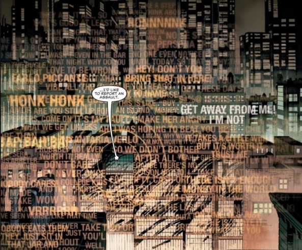
Best Letterer: Terry Moore, “Five Years” #2
I’m a sucker for hand lettering because when it’s good, it’s good. As I keep an eye out for letterers’ names more and more, I’m trying to find what makes them stick, what makes them great, and why I despise the Ultimate universe lettering so much.
Terry Moore may not be as prolific a letterer as someone like Clayton Cowles but his body of work is robust and his letters have a life of their own. They are as much a part of the art as the words and the sounds they represent. This is ultimately due to his position as a singer-songwriter, I mean, a cartoonist, affording him a level of control and understanding of his own pages that others, especially other writers, do not always give/have.
The slight warble and wobble to the letters mirrors the uneven nature of a speaker’s voice, undulating with intensity. . .which makes his use of a typed font, one that mixes capital and lowercase letters, for Zoe’s internal narration all the more jarring and noteworthy. Her words become colder and more distant, unnerving in its brutality, reflecting her unnatural history. . .and making the hand lettering feel all the more comforting when it arrives.

Most Cosmic Depiction of the Cosmos:: Tradd Moore & Dave Stewart, “Silver Surfer: Black” #1 & Afu Chan, “Outer Darkness” #7
Continued belowThese two visions of the vast, absurd nature of space could not be more different: the exploratory space adventure and the claustrophobic space thriller.
One is absolutely bonkers, twisting and stretching like a psychedelic trip gone wrong but also oh so right, filled with fractal patterns, mind-bending representations of space-time and Moore’s trademark hyper-stylized, larger than life, musclebound and fluid characters and Dave Stewart’s always appropriate and gorgeous coloring.
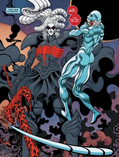
The other is a more subdued but no less grand representation, dark and neon, embracing the emptiness rather than the fantastic fluidity, filled with demons and aliens that appear closer to our reality, and thus emphasizing the unyielding terror of it all.
Both take their concepts to the edge and make sure we know that space is an amazing, wild, and will absolutely kill all of us when given the change.

Best “Ghost of EC Comics”: “Immortal Hulk” #19
This comic is absolutely, pants-to-be-darkened, horrifying and I cannot believe Marvel let this get greenlit but I am so grateful they did. Ruy José, joined by Belardino Brabo, are bringing Joe Bennett’s artwork to the next level and if Wilson hadn’t turned in “War of the Realms” #5 & 6, Paul Mounts and Rachelle Rosenberg would have clinched that title for the utter grim beauty they bring to the page. Take a look at the composition of this panel and marvel. Part renaissance painting, part Hieronymus Bosch hellscape, all insane body horror.

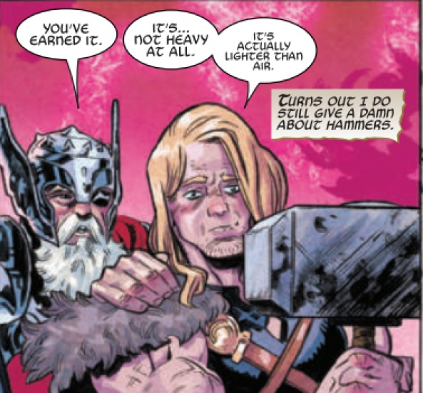
Best Event Comic of the Decade: “War of the Realms” #5 & #6
Every single person who contributed to this comic deserves recognition for a number of reasons, not least of which is they turned in six issues of a twice monthly, oversized event comic, on time, without a hit to the quality of the story, visuals, or lettering.* Think about that. When was the last time Marvel, or either of the big two really, turned in an event comic that
1) felt like an EVENT rather than an overblown crossover title
2) was over in a reasonable amount of time
3) didn’t have tie-ins that were essential to understanding the story but added flavor to it/explained how it affected different corners of the universe, and
4), and this is the important one, ended satisfactorily, with real changes, and the same, high level of quality as the start, and EVERY ISSUE CAME OUT ON TIME!
I can’t think of any in the last five years, or even in the last 10, that was able to do all of that, though I know some people will disagree. Do I still have quibbles about the series? Yes but they neither take away from my enjoyment of it nor do they demonstrably affect the quality of these final two issues.
This is what a superhero event comic should feel like, look like, and be like. Built up elsewhere with a solid foundation, huge stakes but an intimate focus, and a story that lives up to the title: this comic felt like a war, with the main title being the big picture and all the tie-ins, battles. Even the main “Thor” comic was used to tell hyper-focused one-shots that bolstered the emotional beats of the main title without having one rely on the other beyond the obvious connections.
So, I want to give it up for Matt Wilson, Joe Sabino, and Jason Aaron for giving us this event but especially to Russell Dautermann, who turned in some of his best art since ‘The Death of the Mighty Thor’ wrapped, and showed why he was the perfect Thor artist and the perfect choice for this event.
Plus, the Omega issue isn’t an added BS conclusion issue to the series, instead acting like an epilogue for the war and a prologue for what’s to come, as issue #6 quite handily concludes the scope of the event.
*I wasn’t sure if I should put lettering under visuals or not, or separate out colors & art from visuals but I figured we don’t give letters enough credit and colorists & illustrators/cartoonists/there-are-no-good-no-specific- are both artists that contribute to the visuals of a comic
Continued below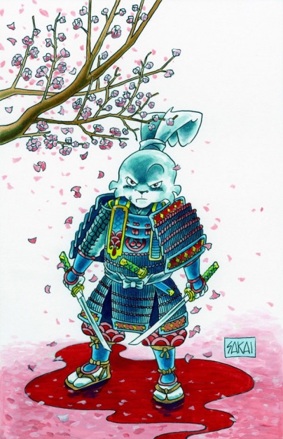
Best New, Old #1: “Usagi Yojimbo” #1
OK, I couldn’t think of a good title but I wanted to highlight the monumental shift that this issue represents and to get at least one other non-Marvel title here. To start, this marks the end of Stan Sakai’s 171 issue tenure at Dark Horse comics, meaning that “Usagi” has now gone through four publishers (Fantagraphics, Mirage, Dark Horse, IDW.) That, in and of itself, is impressive. Add onto that this is the first issue in a long time that will be in full color and it’s hard not to see how this issue is special.
I must admit, I was wary about the coloring. Tom Luth is wonderful on the covers and on the few previous color issues but the black & white aesthetic really helped sell the timelessness and gravitas of “Usagi Yojimbo.” While I still think I prefer the rabbit ronin’s adventures in black & white, the coloring keeps what made “Usagi” so wonderful and brings it out in new and different ways.
As for the contents, Sakai is a master of his craft and has honed his unique brand of cartooning for decades, so it’s no surprise that issue #1 is fantastic both as a continuation and a new start. Additionally, it’s the start of a three issue arc, something we don’t see enough of in modern comics, and the story is already deeply intriguing, featuring one of my favorite supernaturally adjacent side-characters, making it the perfect introductory arc for newcomers who want to know why this series so beloved. Plus, this man has drawn, written and lettered every one of these issues, nearly monthly, for over 200 issues, and deserves the recognition he gets.


