
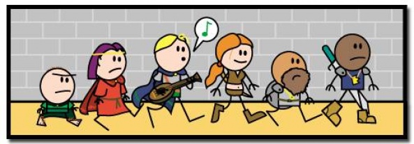
The march towards New Year continues. The winter is almost upon us and that means it’s time to cozy up with blanket, a cat, a dog, a loved one, a different animal, both, neither, all, whatever your preference, and read some webcomics. We’ve got five to get you through the second week of the month with strips like “Jonah and the Dark Arts,” and “Lonely Vincent Bellingham” and returning favorites like “Blood Stain,” “Order of the Stick,” and “Sam and Fuzzy.”
Blood Stain – Line – Tapas
Chapters 21-25
Schedule: Once a Week on Line/Tapas otherwise currently on hiatus
By Linda Sejic
Reviewed by Michael Mazzacane
And on this week’s addition of the Job Interview, the perspective client gets a truly impossible task: make it to an airport and on a plane in under 3 hours! This batch of five strips is actually a nice little narrative chunk as a whole and by itself, as each strip slowly piles more and more complication on Elli’s quest to get the job. The happenstance nature of everything turns each strip into an ultra-compressed sitcom as everything and nothing seem to be going right for Elli.
Vlad is supposed to be this creepy mad scientist character, his lettering is black on white and he’s constantly covered in blood. Their quasi-interview/reality game show segment is this play on bright warm colors and black cold ones. All of these things point to Vlad being a certain way, at the same time the strip has to comedically undercut him. He’s an ineffectual mad scientist. Sejic’s framing that transitions him snoring as Serge goes on an exasperated rant, balances these two needs. It’s also a bit hidden one as Serge’s prominence and the heavy lettering dominate everything within the panels.
Sejic gets a lot of expression and storytelling out of her lettering in these strips. Her figure work here is kinda sketchy, figures are more an accumulation of color and texture with outlined highlights. Their faces are expressive in a broad way, kind of Sandman (the Marvel kind) like. The lettering helps to focus and narrate their character. Vlad’s dialog reads very differently due to his unique lettering. The way the lettering slowly groups up and grows angry with Serge is another visual que on how to read the moment. Elli’s download to her sister made into literal background, and overwritten by the screaming baby is a highlight. The synergy peaked for me as Elli runs after the bus, the prior panel is the crazed close up on her face with “Raaaaghh.” Something about the extra ‘O’ as she yells “stop” read as frustrated and angry. The expressive lettering forms a road map to viewing these five strips as something of a whole.

Updates: Presumably Sundays & Wednesdays
By Alanphabetology
Reviewed by Elias Rosner
Don’t let the esoteric episode titles fool you, this comic is far stranger than they would have you believe. From the episode descriptions, to the art style, to the tone — a mix of K. C. Green’s “This is Fine” comic and The Marvelous Misadventures of Flapjack — “Jonah and the Dark Arts” is a throw-back to the surreal, wonderous landscape of those cartoons that were always a little bit off, a little bit creepy, and a lot of comedy.
Everything is stylized to squash and stretch, wiggle and warp. It’s not a surprise, then, that the creator, Alanphabetology, is an animator; it shows in the way they approach the timing of their jokes and the movement between panels. Even the movement within panels is crafted with an eye for animation. Every panel, be it an extreme close up or a mid-range shot or an aspect shot, conveys tons of information about character, motion, and is built for humor. Zooms are used to emphasize Mr. Finks anger and Jonah’s lackadaisical attitude while the dialogue creates a familiar atmosphere between us and the characters. The coloring helps to enhance the eerie but fun nature of the comic, with a heavy use of purple, a color I wish more comics utilized.
Continued below
While there is much to love, the lettering of the first episode is a bit shaky, literally and figuratively. That shakiness doesn’t add much to the character of the dialogue and instead hampers its effectiveness at times. However, it is still easily readable and by episode 2, is much stronger. That is also the point where things become very weird.
Only two episodes are out so far, the comic having launched around a week ago, so this is the perfect time to jump into what promises to be a strange, funny, and dark journey.

Pages 3.01-3.07
Updates: On Hiatus (returns June)
By Diana Huh
Reviewed by Gustavo S. Lodi
“The Lonely Vincent Bellingham” is a somewhat unusual web comic, as it sometimes plays with the notion of meta language without fully acknowledging it. Differently than series where the characters know they are part of the story, here the meta context is more subliminal, with character traits – such as Vincent’s aloofness and unwillingness to commit – seem to directly mimic some moments of the creator’s choices as well. This is not a criticism, but a realisation that adds to the features of the story.
The art is gorgeous. Diana Huh adopted a style that is so well-rendered that it looks like cells from a top tier animation studio. The slightly deformed characters, their movements, even sharp expressions of emotions and action are spot-on. A special note should be given to colors: they add as much to depth than the linework itself. On the latest update, which takes place entirely in closed quarters within a kitchen and table setting, the layers are well realised, giving a real sense of space to the pages.
Characters are where “The Lonely Vincent Bellingham” really shines. It is exponentially harder to make characters likeable where their main trait in being ego-driven, selfish individuals. Creators often go the route of anti-heroes or anything on these lines to soften the blow. Here, Huh instead focuses on nuances, on reasons for being, adding much more dimensions to Vincent and the rest of the cast. They feel like real people, warts and all, who can still wish forward and wish to become better individuals – or at least to do some good.
With an inviting, clear, beautiful art, “The Lonely Vincent Bellingham” will invite readers for its visual package, but will make them feel at home by the complexity of its characters.
Pages 31-35
Updates: Varies
By Rich Burlew
Reviewed by Robbie Pleasant
The fourth wall is dead. It’s broken beyond repair, never to return again. While this has been the case for this comic before, never before has it had actual lawyers representing Wizards of the Coast come in and drag a monster away for copyright infringement.
That is brilliant and hilarious. Yet it even sets up future events to come – this isn’t the last we’ll see of those lawyers. And while I lament the loss of Mind Flayers (and Beholders) from this comic, it’s a fantastic way to address it in good humor.
As such, we even get an “audience mail” filler strip… which derails as Vaarsuvius determines the true arcane purposes of a doily. Random? Yes. But hilarious? Also yes.
Players might also be familiar with the moments mid-game when they realize they forgot to add certain modifiers, and retroactively adjust whether or not they hit and the damage they did. So how does that factor into account in a world run by D&D rules? Exactly as you would expect – with characters realizing “Oh, I guess I did hit you” and the target suddenly taking damage. It’s hilarious to see in action, and comes in at a time when the world’s rules have been established to a point where it makes sense.
Finally, we get a “searching for traps” sequence. I’ll be honest, this one falls a little flat compared to the rest, as it features the male cast gawking at Haley as she searches a door for traps in an apparently erotic manner. It doesn’t really work for what we know of any of their characters, and it’s an odd objectification of the party rogue, but it’s not a situation that ever comes up again, so it doesn’t detract much from the comic overall.
Continued belowStill, after 35 pages, for only a single one to not quite work is still an impressive feat. And it only gets better from here.
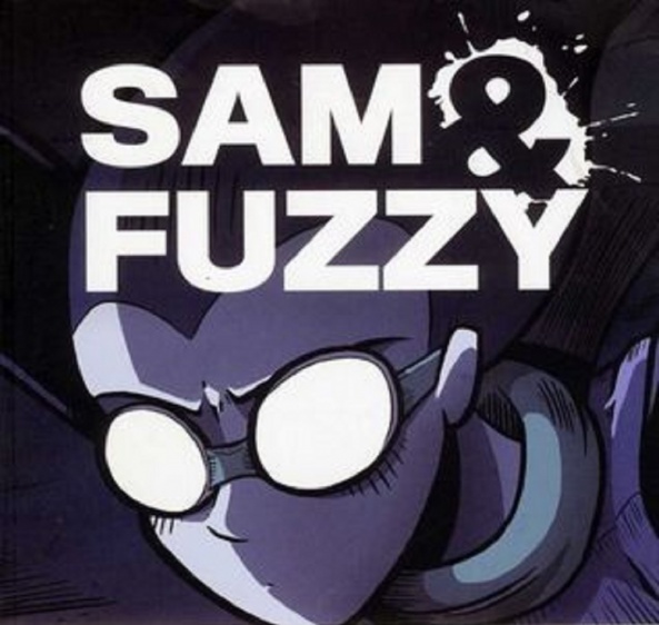
Help Wanted parts 26-30
Updates: Mondays, Wednesdays, and Fridays
By Sam Logan
Reviewed by Dexter Buschetelli
Messed up and sexy describes the installments of “Sam and Fuzzy” we cover this week. As Dev manages to adore Gerbo into submission this webcomic continues with its weird, disturbing, and amusing form of comedy. The boys, and Dev, manage to get out of a dangerous situation, but a problem solved is a problem obtained for Sam.
“Sam and Fuzzy” is somehow, simultaneously, both formulaic and unconventional. Moments that seem to be off-the-cuff lead to later plot-thread payoffs while the overarching storytelling is unpredictable. It is a contradiction of a read that leaves the reader feeling anything but conflicted. This is embodied in moments like Dev’s calming of Gerbo and Sam’s subsequent explanation of the difference in human understanding of squirrels and rats being cute and disgusting, respectively.
There’s a dichotomy to this strip. It is not an internal struggle, but rather a complimentary split of humors that work well with the title itself. One would be hard pressed to find another series that can both lean into jokes about how cuddly gerbils are and make risque references to the adult entertainment industry, but “Sam and Fuzzy” strikes a balance; a messed up and sexy balance.

Bybloemen
Pages November 2, 2018-November 30, 2018
Updates: Fridays
Written and Illustrated by C.B. McPherson
Reviewed by Bodhi
C.B. McPherson’s webcomic “Bybloemen” is set during the height of Dutch tulip mania when two demons, Basil and Ludwig, master and apprentice, are trying to take advantage of the craze to … let’s say recruit some souls for their team.
C.B. McPherson’s artwork is a joy to behold especially in those panels where he is actively mimicking the art of the time period the webcomic is set in while not letting go of his own style. He is at his best when he uses splashes to get the story across (something you don’t see often in webcomics, in my humble opinion) and the Reformations page is simply beautiful–all the more because of the flipped ratio of black upon white.
On the other hand, I think McPherson needs to decompress the comic a bit more and consider the art to word balance per panel. Too often panels seem to be groaning under overloaded speech bubbles and in some cases there is a sudden reduction in font size, not because a character is speaking softly but because an overlong sentence has to be fitted in a bubble placed in a constricted panel.
The above aside, McPherson does a good job of moving the story along while establishing his main characters clearly especially when Ludwig demonstrates his inexperience and casual disregard for human capabilities and McPherson uses visual humor to show Basil’s reaction.
A general point of note: it probably is a good idea to use the comments space below each update to clarify specific terms related to tulip plantation.


