
Back in 2012, an event ripped through the Marvel Universe. It tore apart the space-time continuum, relaunching the line with all new #1s and a streamlined universe. It was called Marvel NOW and it mirrored the Direct Competition’s then-year old relaunch in size, scale and br — What’s that? It was just a re-branding and a bunch of new titles and new #1s? “AvX” didn’t even change up the universe itself, unlike “Secret Wars” in 2015? Well, now I feel silly.
Regardless, we’re here to cover the first third of the initiative that’s had, perhaps, the most outsized impact on the company, spawning multiple waves, a 2.0 version, and the start to a few fan-favorite, and fan-reviled, runs. In case you missed the last two, here’s A-F and G-Se. Today, we’re finishing up the initiative with Marvel NOW Su-Z titles. Let’s see what Marvel thought was important enough to be their flagship titles in 2012.
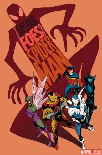
The Superior Foes of Spider-Man #1
Written by Nick Spencer
Illustrated by Steve Lieber
Colored by Rachelle Rosenberg
Lettered by Joe Caramagna
Reviewed by Kevin Gregory
So full disclosure, I haven’t read any “Superior Spider-Man.” Or much of Dan Slott’s run for that matter. I seem to be admitting to a lot of books I haven’t read over the course of these reviews, but I doubt you care. Anyway, I didn’t need to in order to read this first issue, and that’s a plus, because this book is hilarious. Full stop. Send tweet. I loved it.
This issue features the new Sinister Six, but the story is told entirely from the perspective of the down-on-his-luck Fred Myers, a.k.a., Boomerang. He gives you his origin in like a page, he get arrested, he tells jokes, other people tell jokes, badabing badaboom. If you couldn’t tell from the constant question of “Is it a sex thing?” this book is not really about foes who are “superior” in any way other than their jokes actually land. Spencer is funny here and I understand why people continue to point back to this book as a hallmark of his. They rob a comic book store in this issue and the nerds argue about which book Beetle should steal. Only caricatures of The Simpsons Comic Book Guy would care. If you can’t make fun of yourself who can you make fun of?
The dry humor is played perfectly by Lieber who doesn’t hit you over the head too hard with anything. His and Rosenberg’s coloring sell the street-level and unserious tone of the book perfectly in a way that is both insanely expressive and downright comical. All of this is like reading a “Peanuts” strip with a tiny whiff of superheroics. Speaking of art, shoutout too to letterer Caramagna. Anytime you can work on a word balloon with an emoji that ties together the expressions, art, and jokes you win. Plus between phone calls and narration the lettering is easily followable. The small touch of changing the font color in a panel featuring a phone call is a game changer.
If you’re into dry humor and bad bad people who are bad at being bad, then this is the book for you. Do you need to know anything about Spider-Man? It helps but not really. This book gives you bad villains in a hilarious way doing bad things for no good reasons and it’s funny enough for them to not need to be redeemable.
Final Verdict: 8.3 – It’s not a sex thing, but it’s a great first issue.

Superior Spider-Man #1
Written by Dan Slott
Illustrated by Ryan Stegman
Colored by Edgar Delgado
Lettered by VC’s Chris Eliopoulos
Reviewed by Jake Hill
There’s something about Dan Slott that rubs a lot of people the wrong way. He’s outspoken and honest about his opinions, particularly concerning politics, and that tends to get people riled up. He also has an engineer’s approach to storytelling, sometimes bending character motivations for the sake of plot. I saw Slott at a con not long before the release of “Superior Spider-Man” #1. During a Q+A, an adult fan started to ask his question:
Continued below“So is Peter Parker ever gon-” the fan started to ask, before Slott leaned towards his microphone.
“He’s DEAD,” Slott growled. “Six feed underground. I killed him! He’s never coming back.”
Flustered, the guy backed away and returned to his seat. A young kid was next with a question. Slott gave this kid a thoughtful answer, a smile, and a pile of signed “Spider-Man” stuff that had been prepared for just such a kid. I think that covers two sides of Slott. He can be an impatient fan when an adult who should know better questions his story decisions, but he’s always got time to brighten a kid’s day.
You can see those two sides in “Superior Spider-Man” #1. Doctor Octopus had already stolen Peter Parker’s body in the final issues of “Amazing Spider-Man,” so this issue is concerned with logistics. What is Doc Ock’s moral code? How is he a different Spider-Man from Peter Parker? And is this entire series going to be one long bummer? It turns out that Ock wants to be the most effective hero he can be, even if that means slicing up bad guy faces to do it. Ock has some of the same complaints of superheroes that the readers do- if Green Goblin escapes from jail every six months and goes on killing sprees, what is a more permanent solution?
Of course, Octavius doesn’t fight Green Goblin in this first issue. He fights Boomerang. And he doesn’t have everything figured out yet. He’s still learning. He’s also still got a major chip on his shoulder, one that verges on villainy. And that creates tension, which makes for an exciting story! By the end of the first issue, a “Force Ghost” version of Peter Parker manifests, and the shape of the series starts to become clear. You knew you were on Ock’s journey, but Peter’s return was quickly set up.
It’s hard to remember how loud this series’ detractors were. “Superior Spider-Man” #1 is good, really good. It’s no more disrespectful to its hero than any story with a conflict is. And despite Slott insisting that Peter Parker was “never coming back,” the story winks at you, letting you know… of course he’s coming back! It’s comics! So it uses all sorts of storytelling tricks to create a different sort of tension- not of life or death stakes, but of the salvation of a villain’s soul. Of all the Marvel Now titles, “Superior Spider-Man” is one that I find myself returning to again and again. It distills everything about the superhero genre to one question: can someone bad learn to be someone good?
Final Verdict: 8.6 – I’m pretty sure this series is a modern, must-read classic.

Superior Spider-Man Team-Up #1
Written by Christopher Yost
Penciled by David Lopez
Inked by Andy Owens
Colored by Rachelle Rosenberg
Lettered by Joe Caramagna
Reviewed by Brian Salvatore
There was a cottage industry of ‘superior’ titles at Marvel during the initial ‘NOW!’ era, and the one I had totally forgotten about was “Superior Spider-Man Team Up.” The idea of the book, presumably, was to show how the Otto Spidey was interacting with the rest of the Marvel Universe, and that’s a good idea for a title. This issue crams about as many Marvel heroes as possible in, but it does so with a purpose, and created a really fun read in the process.
The reader is meant to believe that Spider-Man is indiscriminately beating up heroes, and so the Avengers get involved. This is somewhat in line with what has been happening in “Superior Spider-Man” and the general tone of Otto as Spidey. But no! It turns out that there is a virus that is imperceptible to the naked eye, bouncing from hero to hero. Christopher Yost pulls this off by not giving any indication of Otto’s motives, and letting the issue play out through the eyes of others, until right before the reveal.
David Lopez’s pencils cover a lot of ground here, having to illustrate everyone from street level thugs to literal gods, and his style grounds the book in the urban setting nicely. He also manages, upon further readings, to add small glimpses of the virus through body language or facial expression in some of the heroes. It’s subtle, nuanced work.
Continued belowFrom the last pages, it appears that the series will be less of a ‘Marvel Universe’ team up and more of an ‘Otto and the villains’ team up, which is less interesting, but doesn’t render this debut issue any less effective.
Final Verdict: 8.2 – A really fun debut issue.

Thor: God of Thunder #1
Written by Jason Aaron
Illustrated by Esad Ribic
Colored by Dean White
Lettered by VC’s Joe Sabino
Reviewed by Joe Skonce
Thor has always been one of my favorite superheroes. There was something appealing to me about both the “fish out of water” aspect of the character combined with his almost way too powerful skill set. He was a god for goodness sake! But by 2012, I was not necessarily reading comics anymore. I was going to see the Marvel films, but for whatever reason, the comics had fallen by the wayside. Then my friend told me to check out “Thor: God of Thunder” #1, written by Jason Aaron. I was immediately hooked. Not only does it succeed as a clean entry point for the character, the main goal of Marvel Now!, It is also an excellent comic. In 2019, Jason Aaron finished his run of “Thor,” a run that will surely be iconic for the character and the decade. Revisiting the issue that started it all shows that while Aaron might not have necessarily known the twists and turns his comic was going to take, he certainly knew the emotional arc of the God of Thunder.
“Thor: God of Thunder” #1 does two things successfully, establish an interesting mystery and show the growth of Thor. We are presented with three distinct Thor’s. The first is before Thor was granted Mjlonir. This Thor is brash and arrogant. A god who loves nothing more than being in a good fight, enjoying a good drink, and sleeping with some wenches. The second Thor is the Thor of modern-day, while still arrogant, this Thor is shown helping people in ways other than knocking off heads. (He still loves drinking though!) Finally, old Thor rules in Asgard alone, engaging in daily fights for his life. The connective tissue of all three of these stories? Gods are being killed, and even worse than that, butchered. We don’t see who is responsible, but we know a name, Gorr, the God Butcher. The mystery of Gorr drives the story forward and the various reactions by Thor show how his character changes from brash, to horrified, to broken. It works really well.
Esad Ribic also does some impressive work in the art department. There are some panels that are both memorable and haunting. The best example of this is the image of the gods of Indigarr hanging from meat hooks. It’s gruesome, showing the brutality of the god butcher. Ribic also does a good job at presenting action, with the swings of Thor’s hammer or the attack of his villain, you have an understanding of their movement in physical space. Overall, “Thor: God of Thunder” #1 is an impressive first chapter in what would be an impressive decade-spanning book.
Final Verdict: 9.7. “Thor: God of Thunder” #1 is a near perfect comic. The mystery is engaging, the art powerful, having three Thor’s really showcases different facets of the character. It was great fun to revisit!

Thunderbolts #1
Written by Daniel Way
Illustrated by Steve Dillon
Colored by Guru eFX
Lettered by Joe Sabino
Reviewed by Brian Salvatore
This was the sixth different incarnation of the Thunderbolts, and the idea is more or less the same: characters who fall somewhere in the grey area of the moral spectrum come together to do the ‘dirty work’ that traditional heroes won’t do. Written by Daniel Way, who had a lengthy run on “Deadpool,” steers this ship and, essentially, just militarizes the concept a bit. This era was rife with that the ‘novel’ concept of militarizing superheroes, and it feels even grosser now than it does then.
What also feels a bit gross is just how casually so many people are killed in the issue. While I know this isn’t a kids comic, we see a number of people, a disproportionate number of which are not white, killed by the various members of the team without hesitation or moralizing. The idea is that these people are doing what ‘needs to be done,’ but it looks awful racist from over here.
Continued belowWhat does not soften the blow, even a little bit, is the art by Steve Dillon, a master of comic storytelling. Dillon makes everything hyper-detailed, so all the deaths have an added sense of realism to them. This isn’t faulting Dillon’s work; it remains exceptional. But the added details make the indiscriminate merc-ing of non-Americans feels even more purposeful.
Final Verdict: 4.8 – Icky for all the wrong reasons.

Uncanny Avengers #1
Written by Rick Remender
Illustrated by John Cassaday
Colored by Laura Martin
Lettered by Christ Eliopoulis
Reviewed by Brian Salvatore
The ‘death’ of Charles Xavier has played out a number of times and in a number of ways, but the way that “Uncanny Avengers” responds to it is one of the most effective, conceptually, in all the times it has been attempted. Captain America and Thor realizing that the Avengers have not done enough for mutants is a logical response to Xavier’s death, as is their desire to control how things shake out in the future. Control is an important piece of his Avengers’ legacy, and wanting to be able to manipulate the mutant heroes falls in line with his modus operandi, even though it is unlikely he is thinking about it as cynically as I am.
Choosing Havoc as the field leader for this hybrid team might seem odd today, but at the time, it was an inspired choice, based on how his brother had been recently used. The rest of the ‘team’ isn’t assembled anywhere but on the cover, but Scarlet Witch and Wolverine make sense as folks with ties to both groups, and Rogue…well, Rogue is always a fun character to introduce to a team setting because of her skillset.
And while this issue does work from a scripting sense (even if Remember, of course, has to work in some daddy issues with Charles and Scott), John Cassaday is really what sells this concept. His art is always ambitious and bombastic, and he doesn’t disappoint here. The details in the costume designs are as intricate as the big city battle that happens mid-issue. Cassaday doesn’t do too many interiors these days, in part because his work is so detail heavy that he likely doesn’t have the time to crank out pages at the rate needed for mainstream comics.
Beyond everything else about this comic, the final page reveal, of the Red Skull stealing Charles Xavier’s brain is one of the best cliffhangers in modern comics. The idea is so absurd, so absolutely comic book-y, that you can’t help but smile a big, goofy grin when you see it. It’s the perfect combination of a mutant and Avengers adversary, and there’s nothing but excitement at the end of this issue.
Final Verdict: 8.4 – A stunning debut issue.

Uncanny X-Force #1
Written by Sam Humphries
Pencilled by Ron Garney
Inked by Danny Miki
Colored by Marte Gracia with Israel Gonzalez
Lettered by VC’s Cory Petit
Reviewed by Jake Hill
Rick Remender’s “Uncanny X-Force” was something unexpected. It proved itself to be something more than a forgettable action book. It felt different. Distinct. Epic. Almost literary. The only thing more wild than the existence of “Uncanny X-Force” is the fact that it works. With Marvel Now, the company tried to make lightning strike twice by rebooting “Uncanny X-Force.” A similar book with a similar (but distinct) art style, using a lot of the same characters was sure to recapture the magic right?
Ron Garney is a good get for “Uncanny X-Force.” He had been drawing comics for a while, but seemed to relish the opportunity to bust loose from superhero house style. Garney led an art team that included Danny Miki on inks, and colors by Israel Gonzalez and future HOXPOX-colorist Marte Gracia. It’s a strong art team, and the book walks a great line between violent grimdark and day-glo sheen. The cast of characters is phenomenally weird, and you can tell that the art team has a good time drawing Spiral (and her many arms) and Puck (and his epic mustache).
Continued belowIt seems though, that someone somewhere underestimated just how deeply weird Sam Humphries is. Humphries got his comic writing start with “Our Love Is Real,” a graphic novel about people in romantic, sexual relationships with dogs and crystals (not at the same time). While he has done good work in the mainstream, Humphries has never been great at containing his true freaky self. That’s worked in his favor plenty of times, but here it is to the detriment of the book.
That’s largely because of the character of Fantomex. Originally created by Grant Morrison, Fantomex is peak Morrison weird. But not all weird is the same, and Humphries adds a lot of complication to an already complicated character, splitting him into multiple selves at odds with each other. It’s certainly a daring creative choice, but ultimately just isn’t that interesting, especially in light of the powerful arc Fantomex had gone through in the first run of “Uncanny X-Force.”
The worst aspect of the book though, is the characterization of Lucas Bishop. He’d already been put through the ringer as the villain in the previous run of “Cable.” It turned Bish into an irredeemable asshole, desperate to murder little kids. I commend Humphries for approaching the character’s history dead on, but you never get the feeling that he knows how to bring Bishop back from all this. The guy becomes an incoherent yelly mess.
And that’s the problem with “Uncanny X-Force.” It’s a bold, fearless book without much to say. The strange cast, gaudy colors, and high concept sci-fi indicates a team that was ready and willing to do anything. Why then, is this the story they arrived at? I almost wonder if this volume of “Uncanny X-Force” would work better on the nation of Krakoa. At least then there would be an explanation of why everyone is being so loud together.
Final Verdict: 6.8 – Good art can’t make this messy book readable or sane.

Uncanny X-Men #1
Written by Brian Michael Bendis
Penciled by Chris Bachalo
Inked by Tim Townsend, Jamie Mendoza and Al Vey
Colored by Chris Bachalo
Lettered by Joe Caramagna
Reviewed by Michael Mazzacane
Move over Hickman and your timey wimey science fiction formalism, the Revolution began in 2013 with Bendis, Bachalo, and a trio of inkers! This latest relaunch of “Uncanny X-Men” gave us the first appearance of Goldballs.
People where put off by “Avengers vs X-Men” not by the events excesses and lack of coherent emotional narrative but for what Bendis had Scott Summers do: kill Professor X (like that’s ever stopped him before.) I fell into the first category, a Marvel Event ending in the “shocking” death of a major character is like saying there would be a big summer crossover. In the aftermath though Bendis relaunched “Uncanny X-Men” focusing on a more militant Scott Summers as he attempts to achieve the man he murdered dream. This more militant stance wasn’t exactly new, he recreated X-Force and did plenty of other ethically questionable command decisions in the name of protecting mutandom. That militancy with the emotional anguish he feels for the what he as a host to the Phoenix Force was an intriguing hook for the series.
This issue doesn’t get into that personal space, it is an exposition debriefing for anyone who didn’t read “AvX” or the subsequent fallout issues. As far as exposition dumps go, this is well done as it doesn’t repeat major plot points readers already know, but uses the retrospective narration to frame Cyclops as a revolutionary-terrorist. It Bendis and Bachalo show and tell at the same time.
Whenever you see multiple inkers on a book it can be worrisome. The credits do not specify who did what pages, but for the most part there is enough consistency in the inking that it appears unified. I forgot how much I liked the cartooned figure work, it just doesn’t look like other stuff that was being put out at the time. With the retrospective view the action reads more in a manga style in terms of action with big bold images and changes in inking texture for effect than fluid action beats. Bachalo doing the colors helps to keep things unified with heavy use of single colors that gives it a more graphic look. It feels apiece with Joe Caramagna’s design work on the bookends.
Continued belowOverall this is a good first issue, it doesn’t get into the interiority of the cast but it explains the point of view of the book better than some series spend 6 issues on.
Final Verdict: 7.0 – With a cohesive aesthetic and smart use of retrospective narration “Uncanny X-Men” primes readers for a Mutant Revolution.

Wolverine #1
Written by Paul Cornell
Penciled by Ryan Stegman
Inked by Mark Morales
Colored by David Curiel
Lettered by VC’s Cory Petit
Reviewed by Elias Rosner
What did I just read? I mean, I kinda know what happens, I think I know who Wolvie is at this point in time, but. . .this can’t be issue #1, can it? Are we sure this isn’t a stealth issue #5? Is Wolverine supposed to be this much of an asshole?
OK, let me back up a little. “Wolverine” #1 seems to be a throw-back to what I, an X-Men novice, know about the Patch era of Wolverine: super-spy antics, anti-hero tendencies, a team we know jack-all about and read about as generic as possible. That last point might just be this book, now that I think about it. We start in media res on a mission that shows Wolverine and his cutthroat team of mutants sneaking in somewhere to steal a macguffin or something and they’re not being too sneaky about it. Then we find out that Apex Lex is here and has deemed Wolverine a villain and thus given him The Offer. Then Wolvie shoots an undercover newspaper reporter for The Offer, establishing that he has, in fact, gone rouge.
I think this idea would have worked far better if it hadn’t taken 20 pages to get here. Twists like these require the story leading up to the reversal to be engaging and distracting you from the reality so that when the rug is pulled out from under you, like in The Shield, it has the right impact. Here? It’s all at once baffling but also was the clearly telegraphed end point for Wolverine. But, again, I don’t think the twist is the problem with the issue, it’s the lackluster story leading up to it.
Artistically, Stegman, Morales, and Curiel bring some A+ paneling and almost keep the tension alive throughout the issue, though that’s continually undercut by the “banter.” I love the second to last page, though. You feel the danger, you know the reporter is doomed, and the nine panel grid lulls us into a pattern that get shattered on the bottom row with a BANG in two joined panels, cut in twain by a bullet, before connecting in the final panel. It’s stylized and exciting and is the kind of presentation that helps sell the clandestine/“Suicide Squad”-esque tone of the piece. It’s just a shame that the character work or the dialog couldn’t support it.
Final Verdict: 4.8 – “Wolverine” #1 takes a big risk and while it doesn’t pay off, the art is nice and I appreciate the trial. His death and Laura taking over the mantle a couple years later mean far more, though.

X-Men #1
Written by Brian Wood
Penciled by Olivier Coipel
Inked by Mark Morales and Olivier Coipel
Colored by Laura Martin
Lettered by VC’s Joe Caramagna
Reviewed by Jake Hill
Of all the Marvel NOW books, none sits as strangely as “X-Men” #1. There’s a dissonance between what the book meant upon its release and what it means now that completely overshadows the content of the story itself (which verges on adequate). That’s mostly because of Brian Wood, who was widely considered at the time to be an exciting voice in comics. Now though, the allegations against Wood are well known. Said allegations involve the mistreatment of women- and the purpose of this book was to be an all-female team of heroes. Oof, that’s a lot.
At the time of publication, people were asking Wood, “Why not call it X-Women?”
“Because they are all X-Men,” Wood would answer. And this response was as unclear then as it was now. It is undeniable that there is a popular team called the “X-Men” and that its members include some of the most beloved women in superhero comics but… what? A team including Storm, Shadowcat, Rogue, Psylocke, Jubilee, and Rachel Grey is a great starting point for a book. And there’s nothing wrong with calling the book “X-Men,” I guess. But the choice seems designed to invite the question, and not having a satisfactory answer prepared seems lazy.
Continued belowThe story itself seems good on paper. It involves the return of John Sublime, a truly weird Grant Morrison-created villain, who is a living virus, and the oldest sentient being on Earth. Tying into the erm, theme of having a lot of women in the cast, Sublime is revealed to have a sister, Arkea. And Arkea takes over the body of another supporting X-Woman, the Omega Sentinel. As a staunch X-fan, all of that should have me hyped. But in execution, it all seems sort of perfunctory. The book seems to scared to make any part of its feminist agenda explicit in the text, and so the rationale for this team goes mostly unremarked upon.
Does an all-female superhero team need a special rationale? Of course not. But any superhero team should have some sort of reason for being. X-Force does the dirty work that other teams couldn’t handle. The Thunderbolts are villains pretending to be heroes. The Champions are kids trying to stay true to their heroic ideals. This team of X-Men just sort of is, and that approach robs the group of a unified mission and thus momentum.
Elevating the material somewhat, is the work of Olivier Coipel. At the time, Coipel was one of the hottest artists at Marvel, having successfully rebooted “Thor” and heading up the “House of M” event. Coipel does a few costume redesigns here, and I really dig his work, especially with Storm and Psylocke. Storm’s new duds look extremely impractical, but the restrained use of color makes her really stand out on the page. Psylocke seems to have gone in an athleisure direction, which she earned after decades of wearing that swimsuit. What energy this book does have is brought by Coipel, who seems to be having the time of his life.
If this comic was a staggering achievement, it would inspire that old conversation about separating the artist from the art. The allegations against Wood are serious, and I know of more than one comic shop that will no longer carry his work. I guess it is merciful then, that this issue is so meh. I really dig Coipel’s work, who seems to be at the top of his game, but Wood’s writing is limp and lifeless. For a book that inspired to much feminist discussion when it was announced, it’s a whole lot of nothing in hindsight.
Final Verdict: 5.4 – An overly cautious and low energy story can’t quite be saved by a superstar artist. Considering who the writer is, I’m comfortable letting this one go.

X-Men Legacy #1
Written by Simon Spurrier
Illustrated by Tan Eng Huat
Inked by Craig Yeung
Colored by José Villarrubia
Lettered by Cory Petit
Reviewed by Kevin Gregory
How does the son of Charles Xavier react to the death of his father as this new era of Marvel Comics begins? Well, not well. “X-Men Legacy” kicks off this new adventure of David “Legion” Haller with a lot of weird flare, some wacky art, and interesting character insight before blowing up it’s entire premise by issue’s end. This is a book that feels more at home in something like DC’s Young Animal imprint than in the proper X-line or in this relaunch, but it offers some fun oddities swallowed by a lack of forward momentum.
Legion is not a character I’m super familiar with, but this makes a case that an Omega Level mutant with multiple personality disorder could be as odd or as tame as one wanted it to be. David’s multiple personalities are depicted as one giant Foucaultian prison, all being drained by the dominant “normal” personality to keep him in check. This tension between the reality of David’s mind and the reality of the world is really interesting and cool, especially as in the real world David finds himself with a guru helping himself with this inner reality. These two different worlds are presented in Huat’s scratchier style which adds to the experimental flavor of the series. Presenting this tension and ideas of control and will and agency are well and cool if not a little bloated and under explained.
Continued belowUnfortunately this book pads out the middle before rushing into the end of the issue by blowing everything set up before. The reality of David’s teaching undone and the balance of his mind and the material world is gone, and all the characters introduced besides David himself gone with them. The other viewpoint persons are killed in order to both bring in the other X-Men and upset the balance in his head. The concepts were cool, but they are jettisoned. The next issue will have to build the plot back up and chart the course for what this series will eventually be.
The pacing and plotting rests on the shoulders of Spurrier, who throws in enough Morrisonian language to let you know this book’s gonna be wacky, while also giving you enough character and heart that you know it won’t be all that. Yet the heart is killed by the end, and thus the high concept remains to be fleshed out another day.
Final Verdict: 4.5 – A weird book that builds up and blows up it’s premise by the end of the issue.

Young Avengers #1
Written by Kieron Gillen
Illustrated by Jamie McKelvie with Mike Norton
Colored by Matt Wilson
Lettered by Clayton Cowles
Reviewed by Kevin Gregory
You want a sleek book about being young and dumb but full of hope that doesn’t feel like it’s catering to the “youths?” Even 7 years later “Young Avengers” #1 reads like a sleek modern and polished take on what it might actually be like to be a young adult dealing with super powers. And most everything about it works.
It’s fun to reread this book after Gillen, McKelvie, and Wilson have had their long acclaimed run on “The Wicked + The Divine.” This was the midway stopping point between that and “Phonogram,” and while all the books are different, they all are grounded in modern pop culture, sleek aesthetics, and a sense of realism. This is truly a comic that is the world outside your window in the best possible way that neither ignores the superheroics but gives you such human (and alien) characters, emotions, and relationships. The characters, situating them, and marinating in their personalities for 20 pages is exactly what this comic does, and damn do they do a lot with what they have.
There are sort of “3” stories in this issue, though they last two intertwine towards the end. We pick up on Kate Bishop and Noh-Varr after a college-aged one night stand and honestly everything about this scene is fun and powerful. Gillen nails Kate’s inner monologue and all the awkwardness and learning of the interaction before McKelvie, Norton, Wilson, and Cowles hit us with a many-panelled double page spread with no dialogue capping off the interaction. Likewise, when the story transitions to Billy and Teddy, Gillen and McKelvie work through their magic as the pair work through their emotions together in a calm, matter of fact fashion. And it is matter-of-fact and beautiful that this queer couple can fight just like everyone else in a Marvel book and it be completely normal.
The America/Loki stuff is the weakest part of the book, though meeting America and all her attitude is a ton of fun and teases much to look forward to. Their bit feels awkward as the issue barrels into an unforeseen and odd conclusion that has less to do with what came before, the characters, and more to do with setting up the first arc. While the character beats of this book land near-flawlessly, it’s this right turn into something completely different and slightly rushed that stalls the issue a little bit as you’re getting ready to break out the tears and tissues.
Nonetheless, seven years later this issue, and all of this run, are still modern Marvel classics which set the stage for much of what Marvel will do with its young characters and minor properties up to the present.
Final Verdict: 8.7 – A sleek beautiful book that is still a winner.


