This comic isn’t all it’s Cracked up to be. It’ll make you Sick to your stomach as it Plop!s out its plot. Thankfully, this is Not Brand Echh or Image might have been in real trouble. Instead, it’s a little bit more Crazy, taking us on a National Lampoon out to sea. I’m not MAD. It’s just “Stupid.”
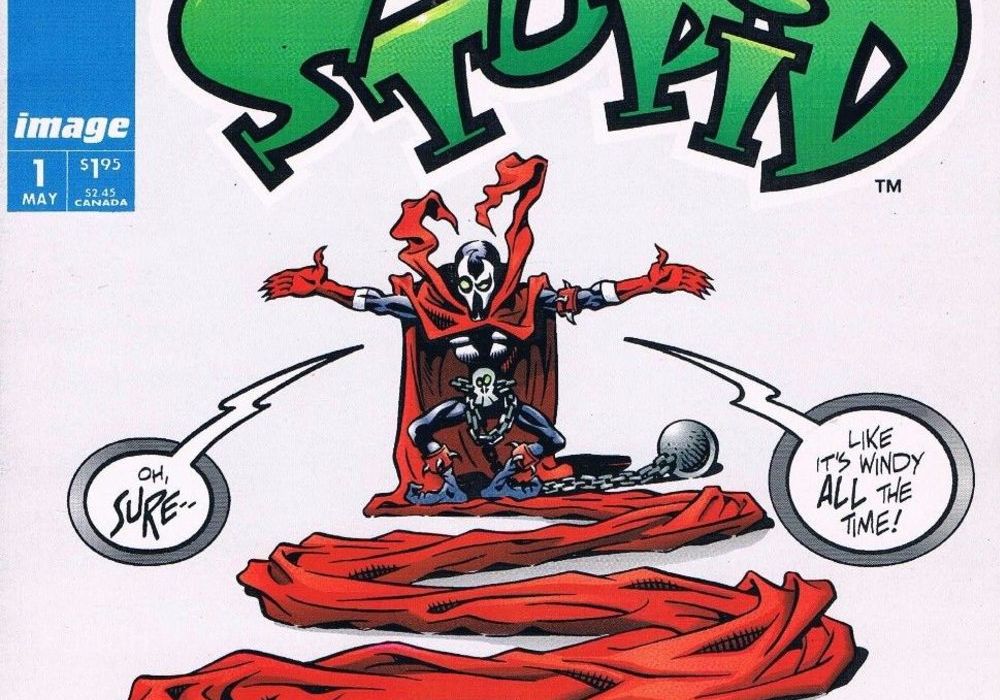
Cover by Hilary BartaWritten By Hilary Barta & Doug Rice
Illustrated by Hilary Barta
Colored by Steve Oliff
Lettered by Willie Schubert

Are they gone? Are the pretentious people off reading their “Dark Knight Returns’s” and “Watchmen’s” and “high literary comics?” Can I make the rest of this review 20 fart jokes and call it a day? No?
Dammit Brian.
Anyway, welcome to my review of “Stupid” #1 from Image comics, where I don’t so much review it as talk about what a surreal experience this comic is.
Coming about a year after the launch of the character, and the issue, it is lampooning, “Stupid” #1 – Spewn is about as thought provoking as the title implies and only about half as fun as it should be. OK, maybe that’s short changing things. Barta & Rice do a lot of things right for a comic that is meant to feel like it was ripped straight out of the pages of longest surviving EC Comics mag, “MAD.” It’s funny more times than not, it takes the piss out of the incredibly self-serious series in a respectful enough way, and makes room for tons of visual gags, background messages, and utilizes the print format to its fullest.
Maybe my favorite gag in the issue is when Spewn gets his cape stuck in the staple of a two page spread, all while he’s narrating in that purple prose-y kind of way about the city, mixing metaphors, and just generally losing his train of thought because of the aforementioned cape in staple problem. It’s simple but effective and while I’m not too familiar with the source material I’ve only read issue #1 of “Spawn,” the broad humor of the title makes it easy to understand and laugh.
Braga’s art is great and a fascinating contrast to McFarland’s “Spawn.” Here, not only is everything hyper squash-and-stretch cartoony, allowing for a greater range of parody, from Spawn’s emaciated form to his cape’s every changing length, but there are backgrounds! BACKGROUNDS! Expressive faces with minimal lines! Mostly conventional paneling structures! OK, maybe that last one isn’t quite accurate but rule of three and all that. Steve Oliff, colorist on “Spawn” #1 as well as “Stupid” #1, does a bang-up job making the world of Spewn reminiscent of “Spawn” while keeping it bright and cartoony. Oliff shows off his coloring range here, blending the more painted backgrounds with the brighter characters and details.
However, it’s nearly impossible to shake the feeling that it’s all just an imitation of “MAD.” The faces of the crowds, the focus on turning the “clean” originals into something gross, a high penchant for fourth-wall breaking gags at the expense of Image creators, it begs comparison. Sure, that’s kinda the point, but satire doesn’t have to follow one mold. Take Kyle Baker’s “Plastic Man.” More than half of that series was satirizing the bloated, edgy-masquerading-as-literary nature of events like “Identity Crisis” and “Infinite Crisis.” It was sharp, it was hilarious, and it did it within the irreverent nature of an all-ages book about Plastic Man.
“Stupid” #1 often feels content to do gross out jokes followed by low hanging fruit followed by an overly belabored parody line over going for the jugular. When it gets into this mode, shying away from its more understated punchlines, it can be very hit or miss. I don’t need to see two pages of Al Persimmons vomiting into his mask but poking fun at narrative boxes becoming scrolls works great. And maybe that’s just my taste on display. I prefer the stylizing of Mark Russell to the irreverence on display here but I also love “MAD’s” sharp but decidedly juvenile takedowns of superheroes, world events, and it’s own staff. And I don’t say this to be dismissive. Both the original “Spawn” and “MAD” are both fantastic examples of their styles, they’re just not always for me.
Continued belowPart of this is also that the issue just kinda. . .ends. There wasn’t going to be anything great, plot-wise, from a comic entitled “Stupid” but it’s surprisingly anti-climatic. The comic is also just one story (and a mock letters page and a puzzle) so the whole thing is kind of light. But, again, it’s fun and I found myself going back throughout the review, rereading pages and enjoying the cartoonish Spewn’s antics. Would I read the comic again? Probably. Would I recommend it to you all?
Eh. Maybe. If only for the joke about the tiny hearted editors. . .Brian’s not going to read this, is he?
[Editor’s note: See me in my (virtual) office, Elias]


