
Welcome back to the the Webcomics Weekly!
Here in the United States, we’re gearing up for Thanksgiving, a holiday with a lot of history, some good, some bad, some utterly baffling. As with all celebrations, however, the day is what you make of it. So here, at the Webcomics Weekly, we’re offering thanks to all of you, our readers and the creators who we review. While we may not always love what is done, we appreciate it nonetheless, for art is being brought into the world and we are invited into conversation with it. The most human aspects of our souls are put to bear in art and in independent art, we find that spirit rough and raw and exciting. Isn’t that beautiful and shouldn’t we give thanks for that? For the toil and love? I think so.
We have a lean week this time around, as we prepare to partake in the holiday, so think of these as an appetizer. “Varsity Noir,” “Order of the Stick” and “A Better Place” are on the menu — you’ll give them a taste, won’t you?
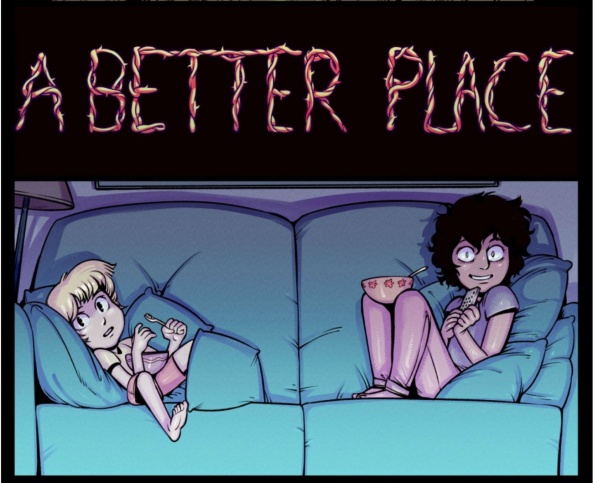
A Better Place
‘The Point’ – ‘The Real Fun’
Updates: Thursdays
By Harry Bogosian
Reviewed by Elias Rosner
It’s hard to find new things to say about “A Better Place.” The art continues to impress, the story deepens with each set of updates and the characters only get stronger with every interaction. Yes, there are a lot of questions being posed by the narrative that have yet to be answered, such as what’s Irtes’ game, but being in the dark is part of the fun of the story. The world is expansive and we’ve entered the hidden corners along with Nina, and thus we only know as much as she does (and what little is gifted to us by Harry to provide a titter of excitement.” So, instead, I’m going to talk about the lettering.
Lettering in webcomics ranges from standard type-faces or shaky hand lettering to THE place to watch experimental and dynamic lettering choices. Because most webcomic artists do their own lettering, making the argument that the medium is more of a successor to newspaper cartoonists and the self-publishing movement than the DC/Marvel method, this leads to a greater integration of lettering into the art. I adore the way webcomic artists come to their stylistic quirks and while it may not always work, that’s the fun of it all.
Bogosian’s use of a thin, full case, sans-serif font compliments the digital linework, both evoking modernity and the future, of which the comic is deeply concerned with. He also hand draws, it seems, the sound effects with a digital pen, continuing the seamless visuals because it all appears to be on one, or perhaps, two planes. This is supported by his choice to overlay the balloons with the same greytone so that they don’t stand out, assaulting our eyes with its bright whiteness. The balloons are also well balanced, extensions of the characters themselves, with the tails curving and extending the pauses between words.
I wonder if the font is made from Bogosian’s own handwriting, as it has the slight imperfections of a produced font rather than a bought one, and the associated warmth thanks to the minor irregularities.
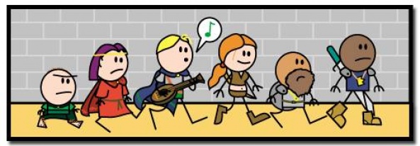
Order of the Stick
Pages 176 – 180
Updates: Varies
By Rich Burlew
Reviewed by Gustavo S. Lodi
When one of the members of the Order falls prey to a spell that dramatically changes its form, the group needs to find a way to reverse the curse, complete their main quest, and still deal with past lies and betrayals. Well, no, not really.
Once again, “Order of the Stick” proves to be just as sharp at comedic timing with longer dialogues, as well as with short bursts of humour and situational comedy. This group of strips revolve around two main beats.
The first, where some of the best developed dialogue of the series is presented, with more complex, classic, English verbiage, which is completely lost to everyone, as it is being uttered by a human-turned-lizard. The comedy is found on the actually wise words being thought of, and the group’s total inability to get it.
Continued belowThe second, where a very funny banter between two members of the cast around the nature of lying and how that makes you unreliable. . .even when one is trying to convince others they were lying in the first place. Quite slippery slope.
There are other funny tidbits as well, aligned with the usual pokes at tabletop RPG conventions (this time around, the hexagon map grid) that adds to the overall appreciation of this series. All in all, another solid entry on a perennial amusing read.
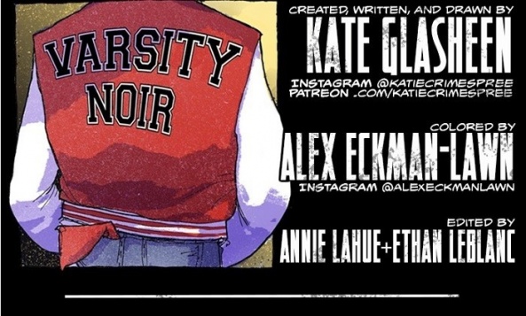
Varsity Noir
Episodes 29 – 33
Schedule: Sundays
Written and Drawn by Kate Glasheen
Colored by Alex Eckman-Lawn
Reviewed by Michael Mazzacane
With a title like “Varsity Noir,” how could I not check this out as someone with a love for Brick? Much like Rian Johnson’s directorial debut, Kate Glasheen and Alex Eckman-Lawn’s comic come at high school from the suspicious, somewhat hard boiled, gaze of noir. Due to the dirty pastel color pallet employed by Eckman-Lawn, “Varsity Noir” feels closer to the muted but colorful neo-noir of the late eighties and nineties than more classic chiaroscuro noir.
John is a recovering addict and after completing a stint in rehab must reintegrate into high school and gets his life back on track. The creative team isn’t specific about what he went in for, the opening episode is ambiguous leaning more into the sense of isolation that experience has left him with. One of the tropes the creative team don’t lean into is inner monologue, though John recounts the proverbial drowning man, someone who through sheer fright ends up taking the people trying to save him down with them, in the opening chapter.
The main focus in these opening chapters is John’s attempts to contact his friend, and maybe even save him. Their interactions both over the phone and mirroring throughout the strip highlights their disconnect. Throughout this batch of strips Glasheen does a good job of isolating John from the people coming back into his life, without over doing it. As he goes into school, John stands out amongst an anonymous crowd of students. Even when he interacts with them, they’re either colored in purple or paneling separates them.
With this talk of rehab, noir sensibilities, isolation, you could get the impression that “Varsity Noir” is a bit of a downer. While it isn’t a comedy, it also lacks an oppressive dourness due to the art. I find the macro structure of these strips to be somewhat visually boring, but workable. The content of those strips and Kate Glasheen’s scribbly cartooning, however, is anything but. She imbues each panel with a sense of life, that when mixed with Eckman-Lawn’s upbeat palette creates a nice tension between subject matter and representation. With Glasheen’s line work and Eckman-Lawn’s color palette “Varsity Noir” feels closer to something published by Fantagraphics than the usual pristine manga inspired visuals found on Line.
The opening chapters of “Varsity Noir” and odd but interesting mix. Visually, it has a rawness I would associate with graphic memoir as John begins to work through a new routine. High school is rough, even when it isn’t being satirized like in “Weak Hero.” While the strip hasn’t laid on the hard boiled traits just yet, it is setting the right mood.


