
Welcome back to The Webcomics Weekly!
I’m still running on fumes after last week so this intro comes to you courtesy of a very tired editor. What do we have for you all this week? We got some “Trekker”-ing to do, “A Better Place” to find, and an “Order of the Stick” to place. Oh, and one mustn’t forget the newcomers, a “Lady Changling” and “The Witch and the Bull.” Make sure to make them feel at home, ey?
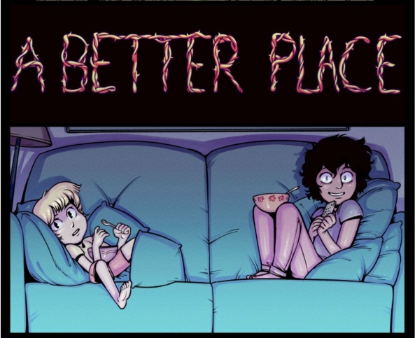
A Better Place
‘Mr. Bun’s Quest’ – ‘Thanksgiving Questing’
Updates: Thursdays
By Harry Bogosian
Reviewed by Elias Rosner
Mr. Bun is more than he seems. His powers are quite convenient and powerful, his timing impeccabile, his tongue sharp and his words honeyed. He brings Arma to his knees with embarrassment and pushes Nina to join him on his fetch quest with his chipper demeanor and secret knowledge. I do not trust this creature, and my distrust is elicited through Bogosian’s keen eye for set up and framing. Remember back in ‘Amongst the Clouds?’ Mr. Bun is front and center, mysterious and holding back, his toothy grin reflective in Spymaster Irtes’ own from ‘Crimes Against God.’
Bogosian also gives him a commanding presence in a way that contrasts Arma’s bulk. One is physically imposing, curt and expressive only in the eyes, but beneath it, we see the insecurities and worries and limited, singular drive. The other is slight, cartoony, and silly but every action taken is drawn with expert control — you can see it in the way Mr. Bun looks at Arma and Nina, or in the way Bogosian renders his speech — and it’s clear that nothing he does is by accident; every action, word, nudge, act of selflessness or compliment, is a calculation.
It’s so fucking good.
These six pages, one of which is the Thanksgiving lore page, which is always a blast and beautifully dark, are nice and tight, balancing moving the story forward, deepening the lore without overloading us on unnecessary exposition, and also a reminder that re-reading is almost a necessity because, 9 times out of 10, if you have a question about an item, like, say, the skull key, it’s either been answered already and have forgotten — the key is to the armory — or has yet to have been addressed, such as when Theo was locked away or what Nina’s sister’s endgame is. It’s also a reminder of how fucking dark this comic is.
It’s easy to forget that “A Better Place’s” world is a child’s idea of what an ideal world is, but after this week’s revelations, the decisions also take on a new dimension. It’s been hinted at for a bit but this is not a world shaped only by her idealistic ideas but also by her unbridled rage born from being exposed, rather violently, to the cruelty of the old world. I believe I posited when we were first told the “history” of the world, that when there are large changes, the question remains of what to do with the relics of the old world? For Hannah, it’s clear now that the question was not a concern.
Her eyes in ‘The Best Weapon’ say it all; if this is the world I’m trying to fix, it’s better to burn it all down first and rebuild from the ashes.
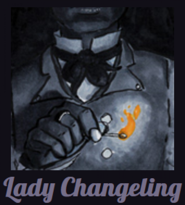
Lady Changeling
Prologue, Pages 1-5
Updates: Varies
By Eilidh McNeil
Reviewed by Jason Jeffords Jr
“Lady Changeling” was another webcomic I’d found back in December while perusing Twitter. Yet, there were only three pages at the time and I wanted to wait til more dropped. Luckily at the beginning of February, McNeil dropped two more pages! That equals five, which is my lucky number!
The first five pages of a story can tell a lot of its world, or very little. “Lady Changeling” is more of the latter, yet that isn’t bad, or a dig at creator McNeil. I mean, making a webcomic is hard, especially between school/work/family. Thing is, “Lady Changeling” first five pages only introduces two characters, small hints at things, and that’s mostly all. Yet, even with this “lack” (“lack” is still a strong word for it) of story, there is a certain charm to it. Could it be the art? Well, yes. But it seems McNeil is doing something everyone should appreciate with the story.
Continued belowGoing Slow.
She isn’t trying to throw every story beat in your face while cluttering the page. Instead, she is taking precious time to show interactions between characters, slowing building up to what seems to be the drive of the story. As the old proverb goes, “Slow and steady wins the race.” Thus what McNeil sets out to do, slowly build up a story. The impatience inside of me wants everything now, yet in a time where everyone wants to binge, this slow build is welcome. Hopefully, it proves beneficial towards “Lady Changeling” and draws in readers.
Now the art, first off the page structure. At first, I thought my zoom was on, as usually I can see the whole page when I first look at it. Yet, for “Lady Changeling” I could only see a part of the top as if the page was extremely blown up. This threw me off, yet as I read on it seems this might have been McNeil’s intent, as when you have to scroll down you are surprised by what transpires.
There is a lot to love about her visual style. Throughout the first five pages, you can see she isn’t afraid to play around with panel shapes/styles. Feeding upon Gothic vibes, McNeil keeps the pages black & white but keeps a few certain objects colored, mainly gold/yellow ones. Yet, one thing that stands out is her lettering. That is, she also plays around in this realm. When a character is smoking the words form in the smoke or when swooshing a bottle around the words are written in a manner that looks as if they’re moving.
Lastly (trust me, a lot can be said on her great art) you can still see some of the old lettering underneath her final letters. To some, this may seem weird. Alas, I adore it and although it doesn’t work for every story, it feels great here.
I would love to take another look at McNeil’s “Lady Changeling” once the Prologue is finished just to see how the story has unraveled and begun. On a final note that was hard to place anywhere above; McNeil bills the story as, “A Gothic Aromance.” The art was what originally drew me in, yet reading this had me even more interested. I’m a fan of Gothic visuals and storytelling, yet I’ve never read an Aromantic comic. That and my other notes above make me want to read more once the next few updates drop.
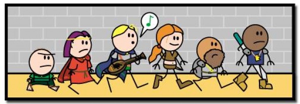
Order of the Stick
Pages 196 – 200
Updates: Varies
By Rich Burlew
Reviewed by Gustavo S. Lodi
“Order of the Stick” is often at its best when taking itself less seriously, and exploring more how to make smart fun over the tropes of tabletop RPG games, doing social satire, or poking jokes at general pop culture. It is a bit unfortunate that on this latest set of chapters, the series focuses almost squarely on plot progression. While not bad by any means, it loses some of its charm.
These last five pages share the screen between the evil group,and the Order itself. Over at bad-farm, the main antagonists ascertain how strong their forces are, to some amusing commentary of leadership, lack of knowledge, and overall change of plans.
Back to the “Order of the Stick” the group continues to progress of its quest, but it stopped short by a new rival, who may or may not be a true antagonist. If feels a lot like the “Green Ranger Syndrome,” where a new villain is set to become an ally. The introduction and dialogue do feel a bit choreographed, but it will be up for readers to continue blowing through to determine if the story goes as expected.
All in all, even a worse day with “Order of the Stick” is better than a lot of comic offering out there, so this was certainly amusing, even if under less-than-ideal conditions.

Trekker
Pages: 17-24 “Trekker” Book 1
Updates: Mondays
Written and Drawn by Ron Randall
Lettering by David Jackson
Reviewed by Michael Mazzacane
And so, the first book of “Trekker” comes to an end. It shouldn’t be so surprising how well this final strip of 8 pages worked. As with the last batch, the Randall originally conceiving it as a strip in “Dark Horse Presents” made the translation of it to the web and re-syndicating it an enjoyable read. It’s the sort of pacing and structure I think some Webtoon and more modern webcomics could borrow from for the better.
Continued belowThere are just a couple of pages that deserve to be highlighted. At the start, page 17, Randall immediately establishes the tense mood. Things do get a bit more frenetic in the following pages but this opening page with its comparatively dense paneling and heavy lighting establishes the stakes before they are verbally re-established on the next page when Molly comes knocking on the door. 11 panels on a page is a lot for this series, but he portions them out in a readable three-tiered setup and their content never feels constrained by the size of the panel. In many regards this is the suit up montage you’d find in an action film prior to the big showdown.
The inclusion of Molly helps to add to and reveal what is at stake for Mercy St.Clair. Sure, we’ve seen her pet, which is adorable. And we have seen her Uncle. But Molly is an actual friend which is a different kind of connection, it shows Mercy has more to lose than just her life if this all goes wrong.
Page 20, the ambush page, is plainly well done. It is confusing and the black and white art is somewhat of a hindrance, but it’s supposed to be that way. This is the moment where Gatefish enacts his scheme, a scheme we don’t know. It places us in the point of view of her Uncle, reduced to a shocked small portrait as he desperately searches for his niece. The page helps to create the sense of confusion by playing off the readers understanding of how comics function.
Size matters, the stuff that is biggest must be most important. On page 20 that would be the crash that occurs. The apparent importance of that crash is also developed by the cars all pointing and flowing together to get the readers eye stuck on that point. It is a distraction so we don’t see Mercy getting pushed in the manhole off to the side in a small set of panels. Why this page works and isn’t just a bit of clever by half misdirection is that Randall sets up the manhole visual cue before it becomes important. The hole is right there in the third panel, you just don’t notice it compared to the flying car that is coming in hot.
The final batch of pages are just plainly efficient action that sees Mercy progress to the Gatefish and capture him, revealing an insight into her character. She is the bounty hunter with a heart of gold, seemingly counter to the requirements of her profession. Randall achieves a lot in these 24 pages. It isn’t some ground breaking spectacular work but it is an excellent example of what efficient storytelling and characterization looks like in practice.

The Witch and the Bull
Pages: Episodes 1-3
Schedule: Thursdays
Written and Illustrated by Moonsia
Edited by Ethan Leblanc
Assisted by Chelsealy
Reviewed by Michael Mazzacane
“The Witch and the Bull” is a tale as old as time, or at least as old as The Emperor’s New Groove. On the outside Tan didn’t always look like the titular bull. On the inside is another matter as he carelessly pushes through tax policies that arbitrarily and disproportionately effect one class of citizen, witches, as part of a long simmering vendetta against them. Internally he justifies this as a way of making them pay their fair share to rebuild the city after a war from two years ago, but through the juxtaposition of words and pictures it is quite clear this is done to service his grudge and keep a perceived threat down. The use of witches and a previous conflict is an interesting twist on this sort of stories more traditional angle on class.
The titular witch, Aro, isn’t given much internal space in these first three episodes. Readers know she has a hidden past and she has a striking resemblance to that witch they never found, but most importantly Moonsia’s art get the characters goodness and charity across. Both of the leads are masking something about themselves through their appearance, only for each it is the reverse. On the outside Tan appears to be an egotistical but upper crust, faithful, bureaucrat that barely conceals his prejudices. Aro is trying to hide something in her past but that only reveals how naturally kind the character is. Three episodes isn’t a lot of space but Moonsia does a good job of getting everyone, including the friend supporting cast, across. Their scripting is a bit blunt at times.
Continued belowFrom a formatting perspective “Witch and the Bull” has a lot of highlights. Moonsia makes good use of the vertical scrolls ability to bend and shift perspective seamlessly or create a sense of scale inside the city center. Once he is transformed into a bull, Tan is forced to comically battle in the Arena, Moonsia’s use of the strip to show the spatial relationship between the bull and person trying to kill him is very effective.
Overall, their art is a wonderful mix of details that don’t let the expressive power of a nice cartoon getting in the way. They do something Akira Toriyama would do a lot in the “Dragon Ball” manga, playing off these dense images with more comedic moments of levity. While there are comedic elements and moments the ability to capture a single emotion, like Tan’s fear in the arena, is a real strength of this strip that pushes it into something more than your typical manga inspired webcomic.
There are some moments of friction as gutter space gets a little too big at times. This is only really noticeable in the first strip and seems to be an example of learning as you go. As the strip progresses and they become more accustomed at laying out multiple panels and leaning into the natural strengths of the medium “The Witch and the Bull” shows some real potential. The core conceit of the strip isn’t all that new but the execution of that story has me interested in reading more of it.


